Cooking School Marketing Professional Website Template
This culinary earn rewards for every referral landing page template gives cooking schools a polished, conversion-focused referral landing page built around tiered rewards, frequently asked question-driven scroll logic, and side-by-side comparison tables. Students and alumni sign up, share their personal referral link, and earn credit toward masterclasses, workshops, and premium kitchen tools, all presented inside an Executive Suite visual identity.
by Rocket studio
Quick summary
This template is a single-page referral landing page built for a culinary academy that wants to turn its own students and graduates into active recruiters. The page uses a structured frequently asked question-driven scroll, two comparison tables, and a low-friction referral form to move visitors from curiosity to action. Every section earns trust before it asks for a click.
Who this template is for
This referral landing page is designed for culinary academies and cooking schools that already have an engaged student body and want to put that enthusiasm to work. It suits schools running a tiered reward structure rather than a flat cash-bonus arrangement. The page speaks directly to three distinct audiences who all have a natural reason to refer friends.
- Current students excited after their first class and ready to bring a classmate to the next one
- Alumni who now run food businesses and want their staff to get proper culinary training
- Home cooks whose dinner guests always ask where they learned to cook like that
What problem this template solves
Most referral program pages fail because they bury the reward, overwhelm visitors with fine print, or ask for too much before giving anything. Students and alumni land on a generic page, read a vague "give twenty dollars, get twenty dollars" offer, and leave unconvinced. A good referral landing page needs to answer real objections in plain language, show the reward tiers clearly, and make sending an invite feel effortless.
- Visitors leave referral pages without acting because the value is unclear or the steps feel complicated
- Flat cash rewards do not motivate passionate culinary students the way premium experiences do
- Schools lose potential referrals when the page cannot address eligibility and credit-timing questions upfront
What you get with this template
You get a fully structured referral landing page with a deep frequently asked question-driven content scroll, two side-by-side comparison tables, a three-field invite form, and a gated PDF download path. The template delivers a complete referral page layout with clear instructions at every stage of the referral process, from first read to final submission.
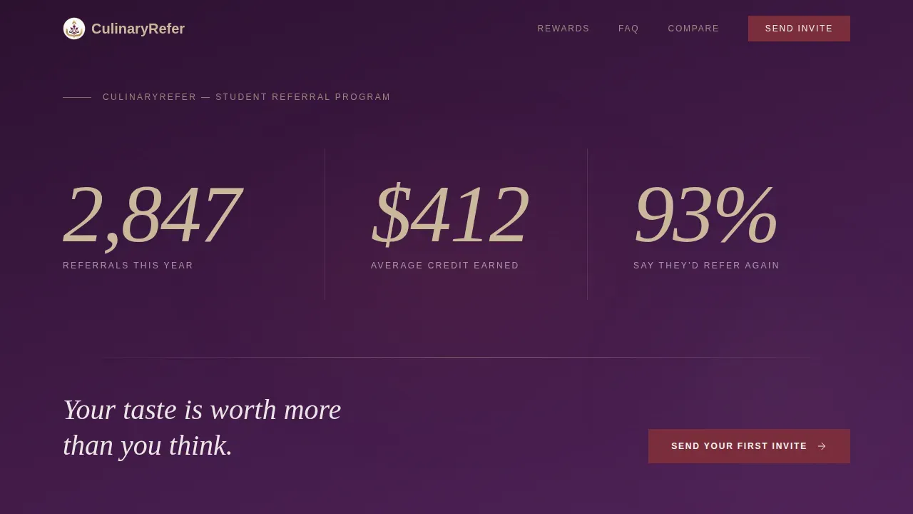
- A hero stats wall with three oversized social proof metrics rendered in champagne on deep plum
- Two structured comparison tables: one for referral reward tiers and one benchmarking this program against flat-fee competitor schemes
- A minimal referral form collecting a friend's first name, email, and relationship context, plus a secondary email-gated PDF download for alumni who want details before committing
Feature list
This template ships with six purpose-built components that carry the referral program from first impression to submitted invite.
Stats-Driven Hero Section
The hero skips photography and leads with three oversized data points: 2,847 referrals this year, an average credit of $412 earned, and a 93% satisfaction rate. These figures act as immediate social proof, showing new visitors that the referral program is active, credible, and rewarding. The numbers are set in a thin editorial serif against deep plum, with a single line of copy beneath: "Your taste is worth more than you think."
frequently asked question Accordion Clusters
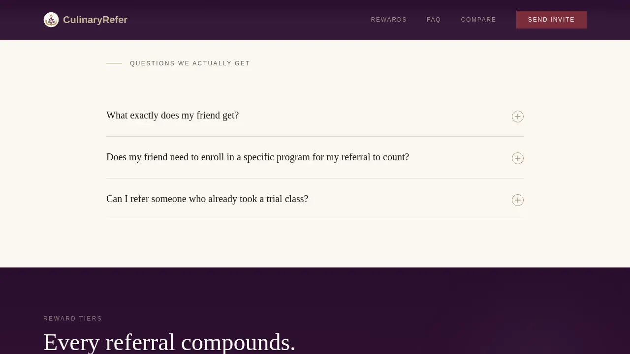
Two clusters of accordion-style frequently asked question blocks structure the entire scroll. Each question mirrors something a real student or alumnus would ask, what their friend receives, whether a trial-class attendee is eligible, and when credit reaches their account. The accordion format keeps the referral page uncluttered while surfacing detailed information on demand. This approach turns every doubt dissolved into a reason to refer friends.
Tiered Reward Comparison Table
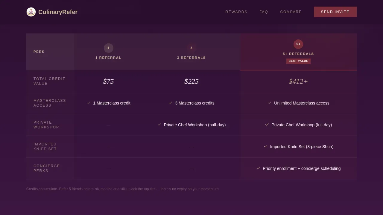
A champagne-bordered comparison table contrasts three referral tiers: one referral, three referrals, and five or more. Each column displays the escalating reward, from course credit to private chef workshops to imported knife sets. Hoverable rows make the differences easy to scan. Seeing the top tier reward immediately before the invite form gives visitors a clear reason to sign up.
Competitor Contrast Table
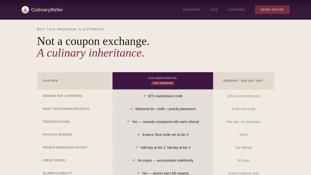
A second comparison table positions this referral program against generic "give twenty dollars, get twenty dollars" schemes at competitor schools. It highlights the difference in reward quality, reward variety, and community value. This kind of side-by-side layout is one of the most effective referral landing page elements for converting visitors who are still weighing their options.
Minimal Invite Form
The primary conversion point is a three-field referral form: friend's first name, their email address, and a dropdown for relationship context (classmate, colleague, family member, or dinner guest). Using minimal fields streamlines the referral process and keeps the barrier to entry extremely easy to clear. The call to action button reads "Send Your First Invite."
Gated PDF Download Path
A secondary path offers a branded downloadable referral guide containing program tiers, frequently asked question answers, and shareable invite language. It is gated behind a single email field. This path captures alumni and existing clients who are not ready to refer friends today but want detailed information in their inbox. Promoting the referral page through email marketing becomes simpler when visitors can self-select into this nurture track.
Page sections overview
| Section | Purpose |
|---|---|
| Hero Stats Wall | Display three oversized referral metrics as immediate social proof |
| frequently asked question Cluster One | Answer what the referred friend receives and introduce reward tiers |
| Tier Comparison Table | Show escalating rewards across one, three, and five-plus referrals |
| Competitor Contrast Table | Benchmark this program against flat cash-reward competitor schemes |
| frequently asked question Cluster Two | Clarify eligibility rules, credit timing, and referral link mechanics |
| Invite Form Section | Capture friend details and relationship context via a three-field form |
| PDF Download Gate | Collect alumni emails in exchange for a branded referral guide |
| Footer Flow | Close with horizontal nav links and program terms of service reference |
Design & branding system
The visual identity follows an Executive Suite theme built around the Plum Executive color system. The palette feels like a private dining room after hours: dark wood, gold-rimmed plates, and the quiet confidence of a chef who does not need to shout. Every color choice reinforces the premium positioning of the referral rewards on offer.
- Deep plum (#3C1642) anchors section backgrounds and headers; brushed champagne (#C9B99A) surfaces card rows and table headers; crisp bone white (#FAF7F2) fills body text areas
- Sharp burgundy (#7B2D3B) marks every call to action button and hover state, reading like a thumbprint of red wine on linen
- Fraunces handles display headings and the hero stats wall; DM Sans carries all body copy for clean, readable contrast; white space is used deliberately to let rewards breathe and keep the brand voice composed
Mobile & speed optimization
The template is built desktop-first to give the complex comparison tables the horizontal space they need. A mobile-responsive fallback collapses tables into stacked card views and converts multi-column layouts to single-column flows. Thumb-friendly button sizes and clear instructions keep the referral landing page functional at every screen width.
- Comparison tables reformat into scrollable stacked cards on smaller screens so reward tiers remain readable
- The referral form and PDF download gate use full-width inputs and large touch targets for easier mobile interaction
- Scroll animations use fade-up reveals and staggered entrance timing, keeping motion purposeful without slowing the page experience
How this template helps you convert
A referral landing page converts when it answers every question before it asks for anything. This template is structured so that each objection dissolved is immediately followed by a visible reward, building momentum toward the invite form. The result is a referral page that feels like a conversation rather than a sales pitch.
- The hero metrics establish instant credibility through social proof, so visitors arrive at the first frequently asked question cluster already trusting the program's success record and its community of satisfied customers
- The frequently asked question-to-table rhythm alternates between answering a doubt and revealing a reward tier, so each scroll step earns the next, and the highest-tier reward sits directly above the referral form, the last thing visitors see before they sign up and refer friends
Other information about this template
This template fits naturally into the broader landscape of rewards programs built for service businesses where community and craft matter more than cash bonuses alone. Schools operating a customer referral program will find the tier structure and frequently asked question format adaptable to different reward types, from loyalty points and free trials to partner programs and course bundles.
- The referral link mechanic supports both direct email sharing and social sharing via social media platforms, giving referrers flexibility in how they reach more friends
- A QR code block can be embedded in the PDF guide, making it easy for alumni to share their personal link at events, pop-up dinners, or on social media without needing to type out a URL
- The page layout supports easy integration into an existing website without structural changes, and the brand voice carries through every section to maintain brand identity from hero to footer
- Schools using employee referral programs or affiliate program structures for their instructors can adapt the tier table columns to reflect those use cases, including open positions or staff incentives
- The template supports a step by step guide layout in the PDF download, making it simple for alumni and existing customers to understand the referral process and share referral links confidently
- Tracking referrals and measuring the program's success is straightforward when the referral form captures relationship context alongside contact details, providing valuable insights into which referral channels convert new customers most effectively
- The dedicated landing page format keeps visitors focused on one action, reducing distraction compared to a busy existing website page; promoting the referral landing through email marketing campaigns and social media posts consistently drives higher participation rates
- For any small business or culinary school looking to build customer loyalty and grow its customer base through word of mouth, this template provides clear call to action placement, clear instructions, and the conversion structure of an effective referral landing page
Theme
Executive Suite
Creative direction
FAQ-Driven
Color system
Plum Executive
Style
Comparison Table
Direction
Content/Resource
Page Sections
Stats-driven Hero with Social Proof
Dual Frequently Asked Question Accordion Clusters
Tiered Reward Comparison Table
Competitor Contrast Table
Minimal Three-field Invite Form
Email-gated PDF Download Path
Related questions
Can this template support escalating reward tiers beyond three levels?
Does the PDF download gate capture contacts separately from the invite form?
Is the frequently asked question accordion ready to use with my own questions and answers?
Can I adapt this referral page for an employee referral program or instructor incentive scheme?
How does the referral landing page handle social sharing for alumni?



