Cannabis Consulting Blog Website Template
Cultivar is a single-page landing page template built for cannabis operations consultancies. It leads with animated data counters, stacks editorial comparison tables contrasting industry averages against consultant-driven outcomes, and drives qualified operators toward a services page. The design follows an Editorial Magazine theme in a deep plum and champagne palette that communicates authority before a single word is read.
by Rocket studio
Quick summary
Cultivar is a stats-first, single-page landing page template for cannabis operations consultants. It opens with an animated revenue counter, unfolds a series of editorial comparison tables, and closes every section with a data-backed case for hiring. The template is built to move operators from curiosity to click, without a single form on the page.
Who this template is for
This template was designed for consultancies serving the licensed cannabis industry at an operational and financial level. It speaks to firms that need to establish credibility fast and drive qualified prospects to a deeper services conversation.
- Cannabis operations consultants advising multi-state operators on compliance and yield improvement
- Boutique advisory firms guiding single-license holders through state audit preparation
- Due diligence service providers working with private equity groups evaluating cultivation assets
What problem this template solves
Cannabis operators come to a consultancy page already skeptical. They have been burned by generic advice and they want proof, not promises. A standard services page with a short paragraph and a contact form does not close that trust gap.
- Operators need to see the performance gap between current results and what expert guidance actually delivers
- Visitors from private equity backgrounds expect financial-grade data presentation, not marketing language
- Consultancies with deep track records lack a visual format that communicates that depth in the first scroll
What you get with this template
You get a complete single-page layout engineered around editorial data storytelling. Every design choice, from the color palette to the table structure, is calibrated to signal expensive expertise before the visitor reads a word.
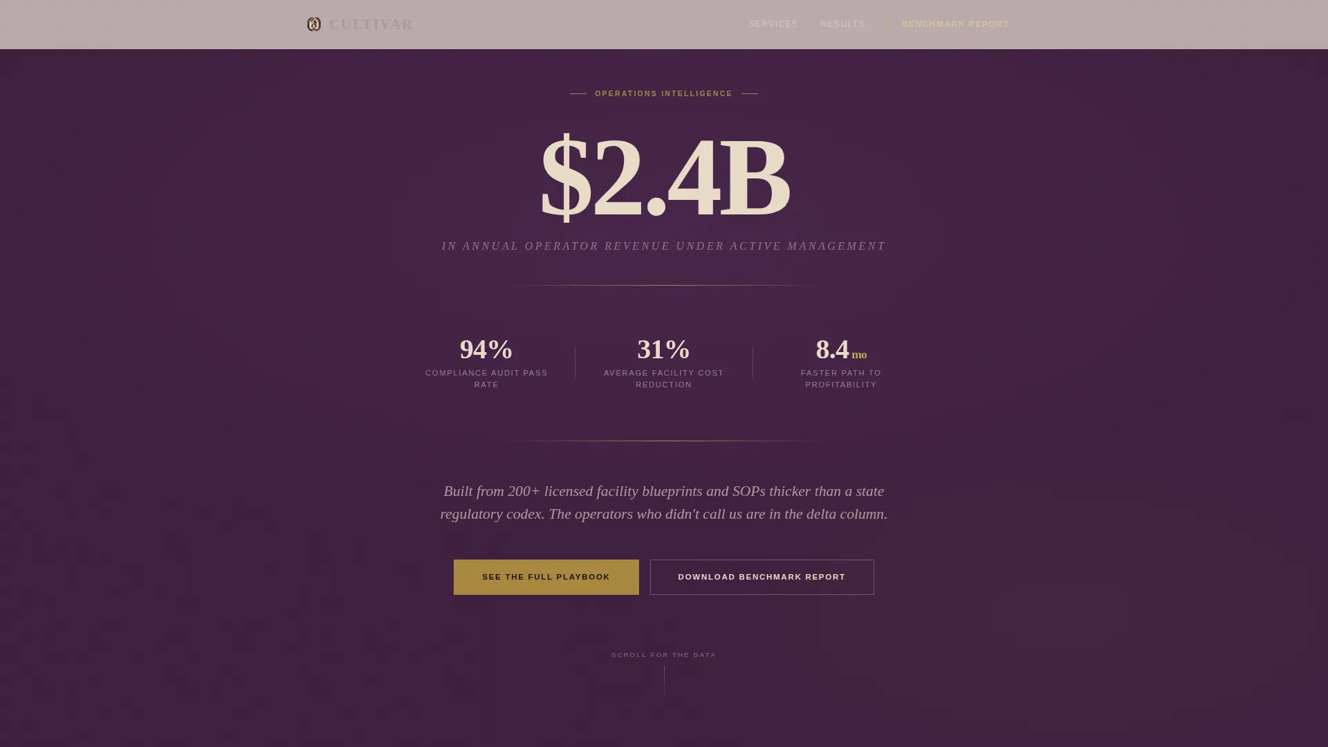
- An animated header block with a live revenue counter and three supporting performance statistics
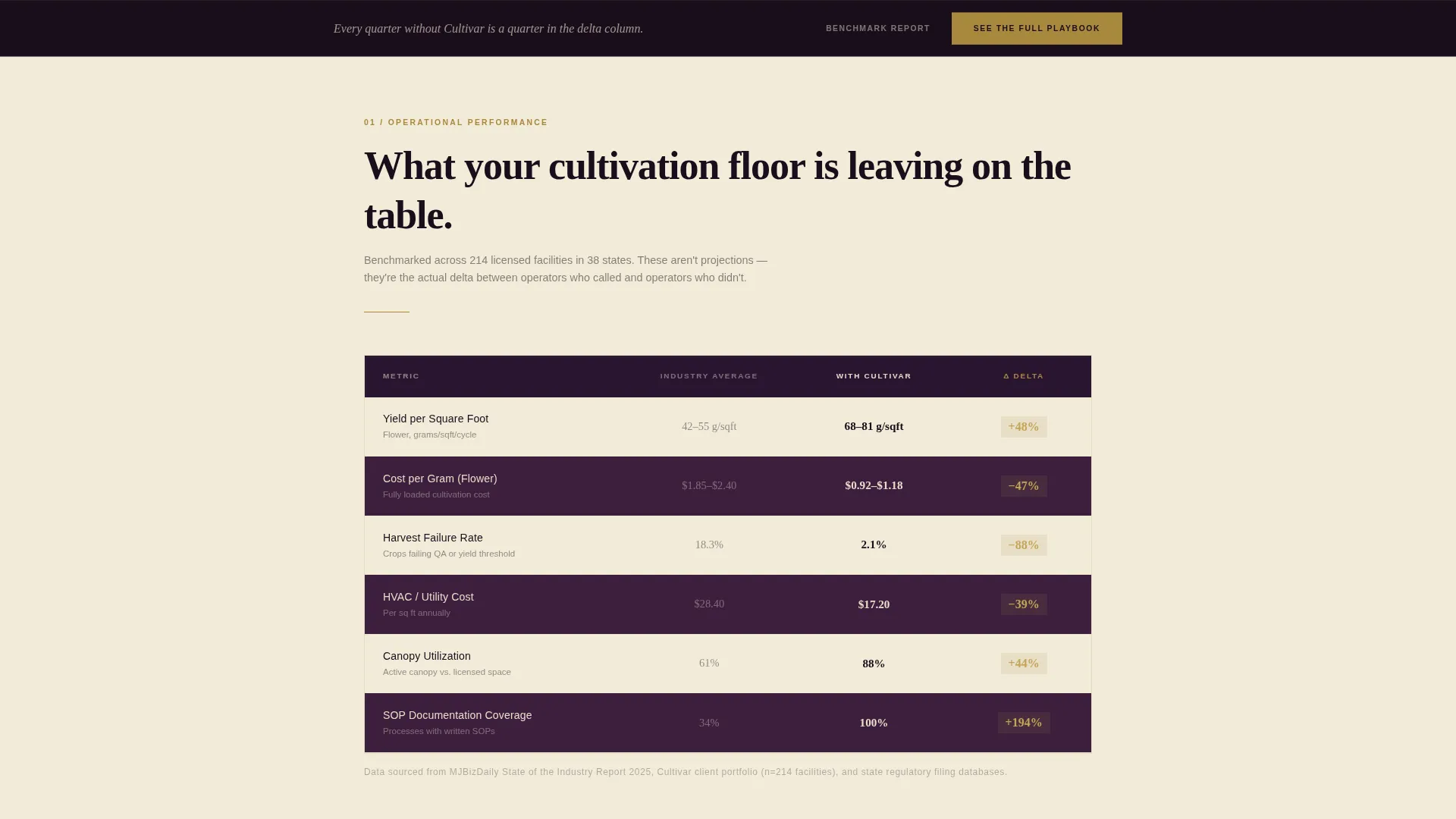
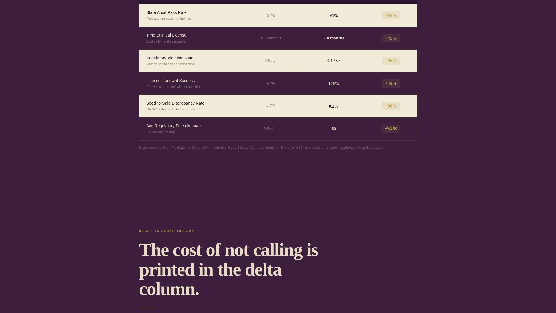
- A sequential series of editorial comparison tables covering yield, cost, audit failure rates, and time-to-license
- A persistent bottom call-to-action bar and a secondary email-capture path for benchmark report downloads
Feature list
This template packs a focused set of high-impact components built for one purpose: making the cost of inaction numerically undeniable.
Animated Data Counter Header
The header opens with a single oversized counter ticking upward to "$2.4B in annual revenue managed." Three supporting statistics fade in below it. No hero image competes for attention. The numbers land like headlines, and a thin gold rule underscores the entire data block.
Editorial Comparison Tables
Multiple comparison tables stack as the visitor scrolls. Each table contrasts "Industry Average" against "With Cultivar" across metrics such as yield per square foot, cost-per-gram, audit failure rates, and time-to-license. Alternating plum and champagne rows give the tables an infographic quality. The delta column is highlighted in tarnished gold so the performance gap is impossible to miss.
Callout Pull Quotes
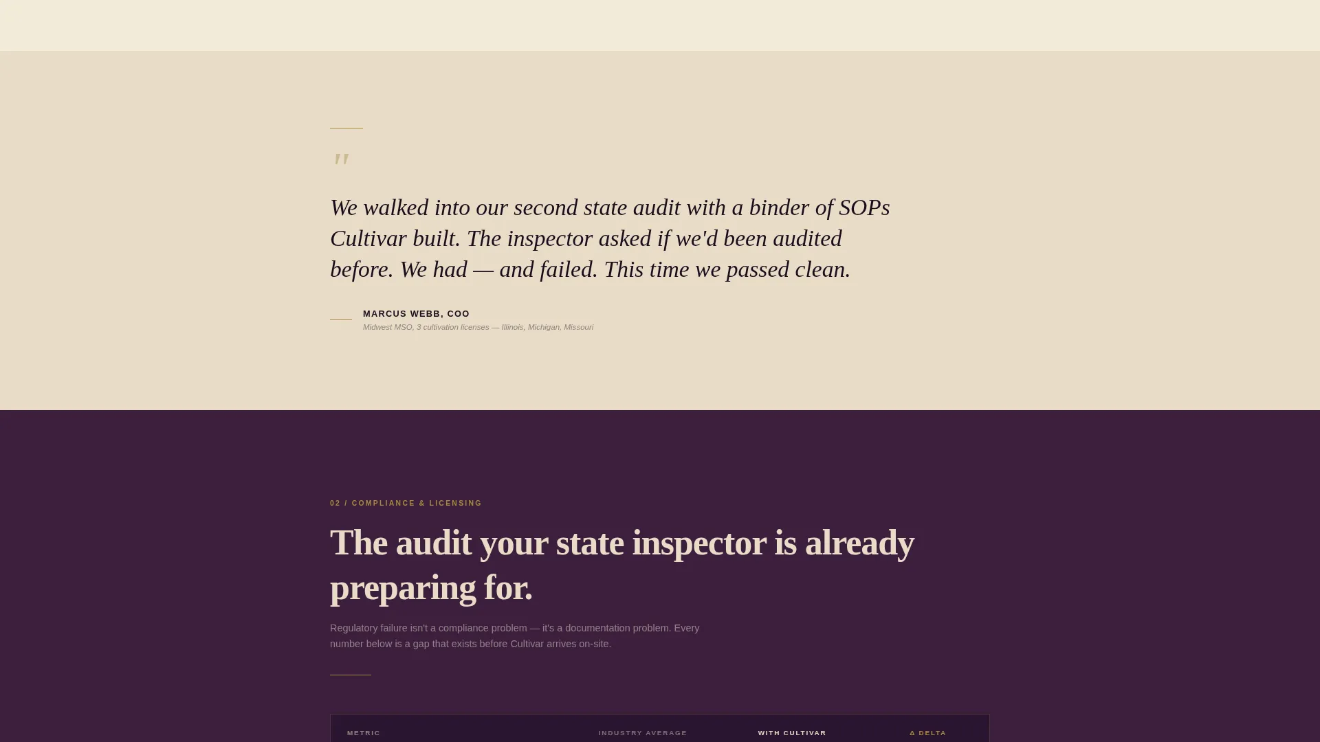
Between each comparison table, a single-sentence client proof point appears in oversized italic type. These function like magazine callouts. They reset the reader's attention and add human credibility between the data blocks.
Dual Call-to-Action Architecture
The primary call to action, "See the Full Playbook," appears after the second comparison table and repeats as a persistent bottom bar after the third. A secondary path, "Download the Benchmark Report," captures emails from visitors who are not yet ready to engage but want the underlying data.
Plum Executive Color System
Deep plum anchors headers and section backgrounds. Muted champagne serves as the primary reading surface. Tarnished gold marks data highlights and interactive table rows. Near-black aubergine carries body text. Every color decision reinforces the perception of financial-grade authority.
Editorial Magazine Typography
The type system uses an oversized editorial serif for headline figures and supporting statistics. Body text is set at a comfortable reading weight in aubergine on champagne. The combination creates a layout that feels closer to a luxury industry report than a digital services page.
Page sections overview
| Section | Purpose |
|---|---|
| Animated counter header | Establishes scale and credibility with live revenue and performance stats |
| Supporting stats block | Reinforces header data with audit pass rate, cost savings, and months-to-profitability |
| First comparison table | Contrasts yield and cost metrics between industry average and Cultivar-guided operations |
| Pull quote callout | Adds client-voice credibility between data sections |
| Second comparison table | Escalates to audit failure rates and time-to-license comparisons |
| Primary call to action block | Drives qualified visitors to the full services breakdown page |
| Third comparison table | Closes the financial outcomes argument with EBITDA-level metrics |
| Persistent bottom bar | Repeats the primary call to action as a fixed scroll companion |
| Benchmark report call to action | Captures emails from research-stage visitors with a secondary download path |
Design & branding system
The Plum Executive color system was chosen to evoke a leather-bound annual report rather than a software product. Every shade is intentional and earns its place in the hierarchy.
- Deep plum (#3D1F3E) for headers and section backgrounds, muted champagne (#E8DCC8) as the reading surface, tarnished gold (#A8893E) on data highlights and delta columns, and near-black aubergine (#1A0E1B) for body text
- An oversized editorial serif drives all headline figures; the scale of the type signals confidence before the number is even read
- Gold rules, alternating table rows, and oversized italic callouts follow Editorial Magazine conventions throughout
Mobile & speed optimization
The template is structured for clean rendering across screen sizes. The stats-first layout and table-heavy design translate to mobile without losing visual hierarchy.
- Comparison tables reflow cleanly on smaller screens so the delta column remains the visual anchor
- The persistent bottom call-to-action bar is designed to stay accessible without obscuring content on mobile viewports
- The header counter animation is lightweight by design, with no hero image competing for load bandwidth
How this template helps you convert
Every scroll on this page is engineered to deepen conviction. The layout does not ask for trust; it earns it column by column.
- The animated counter opens with a number large enough to signal that this firm operates at a serious scale, setting the authority frame before any copy is read.
- Sequential comparison tables build a cumulative financial argument. By the third table, the visitor has seen the performance gap repeated across yield, compliance, and profitability, making inaction feel costly.
- The dual call-to-action structure captures two types of buyer: the operator ready to engage now via "See the Full Playbook," and the research-stage visitor who downloads the benchmark report and stays in the funnel.
Other information about this template
This template sits at the intersection of cannabis consulting and financial services presentation design. It is particularly well-suited for firms whose authority rests on documented outcomes from real licensed builds.
- The template supports a cannabis operations consultant positioning strategy where proof of performance replaces promotional language
- The comparison table format works equally well for seed-to-sale compliance positioning and facility cost benchmarking narratives
- No form appears on this page; the click-through architecture keeps the experience frictionless and routes visitors to a separate services page with engagement tiers
- The benchmark report download path gives the page a secondary conversion point that suits visitors doing pre-acquisition due diligence research
Theme
Editorial Magazine
Creative direction
Stats-First Impact
Color system
Plum Executive
Style
Comparison Table
Direction
Click-Through
Page Sections
Animated Revenue Counter Header
Editorial Comparison Tables
Magazine-style Pull Quote Callouts
Dual Call-to-action Structure
Plum Executive Color System
Editorial Serif Typography System
Related questions
Does this template include a contact form?
Can I edit the comparison table metrics to match my firm's data?
Who is this landing page designed for?
Is there a hero image in the header section?
How does the persistent bottom bar work?



