Garden Tools & Planters Store Professional Website Template
Cultivar is a masonry-grid landing page built for a curated garden tools and planters subscription box. It combines a full-bleed hero search bar, scarcity-driven countdown cards, and a side-panel tier comparison to move visitors from curious browsers to committed subscribers. The design feels like a well-loved nursery, warm, organic, and quietly urgent.
by Rocket studio
Quick summary
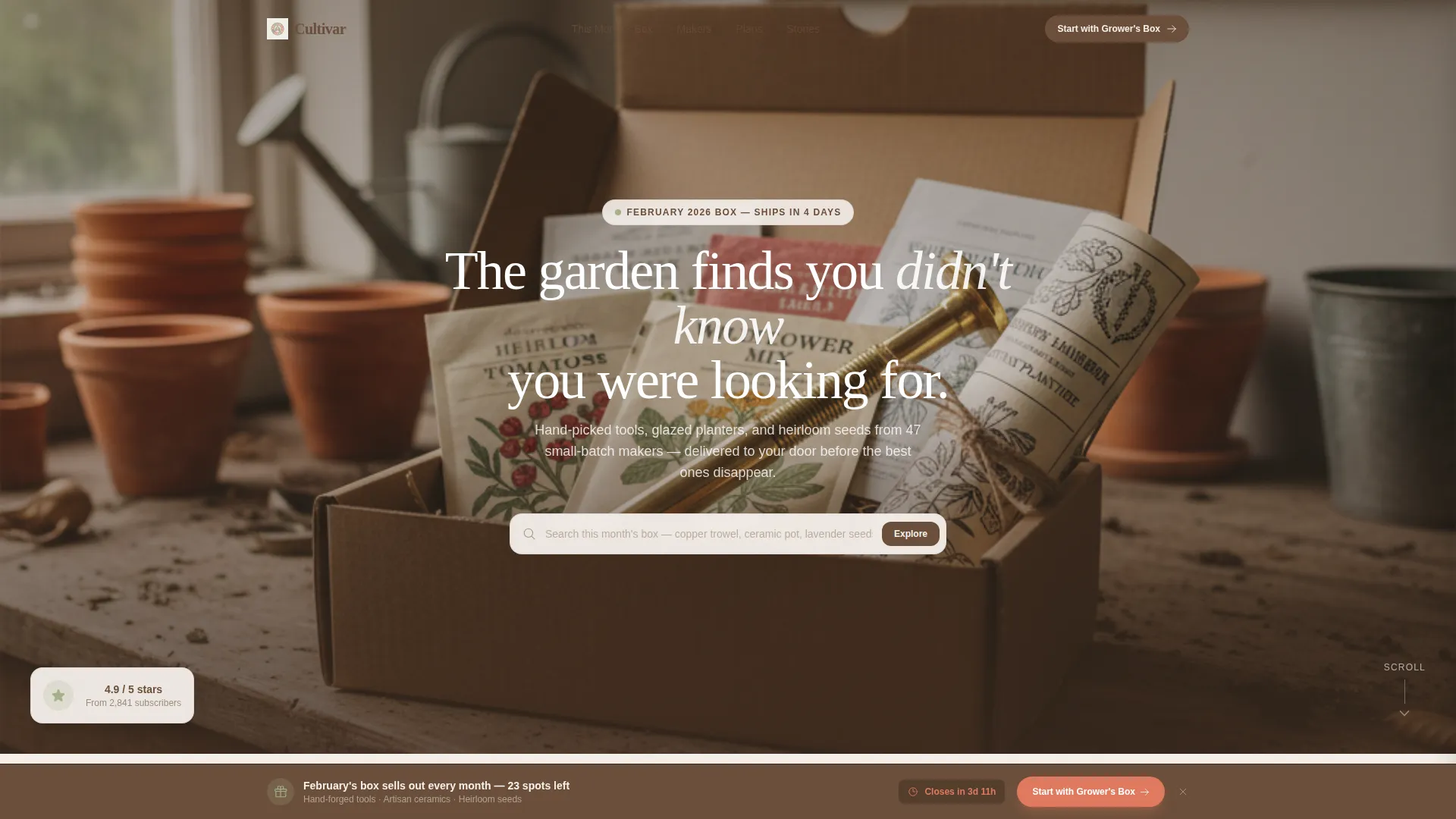
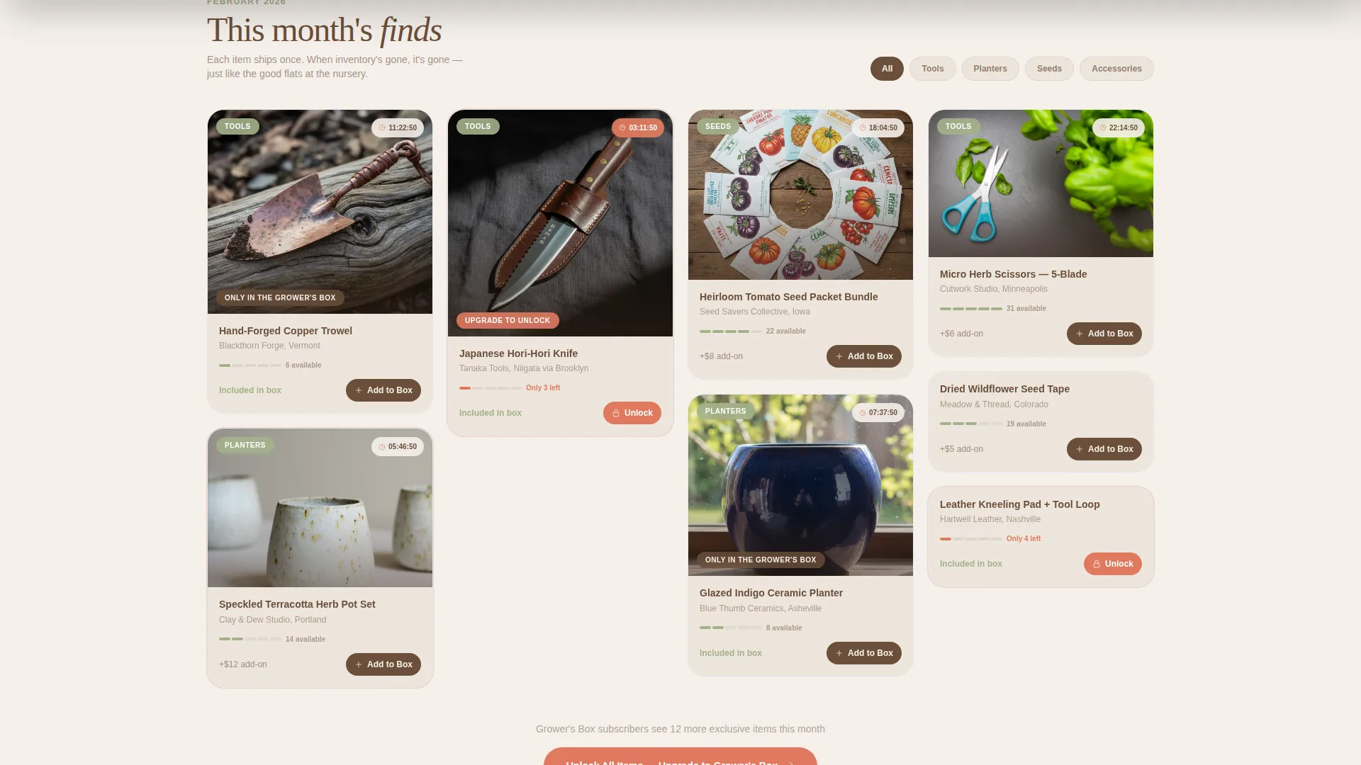
Cultivar is a single-page subscription landing page for a curated garden tools and planters box. It opens with an immersive hero search bar, then flows into a masonry product grid where countdown badges and "Only in the Grower's Box" stamps build real purchase urgency. The upsell architecture serves both new visitors and existing subscribers in the same scroll.
Who this template is for
This template was designed for subscription box brands that sell tactile, small-batch goods to enthusiastic hobbyists. It suits founders who want a page that feels like a destination, not a checkout form.
- Subscription box operators selling curated garden tools, planters, or seed assortments
- Direct-to-consumer brands sourcing from small-batch or artisan makers
- Marketers who need a single page to handle both new sign-ups and subscriber upgrades
What problem this template solves
Most subscription landing pages either overwhelm visitors with text or bury the product behind a generic hero and a sign-up form. Neither approach conveys the excitement of opening a hand-packed box of carefully chosen goods.
- Visitors have no way to browse what is inside before committing, so they leave without converting
- Existing subscribers see the same page as new visitors, missing a chance to upgrade their tier
- Scarcity from real limited inventory is invisible, so urgency that could close a sale goes to waste
What you get with this template
You get a fully structured landing page layout built around a masonry grid, a hero search experience, and a layered upsell flow. Every section is designed to hold a specific job in the conversion sequence.
- A centered hero search bar over a full-bleed product photograph, with ghost text that invites immediate exploration
- A scrollable masonry card grid with countdown badges, tier stamps, and per-card "Add to This Month's Box" actions
- A persistent bottom bar and a slide-in side panel for tier comparison and billing toggle between monthly and seasonal plans
Feature list
This landing page packs several purpose-built components into one cohesive scroll.
Hero Search Bar Over Full-Bleed Photo
The header places a centered search field directly over a soft-focus overhead photograph of an unboxed subscription spread. Ghost text reads "Search this month's box, copper trowel, ceramic pot, lavender seeds…" making visitors feel like they are already inside the shop before they scroll.
Masonry Product Grid with Countdown Badges
The core of the page is a Pinterest-style masonry grid where each card carries a live countdown badge showing hours remaining on that item or bundle variant. Cards are stamped with labels like "Only in the Grower's Box" or "Upgrade to Unlock" to signal exclusivity without overstating scarcity.
Per-Card À La Carte Add Button
Every masonry card includes an "Add to This Month's Box" button. This lets visitors purchase individual limited-edition items without committing to a full subscription tier upgrade, reducing the barrier to first purchase while increasing average order value through impulse additions.
Persistent Upgrade Bottom Bar
A sticky bottom bar adapts its call to action based on visitor status. Existing subscribers see "Upgrade to Grower's Box" while new visitors see "Start with the Grower's Box," keeping the primary conversion action always visible regardless of scroll depth.
Side-Panel Tier Comparison
Clicking either call-to-action opens a slide-in side panel showing a side-by-side comparison of the Seedling tier and the Grower's tier. A billing toggle lets visitors switch between monthly and seasonal pricing before they commit.
Scroll-Progressive Product Reveal
The masonry grid is ordered intentionally. Items grow more premium as visitors scroll, moving from herb scissors at the top to hand-forged Japanese hori-hori knives deeper in the grid. This mirrors the experience of walking deeper into a well-stocked nursery.
Page sections overview
| Section | Purpose |
|---|---|
| Hero Search Header | Invites catalog exploration via a centered search bar over a full-bleed unboxing photograph |
| Masonry Product Grid | Displays curated items in a scrollable Pinterest-style grid with countdown badges and tier stamps |
| Per-Card Add Actions | Lets visitors add individual items à la carte without upgrading their full subscription tier |
| Tier Comparison Panel | Side panel showing Seedling versus Grower's tier with a monthly or seasonal billing toggle |
| Persistent Bottom Bar | Sticky call-to-action bar that adapts its message for new visitors or existing subscribers |
Design & branding system
The visual identity uses a Cloud Canvas color palette that feels like a watercolor sketch in a gardening journal. Every color choice is deliberate and restrained, keeping the focus on the products rather than the interface.
- Background in soft linen white (#F5F0EB), typography and borders in warm potting-soil brown (#6B4F3A), and category pills in muted sage (#A3B18A)
- A single urgent coral (#E07A5F) reserved exclusively for countdown timer badges and upgrade call-to-action buttons, so it always carries weight
- Cards are styled to look hand-pinned to a corkboard, with an overlap and layered aesthetic that gives the grid a tactile, greenhouse-table feeling
Mobile & speed optimization
The masonry grid layout is built to reflow cleanly across screen sizes so the browsing experience holds up whether a visitor is on a desktop at a desk or a phone in a garden center.
- Masonry columns collapse gracefully on smaller screens, keeping countdown badges and add buttons accessible without horizontal scrolling
- The persistent bottom bar remains anchored and readable on mobile viewports, so the primary call to action is never lost during scroll
How this template helps you convert
The page is structured so that every scroll interaction moves a visitor one step closer to a decision.
- The hero search bar creates immediate product engagement before the visitor has even formed an opinion about subscribing, making the first interaction feel like browsing rather than committing.
- The countdown badges on each masonry card introduce honest scarcity tied to real small-batch inventory, giving visitors a concrete reason to act now rather than return later.
- The side-panel tier comparison removes the most common objection by letting visitors weigh plan differences and billing options in context, without navigating away from the page.
Other information about this template
This template sits inside the Retail and E-Commerce category, specifically aligned with the garden tools and planters store niche. It is built on a Marketplace Grid theme with an Overlap and Layered template style.
- The landing page direction is Marketplace and Multi, meaning it handles both discovery browsing and direct conversion in one scroll
- The creative direction follows a Limited Time urgency model, where scarcity mirrors real inventory from small-batch makers rather than artificial pressure
- The header concept pairs a full product photograph with an interactive search field, borrowing a catalog-browsing feel that lowers first-visit anxiety
- The Cloud Canvas color system keeps the palette sun-bleached and organic, consistent with the handcrafted sourcing story the brand tells
Theme
Marketplace Grid
Creative direction
Unboxing Experience
Color system
Obsidian & Gold
Style
Overlap/Layered
Direction
Marketplace/Multi
Page Sections
Hero Search Bar Over Full-bleed Photo
Masonry Grid with Countdown Badges
Per-card À La Carte Add Button
Persistent Upgrade Bottom Bar
Side-panel Tier Comparison
Scroll-progressive Product Reveal
Related questions
Who is the ideal user for this landing page template?
Can the template handle both new visitors and existing subscribers on the same page?
How does the side-panel tier comparison work?
Can visitors purchase items without signing up for a subscription?
What makes the countdown badges feel credible rather than gimmicky?



