Agriculture Consulting Directory Website Template
Cultivar is a precision agriculture landing page template built for growth consultancies that work with farm operators, co-op directors, and agri-tech founders. It leads with live data counters, comparison tables, and a stats-first layout that teaches visitors before asking anything of them. The design pairs an Arctic White palette with deep loam typography and growth-signal green accents for a research-grade, trustworthy feel.
by Rocket studio
Quick summary
Cultivar is a single-page agriculture consulting template designed around data credibility. It opens with an animated yield counter, moves through oversized performance metrics, and anchors every claim in comparison tables. The layout earns visitor trust section by section before presenting a lead capture form with two clear conversion paths.
Who this template is for
This template is built for agriculture growth consultants who need a page that speaks to technically literate, numbers-driven clients. It suits professionals who win business by showing proof, not by describing their process in vague terms.
- Third-generation farm operators who want yield improvement backed by field data
- Regional co-op directors and agri-tech startup founders evaluating consulting ROI
- Precision agriculture consultancies ready to present soil, satellite, and margin data up front
What problem this template solves
Many agriculture consultants lose credible prospects because their pages lead with biography instead of evidence. A farm operator watching yields flatline does not want a mission statement. They want numbers they can trust.
- Visitors leave before reaching the offer because early sections feel generic and unqualified
- Comparison data is buried in PDFs rather than shown inline where it can do real persuasion work
- The page asks for a form fill before it has given the visitor any reason to believe the consultant understands their operation
What you get with this template
You get a fully structured, single-page layout that puts performance data in front of every explanation. The template is organized around a stats-first content cadence, meaning each section opens with a headline metric before any supporting copy appears.
- An animated counter header, three comparison tables, and a two-path lead capture form
- A content and resource hub structure that delivers genuine insight at every scroll depth
- A clean Arctic White visual system with growth-signal green reserved for positive indicators and calls to action
Feature list
This template is built around a set of intentional components, each serving a specific role in the persuasion sequence.
Animated Yield Counter Header
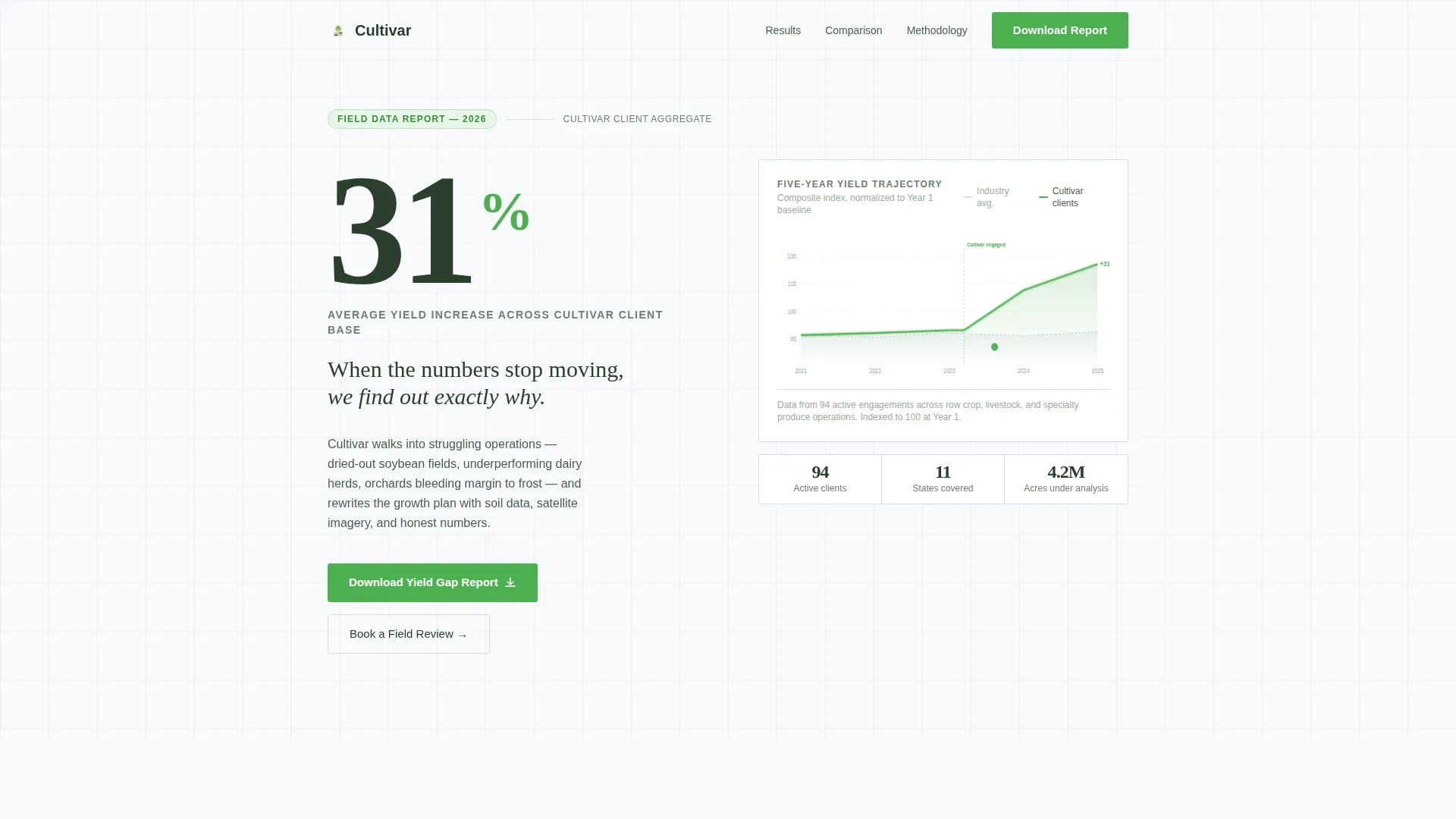
The page opens with a live counter ticking from 0 to 31%, representing the average yield increase across the consultancy's client base. It renders in oversized display type against permafrost white, stopping visitors before they scroll. A simplified five-year area chart sits below it, marking the intervention point with a subtle green pulse.
Stats-First Section Cadence
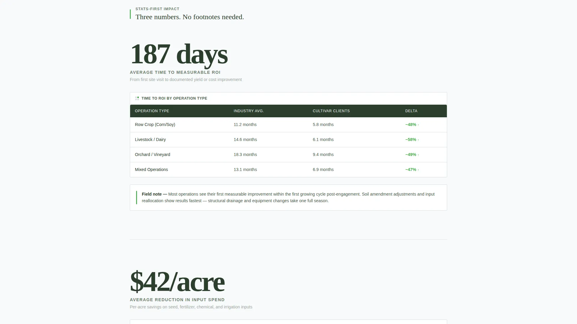
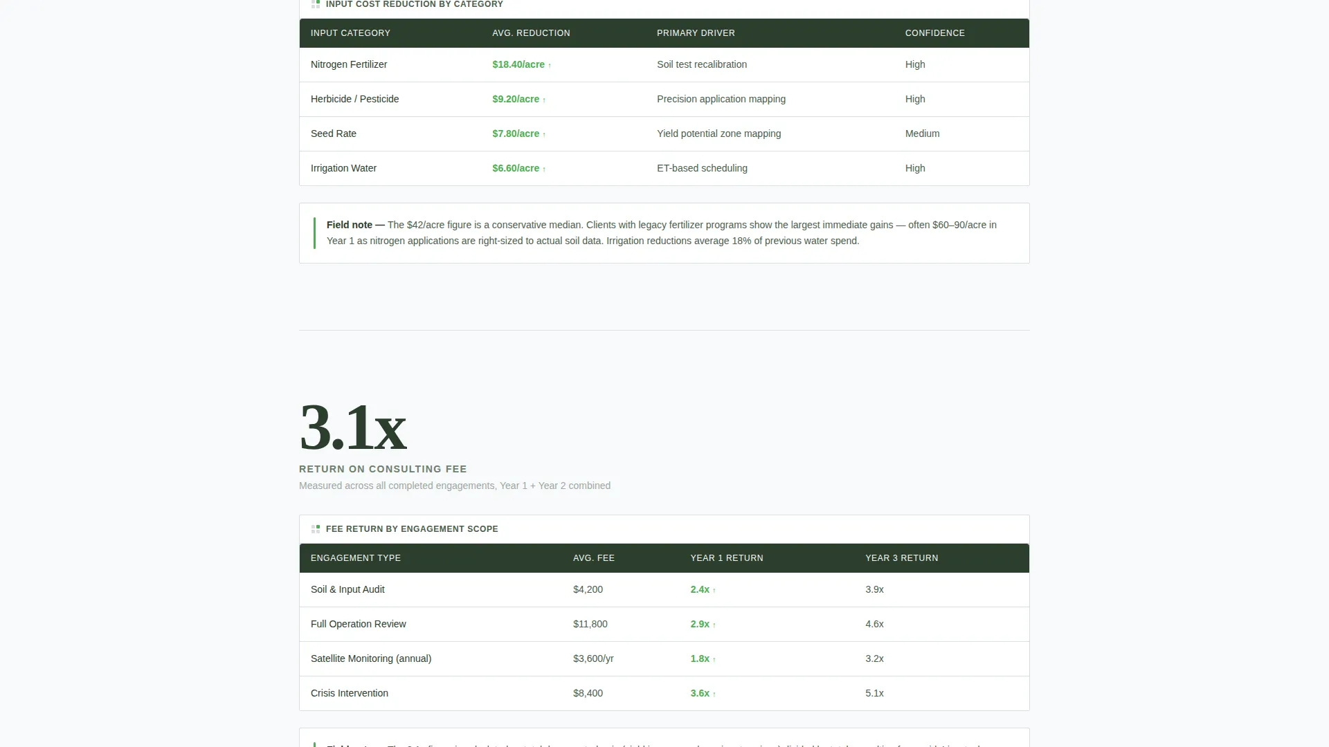
Every major section leads with a single oversized metric before any explanation appears. The sequence covers 187 days to measurable return on investment, $42 per acre in average input cost reduction, and a 3.1x return on consulting fee. This structure lets the numbers make the argument before the copy reinforces it.
Inline Comparison Tables
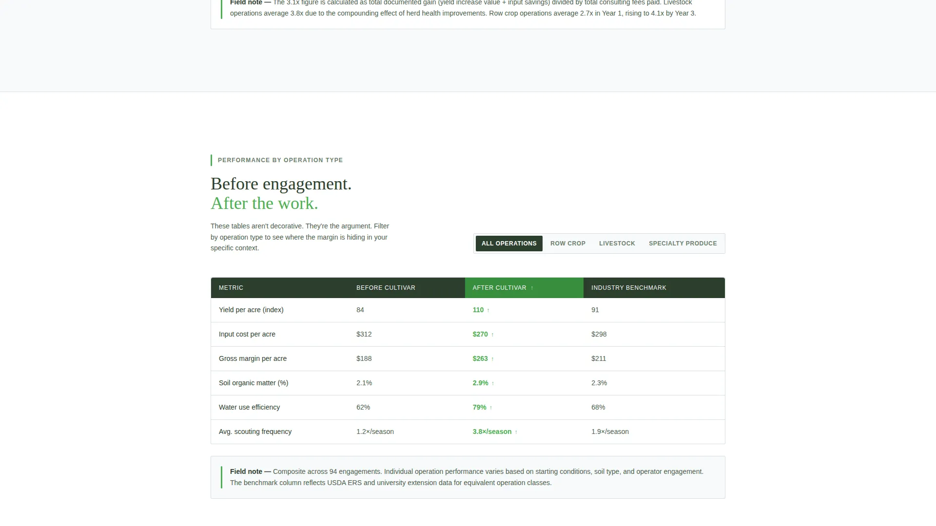
Three data tables break down performance across row crop, livestock, and specialty produce operations. Each table shows before-and-after figures alongside industry benchmarks. The tables are followed by short field-report paragraphs that contextualize the data without restating it.
Two-Path Lead Capture Form
The primary call to action prompts visitors to download the Yield Gap Report. It collects operation type via a dropdown (row crop, livestock, orchard or vineyard, mixed), total acreage, and email address. A secondary path offers a direct booking option for visitors ready to skip the reading and schedule a field review.
Educational Content Structure
The page functions as a content and resource hub, teaching the visitor something useful in every section. By the time a reader reaches the form, they have absorbed enough operational insight to recognize the consultancy's depth. This structure reduces friction at the point of conversion.
Field-Report Typography System
Body copy reads like a field notebook entry: direct, data-referencing, and jargon-fluent without being exclusionary. Deep loam text color on permafrost white creates a clinical, research-paper feel. Growth-signal green appears only on positive yield indicators, call-to-action buttons, and upward-trend arrows, keeping the palette purposeful.
Page sections overview
| Section | Purpose |
|---|---|
| Animated counter header | Opens with a 31% yield metric and five-year area chart |
| ROI metric block | Displays 187-day average time to measurable return |
| Input cost metric | Shows $42 per acre average reduction in input spend |
| Consulting fee return | Presents the 3.1x return on consulting fee metric |
| Row crop table | Compares before, after, and benchmark for row crops |
| Livestock table | Compares before, after, and benchmark for livestock |
| Specialty produce table | Compares before, after, and benchmark for orchard and vineyard operations |
| Field report copy | Short jargon-fluent paragraph follows each comparison table |
| Lead capture form | Collects operation type, acreage, and email for report download |
| Secondary call to action | Offers a direct booking path for visitors ready to act now |
Design & branding system
The visual identity follows an Educational Guide theme that feels like a research paper printed on clean stock. Every color decision is deliberate, and nothing competes with the data.
- Permafrost white (#F8FAFB) as the dominant background, frost gray (#D6DDE3) for table borders and dividers, and deep loam (#2C3E2D) for all body text and data labels
- Growth-signal green (#4CAF50) reserved exclusively for positive yield indicators, call-to-action buttons, and upward-trend arrows
- No stock photography of fields or farmers; the header uses only the animated counter and area chart, keeping visual weight on the numbers
Mobile & speed optimization
The template is built for readers who may open it on a tablet in a truck cab or a laptop in a co-op office. The layout scales cleanly across screen sizes without losing the data-first reading sequence.
- Comparison tables reflow gracefully on smaller screens so column data remains readable without horizontal scrolling
- The stats-first section cadence maintains its impact on mobile because each oversized metric occupies its own visual lane before supporting copy loads beneath it
How this template helps you convert
This template converts by teaching first and asking second. Visitors arrive skeptical and leave convinced, not because of persuasion language, but because the data is right there and it is undeniable.
- The animated counter and area chart create an immediate credibility signal in the first viewport, reducing early exit before any copy is read.
- The three comparison tables, each followed by a field-report paragraph, give visitors enough operational context to self-qualify before they reach the form, which means the people who fill it out already understand why they should.
Other information about this template
Cultivar is suited to any precision agriculture consultancy that competes on evidence rather than reputation alone. The template style is a comparison table layout, and the creative direction follows a stats-first impact sequence that keeps every scroll depth purposeful.
- The theme is Educational Guide, meaning the page is designed to inform and qualify visitors, not just to capture leads
- The landing page direction is Content and Resource hub, making it appropriate for consultancies that publish yield gap analysis, soil health benchmarks, or seasonal input cost data alongside their service offer
- The template is a strong fit for operations consulting practices working across row crops, livestock management, and orchard or vineyard production
- It can support agriculture growth consultant positioning where the competitive advantage is demonstrable, data-backed field results rather than general advisory credentials
Theme
Educational Guide
Creative direction
Stats-First Impact
Color system
Arctic White
Style
Comparison Table
Direction
Content/Resource
Page Sections
Animated Yield Counter Header
Stats-first Section Cadence
Inline Comparison Tables
Two-path Lead Capture Form
Field-report Typography System
Educational Content Hub Structure
Related questions
Can I update the metrics and table data to match my own results?
Does this template work for a consultancy focused on only one operation type?
What does the lead capture form collect from visitors?
Is this template suitable for a co-op or agri-tech organization rather than a solo consultant?
Does the page use any photography or illustrative visuals?



