Marketing & Advertising Agency Blog Website Template
Curate is an editorial-style landing page template built for social media marketing agencies that serve sophisticated B2B clients. It pairs a deep plum and warm parchment color system with a zigzag section layout, a three-step audit request form, and a gated PDF lead magnet, giving agencies a polished, conversion-focused page that shows their process before asking for the sale.
by Rocket studio
Quick summary
Curate is a single-page landing page template for social media marketing agencies ready to position themselves at the VP and CMO level. It uses an editorial magazine aesthetic, alternating plum and parchment sections, oversized serif typography, and muted gold accents, to present agency process as proof, not promise.
Who this template is for
This template is built for agencies and consultants who sell social media strategy to serious buyers. It speaks the language of mid-market and enterprise marketing decision-makers, not startup side-hustlers.
- Social media marketing agencies targeting VP-level or CMO-level clients
- Boutique brand strategy studios working with mid-market direct-to-consumer brands and franchise operators
- Series B and growth-stage founders repositioning their agency or service offering
What problem this template solves
Most agency websites bury their process behind vague promises and stock photography. Sophisticated buyers, the ones who manage real budgets, need to see how the work actually gets done before they book a call.
- Generic agency pages fail to build trust with experienced marketing buyers who have been burned before
- A cluttered or off-brand page signals that an agency cannot manage its own visual identity, let alone a client's
- Visitors leave without converting because there is no low-commitment option for buyers who need more time
What you get with this template
You get a fully structured, single-page layout that walks a visitor through the agency's entire operation in one scroll. Every section is purposeful, and every conversion touchpoint is deliberate.
- A typographic header block with credential statistics, a zigzag process section, and a two-path conversion system
- A three-step progressive audit request form that qualifies leads by platform, ad spend, and pain point
- A gated PDF lead magnet section that captures email addresses from visitors who are not yet ready to book
Feature list
This template includes a focused set of design and conversion components drawn directly from the brief.
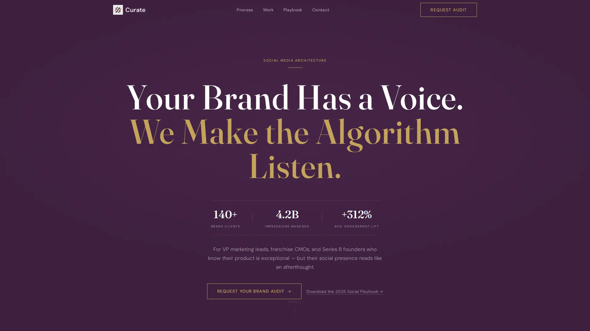
Giant Editorial Header Block
The header opens on a full-viewport plum field with a single oversized serif headline and a quiet credential bar below it. No images, no video, just typographic authority and deliberate negative space that signals confidence from the first second.
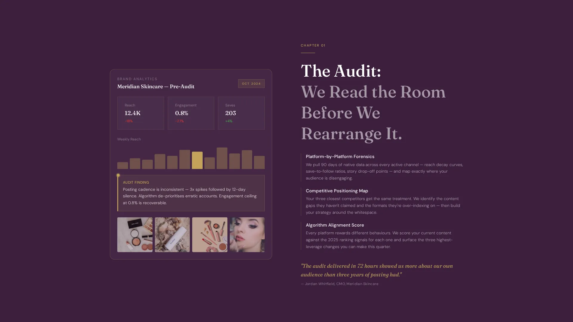
Zigzag Process Section Layout
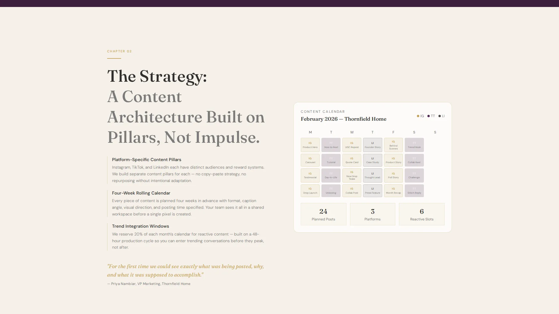
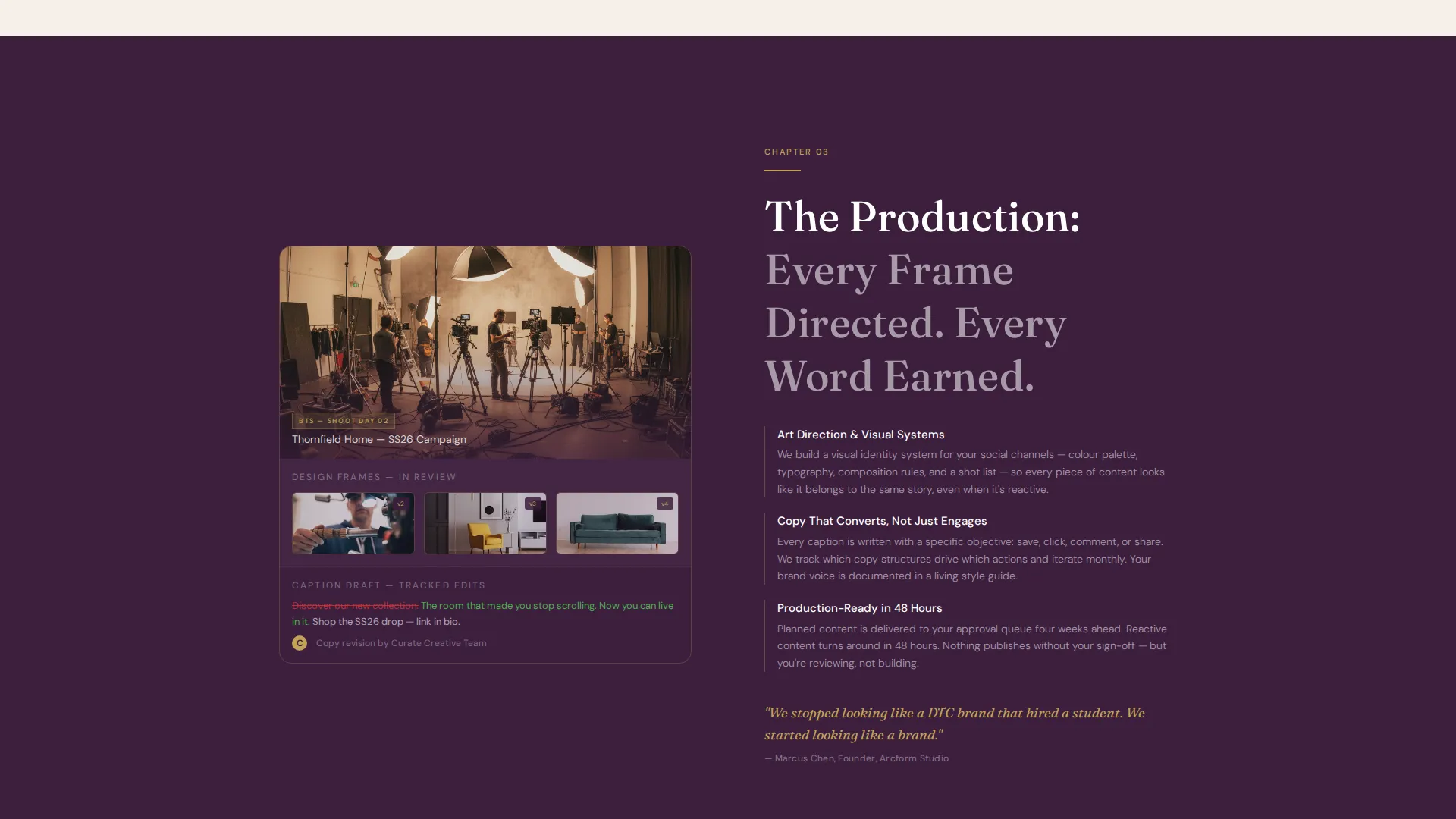
Four alternating sections reveal the agency's workflow layer by layer: brand audit, content strategy, creative production, and monthly reporting. Left-image and right-text panels swap sides between sections, with plum and parchment backgrounds alternating to maintain visual rhythm across the scroll.
Three-Step Progressive Lead Form
The primary conversion form unfolds in three steps. Step one collects company name and website. Step two uses dropdowns for primary platforms and monthly ad spend range. Step three presents an open field asking what is not working right now, qualifying intent without friction.
Gated PDF Lead Magnet
A secondary conversion path offers a downloadable resource gated behind email address and company name. This nurture path captures visitors who are interested but not yet ready for a direct conversation, expanding the top of the agency's pipeline.
Persistent Mobile Call-to-Action Bar
On mobile viewports, the primary call-to-action reappears as a fixed bottom bar. Visitors never lose access to the conversion entry point regardless of how far they scroll, keeping the page action-ready on every device.
Editorial Color and Typography System
The plum and parchment alternating palette is paired with an oversized editorial serif for headlines and a restrained sans-serif for supporting copy. Muted gold appears only on horizontal rules, hover states, and case-study card borders, used sparingly to preserve its visual weight.
Page sections overview
| Section | Purpose |
|---|---|
| Editorial Header | Establishes authority with a typographic headline and credential statistics |
| Brand Audit Section | Shows a real analytics dashboard with annotations to demonstrate audit depth |
| Strategy Document Section | Reveals a content calendar grid with platform-specific content pillars |
| Creative Production Section | Displays behind-the-scenes shoot stills, design frames, and draft copy with tracked edits |
| Performance Report Section | Presents a monthly reporting view with visible trend indicators |
| Audit Request Form | Converts ready buyers through a three-step progressive qualification form |
| PDF Lead Magnet | Captures nurture leads via a gated downloadable resource |
Design & branding system
The visual identity is built around an Editorial Magazine theme using a Plum Executive color system. Every color decision is intentional, nothing is decorative without also being functional.
- Deep plum (#3D1F3E) dominates alternating section backgrounds and carries white type; warm parchment (#F5F0E8) counter-backgrounds carry soft charcoal (#2E2E2E) body text
- Muted gold (#C4A35A) is used sparingly on horizontal rules, hover states, and case-study card borders only, never as a fill color
- An oversized editorial serif drives headline authority, while a restrained sans-serif handles subtext and credential bars
Mobile & speed optimization
The landing page is structured to remain fully functional and visually coherent on smaller screens. The layout adapts without sacrificing the editorial character that defines the desktop experience.
- The zigzag image-and-text layout reflows to a stacked single-column format on mobile viewports
- The persistent bottom bar keeps the primary call-to-action visible at all times on mobile without obstructing content
How this template helps you convert
The page is engineered around two distinct buyer types: the ready decision-maker and the curious researcher. Both paths lead toward a relationship with the agency.
- The three-step audit form qualifies high-intent buyers by asking about platforms, budget range, and current pain points, so the agency receives pre-qualified leads rather than cold inquiries
- The gated PDF lead magnet captures visitors who need more time, converting passive interest into a nurture-ready contact with just an email address and company name
Other information about this template
This template fits naturally within the Executive Suite theme and is suited for agencies that want a content-forward, resource-led positioning page. It supports a transparent process narrative rather than a portfolio-first approach.
- The template is designed for the Professional Services category under Marketing and Advertising Agency, with a clear B2B Marketing Agency niche alignment
- The creative direction follows a process-reveal structure, each section functions like a feature spread in a trade publication, not a traditional agency portfolio slide
- The color system, typography choices, and conversion architecture are all set up for a single-page landing flow, making it straightforward to customize copy, swap section images, and update credential statistics
Theme
Executive Suite
Creative direction
FAQ-Driven
Color system
Cloud Canvas
Style
Sidebar Companion
Direction
Content/Resource
Page Sections
Giant Editorial Header Block
Zigzag Process Section Layout
Three-step Progressive Lead Form
Gated PDF Lead Magnet
Persistent Mobile Call-to-action Bar
Related questions
Who is this landing page template designed for?
Can I update the credential statistics in the header?
How does the two-path conversion system work?
Is the zigzag layout easy to edit?
What is the gated PDF lead magnet section?



