Dental Marketing & Agency Pricing Website Template
Curate is a luxury dental social media agency landing page template built for boutique creative studios that position dental practices as premium brands. It pairs an Obsidian and Gold color system with a Gallery Walk scroll experience, cinematic overlapping panels, and two deliberate calls to action that guide visitors toward a services and pricing page without using a form.
by Rocket studio
Quick summary
Curate is a single-page, overlap-layered landing page template designed for dental social media agencies that operate at a luxury creative level. It uses deep obsidian black and warm antiqued gold to frame an editorial scroll experience where case study panels, process breakdowns, and content proof stack and reveal like gallery prints. Every element is built to earn a click toward services and pricing.
Who this template is for
This template is built for ambitious creative agencies and studio owners who market their social media services to dental professionals. It suits specialists who need a landing page that communicates premium positioning before a single word is read.
- Boutique dental social media agencies serving cosmetic dentists, orthodontists, and dental service organizations
- Independent brand strategists and content directors pitching high-value social retainers to practice owners
- Agency founders launching or relaunching their studio presence with a high-design, scroll-driven page
What problem this template solves
Most agency landing pages look like generic service directories. They list deliverables in bullet columns and end with a contact form. For a luxury dental social media agency, that presentation actively undermines credibility. Prospective clients who have invested in premium operatory equipment expect a digital presence that matches that standard.
- Practices in competitive markets evaluate agencies visually before they read a word of copy
- A generic template signals generic thinking, making it harder to justify a premium retainer
- Agencies need a page that accumulates proof progressively rather than front-loading a pitch
What you get with this template
This template delivers a fully designed, scroll-driven landing page built around a Gallery Walk creative direction. Overlapping content panels reveal case study evidence, process depth, and conversion proof in a deliberate sequence. The layout is designed to earn trust through accumulated visual weight, not a form submission.
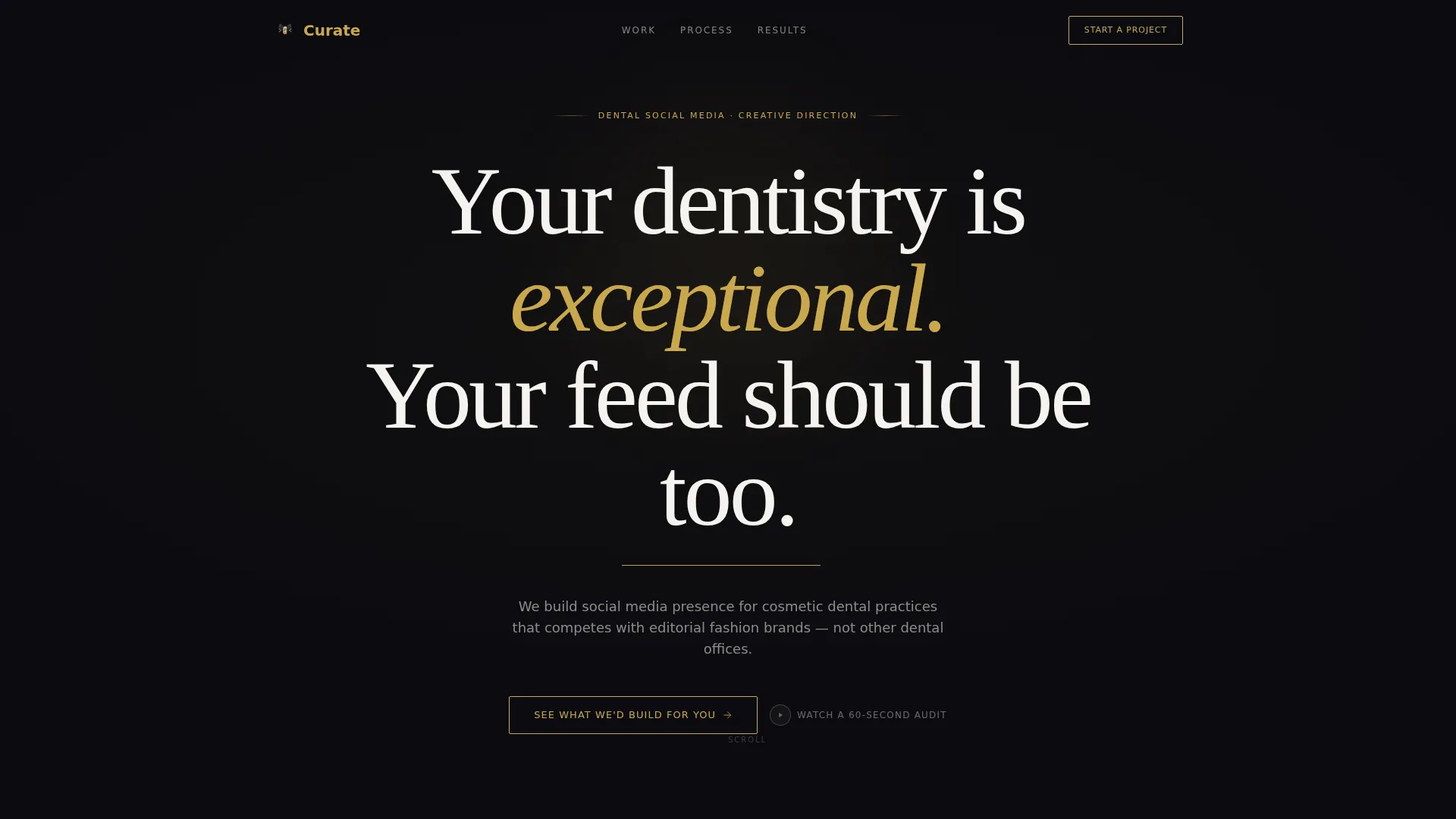
- A viewport-filling editorial serif headline in gold on obsidian with parallax depth on a single word
- Layered, staggered content panels that slide, stack, and reveal like framed prints during scroll
- Two contextually placed calls to action that shift from ghost button to solid gold bar as proof accumulates
Feature list
This template is purpose-built around a small set of high-impact design and layout decisions. Each feature serves the central goal: making a luxury dental social media agency feel unmistakably credible before a visitor reaches the bottom of the page.
Giant Headline Centered with Parallax Depth
The header fills the viewport with a single editorial serif headline set in warm antiqued gold on deep obsidian black. The word "exceptional" floats slightly forward through parallax layering, as if printed on acetate hovering above the screen. A thin gold line pulses beneath like a waiting cursor. No image competes with the typography.
Gallery Walk Scroll Experience
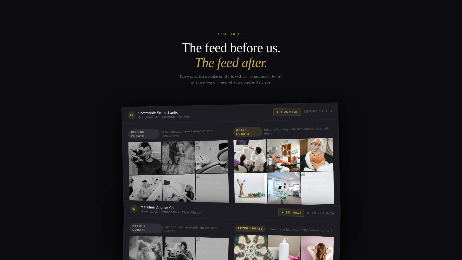
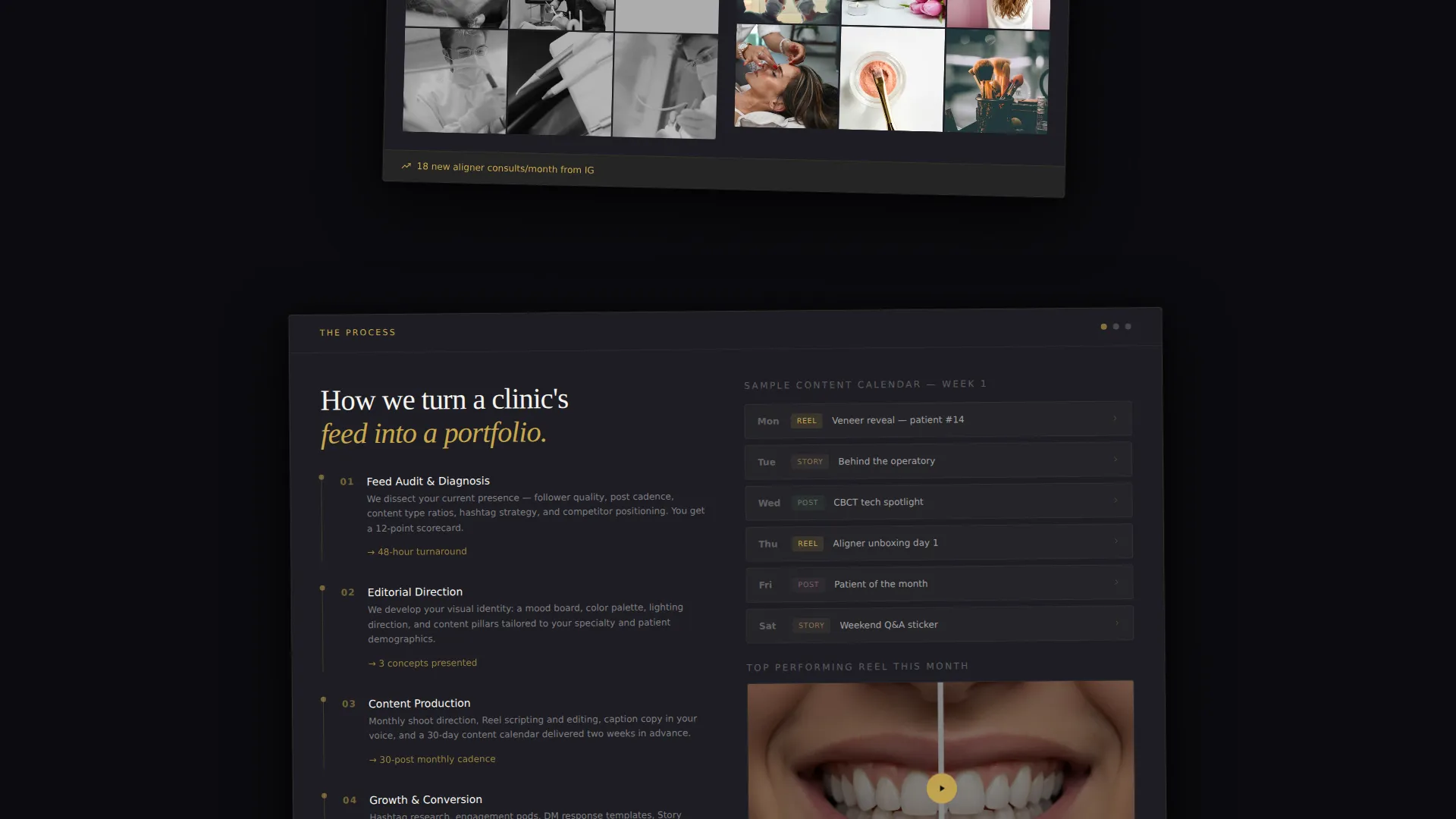
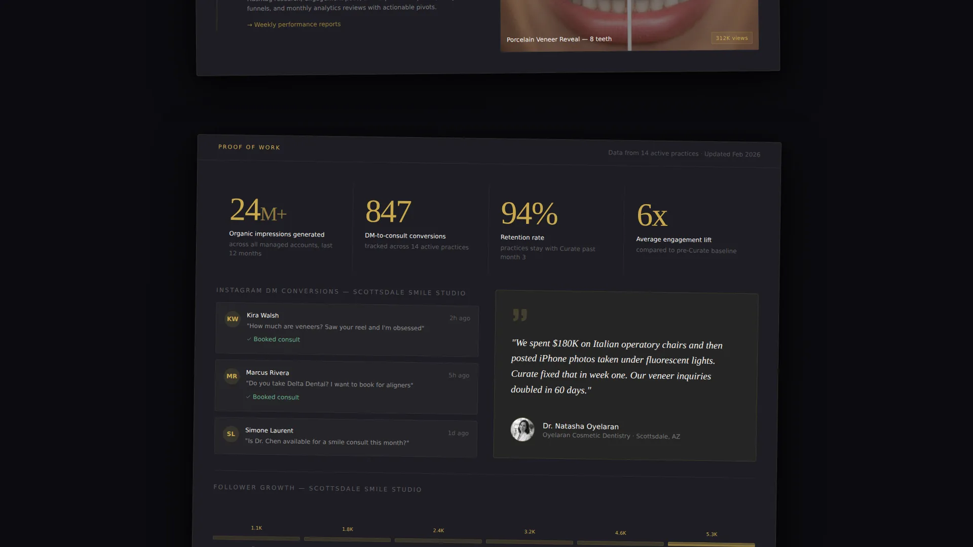
Scrolling moves the visitor through overlapping content panels that slide, stack, and reveal at deliberate pace. Each depth layer peels back another proof point: Instagram grid transformations, strategy breakdowns, content calendars, Reel thumbnails with view counts, and direct message conversion screenshots. Motion is slow and parallax-driven. Nothing jumps.
Staggered Case Study Panels
Practice transformation case studies appear as layered cards that arrive at angles, evoking prints drying in a darkroom. The first card overlaps the header. Each subsequent panel exposes more process depth beneath. The sequencing builds accumulated authority rather than presenting claims all at once.
Two-State Call to Action System
The primary call to action, "See What We'd Build for You," launches as a gold-outlined ghost button beneath the header. After the third case study panel, it resurfaces as a solid gold bar reading "Explore Our Process and Pricing." The shift in weight mirrors the shift in visitor confidence.
Secondary Low-Commitment Path
A secondary call to action, "Watch a 60-Second Audit," links to a sample teardown video of a real dental practice feed. This path lowers entry friction and builds agency authority for visitors not yet ready to click toward pricing.
Atelier Studio Color and Typography System
The palette uses deep obsidian black as the dominant canvas, warm antiqued gold for accent typography and hover states, soft studio gray for layered card surfaces, and crisp porcelain white for body text. The combination evokes a luxury jewelry case lined in black velvet, with each element placed with deliberate restraint.
Page sections overview
| Section | Purpose |
|---|---|
| Hero Headline | Fills viewport with editorial serif headline and parallax depth |
| Ghost Button call to action | Introduces the primary click path beneath the header |
| First Case Study | Overlaps header with Instagram grid transformation card |
| Strategy Breakdown | Exposes agency process beneath the first case study panel |
| Content Proof Layer | Reveals calendars, Reel thumbnails, and view counts |
| Direct Message Proof | Shows conversion screenshots staggered at darkroom angles |
| Solid Gold call to action Bar | Resurfaces primary call to action after third case study panel |
| Secondary Audit Path | Offers low-commitment video audit link for hesitant visitors |
Design & branding system
The visual identity follows an Atelier Studio theme built entirely around restraint and contrast. Darkness is used deliberately so that gold elements carry maximum visual weight. Every design decision reinforces the sense of stepping into a creative director's private studio after hours.
- Color system: deep obsidian black (#0B0B0F) as canvas, warm antiqued gold (#C9A84C) for accents and hover states, soft studio gray (#1E1E24) for card surfaces, crisp porcelain white (#F5F3EF) for body text
- Typography: editorial serif at viewport-filling scale for the headline, with gold accent treatment and parallax separation on a single focal word
- Motion language: slow, parallax-driven panel arrivals with no abrupt jumps, evoking a curated gallery walk rather than a standard scroll
Mobile & speed optimization
The template is designed with a layout system that supports the overlapping panel structure across screen sizes. The deliberate, minimal asset approach keeps the visual system coherent without relying on heavy media files.
- Overlapping panel animations are built for deliberate, measured motion that translates cleanly to smaller viewports
- The typography-first header eliminates the need for a hero image, reducing visual load on initial render
- Card surfaces and staggered layouts are structured to reflow gracefully without breaking the layered depth effect
How this template helps you convert
This landing page is built as a Click-Through page, meaning its sole job is to move a qualified visitor to a services and pricing page. It earns that click through accumulated proof rather than an upfront pitch or a form.
- The Gallery Walk scroll structure presents case study evidence, process transparency, and social proof in a deliberate sequence, so each visitor arrives at the call to action already convinced rather than still evaluating.
- The two-state call to action system meets visitors at two different confidence levels: a low-pressure ghost button early and a solid gold bar after proof accumulates, giving both quick-movers and careful evaluators a natural moment to act.
Other information about this template
This template is part of a broader Atelier Studio theme family designed for service businesses that compete on positioning and creative perception. A few additional details worth noting before you use it.
- The page includes no contact form by design; the click-through architecture is intentional and reflects the brief's philosophy that the click must be earned through proof
- The "Watch a 60-Second Audit" secondary path is pre-wired as a link element pointing to a sample video, making it straightforward to swap in your own audit footage
- The Obsidian and Gold color system is fully documented with hex values, making brand color replacement systematic for agencies with an existing palette
- This template is well suited for dental social media agencies, dental marketing consultants, and boutique brand studios that serve cosmetic dentists, orthodontists, and multi-location dental service organizations rolling out new locations
Theme
Atelier Studio
Creative direction
Gallery Walk
Color system
Obsidian & Gold
Style
Overlap/Layered
Direction
Click-Through
Page Sections
Giant Headline with Parallax Depth
Gallery Walk Scroll Experience
Staggered Case Study Panels
Two-state Call to Action System
Secondary Low-commitment Path
Atelier Studio Visual System
Related questions
Does this landing page include a contact form?
Can I swap in my own case study content and Reel thumbnails?
Who is the ideal agency using this template?
How does the two-state call to action work?
Can I use this template if my agency is not focused exclusively on dentistry?



