Specialist Chef Profile Professional Website Template
Curate is a single-page landing page template built for a boutique chef personal-branding service. It combines a dramatic before/after slider header, layered case study spotlights, and a focused B2B conversion flow. The design uses a deep Electric Indigo palette with seared gold accents to deliver a theatrical, high-trust presentation that turns culinary credentials into compelling business opportunities.
by Rocket studio
Quick summary
Curate is a landing page template designed for a chef personal-branding service that helps culinary professionals build compelling presences that attract sponsors, publishers, and media. It opens with a split before/after slider, flows through layered transformation case studies, and closes with a B2B conversion form targeting hospitality groups and culinary organizations.
Who this template is for
This template is built for boutique personal-branding agencies and service providers working with culinary professionals. It speaks directly to the organizations those professionals belong to and the individuals who want to upgrade their visibility.
- Culinary schools, hospitality groups, and restaurant PR agencies wanting to uplift full rosters of chefs
- Chef management companies seeking a credible, conversion-ready page to present their optimization service
- Individual chefs and culinary operators exploring a solo intake path through the secondary call to action
What problem this template solves
Many talented culinary professionals have strong platforms in the kitchen but weak visibility where brand deals, consulting gigs, and media bookings actually happen. A generic service page does nothing to prove the gap exists or that the solution works.
- Chefs with sparse profiles miss sponsorship deals, cookbook publisher interest, and consulting inquiries they never see coming
- Organizations managing chef rosters have no clear way to present a professional optimization offer as something proven and scalable
- A standard portfolio or brochure page fails to show the before/after contrast that makes the value of the service immediately obvious
What you get with this template
This template delivers a fully structured, single-page layout designed around visual proof and progressive persuasion. Every section is built to move a visitor from skepticism to commitment.
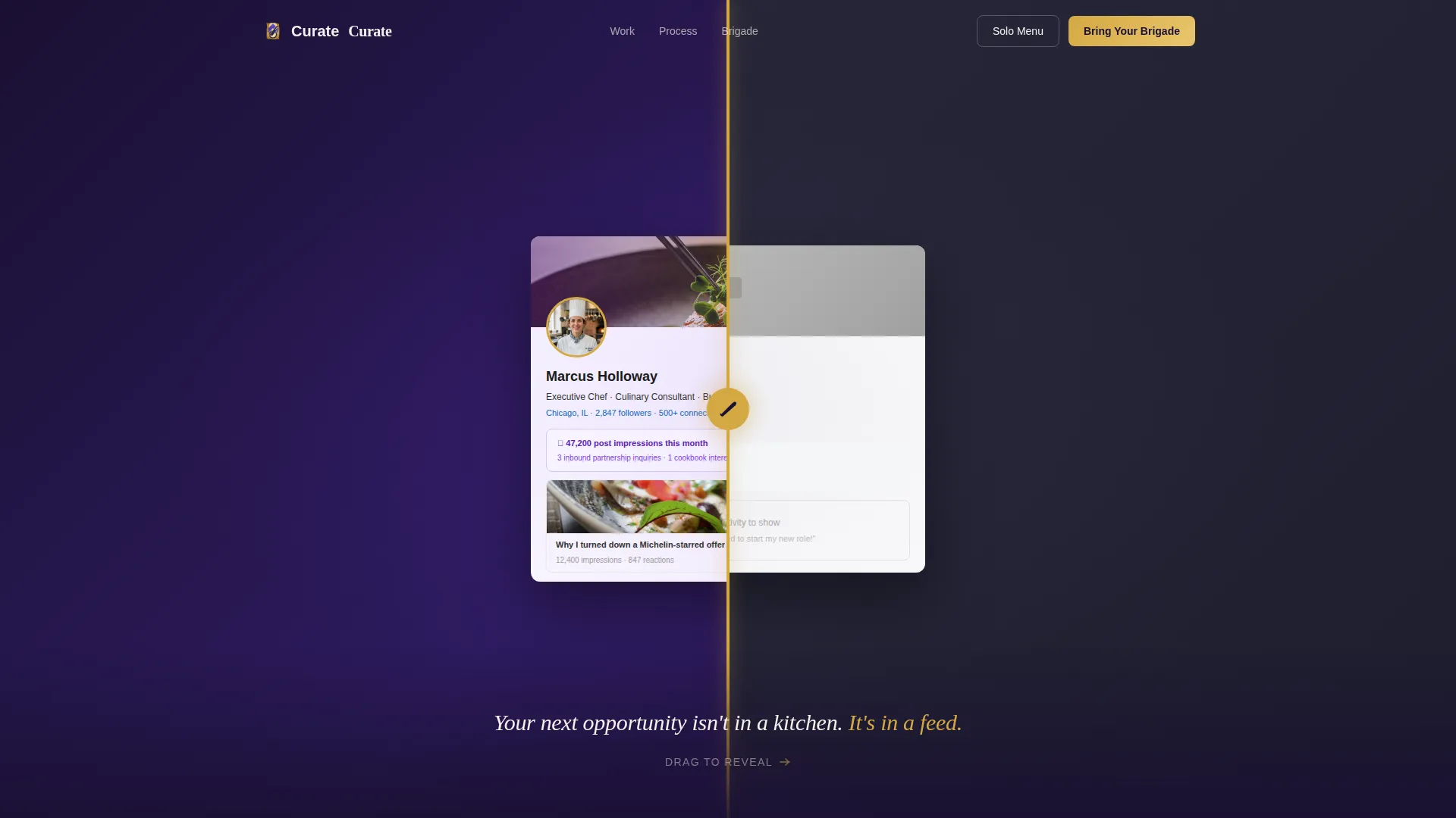
- A viewport-filling before/after slider header that shows a real-looking profile transformation without a single word of explanation
- A tasting-menu-style scroll flow with layered case study cards, floating metric tiles, and parchment-strip interstitial quotes
- A dual-path conversion section featuring a B2B qualification form and a secondary solo intake route for individual chefs
Feature list
The template is built around a small set of high-impact components. Each one earns its place in the conversion flow.
Before/After Slider Header
The header splits the full viewport into two states. The left side presents a recognizable "before" LinkedIn profile with a default banner, a cropped headshot, and a sparse headline. The right side reveals the transformation: a cinematic portrait, a rich banner, and a detailed professional headline. A seared gold chef's knife icon serves as the slider handle.
Layered Case Study Cards
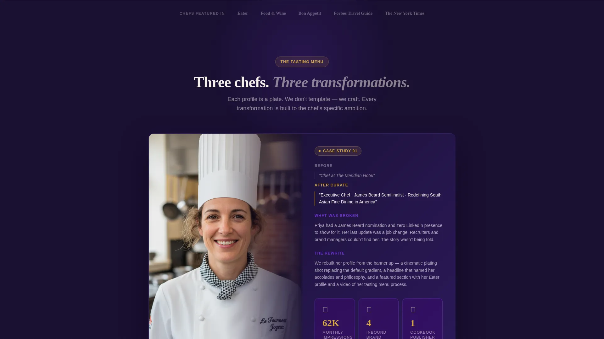
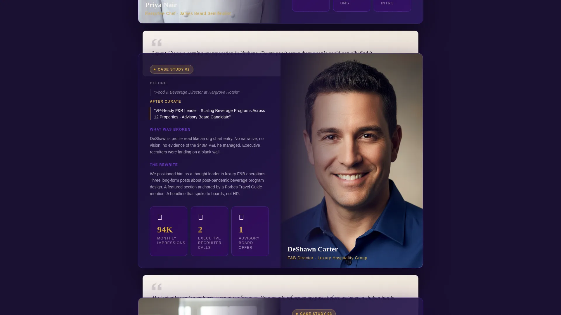
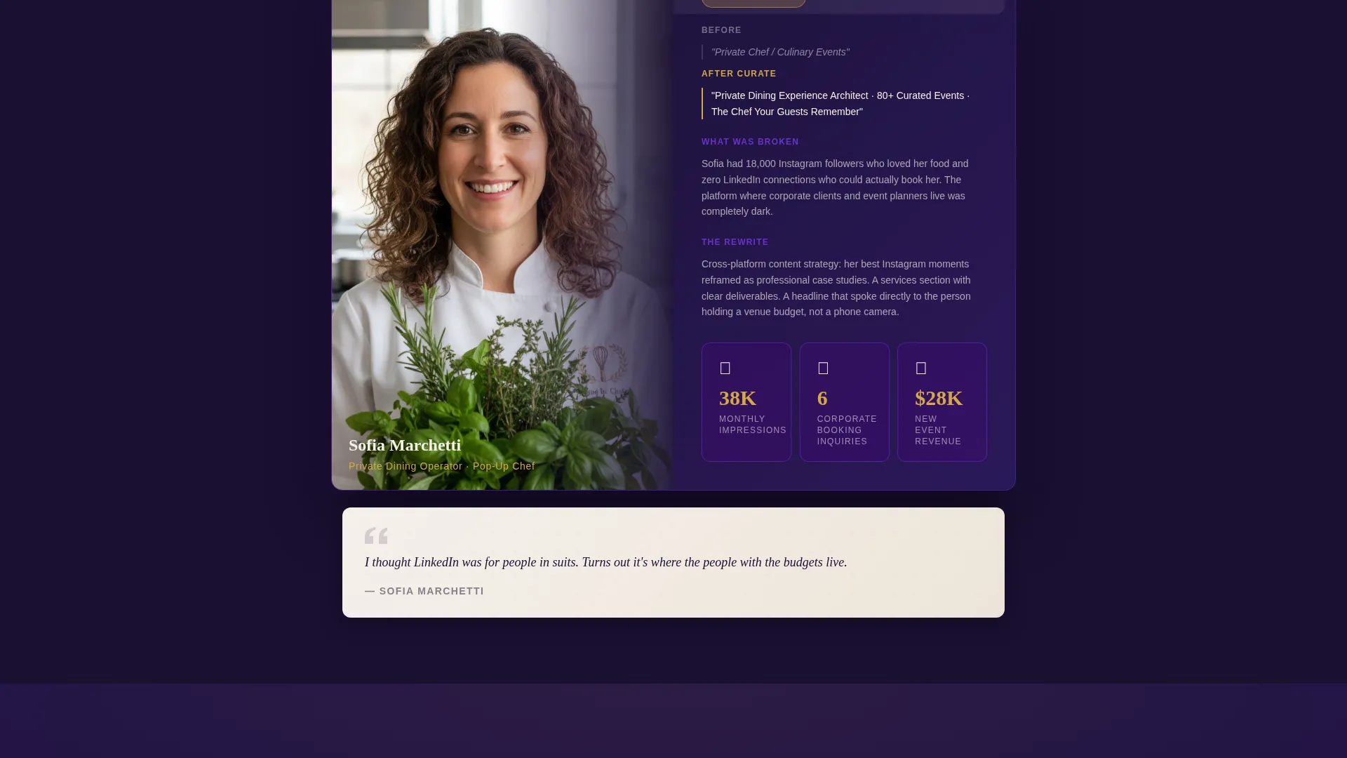
Each chef transformation is presented as a stacked card that overlaps the edge of the previous section. Cards are structured in three parts: the strategy (what was broken), the rewrite (headline, about section, and featured content), and the results. This rhythm mirrors a tasting menu and keeps the scroll purposeful.
Floating Metric Tiles
Results from each chef transformation appear as floating tile elements. Impressions, inbound messages, and partnership offers are displayed in a visual format that gives weight to the proof without dense text blocks.
Parchment-Strip Quote Interludes
Between each case study spotlight, a short chef quote appears on a parchment-colored strip. These interstitial moments slow the pace, add authenticity, and reinforce trust before the next transformation story begins.
B2B Qualification Form
The primary conversion element is a short form that asks for organization name, number of chefs to optimize, current profile status, and a free-text field for placement goals. It appears after the third spotlight, once proof has been established. A secondary link labeled "See the Solo Menu" routes individual visitors to a simpler intake path.
Overlapping Chef Portrait Mosaic
The final section before the conversion area stacks all featured chef portraits into a layered mosaic. It signals volume and range at a glance, reinforcing that this service works across different culinary roles and experience levels.
Page sections overview
| Section | Purpose |
|---|---|
| Before/After Slider | Opens with visual proof of profile transformation |
| Fade-In Tagline | Delivers the core value proposition in one line |
| Case Study Spotlight 1 | Shows first chef transformation and strategy |
| Interstitial Chef Quote | Adds authenticity between spotlights |
| Case Study Spotlight 2 | Deepens proof with rewrite and results |
| Interstitial Chef Quote | Reinforces trust before the final spotlight |
| Case Study Spotlight 3 | Peaks with the most dramatic transformation |
| Portrait Mosaic Grid | Proves range and volume visually |
| B2B Conversion Form | Captures qualified organizational leads |
| Solo Intake Path | Offers individual chefs a secondary entry point |
Design & branding system
The visual identity is built around an Atelier Studio theme using an Electric Indigo color system. The palette is theatrical and precise, evoking the atmosphere of a professional kitchen after service: shadowed, intentional, and warm only where it counts.
- Core colors include deep kitchen-slate (#1A1032), luminous indigo (#4B0082), bright violet spark (#7C3AED) for hover and interactive states, and clean parchment (#F5F0EB) for text surfaces
- Seared gold (#D4A843) is used selectively for call-to-action elements and testimonial borders, drawing the eye without overwhelming the dark base palette
- The Overlap/Layered template style creates physical depth: cards float above dark fields, profile screenshots tilt at slight angles with drop shadows, and sections slide beneath one another as you scroll
Mobile & speed optimization
The layered visual structure is designed to translate well across screen sizes while preserving the depth and drama of the desktop experience.
- The before/after slider is built for touch interaction, allowing mobile visitors to drag the chef's knife handle across the viewport just as easily as desktop users
- Floating metric tiles and overlapping card elements are structured to reflow cleanly on smaller screens without losing their stacked visual hierarchy
- The qualification form is kept deliberately short with dropdown fields and free-text input, reducing friction for mobile visitors completing the B2B or solo intake path
How this template helps you convert
This template earns its conversions by showing proof before making any ask. Every layout decision is sequenced to build trust incrementally.
- The before/after slider creates an immediate, wordless argument for the service. Visitors understand the gap before reading a single headline, which lowers resistance to everything that follows.
- The tasting-menu scroll structure keeps visitors moving through three full transformation stories, each more dramatic than the last. By the time the "Bring Us Your Brigade" call to action appears, the case has already been made.
- The dual conversion path acknowledges two distinct visitor types: organizations managing multiple chefs and individual culinary professionals. Routing each to the right form reduces drop-off and improves lead quality.
Other information about this template
This template is part of the Personal and Resume category, specifically built for the Chef Profile subcategory within the chef LinkedIn optimization niche. It is a strong fit for services positioning themselves against generic personal branding tools by leading with culinary-industry specificity.
- The template is designed as a single-page layout with a section-led scroll flow, making it straightforward to deploy without a complex multi-page build
- The "Bring Us Your Brigade" primary call to action and "See the Solo Menu" secondary path are both included as labeled components within the conversion section
- The Atelier Studio theme and Electric Indigo color system are matched intersection context signals, meaning this design language is purpose-built for this niche and creative direction
- The template style is classified as Overlap/Layered, the creative direction as Creator Spotlight, and the header concept as Before/After Slider, all of which are reflected in the layout components described above
Theme
Atelier Studio
Creative direction
Creator Spotlight
Color system
Electric Indigo
Style
Overlap/Layered
Direction
Partnership/B2B
Page Sections
Before/after Slider Header
Layered Case Study Cards
Floating Metric Tiles
Parchment-strip Quote Interludes
Dual-path Conversion Section
Overlapping Portrait Mosaic
Related questions
Who is the primary audience this landing page is built to convert?
Can this template work for a solo chef branding service, not just B2B clients?
What does the qualification form collect?
How many chef transformation case studies are included in the layout?
Does the template include placeholder content to guide customization?



