Dental Marketing & Agency Professional Website Template
Curate is a dark, immersive landing page template built for dental content marketing agencies. It pairs a manifesto-style scroll flow with a masonry grid layout, iridescent color accents, and two targeted calls to action. The result is a single-page experience that positions your agency as the definitive answer to mediocre dental marketing.
by Rocket studio
Quick summary
Curate is a single landing page template designed for dental content marketing agencies. It opens with a cinematic full-bleed photo header and unfolds into a manifesto-driven masonry grid. The dark immersive design uses iridescent accents to spotlight case study work, while a lead-capture form and a floating secondary call to action guide practice owners toward conversion.
Who this template is for
This template is built for agencies and creative studios that help dental practices grow their digital presence through content. It speaks directly to operators who serve ambitious, results-focused clients in the dental space.
- Dental content agencies pitching ambitious practice owners, periodontists, and dental service organization marketing directors
- Solo creative strategists positioning themselves as specialist dental content partners
- Agency founders who need a polished, high-conviction landing page that does the selling for them
What problem this template solves
Most dental marketing agency pages look identical: stock smiles, blue gradients, and bullet points about social media packages. They fail to create urgency or emotional conviction. Curate solves the credibility gap between an agency's real output and its online presence.
- Practice owners scroll past generic agency pages because nothing feels specific to their world
- Agencies lose potential clients who never see proof of real results before being asked to commit
- There is no clear path from skepticism to conversion without a structured, escalating argument
What you get with this template
You get a fully designed, single-page layout ready to be customized with your agency's real work, metrics, and brand copy. Every section has a defined role in moving the visitor from curiosity to a signed audit request.
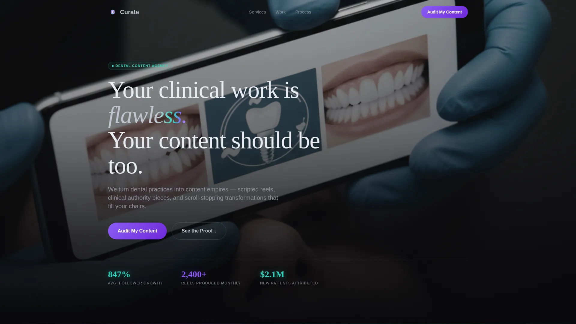
- A full-bleed cinematic photo header with a chrome-type manifesto line overlay
- A masonry case study grid with iridescent teal metric highlights and a floating "See the Proof" call to action
- A dark-mode lead capture form collecting practice name, Instagram handle, monthly new-patient goal, and content frequency
Feature list
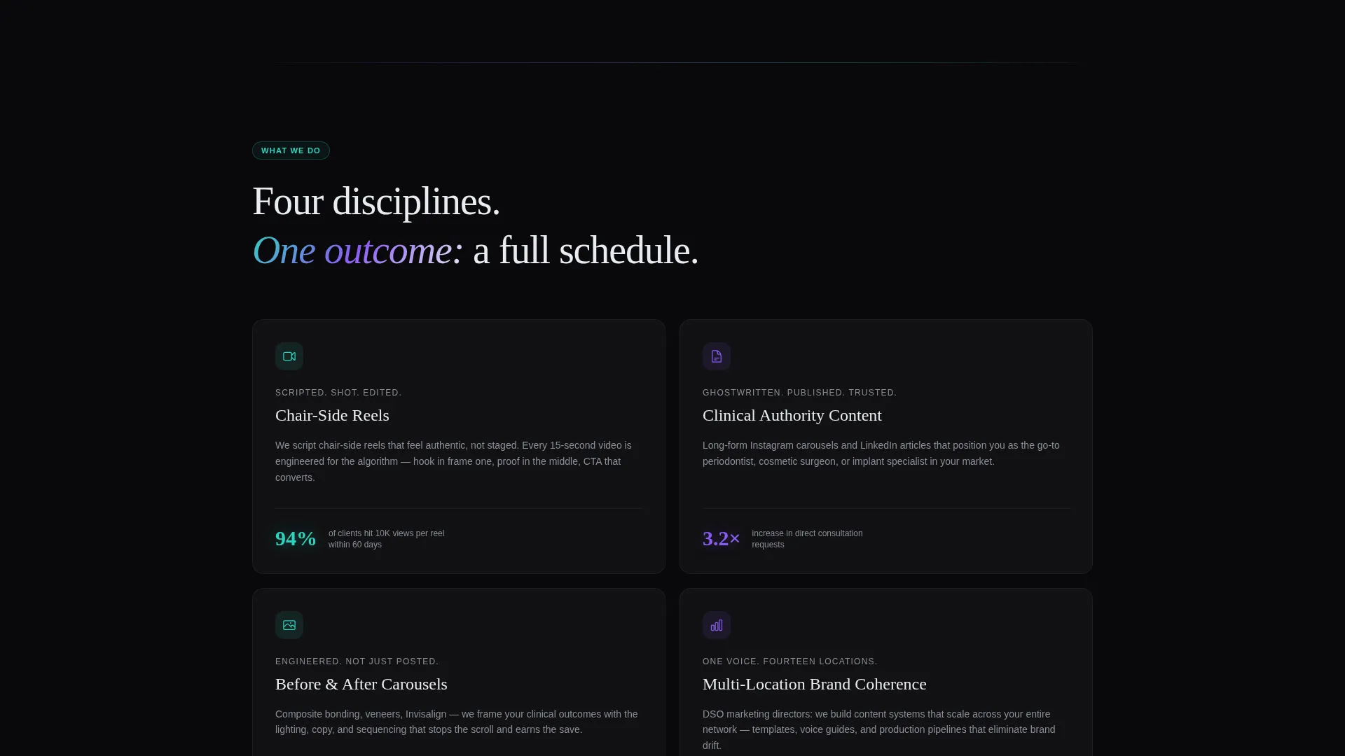
This template ships with the following design and layout capabilities, each grounded directly in the source brief.
Full-Bleed Cinematic Header
The header uses a desaturated, high-contrast photo concept: gloved hands holding a phone over a patient's smile, with the phone screen blazing against a darkened clinical background. A single manifesto line fades in over the image in chrome type. The contrast between raw clinical reality and polished digital output is the opening argument.
Manifesto Scroll Flow
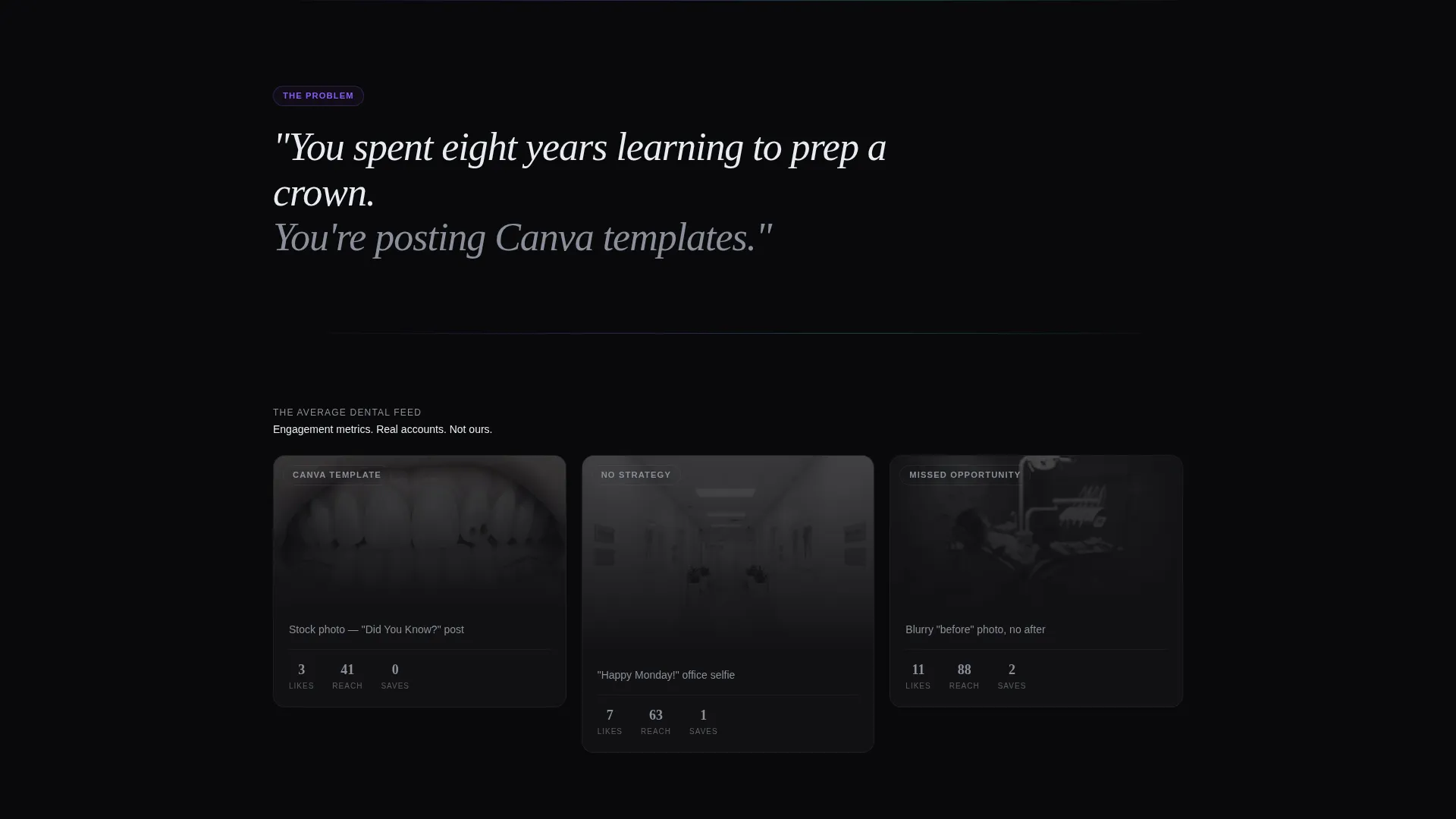
The page reads like a structured declaration rather than a standard agency brochure. Oversized italic provocation lines appear between sections, each one escalating the argument against mediocre dental marketing. The copy builds emotional pressure progressively, moving from diagnosis to proof to invitation.
Masonry Case Study Grid
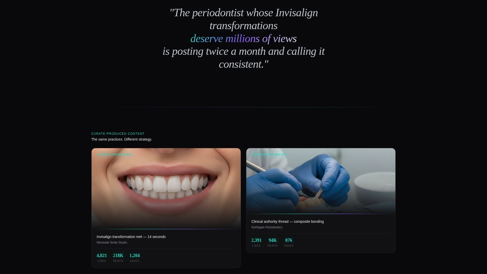
The masonry layout presents real client work in a Pinterest-style tile arrangement. Each card floats on the abyssal black background, catching iridescent edge light. The grid separates a "before" section of generic dental ads with near-zero engagement metrics from an "after" section of the agency's own work with glowing teal metric callouts.
Lead Capture Audit Form
The primary call to action anchors to a sleek dark-mode form. It requests four inputs: practice name, Instagram handle, monthly new-patient goal, and a dropdown for current content frequency. The audit promise is specific and tangible: submit your handle and receive a personalized teardown of your worst-performing post.
Floating Secondary Call to Action
A secondary button labeled "See the Proof" floats persistently and smooth-scrolls visitors to the case study grid. It gives skeptical visitors a low-commitment path to build conviction before they reach the audit form. This two-path structure accommodates both ready buyers and cautious browsers.
AI Iridescent Color System
Hover states and active elements shift from abyssal black into holographic violet and iridescent teal. The shimmer effect is deliberate: it reads like a dental curing light sweeping across polished composite in a darkened room. Chrome typography on black reinforces the precision-instrument aesthetic throughout.
Page sections overview
| Section | Purpose |
|---|---|
| Full-bleed header | Opens with cinematic photo and chrome manifesto line |
| Manifesto intro block | States the agency's core argument in oversized italic type |
| Generic ads grid | Shows before-state: stock dental content with near-zero metrics |
| Agency work grid | Shows after-state: real client reels and carousels with teal metric callouts |
| Manifesto interlude | Escalates the argument with a second provocation line between grids |
| Case study masonry | Presents detailed client proof in floating masonry card tiles |
| Audit lead form | Captures practice details and content frequency via dark-mode form |
| Floating scroll call to action | Persists on scroll and links directly to the case study section |
Design & branding system
The visual identity is built around a dark immersive theme that makes the agency's work the only thing that glows. The palette is deliberate and clinical in its precision.
- Core colors: abyssal black (#09090B) as the base, liquid chrome (#C0C5CE) for typography, holographic violet (#8B5CF6) for accent elements, and iridescent teal (#2DD4BF) for hover states and metric highlights
- Masonry cards use iridescent edge lighting so each tile appears to float independently on the void background
- Chrome type on black creates an instrument-engraving aesthetic, reinforcing the precision and authority positioning
Mobile & speed optimization
The layout is designed to translate the masonry card system into a readable, touch-friendly format on smaller screens without losing the dark immersive visual weight.
- Masonry tiles reflow gracefully so the iridescent card aesthetic holds on mobile viewports
- The floating "See the Proof" call to action remains accessible on mobile, keeping both conversion paths available
- The dark-mode form is sized for comfortable touch input, reducing friction for visitors submitting from a phone
How this template helps you convert
Every structural decision in this template is oriented toward one outcome: turning a skeptical practice owner into a booked audit request.
- The manifesto scroll builds emotional investment before asking for anything. By the time a visitor reaches the form, they have already been shown their own problem, seen proof it is solvable, and read a specific promise tied to the submission.
- The two-path call-to-action system reduces drop-off. Visitors who are not ready to commit can click "See the Proof" and deepen conviction through the case study grid, then return to the form with higher intent.
- The audit promise is a concrete, low-risk offer. Submitting an Instagram handle in exchange for a personalized post teardown feels like receiving value, not completing a sales form.
Other information about this template
This template is categorized under Portfolio and Agency, with a subcategory focus on dental marketing and agency work. It is a strong fit for any creative professional building a niche content practice in the dental vertical.
- Template style: Masonry and Pinterest-style grid layout
- Theme: Dark Immersive with an AI Iridescent color system
- Creative direction: Manifesto, with a progressive escalation structure built into the scroll
- Header concept: Full-bleed photo with cinematic staging and overlay typography
- Primary call to action: "Audit My Content" anchored to the lead capture form
- Secondary call to action: "See the Proof" with smooth-scroll behavior to the case study section
- Niche intersection: Dental Content Marketing Agency within the broader Portfolio and Agency category
Theme
Dark Immersive
Creative direction
Manifesto
Color system
AI Iridescent
Style
Masonry/Pinterest
Direction
Lead Generation
Page Sections
Full-bleed Cinematic Header
Manifesto-driven Scroll Flow
Masonry Case Study Grid
Dark-mode Lead Capture Form
Floating Secondary Call to Action
AI Iridescent Hover System
Related questions
Can I replace the header photo with my own image?
Do I need to write my own manifesto copy?
Is this template suitable for a solo dental content strategist?
What does the audit form actually collect?
Is this template designed for agencies or for dental practices themselves?



