Closet Consulting Comparison Table Landing Page
Curate is a single-page comparison table landing page built for closet and organization consultants. It opens with an oversized testimonial card, anchors trust with a three-column data comparison, and moves visitors toward a service and pricing page through two strategically placed calls to action. The design uses deep charcoal, brushed graphite, and warm amber for a polished, corporate-precision feel.
by Rocket studio
Quick summary
Curate is a comparison-focused landing page for a closet and organization consultancy. It leads with a single client testimonial, builds credibility through hard metrics, and drives clicks to a detailed service page. The Charcoal and Amber palette and Corporate Precision theme give the page a tailored, authoritative presence that matches a high-end consulting offer.
Who this template is for
This template is designed for organization consultants who need to justify their premium fees with data before a prospect ever picks up the phone. It speaks directly to clients who have already tried the cheaper alternatives and are ready for a real solution.
- Closet and organization consultants offering custom, measured space design
- Specialty service firms that sell on ROI and need a comparison-led page to prove it
- Renovation-adjacent professionals targeting dual-income homeowners and real estate staging clients
What problem this template solves
Most service pages describe what a consultant does. This template shows why custom consulting wins. Visitors arrive with price objections already in mind, having spent money on big-box installs or organizer bins that changed nothing. The page meets that skepticism head-on with numbers.
- It replaces vague service descriptions with a direct three-column comparison across real metrics
- It eliminates the need for a contact form by routing trust-ready visitors to a service and pricing page instead
- It captures warmer, earlier-stage leads through a secondary downloadable guide link
What you get with this template
The template delivers a complete single-page layout structured around proof, not promotion. Every section is sequenced to move a visitor from skepticism to curiosity to a confident click.
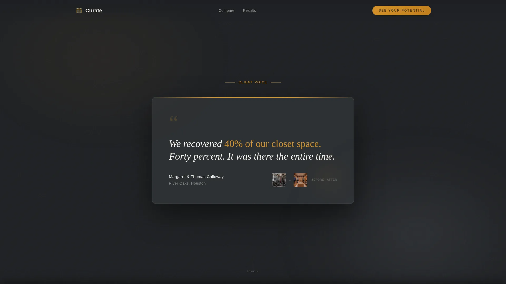
- An editorial testimonial card header with a client quote, name, neighborhood, and before-and-after thumbnail
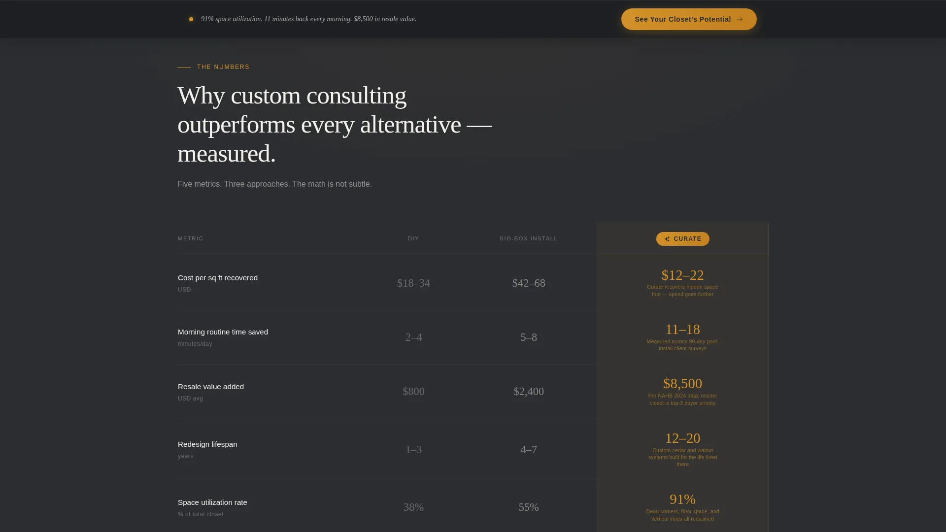
- A three-column comparison table contrasting DIY, big-box installs, and custom consulting across cost, time, resale value, and lifespan metrics
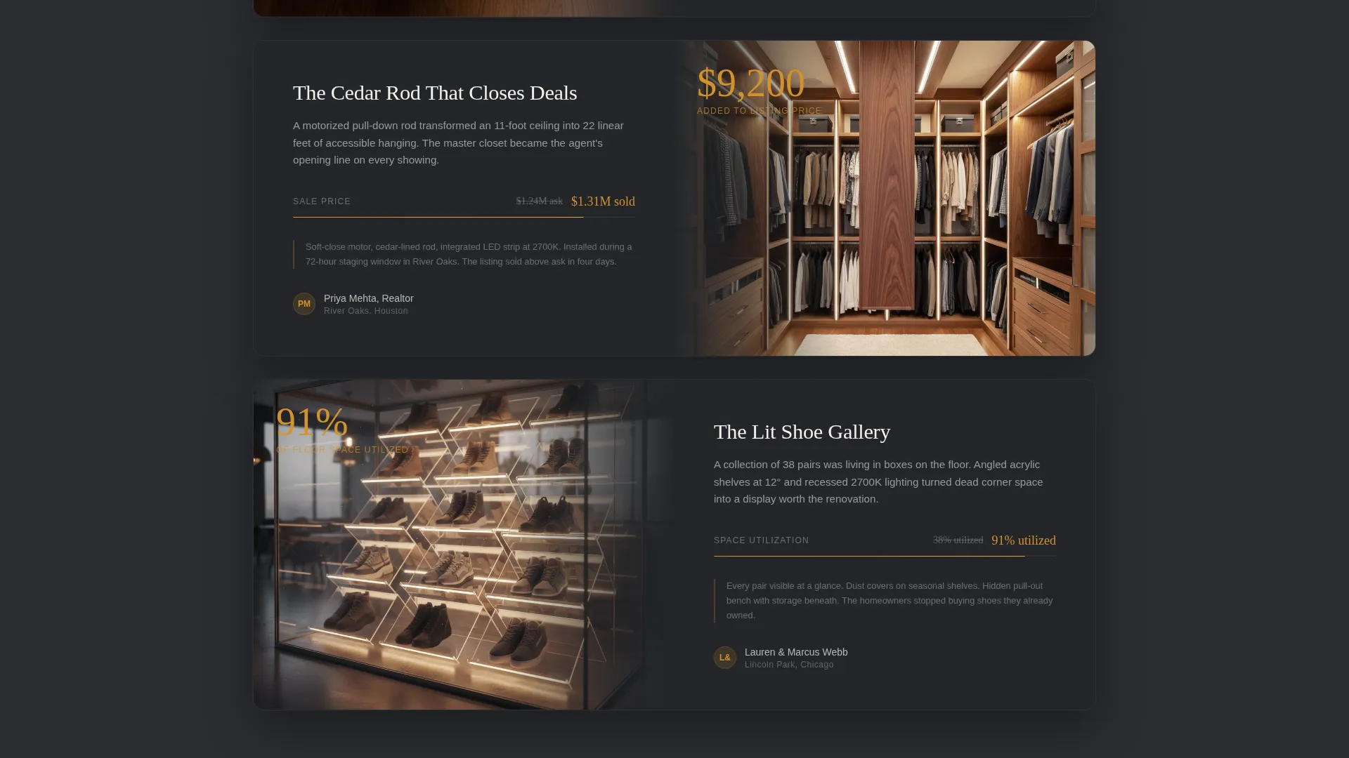
- Micro-case-study blocks below the table, each pairing a stat with a photo detail and a click-through call to action
Feature list
This template is built around a focused set of components that work together to build trust and earn the click.
Oversized Testimonial Card Header
The page opens with a single client quote displayed in large editorial serif type against a deep charcoal background. A name, neighborhood, and a small before-and-after thumbnail sit below the quote. The restraint is deliberate: one voice, one number, one transformation.
Three-Column Comparison Table
The comparison table is the structural anchor of the page. It places DIY organization, big-box install services, and custom consulting side by side across metrics including cost per square foot recovered, average morning routine time saved, resale value added, and redesign lifespan in years. Metric values are set in oversized amber type so the numbers land before the copy.
Stat-to-Case-Study Scroll Sequence
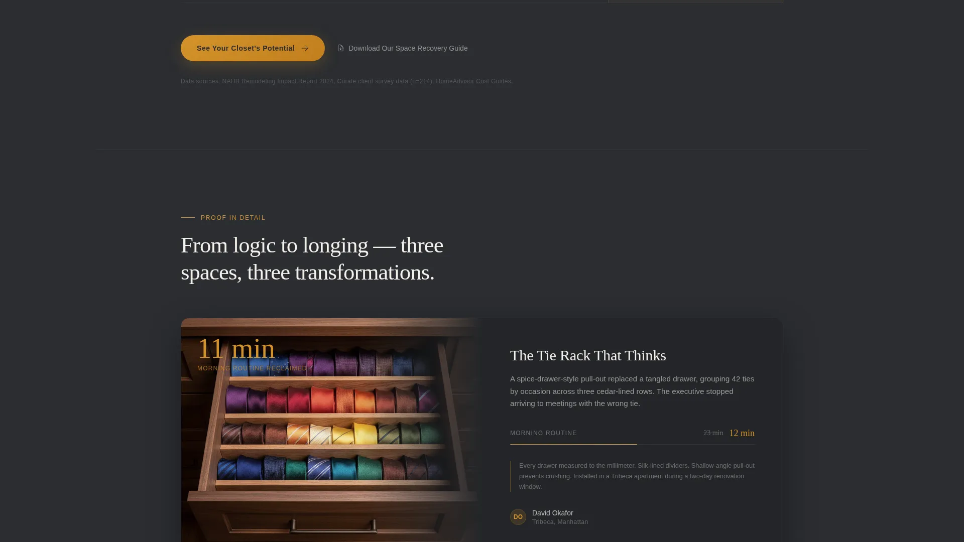
Each metric in the comparison table expands below into a micro-case-study block. A photo detail, such as a spice-drawer-style tie rack, a pull-down cedar rod, or a lit shoe gallery, accompanies each stat. This moves the visitor from analytical proof to sensory desire in a single scroll.
Dual Call-to-Action Placement
The primary call to action, "See Your Closet's Potential," appears directly beneath the comparison table. It reappears as a fixed bottom bar after the case study section. Both route visitors to a service and pricing page without requiring a form submission on this page.
Secondary Lead Capture Link
A text link below the primary call to action offers a downloadable Space Recovery Guide. This captures visitors who are still in research mode without disrupting the main conversion flow. No form is embedded on this page.
Stats-First Visual Hierarchy
Metric values are oversized and styled in warm amber throughout the page. Supporting copy stays in charcoal. This visual contrast ensures that data registers first, creating a logic-before-emotion scroll experience that builds conviction progressively.
Page sections overview
| Section | Purpose |
|---|---|
| Testimonial Card Header | Opens with a single client result to establish immediate credibility |
| Comparison Table | Contrasts three service tiers across four measurable metrics |
| Metric Expansion Blocks | Pairs each stat with a photo detail and micro-case-study context |
| Primary call to action Block | Routes trust-ready visitors to the service and pricing page |
| Fixed Bottom Bar | Keeps the primary call to action visible after the case study section |
| Secondary Guide Link | Captures earlier-stage leads with a downloadable resource offer |
Design & branding system
The template uses a Corporate Precision theme built around a Charcoal and Amber color system. Every design decision reinforces authority and warmth in equal measure, like a tailored suit with brass hardware details.
- Deep charcoal (#2B2D31) covers primary backgrounds; brushed graphite (#4A4E54) defines table rows and section dividers
- Warm amber (#D4922A) highlights metric values and interactive hover states; pressed linen white (#F4F1EB) handles open space and body typography
- Editorial serif type carries the testimonial and headline moments, while the overall layout stays structured, dark, and deliberate
Mobile & speed optimization
The template is designed to stay legible and navigable on smaller screens without losing the visual weight that makes the comparison table credible.
- The comparison table adapts to narrower viewports so metric values and column labels remain readable on mobile devices
- The fixed bottom bar call to action stays accessible on scroll across device sizes
- Photo detail blocks in the case study section are sized to load efficiently without breaking the visual rhythm of the page
How this template helps you convert
This page earns the click by making the visitor feel informed before they ever contact a consultant. The conversion path is short, uncluttered, and built around proof.
- The testimonial card establishes a concrete result in the first moment of attention, anchoring the visitor's expectation with a real number before anything else loads
- The comparison table removes price objections by showing the cost-to-value gap between DIY, big-box, and custom consulting in a single scannable view
- The dual call-to-action placement, once below the table and once as a fixed bar, keeps the next step visible at every stage of the scroll without pressure
Other information about this template
This template fits naturally into a broader specialty consulting practice where the sales cycle requires educating buyers before they are ready to commit. It is particularly well suited for practices that serve renovation-active homeowners, real estate professionals, and time-conscious executives.
- The page requires no form on the visitor side, which reduces friction and positions the consultant as a premium, demand-led service
- The downloadable guide link functions as a soft lead capture for visitors who need more time before booking
- This template works as a standalone click-through page within a larger site or as a campaign-specific landing page for a targeted audience segment
- Consultants can adapt the comparison table metrics to reflect their own service data, making the proof layer specific to their actual client outcomes
Theme
Corporate Precision
Creative direction
Stats-First Impact
Color system
Charcoal & Amber
Style
Comparison Table
Direction
Click-Through
Page Sections
Oversized Testimonial Card Header
Three-column Comparison Table
Stat-to-case-study Scroll Sequence
Dual Call-to-action Placement
Secondary Lead Capture Link
Stats-first Visual Hierarchy
Related questions
Does this template include a contact form?
What does the comparison table measure?
Who is this landing page template designed for?
Can the comparison table metrics be updated with real client data?
What does the fixed bottom bar do?



