Wedding Venue Booking Website Template
Curator is a single-column landing page template built for museum wedding day-of coordinators. It combines a full-bleed ceremony photo header, a community gallery of real-wedding exhibition placards, and a warm Desert Rose color system to earn trust and drive walkthrough bookings. The design feels like a gallery after hours: refined, warm, and quietly authoritative.
by Rocket studio
Quick summary
Curator is a landing page template designed for a day-of coordinator who specializes in museum venue weddings. It opens with a full-bleed ceremony photograph and a single serif headline, then unfolds as a curated gallery of real weddings. Every section builds confidence in the coordinator's institutional fluency, guiding couples toward booking a walkthrough.
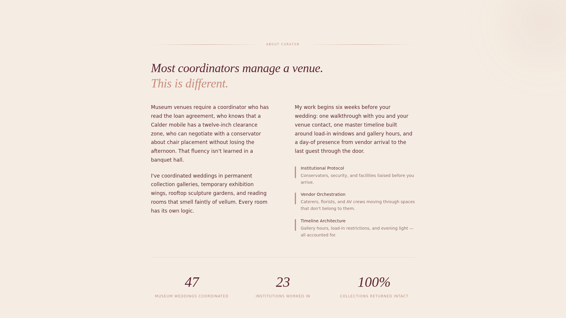
Who this template is for
This template is built for a very specific professional: a day-of wedding coordinator whose entire practice lives inside museum galleries, historic wings, and institutional spaces. It speaks directly to couples who have already chosen the venue and now need someone who understands both the romance and the logistics that come with it.
- Day-of coordinators who work exclusively or primarily with museum and gallery wedding venues
- Wedding planners positioning themselves as specialists in institutional or arts-venue events
- Couples in the research phase who want to vet a coordinator's real experience before reaching out
What problem this template solves
Coordinating a museum wedding is genuinely different from coordinating a ballroom event. The venues have curators, conservators, load-in windows, and traveling exhibits that can change the floor plan a week before the wedding. Most coordinator websites are not built to communicate that level of specialization. Curator solves this.
- Couples struggle to tell whether a coordinator truly understands museum protocols or is simply willing to try
- Generic coordinator websites bury real experience inside long bios and vague testimonial blocks
- There is no clear, fast way to demonstrate vendor-management depth and institutional knowledge on a standard template
What you get with this template
You get a complete, single-column landing page layout that moves a visitor from first impression to booking inquiry without friction. Every section has a defined purpose, and the design vocabulary does as much persuasive work as the copy.
- A full-bleed photo header with a centered serif headline overlay, no navigation clutter
- A scrolling community gallery section styled as exhibition placards, each pairing a real-wedding photo with a specific logistical detail
- A dual-conversion section featuring a primary booking form and a secondary lead-capture path for a downloadable venue checklist PDF
Feature list
The template is built around a focused set of components that serve one goal: proving expertise and earning the booking inquiry.
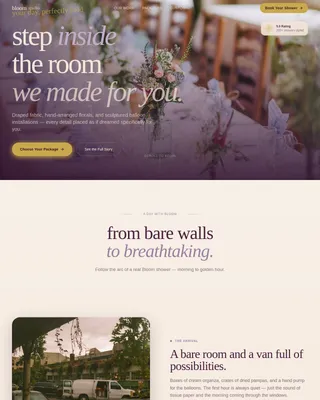
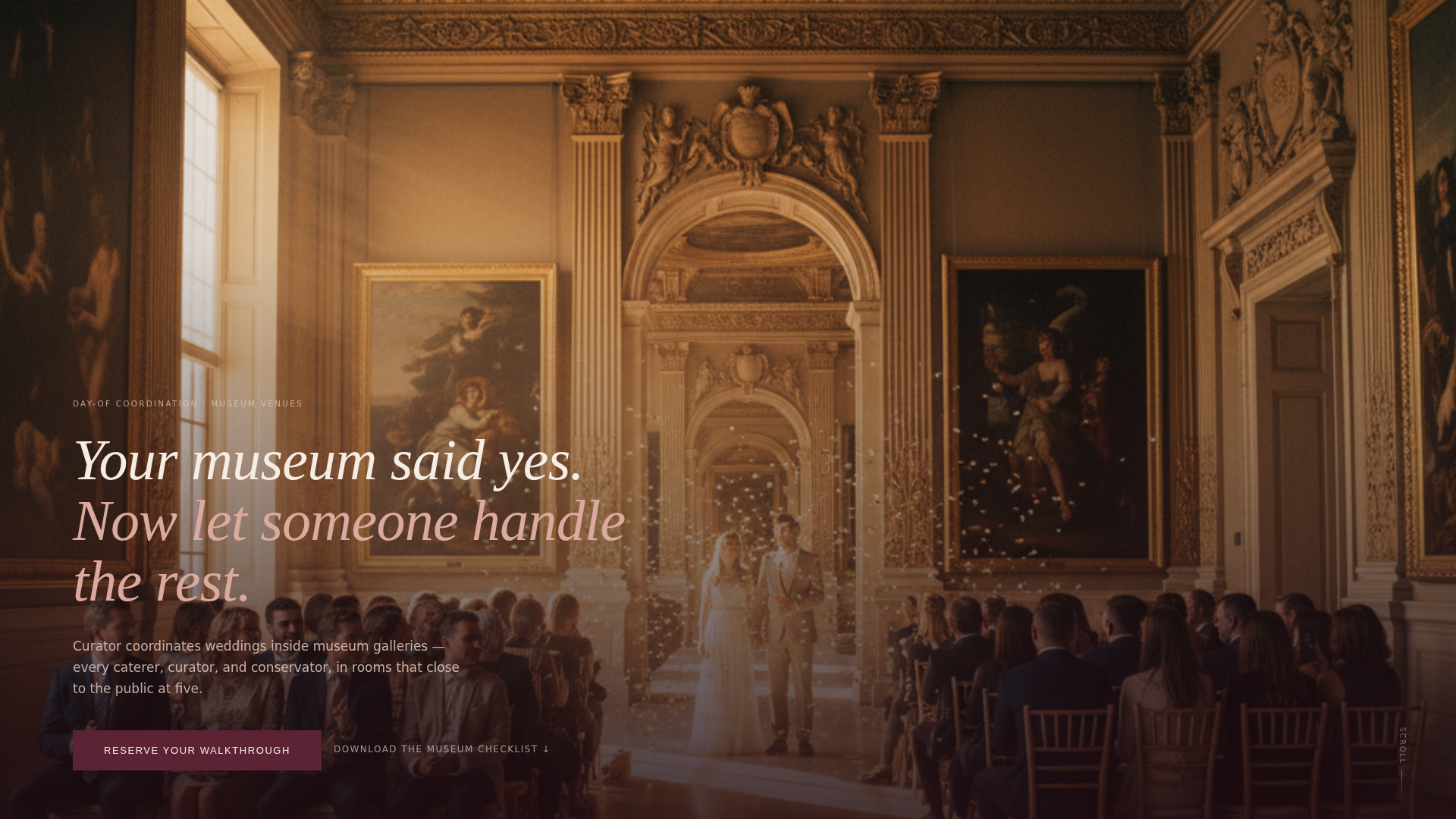
Full-Bleed Ceremony Header
The header is a single wide photograph taken from the back of a museum gallery during a live ceremony. A one-line serif headline sits below the image: "Your museum said yes. Now let someone handle the rest." There is no navigation bar or logo, giving the image room to breathe and set the tone immediately.
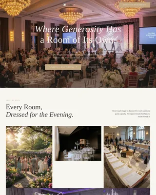
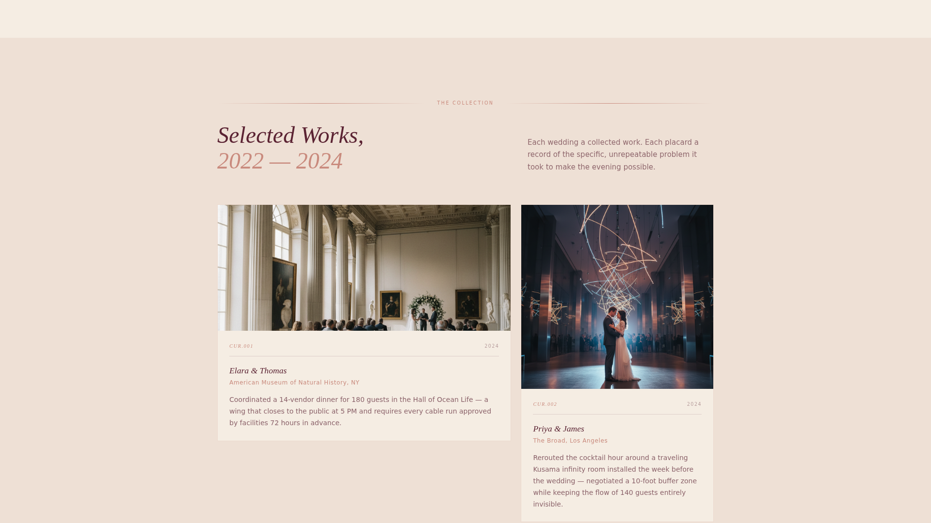
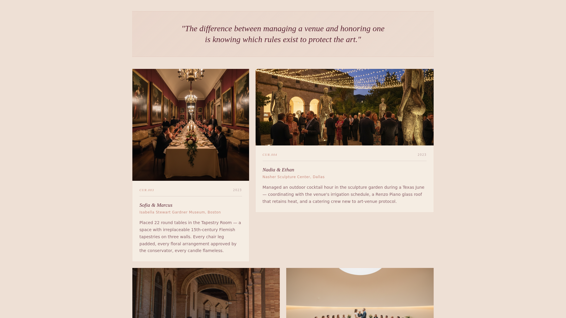
Exhibition Placard Gallery
The gallery section presents real wedding photographs paired with short, specific logistical captions. These are formatted as exhibition placards rather than standard testimonials. Each one names a concrete detail, such as coordinating a multi-vendor dinner in a wing that closes to the public at 5 PM, giving visitors a precise sense of what the coordinator has actually handled.
Philosophy Interstitials
Between clusters of wedding photographs, single-sentence philosophy lines appear on soft gradient backgrounds. The gradients shift from linen to blush to terracotta as the visitor scrolls deeper. This creates a slow emotional build and gives the page a sense of movement without relying on animation.
Walkthrough Booking Form
The primary call to action is "Reserve Your Walkthrough," linking to a short embedded form. The form asks for wedding date, museum name or "still deciding," guest count range, and an open field labeled "What made you choose a museum?" The questions are specific enough to feel personal without being burdensome.
Venue Checklist Lead Capture
A secondary conversion path offers a downloadable PDF titled "The Museum Venue Checklist: 30 Questions to Ask Before You Sign." Visitors exchange an email address for the download. This captures couples who are still in the venue-selection phase, expanding the reach of the page beyond couples who have already committed.
Dual Call-to-Action Placement
The "Reserve Your Walkthrough" button appears twice: once directly beneath the header and once after the full gallery section. This placement mirrors the natural decision points of a scrolling visitor, reducing the distance between interest and action at both early and late stages of the page.
Page sections overview
| Section | Purpose |
|---|---|
| Full-Bleed Header | Opens with ceremony atmosphere and a single compelling headline |
| Primary call to action Block | Places the booking button immediately below the header image |
| Exhibition Placard Gallery | Demonstrates real experience through specific, captioned wedding photographs |
| Philosophy Interstitials | Builds emotional conviction between gallery clusters with floating single-line statements |
| Walkthrough Booking Form | Collects wedding details through a short, personal intake form |
| Venue Checklist Capture | Offers a downloadable PDF to capture couples still choosing a museum venue |
| Secondary call to action Block | Repeats the booking call to action after the full gallery scroll |
Design & branding system
The visual identity uses a Soft Gradient theme built around the Desert Rose color system. The palette is deliberately muted and institutional, warm enough for romance but restrained enough for a gallery setting.
- Core colors: dusted terracotta (#C98A7D), sun-bleached linen (#F5EDE3), muted gallery blush (#E4C9BE), and deep wine shadow (#5B2333) for text and anchoring elements
- Typography uses serif type for headlines and display text, reinforcing the gallery and editorial register of the page
- Gradient backgrounds shift progressively from linen through blush to terracotta as the visitor scrolls, creating a subtle warmth that builds across the page
Mobile & speed optimization
The single-column layout is inherently suited to mobile viewing. There are no complex grid structures to reflow, and each section is designed to read cleanly at any screen width.
- The full-bleed header image and placard gallery scale responsively within the single-column structure
- Form fields in the booking and lead-capture sections stack vertically for easy thumb navigation on smaller screens
- The progressive gradient shift works across viewport sizes without requiring additional rendering layers
How this template helps you convert
Every design and copy decision in this template points toward one of two conversion outcomes: a walkthrough booking or an email capture. The page does not try to do everything; it tries to do those two things very well.
- The exhibition placard format builds specific, verifiable trust faster than a generic testimonial block, making a visitor confident enough to submit a booking inquiry before reaching the form
- The secondary PDF lead-capture path means the page converts couples at two different stages of readiness, capturing venue-shopping visitors who are not yet ready to book but are warming toward the coordinator's expertise
Other information about this template
This template is part of a niche-specific collection focused on wedding venue services and arts-adjacent event coordination. It is especially well suited to coordinators whose brand identity is tied to a specific type of institutional space rather than a general event style.
- The template file is built for single-column flow, making it straightforward to adapt copy and photographs to a specific coordinator's portfolio
- The downloadable checklist component serves a dual purpose: it positions the coordinator as an educator and captures leads from couples at an earlier decision stage
- This template fits naturally within a broader wedding and events category, alongside venue-specific service pages for other institutional or non-traditional spaces
Theme
Soft Gradient
Creative direction
Community Gallery
Color system
Desert Rose
Style
Single Column Flow
Direction
Booking/Scheduling
Page Sections
Full-bleed Ceremony Photo Header
Exhibition Placard Gallery Section
Philosophy Interstitial Blocks
Walkthrough Booking Form
Venue Checklist Lead Capture
Dual Call to Action Placement
Related questions
Can I use this template if I coordinate weddings at venues other than museums?
What type of photographs work best in the gallery section?
Does the booking form collect enough information to qualify a lead?
How does the venue checklist lead-capture section work?
Can I customize the colors and typography in this template?