Comprehensive Online Learning Landing Page Template
Syllabus is an editorial landing page template built for education digital transformation consultancies. It combines animated data counters, a transparent five-phase engagement framework, and a dual lead-generation system into one authoritative, magazine-style layout. The design uses deep charcoal and institutional amber to signal competence and structure, giving higher-ed decision-makers exactly the credibility signal they need before committing to a conversation.
by Rocket studio
Quick summary
Syllabus is a single-page editorial template for an education digital transformation consultancy. It opens with a live-counting data wall, walks visitors through a five-phase engagement process, and closes with two conversion paths: a short audit request form and a downloadable playbook. The layout feels like a well-organized project binder, authoritative, warm, and methodical.
Who this template is for
This template is built for consultancies that help educational institutions modernize their operations. It speaks directly to the people holding the mandate and the timeline.
- District superintendents and university Chief Information Officers managing legacy system overhauls
- Provosts and academic operations leaders who have been handed a digital strategy with no clear roadmap
- Education consultancies that need to earn trust quickly from compliance-pressured, budget-conscious clients
What problem this template solves
Higher-education and K-12 decision-makers are skeptical by nature. They've seen vendors overpromise. A generic consultancy website doesn't move them. This template replaces vague claims with visible evidence of process.
- Institutions migrating from paper-based admissions or disconnected Learning Management System platforms need to see a real methodology before they book a call
- Faculty adoption projects and data compliance deadlines require a consultancy that looks like it has done this before
- Most service pages hide the work; this template shows the actual engagement framework, phase by phase, so trust builds as the visitor scrolls
What you get with this template
You get a complete editorial landing page designed to convert skeptical higher-ed buyers into qualified leads. Every section has a defined role in the conversion flow.
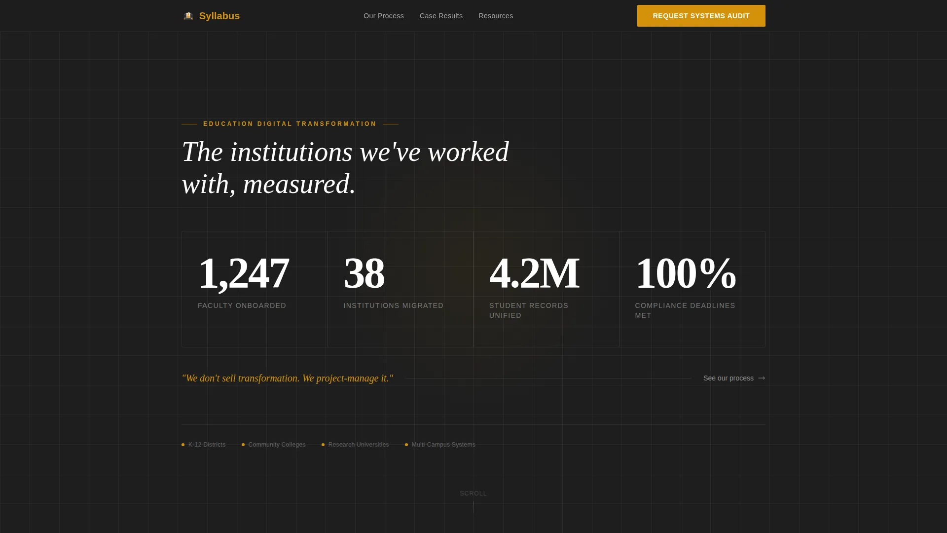
- An animated counter wall that populates on load, showing real engagement metrics like faculty onboarded, institutions migrated, and student records unified
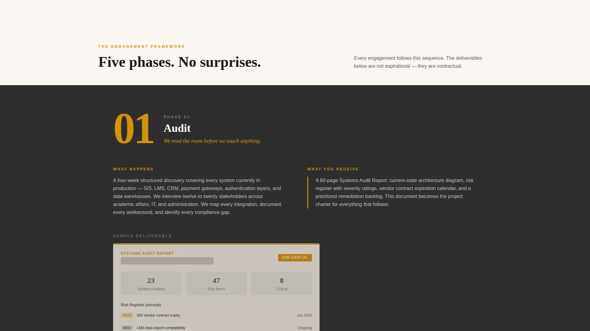
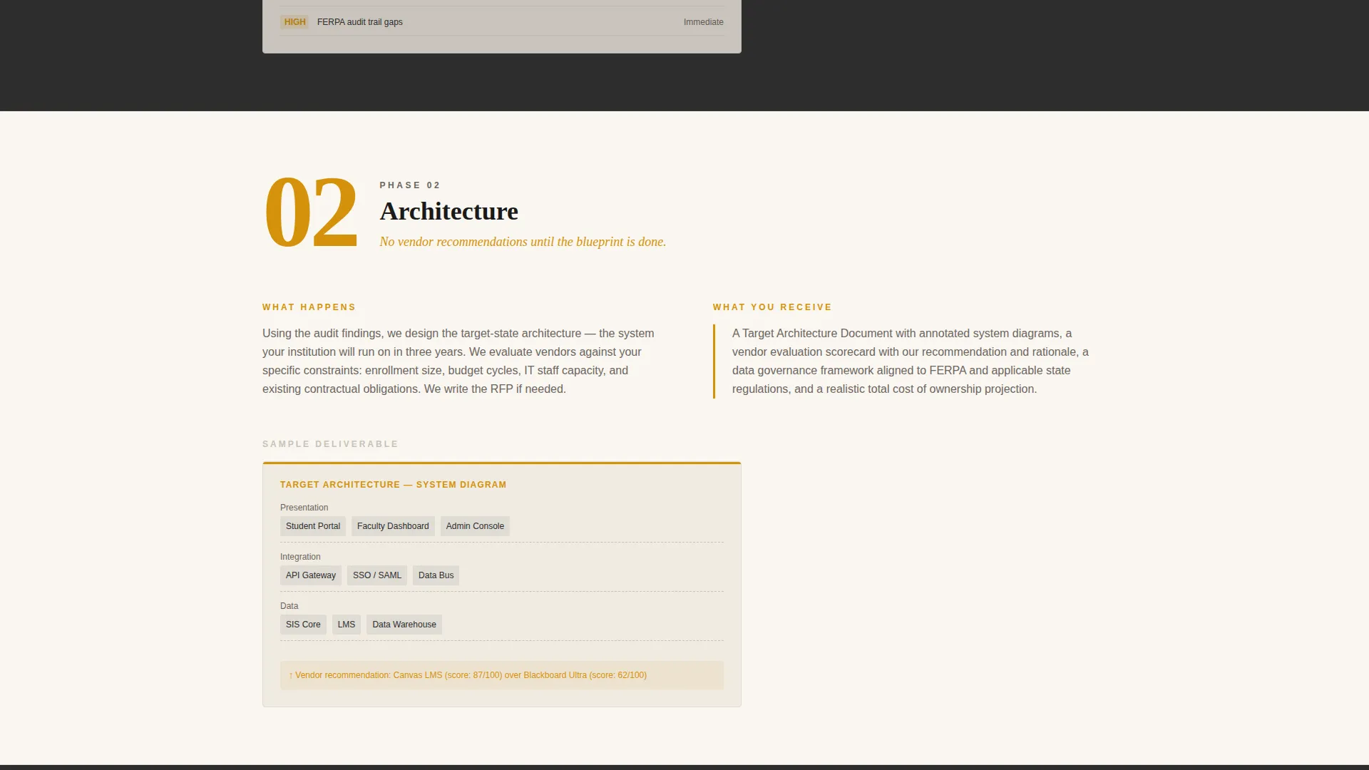
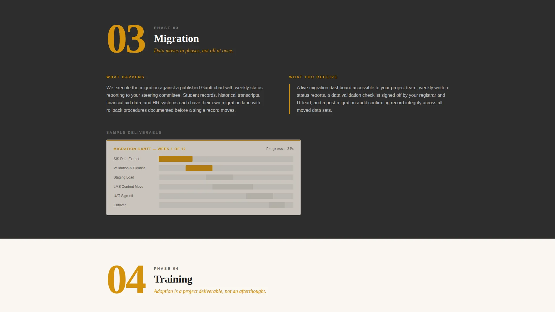
- A five-phase process layout (Audit, Architecture, Migration, Training, Handoff), each rendered as a magazine-style spread with phase numbers, two-column explanations, and anonymized deliverable thumbnails
- A sticky bottom bar with a three-field audit request form, plus a secondary email-gated PDF download path for visitors who are not yet ready to talk
Feature list
This section covers the core built-in capabilities of the Syllabus template as defined in the source brief.
Animated Data Counter Wall
The header replaces stock photography with live-counting numbers. Metrics tick upward from zero as the page loads, displayed in large editorial serif type against a charcoal background. A single amber tagline anchors the section below the counters.
Five-Phase Editorial Framework
Each engagement phase gets its own magazine-style spread. Phase numbers appear in oversized amber type. A two-column layout explains what happens in each phase and what the client receives. Anonymized deliverable thumbnails, such as a redacted systems audit and a migration Gantt chart, are included per phase.
Sticky Lead Capture Bar
A sticky bottom bar appears after the visitor scrolls past the second phase section. It holds a three-field form: institution type, primary pain point, and work email. The bar stays anchored so the call to action is always reachable without interrupting the reading flow.
Dual Conversion Paths
The primary path is an audit request. The secondary path is a downloadable PDF titled "The 90-Day Migration Playbook," gated behind email only. Both paths serve different buyer readiness levels on the same page.
Service Utility Color System
The Charcoal and Amber palette uses deep graphite for alternating section backgrounds, warm parchment for content panels, institutional amber for callouts and interactive elements, and chalk-dust gray for borders. The result feels like a leather-bound policy manual under a brass desk lamp.
Editorial Magazine Layout
The overall page structure follows a long-form editorial format. Sections scroll like a higher-ed journal feature, building credibility progressively. No hero image, no stock photography. The data and process documentation serve as the visual content.
Page sections overview
| Section | Purpose |
|---|---|
| Animated Counter Header | Establishes credibility instantly with live metric counts |
| Amber Tagline Block | Sets the consultancy's core positioning in one line |
| Phase 1: Audit | Shows what the audit contains and what the client receives |
| Phase 2: Architecture | Explains system design decisions and deliverables |
| Phase 3: Migration | Details the migration process with Gantt chart thumbnail |
| Phase 4: Training | Covers faculty onboarding and adoption support |
| Phase 5: Handoff | Describes final documentation and transition close-out |
| Sticky Bottom Bar | Anchors the primary audit request form on scroll |
| Playbook Download Section | Captures early-stage leads with a PDF email gate |
Design & branding system
The visual identity follows a Service Utility theme. Every color decision reinforces authority and structure without feeling cold or corporate.
- Deep graphite (#2D2D2D) backgrounds alternate with warm parchment (#FAF6F0) content panels, creating a rhythm that guides the eye through long-form content
- Institutional amber (#D4920B) appears on callout blocks, pull-quotes, phase numbers, and interactive elements to draw attention without distraction
- Chalk-dust gray (#E0DCD5) defines borders and secondary surfaces, keeping the layout structured and readable throughout
Mobile & speed optimization
The template is built to stay readable and functional on smaller screens without compromising the editorial tone. Long-form pages are inherently demanding, and the layout accounts for that.
- Two-column phase spreads reflow into single-column stacks on mobile, preserving the phase-number hierarchy and deliverable thumbnails
- The sticky bottom bar is designed to sit cleanly at the bottom of the viewport on both desktop and mobile without covering critical content
How this template helps you convert
Every structural decision in this template is tied to a specific moment in the buyer's decision process. The layout earns trust before it asks for anything.
- The data counter header creates immediate credibility. Visitors see real numbers before they read a single sentence of marketing copy, which lowers skepticism at the entry point.
- The phased editorial framework makes the consultancy's process visible and legible. By the time a visitor reaches phase two, the sticky form appears because they now understand what they are being asked to request.
Other information about this template
This template is purpose-built for the education consulting market and reflects the specific tone, language, and decision-making style of institutional buyers.
- The template style is Editorial and Magazine, suited to consultancies that want to position themselves as thought leaders, not just vendors
- The three-field audit form uses institution type and pain point dropdowns to qualify leads at the point of capture without adding friction
- The "90-Day Migration Playbook" secondary path is designed for visitors who are early in their evaluation and not yet ready to book a call
- The template uses no hero images or stock photography anywhere; all visual weight comes from data, typography, and the process documentation itself
- This landing page is well-suited to higher-ed consultancies working across K-12 districts, community colleges, universities, and multi-campus systems
Theme
Service Utility
Creative direction
Transparent Process
Color system
Charcoal & Amber
Style
Editorial/Magazine
Direction
Lead Generation
Page Sections
Animated Data Counter Header
Five-phase Editorial Framework
Sticky Lead Capture Bar
Dual Conversion Path Design
Service Utility Color System
Related questions
Who is this landing page template designed for?
What conversion tools are built into this template?
Can I edit the phase names and deliverable thumbnails?
Does this template use any photography or illustration?
Is this template suitable for a solo practitioner or a larger firm?



