Subscription Box Services Professional Website Template
Cycle is a bento grid landing page template built for curated menstrual subscription services. It blends interactive product storytelling with a Luxe Minimal visual identity, guiding visitors through a sensory unboxing experience before funneling them into a quiz-to-subscribe flow. Two call-to-action paths, one for subscribers and one for gift shoppers, keep every visitor moving forward.
by Rocket studio
Quick summary
Cycle is a single-page bento grid landing page template designed for curated period and menstrual subscription box services. It combines a Before/After header slider, interactive product tiles, and a Dopamine Pop color system to create a sensory browsing experience. Every interaction builds desire before guiding visitors into a quiz-to-subscribe flow.
Who this template is for
This template is built for founders and marketers running curated subscription box services in the personal care or wellness space. It works especially well when your product has a story worth telling and your audience values discovery over a standard storefront.
- Subscription box brands selling organic or natural period care products
- Small business owners targeting college students, new moms, or remote workers
- Marketers who want an interactive, gift-like first impression before the signup step
What problem this template solves
Most subscription landing pages feel transactional. They list features, show a price, and ask for a signup before the visitor feels anything. Cycle solves the engagement gap by turning browsing into a mini unboxing experience, earning the click rather than demanding it.
- Visitors leave generic product pages before they feel connected to the brand
- Standard layouts cannot communicate a curated, sensory product through static copy alone
- Dual-audience pages often confuse visitors shopping for themselves versus shopping for a gift
What you get with this template
You get a fully structured bento grid landing page with interactive tiles, a viewport-splitting header, and a dual call-to-action path. Every section is designed to build desire progressively so the final click feels earned, not forced.
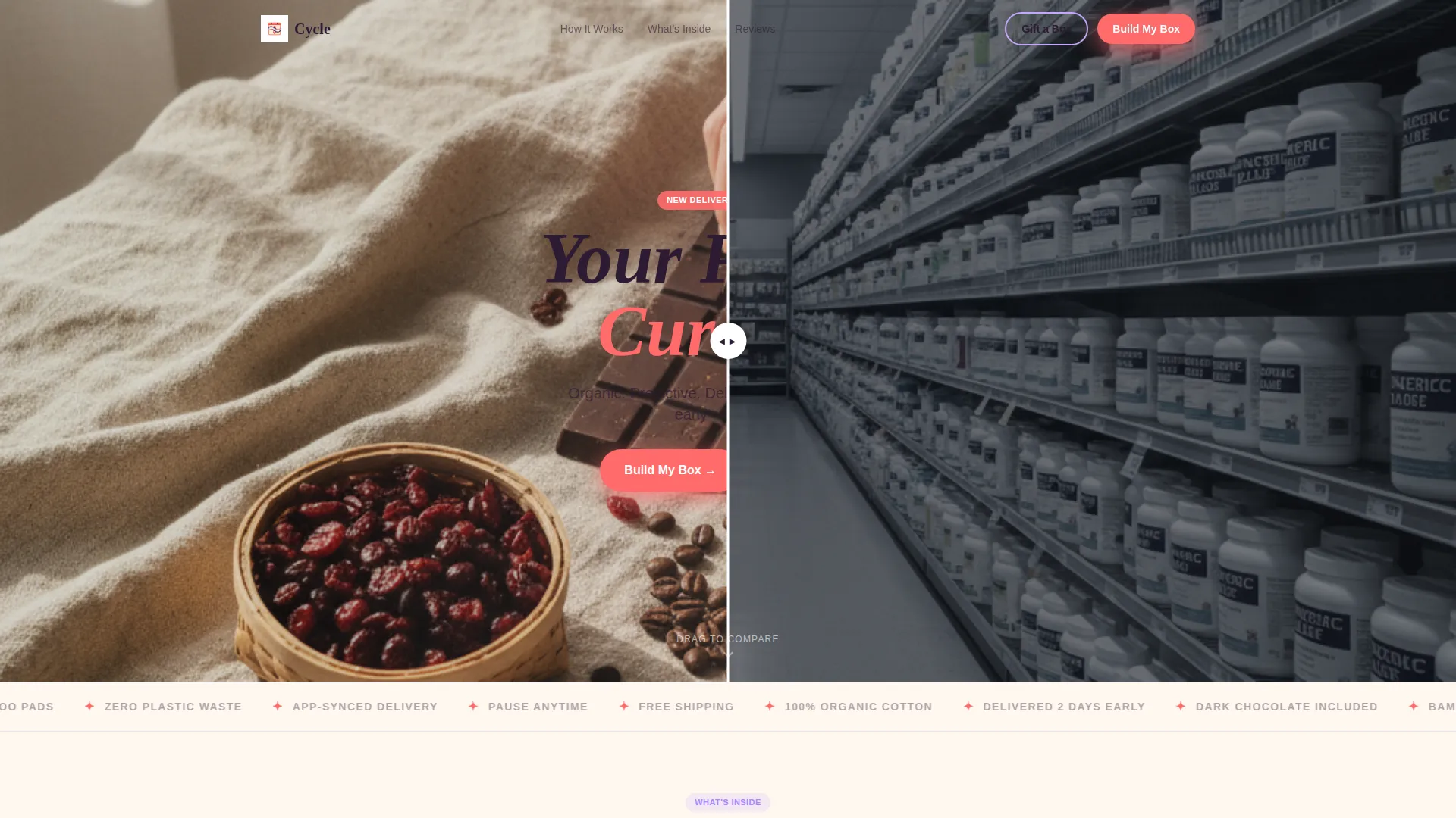
- A Before/After slider header that transforms the first impression from clinical to sensory
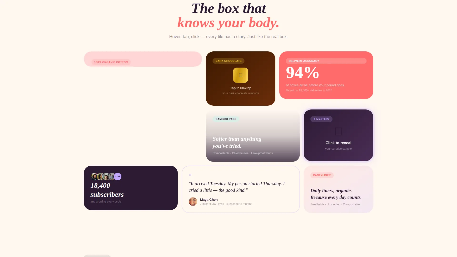
- A reshuffling bento grid with flip, tap, and reveal micro-interactions on product tiles
- Two distinct calls to action: "Build My Box" in hot coral and "Gift a Box" in electric lilac
Feature list
A brief overview of the template's built-in interactive and visual capabilities is below.
Before/After Header Slider
The header splits the viewport into two panels. The left side shows a stark pharmacy aisle; the right reveals a curated subscription box on linen. Visitors drag the divider to watch the transformation happen in real time. A headline, "Your Period, Curated," fades in over the right panel.
Interactive Bento Grid Layout
The page body is built as a bento grid where each tile serves a distinct purpose. Cards flip, unwrap, and pulse to reward curiosity. The grid reshuffles subtly on each visit so returning visitors always see a fresh arrangement.
Flip-to-Story Product Cards
Hovering over product tiles reveals an origin or sourcing story on the reverse side. The tampon card, for example, flips to show the organic cotton sourcing detail. This approach teaches visitors something meaningful without interrupting the scroll.
Mystery Bonus Reveal Tile
One bento card stays sealed with a pulsing glow animation. Visitors click it to reveal that month's surprise sample. This mechanic mirrors the real unboxing surprise and gives the page a reason to be revisited each month.
Sticky Quiz-to-Subscribe call to action
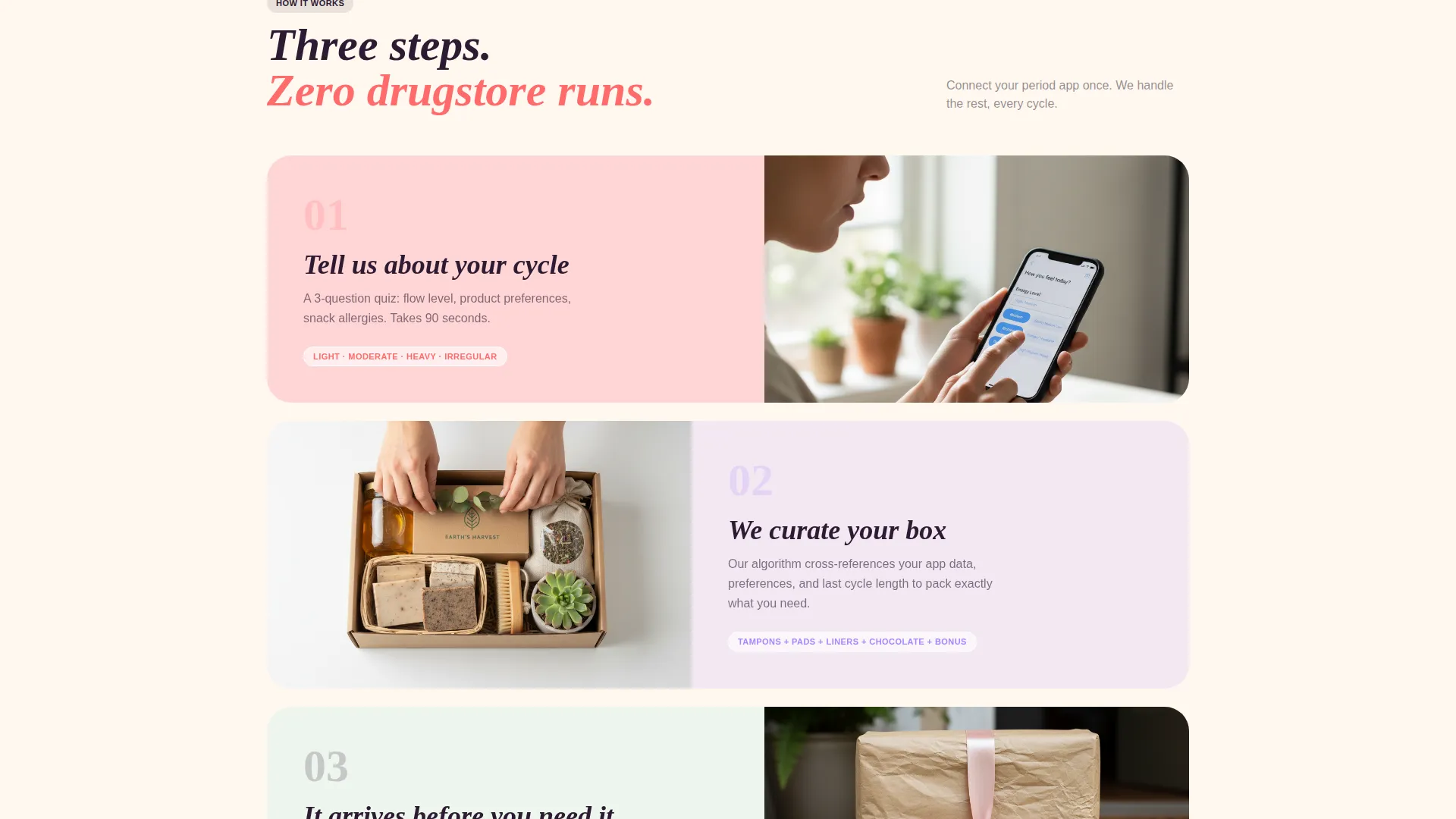
The primary "Build My Box" call to action appears in hot coral at the header, floats as a sticky pill during scroll, and anchors the final bento tile. Clicking it leads to a three-step quiz covering flow level, product preferences, and snack allergies before plan selection.
Dual call to action Path Design
A secondary "Gift a Box" button in electric lilac serves visitors who arrive with gifting intent. The two paths are visually distinct, preventing decision confusion while keeping the gifting audience on the same page.
Page sections overview
| Section | Purpose |
|---|---|
| Before/After Slider Header | Transforms first impression from clinical to sensory |
| Headline Fade-In | Introduces brand promise over the right panel |
| Bento Grid Body | Hosts all interactive product and story tiles |
| Tampon Sourcing Card | Flips to reveal organic cotton origin story |
| Chocolate Unwrap Tile | Triggers micro-animation on tap |
| Mystery Bonus Tile | Sealed card with pulsing glow; reveals monthly surprise on click |
| Sticky call to action Pill | Floats "Build My Box" button throughout scroll |
| Quiz Entry Point | Transfers visitor to three-step preference quiz |
| Gift call to action Anchor | Secondary lilac button for gifting visitors |
| Final Bento call to action Tile | Closes the page with the primary subscribe action |
Design & branding system
The visual identity follows a Luxe Minimal theme built on a Dopamine Pop color system. The palette is restrained at first glance and then unapologetically vivid in its accent moments, much like a single peony dropped into a white ceramic vase.
- Base canvas in warm ivory (#FFF8F0), primary actions and highlights in hot coral (#FF6B6B), secondary cards and hover states in electric lilac (#C3A6FF), and body text and navigation in deep aubergine (#2D1B33)
- Overlap and layered template style creates editorial depth across bento tiles without visual clutter
- The overall aesthetic feels like an unboxing gift you bought yourself: soft, textured, and quietly luxurious
Mobile & speed optimization
The bento grid layout is structured to adapt naturally to smaller viewports, keeping touch interactions like tap-to-reveal and swipe gestures functional on mobile devices. The page is built as a single-page flow, which reduces navigation overhead and keeps the visitor path clean.
- Bento tiles reflow into a vertical stack on narrow screens without losing interaction logic
- The sticky call to action pill remains accessible throughout the mobile scroll without obscuring content
- The Before/After slider translates to a drag or swipe gesture on touch screens
How this template helps you convert
Cycle is built as a click-through landing page optimized to move visitors into the quiz-to-subscribe funnel. Every interactive element is designed to earn trust and desire before the commitment step.
- The Before/After slider creates an immediate emotional contrast, making visitors feel the difference between a drugstore run and a curated delivery before they read a single line of copy.
- Interactive bento tiles act as free samples of the unboxing experience, giving visitors a tangible reason to want the real box before they ever reach the call to action.
- The sticky "Build My Box" pill ensures the primary action is always one tap away, reducing friction at the moment a visitor decides to move forward.
Other information about this template
This template sits within the Retail and E-Commerce category under the Subscription Box Services subcategory. It is designed as a single click-through landing page, not a multi-page storefront, so it pairs best with an external quiz or checkout tool that handles plan selection.
- The quiz-to-subscribe flow covers three steps: flow level, product preferences, and snack allergies, ending with plan selection on the linked destination page
- The template is suited for organic, natural, or wellness-focused subscription box brands that lead with product storytelling
- The grid-reshuffling behavior gives returning visitors a fresh layout on every visit, which supports repeat engagement without requiring a content update
- This template works well for brands offering monthly curated boxes in the personal care space, particularly those whose product mix includes both functional items and small treats or surprise samples
Theme
Neo-Retro
Creative direction
Curated Collection
Color system
Lavender Dream
Style
Overlap/Layered
Direction
Marketplace/Multi
Page Sections
Before/after Header Slider
Interactive Bento Grid with Micro-animations
Mystery Bonus Reveal Tile
Sticky Quiz-to-subscribe Call to Action
Dual Call-to-action Path
Reshuffling Grid on Return Visits
Related questions
Does this template include the quiz flow?
Can I use this template for a gifting campaign?
How does the bento grid reshuffling work?
Can I update the product cards to match my own subscription items?
Is this template suitable for a brand with only one subscription tier?



