Kids Hip-Hop Dance After-School Landing Page
Cypher is a masonry-style kids hip-hop dance landing page built for after-school programs. It follows a single afternoon from arrival to pickup, using a Pinterest-style grid, playful geometric shapes, and a coral call-to-action strategy to move parents from curiosity to clicking "Try a Free Class", with zero forms and pure emotional proof.
by Rocket studio
Quick summary
Cypher is a single-page landing page template for a kids hip-hop dance after-school program. It tells the story of one afternoon in the studio, from backpacks hitting cubbies at 3:00 PM to a kid teaching their parent a move at 5:45 PM pickup. The design is playful, the layout is masonry-style, and every section pushes parents toward one click.
Who this template is for
This template is built for studio owners and program directors who run kids hip-hop dance after-school programs. It speaks directly to the parents who enroll those kids, not to the children themselves.
- Dance studio owners launching or promoting a kids after-school program
- After-school enrichment programs adding hip-hop dance as a core offering
- Program directors who need an emotionally persuasive, mobile-first landing page that drives enrollment clicks
What problem this template solves
Most after-school program pages feel like flyers, they list times and prices but never show the room. Parents searching late at night on their phones need to feel the energy of the program before they commit. This template solves the trust gap between "sounds fine" and "my kid needs to be there."
- No forms, no friction, just visual and emotional proof that the program is real and worth trying
- Parents get logistics (schedule, session times) without losing the emotional thread that makes them act
- The click-through flow removes enrollment anxiety by leading parents to a scheduling page, not a sign-up wall
What you get with this template
You get a fully structured, single-page landing page laid out around a masonry grid that tells a real story. Every section has a defined role, and the design system is consistent from header to footer.
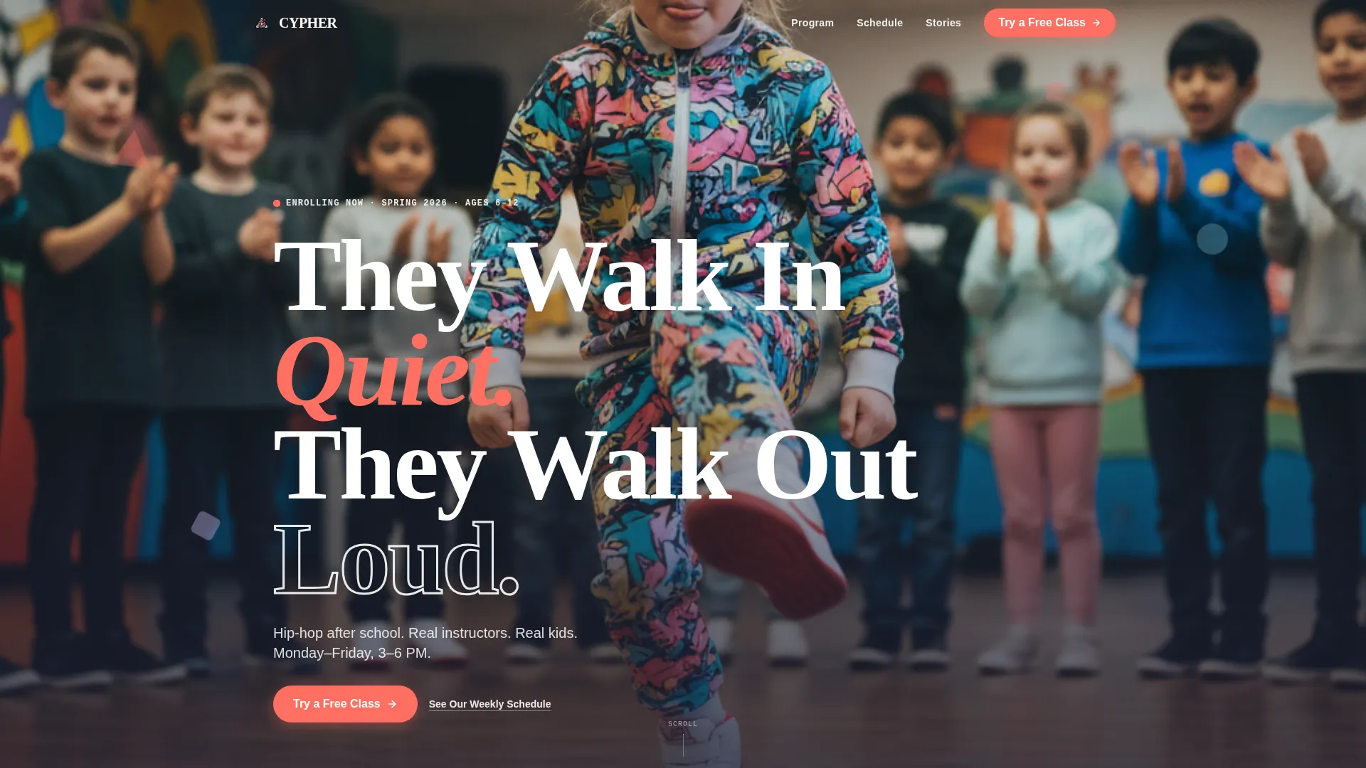
- A full-bleed hero section with floor-level photo framing, chunky headline typography, and a pinned coral call-to-action button
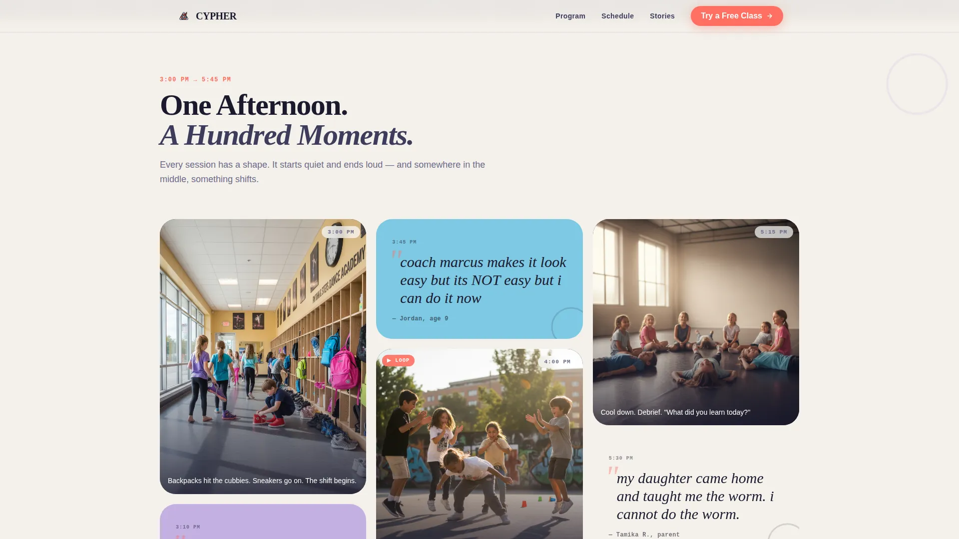
- A day-in-the-life masonry grid with photo cards, silent looping video slots, and pull-quote cards styled in kid handwriting
- Supporting sections for instructor philosophy, parent and kid testimonials, and a practical schedule strip
Feature list
This template is built around six defined capabilities that work together to move a parent from scrolling to clicking.
Full-Bleed Floor-Level Hero
The header opens with a floor-level photo composition showing a kid mid-move with classmates clapping behind them. A chunky geometric headline sits over the image, and a coral "Try a Free Class" button is pinned to the bottom of the hero. The setup creates an immediate emotional impression before the parent reads a single word.
Masonry Day-in-the-Life Grid
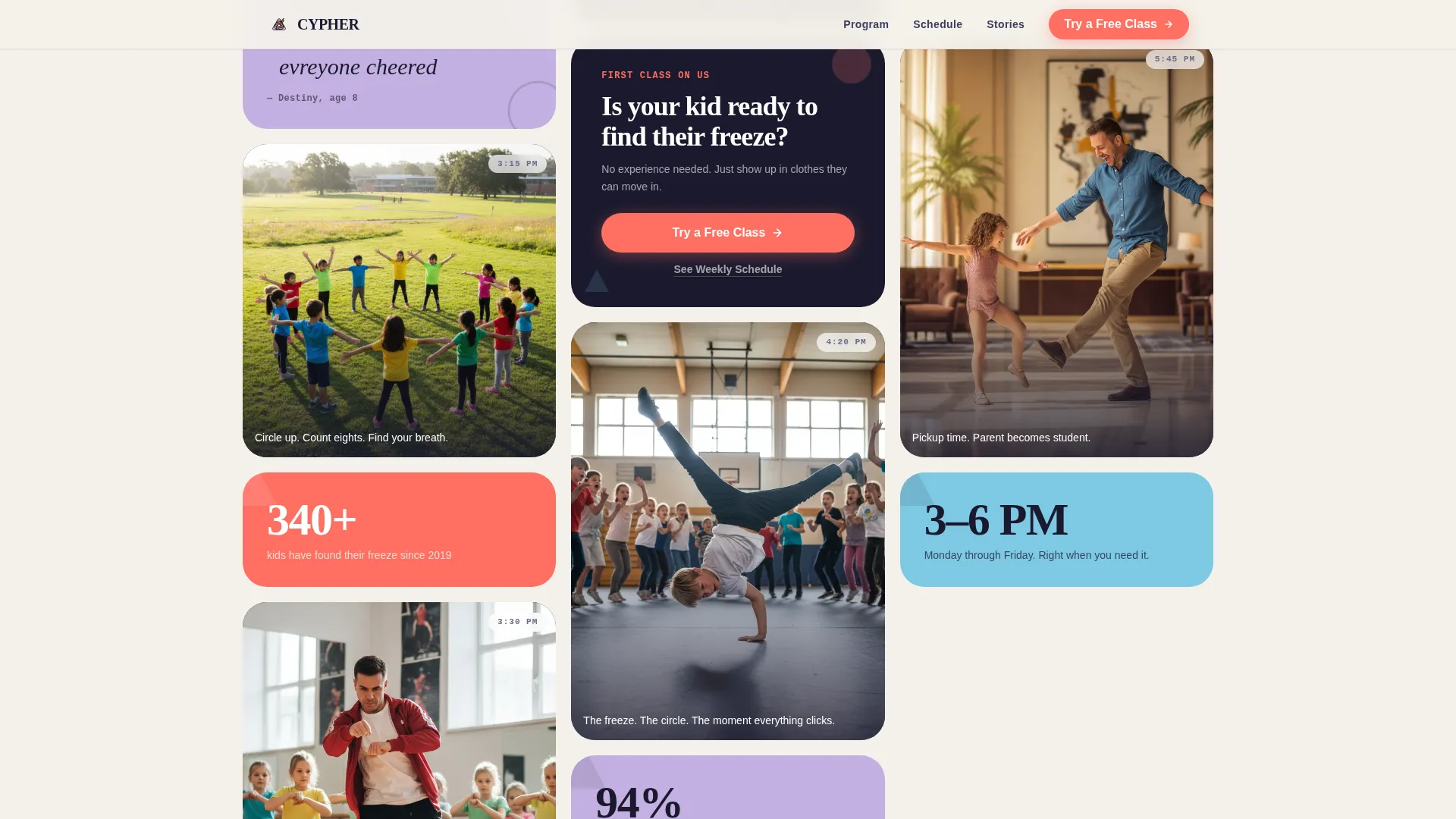
The core of the page is a Pinterest-style masonry grid that narrates a 3:00 PM to 5:45 PM class arc. Cards shift between photos, silent looping video slots, and handwriting-style pull-quotes. The grid density peaks at the energetic midpoint of class and opens back up at dismissal, mirroring the rhythm of the afternoon.
Asymmetric Bento Why-It-Works Section
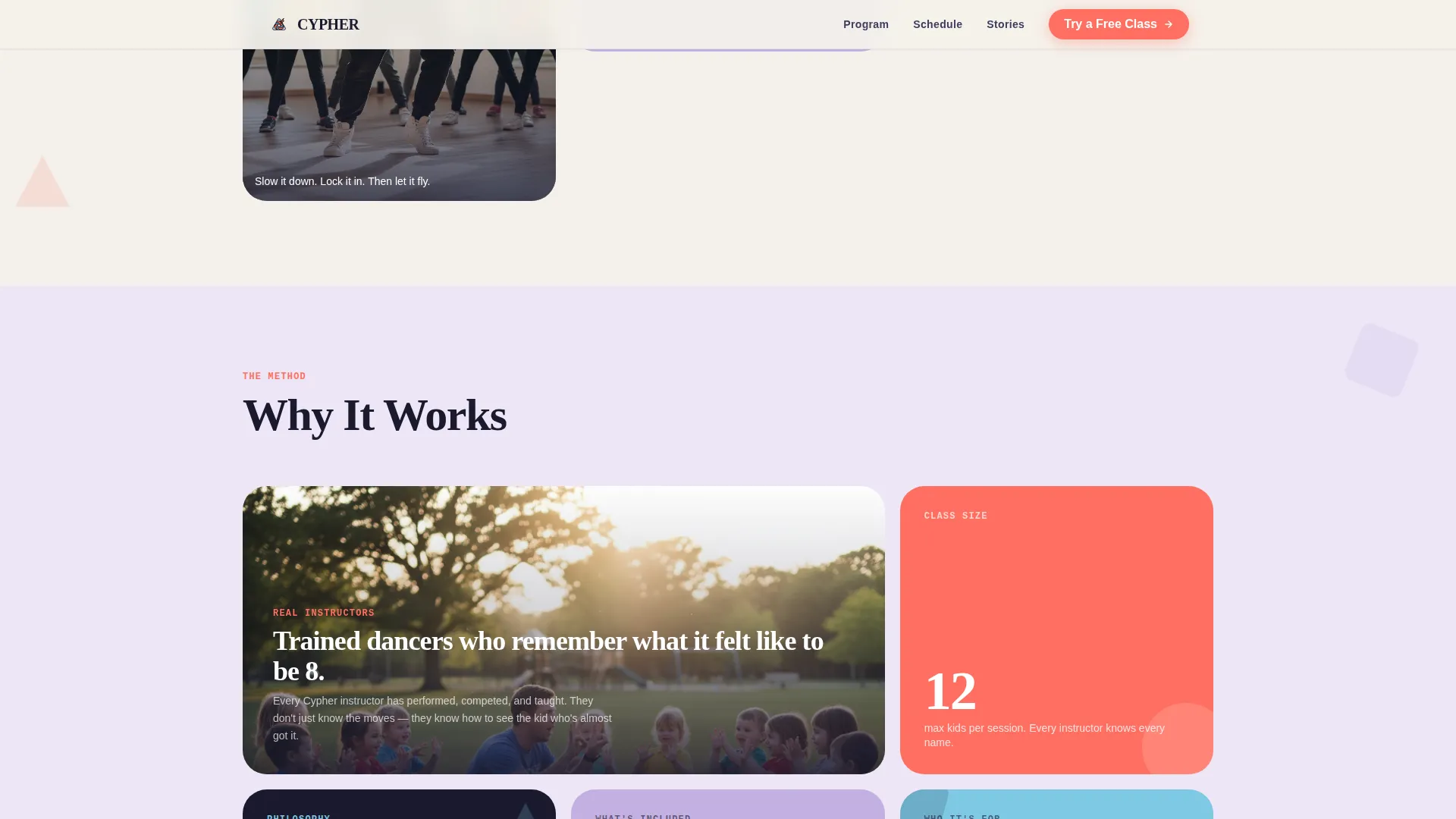
An asymmetric bento grid presents program stats and instructor philosophy side by side. This section gives parents the rational reassurance they need after the emotional pull of the masonry grid. It answers "why this program" without breaking the visual flow.
Handwriting-Style Testimonial Cards
The testimonial section uses pull-quotes styled in kid handwriting, paired with parent testimonial cards. The combination gives the social proof section a layered, authentic feel that generic star-rating formats cannot replicate. Misspelled words and all-caps energy are intentional design details.
Sticky Mobile Call-to-Action Bar
On mobile, a sticky bottom bar keeps the primary "Try a Free Class" call-to-action visible at all times. This is the key conversion element for working parents searching on their phones late at night. The bar appears without overlapping content and stays accessible throughout the full scroll.
Schedule Strip for Practical Parents
A dedicated schedule strip presents session times, days, and age-group logistics in a clean, scannable format. A secondary "See Our Weekly Schedule" text link sits here as a low-friction path for parents who want logistics before feelings. This section ensures no practical question goes unanswered before the parent reaches the footer.
Page sections overview
| Section | Purpose |
|---|---|
| Hero Full-Bleed | Emotional first impression with headline and pinned coral call-to-action |
| Masonry Day Grid | Tells the 3:00 PM to 5:45 PM afternoon story through mixed-format cards |
| Why Cypher Works | Bento grid with program stats and instructor philosophy |
| Testimonial Cards | Kid pull-quotes and parent voices in layered social proof format |
| Schedule Strip | Session times, age groups, and secondary schedule link for practical parents |
| Single-Row Footer | Clean linear footer closing the page |
Design & branding system
The visual identity follows a Playful Geometric theme built around a Cloud Canvas color system. The palette feels like a coloring book left open on a gymnasium floor, airy and innocent but buzzing with energy. Floating geometric shapes (triangles, circles, and offset rectangles) appear behind content blocks like confetti frozen mid-toss.
- Cloud Canvas white (#F4F1EB) as the dominant background, chalk lavender (#C3B1E1) for card surfaces, sidewalk-blue (#7EC8E3) for interactive accents and hover states, and highlighter coral (#FF6F61) reserved for calls-to-action and energy moments
- Typography uses Fraunces for display headlines, DM Sans for body copy, and JetBrains Mono for accent details, creating a stack that feels both playful and intentional
- Geometric shapes shift color palette section by section in sync with the energy arc of the afternoon story
Mobile & speed optimization
This template is built mobile-first, reflecting the reality that most parents discover after-school programs on their phones at night. Every layout decision prioritizes the small-screen experience before scaling up.
- The sticky bottom call-to-action bar keeps "Try a Free Class" accessible at all times on mobile without obscuring content
- GSAP ScrollTrigger drives staggered masonry card reveals, marquee strips, and floating geometric shape parallax, with animations split between server-rendered static content and client-side interactive components
How this template helps you convert
The landing page is designed as a pure click-through experience. Its only job is emotional persuasion that ends in one action: clicking through to a scheduling page.
- The hero, mid-grid call-to-action card, and sticky mobile bar each surface "Try a Free Class" at different scroll depths, so a parent who is ready at any point in the journey always has a clear path forward.
- The masonry arc builds emotional momentum from arrival to dismissal, so by the time a parent reaches the schedule strip, they are already picturing their kid in the circle.
Other information about this template
This template is part of a focused landing page collection built around real program niches and specific audience behaviors. A few additional details worth knowing before you customize it.
- The template is built for English-language, United States-format content with pricing and scheduling copy in USD and 12-hour time notation
- Social proof elements include an enrollment count badge slot, alongside the testimonial and pull-quote cards
- The click-through flow assumes enrollment happens on a separate scheduling page, so no form fields are included in this template
- Animation intensity is set to high by default, using GSAP ScrollTrigger for masonry reveals, hover states on cards, and geometric shape parallax across sections
Theme
Playful Geometric
Creative direction
Day-in-the-Life
Color system
Cloud Canvas
Style
Masonry/Pinterest
Direction
Click-Through
Page Sections
Full-bleed Floor-level Hero
Masonry Day-in-the-life Grid
Asymmetric Bento Why-it-works Section
Handwriting-style Testimonial Cards
Sticky Mobile Call-to-action Bar
Practical Schedule Strip
Related questions
Does this template include any sign-up forms?
What does the masonry grid actually contain?
Is this template designed for mobile users first?
How many times does the call-to-action appear on the page?
Can I adapt this template for a different kids program niche?