Highconverting Danceschool Landing Page Template
Dancepartners is a split-screen, B2B-focused landing page built for dance schools that sell in volume. It presents bulk pricing packages, branded passes, and partner rate tiers in a clean monochrome layout with signal-yellow callouts. Every section pairs a real staff or class photo with a structured offer panel, making the pitch personal and the pricing impossible to miss.
by Rocket studio
Quick summary
Dancepartners is a high-converting landing page template for dance schools targeting bulk buyers. It uses a 50/50 split-screen layout to pair candid staff photography with structured offer panels. Corporate wellness coordinators, event planners, and school district purchasers can see every rate tier at a glance and request a partner rate sheet without friction.
Who this template is for
This template is built for dance school owners and studio managers who sell classes at volume. It speaks directly to institutional and professional buyers who need a clear, fast path to pricing.
- Corporate wellness coordinators bundling group dance sessions into employee benefit programs
- Wedding planners and event professionals booking private couple or group sessions in bulk
- School district after-care directors who need a formal enrichment line item on a purchase order
What problem this template solves
Most dance school websites are designed for individual students, not for bulk buyers. Coordinators and planners waste time hunting for group rates, only to find contact forms built for walk-in inquiries. This template fixes that mismatch by putting every offer front and center for decision-makers.
- Bulk pricing is buried or absent on typical dance school pages, costing schools valuable institutional contracts
- B2B buyers need an internal-sell asset before committing, which most templates never provide
- Partnership inquiries get lost in general contact forms that signal the studio is not equipped to handle volume deals
What you get with this template
The template delivers a fully structured, single-page layout organized around offer clarity and low-friction conversion. Every section is purpose-built for the B2B buyer journey from first impression to form submission.
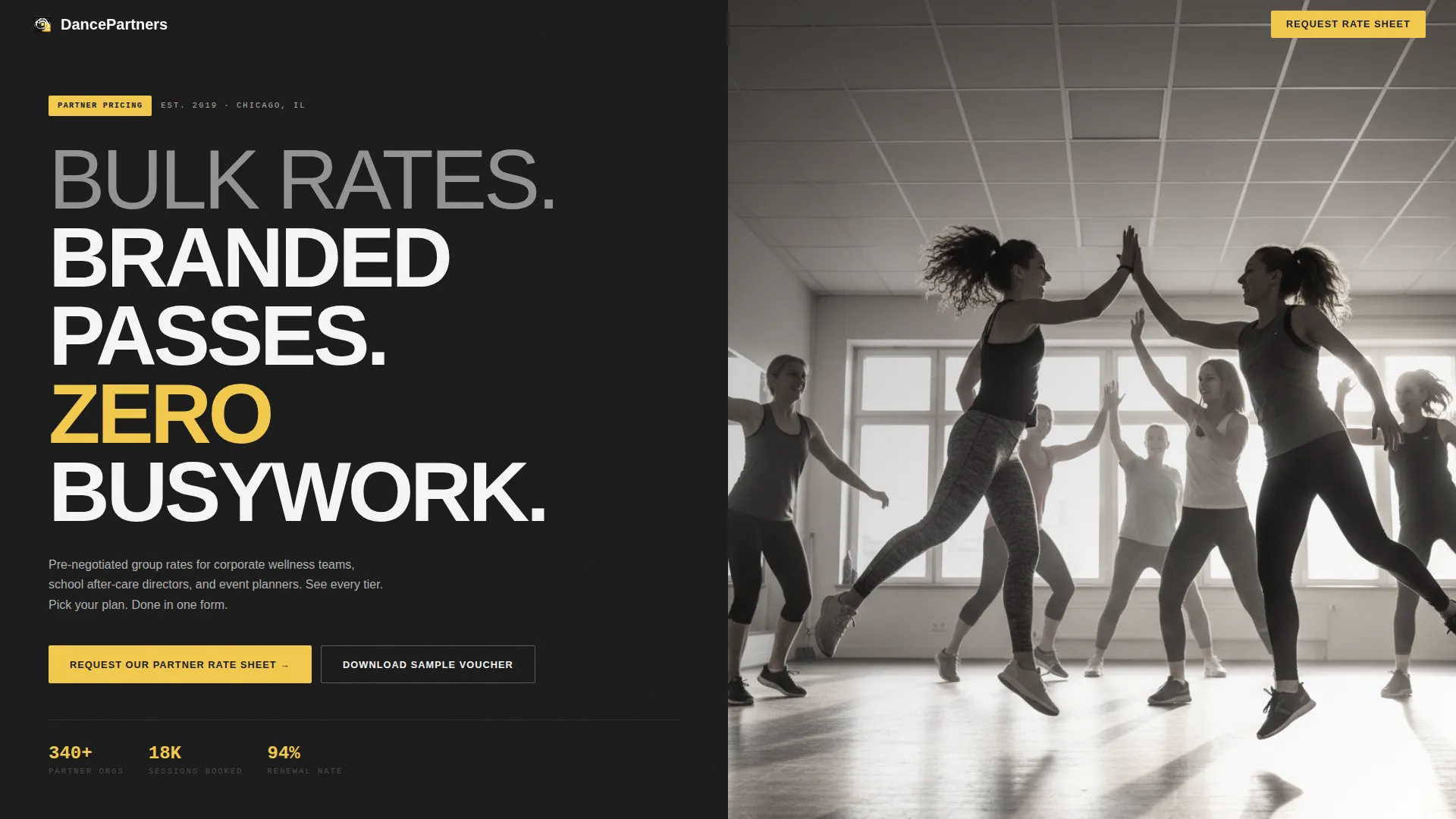
- A giant headline header section with oversized white type and a candid class photo delivering immediate impact
- Three persona-matched split sections covering corporate wellness, after-school programs, and event block-booking tiers
- A primary "Request Our Partner Rate Sheet" call-to-action pinned at the bottom of every split section and repeated in a sticky bar after the second scroll
Feature list
Each built-in feature below is drawn directly from the template brief. Nothing here is speculative.
Giant Headline Left Header
The header divides the screen into two equal halves. The left side displays oversized, tightly tracked white type on forge black reading "BULK RATES. BRANDED PASSES. ZERO BUSYWORK." stacked in three lines. The right side holds a candid, desaturated waist-height photograph of an instructor high-fiving adult students mid-class. The contrast between copy and image is immediate and intentional.
Three Persona-Matched Split Sections
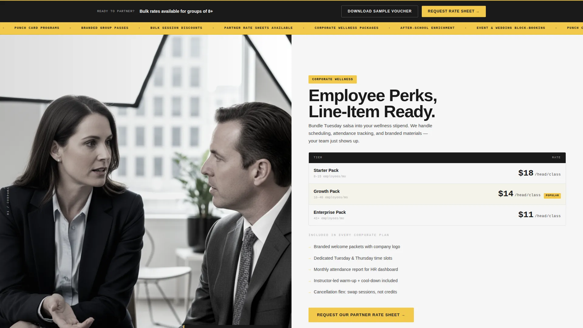
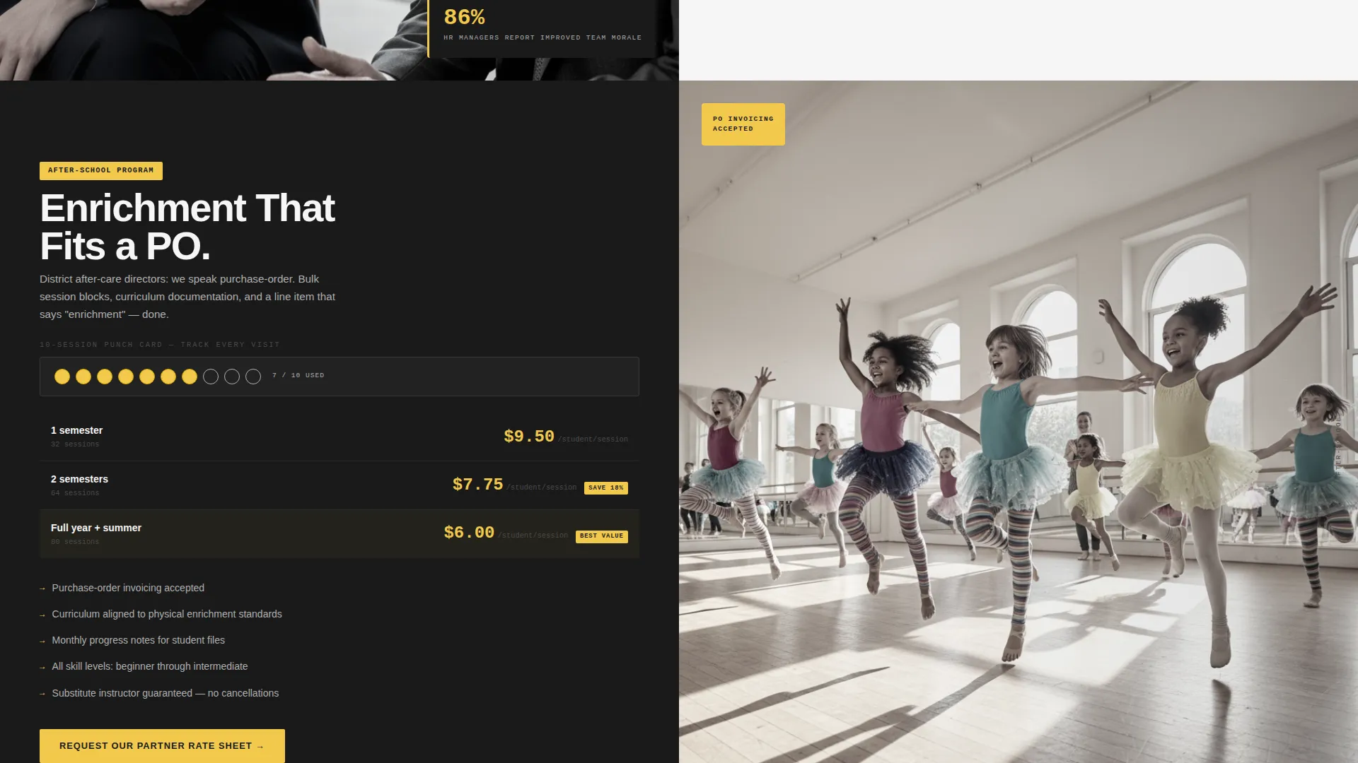
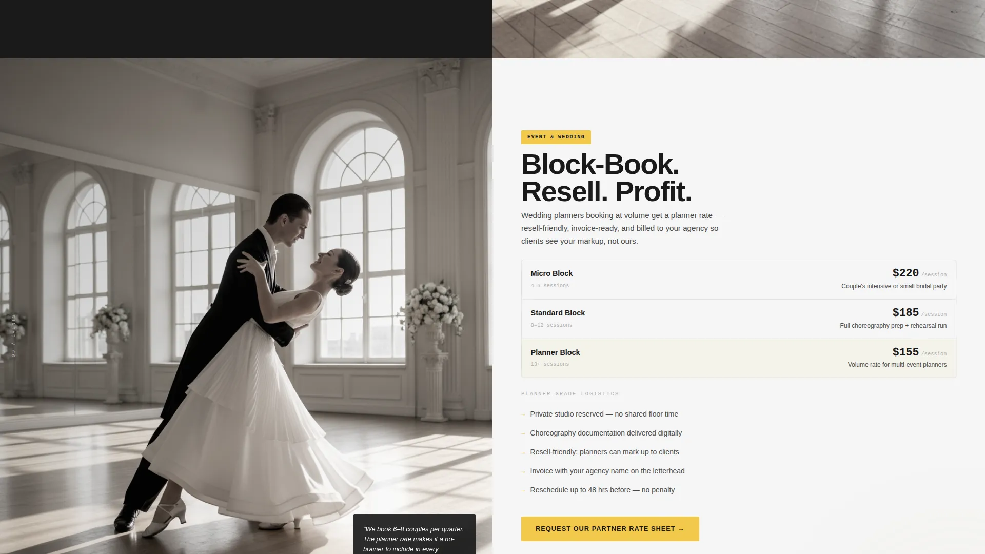
Each of the three main content sections pairs a real photo on one side with a structured offer panel on the other. The first covers the Corporate Wellness Package with per-head pricing beside a studio owner portrait. The second shows a children's class mid-plié beside the After-School Program bulk discount. The third features a couple mid-dip beside the Event and Wedding Block-Booking tier.
Sticky Partner Rate Sheet call to action Bar
After the second scroll, a sticky bar appears and stays visible as the visitor continues down the page. It repeats the primary call-to-action so the conversion path is never out of reach, regardless of how far the buyer has read.
Low-Friction Partner Intake Form
The partner intake form asks for organization name first, then partner type (corporate, education, or event), estimated headcount per month, and a work email address. There is no phone field, which deliberately lowers the barrier for first contact.
Gated Sample Voucher Download
A secondary conversion path offers a downloadable sample voucher as a gated portable document format (PDF). Prospects can see exactly what their employees or clients will receive, giving them a ready-made internal-sell asset before the first call is booked.
Signal Yellow Pricing Callouts
The signal yellow accent color (#F2C94C) is reserved exclusively for pricing callouts, discount badges, and call-to-action buttons. This keeps visual hierarchy strict and ensures the most important numbers are always the first thing a buyer's eye lands on.
Page sections overview
| Section | Purpose |
|---|---|
| Giant Headline Header | Announces bulk deal positioning and anchors brand tone instantly |
| Corporate Wellness Split | Presents per-head group pricing beside a studio owner portrait |
| After-School Program Split | Shows children's class photography paired with bulk discount panel |
| Event & Wedding Split | Displays couple block-booking tier with mid-dip class photography |
| Partner Intake Form | Captures organization details and partner type with minimal fields |
| Sample Voucher Download | Offers a gated PDF to support internal buyer sign-off |
| Sticky call to action Bar | Keeps the partner rate sheet request visible throughout the scroll |
Design & branding system
The visual identity follows a Service Utility theme built on a Monochrome Steel color system. The palette is precise and functional, engineered to feel like a rate sheet on a stainless-steel clipboard rather than a dance class brochure.
- Core colors: forge black (#1A1A1A), brushed gunmetal (#4A4A4A), polished aluminum (#B0B0B0), and bright white (#F5F5F5) form the neutral base
- Signal yellow (#F2C94C) is used exclusively for pricing callouts, discount badges, and call-to-action buttons to draw the eye to what matters most
- Photography is desaturated and candid, following a Team and People creative direction that pairs real faces with structured offer panels throughout the scroll
Mobile & speed optimization
The split-screen layout is designed to remain clear and functional as screen sizes change. Each section is built to stack cleanly so the offer panel and photography read correctly on smaller devices.
- On mobile, the 50/50 split transitions to a stacked layout so pricing panels appear above their corresponding images
- The low-field intake form (four fields, no phone number) reduces tap fatigue on mobile devices
- The sticky call-to-action bar remains pinned and visible on mobile throughout the scroll, keeping the conversion path accessible at all times
How this template helps you convert
Every layout decision in this template is oriented toward one outcome: getting a bulk buyer to submit the partner rate sheet form or download the sample voucher.
- The giant headline and immediate split-screen contrast communicate the value proposition before a single line of body copy is read, reducing early drop-off from buyers who are scanning, not reading.
- Pairing each pricing panel with a real staff or class photograph builds personal trust at every scroll step, so the deal feels delivered by a real team rather than an anonymous rate card.
- The two-path conversion strategy (rate sheet request plus gated voucher download) gives cautious institutional buyers an asset they can share internally before committing, shortening the approval cycle.
Other information about this template
This template is a strong fit for studios entering the corporate wellness market or expanding into volume contracts with schools and events businesses. It can also support dance school franchise models that need a consistent partner-facing sales page.
- The template is categorized under Professional Services with a Dance School Marketing subcategory, making it relevant to studios positioning themselves as service providers rather than hobbyist programs
- The referral whiteboard and punch card motif described in the brief signal that the studio already has a repeat-client culture, which this template reinforces visually through candid photography
- The deliberate absence of a phone field in the intake form reflects current B2B lead generation practice, where work email is the preferred first-contact channel for institutional purchasers
- Studios using branded passes or punch card systems will find the pricing callout and discount badge components directly applicable to how they already package and communicate value
Theme
Service Utility
Creative direction
Team & People
Color system
Monochrome Steel
Style
Split Screen (50/50)
Direction
Partnership/B2B
Page Sections
Giant Headline Left Header
Three Persona-matched Split Sections
Sticky Partner Rate Sheet Call to Action Bar
Low-friction Partner Intake Form
Gated Sample Voucher Download
Signal Yellow Pricing Callouts
Related questions
Who is the ideal user of this template?
Can I customize the pricing panels for my own rate tiers?
What is the purpose of the sample voucher download?
Does the intake form include a phone number field?
Is this template suitable for a solo instructor or small studio?



