Artisan Hosiery Landing Page Template
Darn is a modular card-grid landing page built for artisan hosiery makers. It presents three handcrafted sock tiers side by side, walks visitors through fiber, dye, and construction with close-up comparison cards, and closes the sale with a live bundle-builder flow. The warm sunset gradient palette and tactile flat-lay photography make every scroll feel like opening a drawer full of color.
by Rocket studio
Quick summary
Darn is a single-page card-grid template designed for small-batch, handmade sock and hosiery makers. It opens with three price-anchored product cards, guides visitors through craft-comparison sections, and ends with a live drawer-builder that recalculates bundle discounts on the spot. The layout feels warm and tactile, built to turn curious browsers into committed buyers.
Who this template is for
This template is made for independent artisan makers who sell handcrafted socks and hosiery directly to buyers who care about what goes into a pair. It speaks equally well to the maker setting up their first product page and the small studio ready to replace a generic storefront.
- Knitting enthusiasts and fiber artists selling hand-knit, hand-dyed socks by pair or by bundle
- Gift-market sellers who need a page that communicates craft quality at a glance
- Independent hosiery makers offering tiered product lines at distinct price points
What problem this template solves
Selling handmade goods online means fighting against the assumption that handmade equals expensive without explanation. Most generic store templates show a price and a photo and leave the buyer to fill in the gaps. Darn closes those gaps deliberately.
- Buyers cannot feel the difference between superwash merino and a mass-produced sock through a screen, so the template shows it through close-up comparison cards at every scroll stage
- Gift shoppers often leave when they cannot quickly understand what justifies a higher price, and the Comparison Journey format solves that with layered craft storytelling
- Bundle hesitation is real, and the live drawer-builder removes friction by showing the discount update in real time
What you get with this template
You get a fully structured, single-page landing page layout built around three product tiers and a progressive craft narrative. Every section is purposeful and sequence-driven, from the price-anchored header to the bundle-close flow at the bottom.
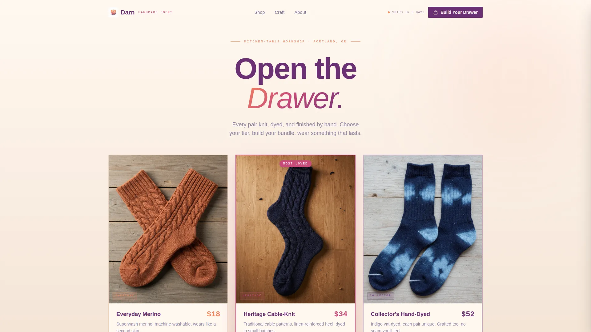
- A three-card price-anchored header with flat-lay product photography slots, tier labels, and a "Most Loved" highlight on the center card
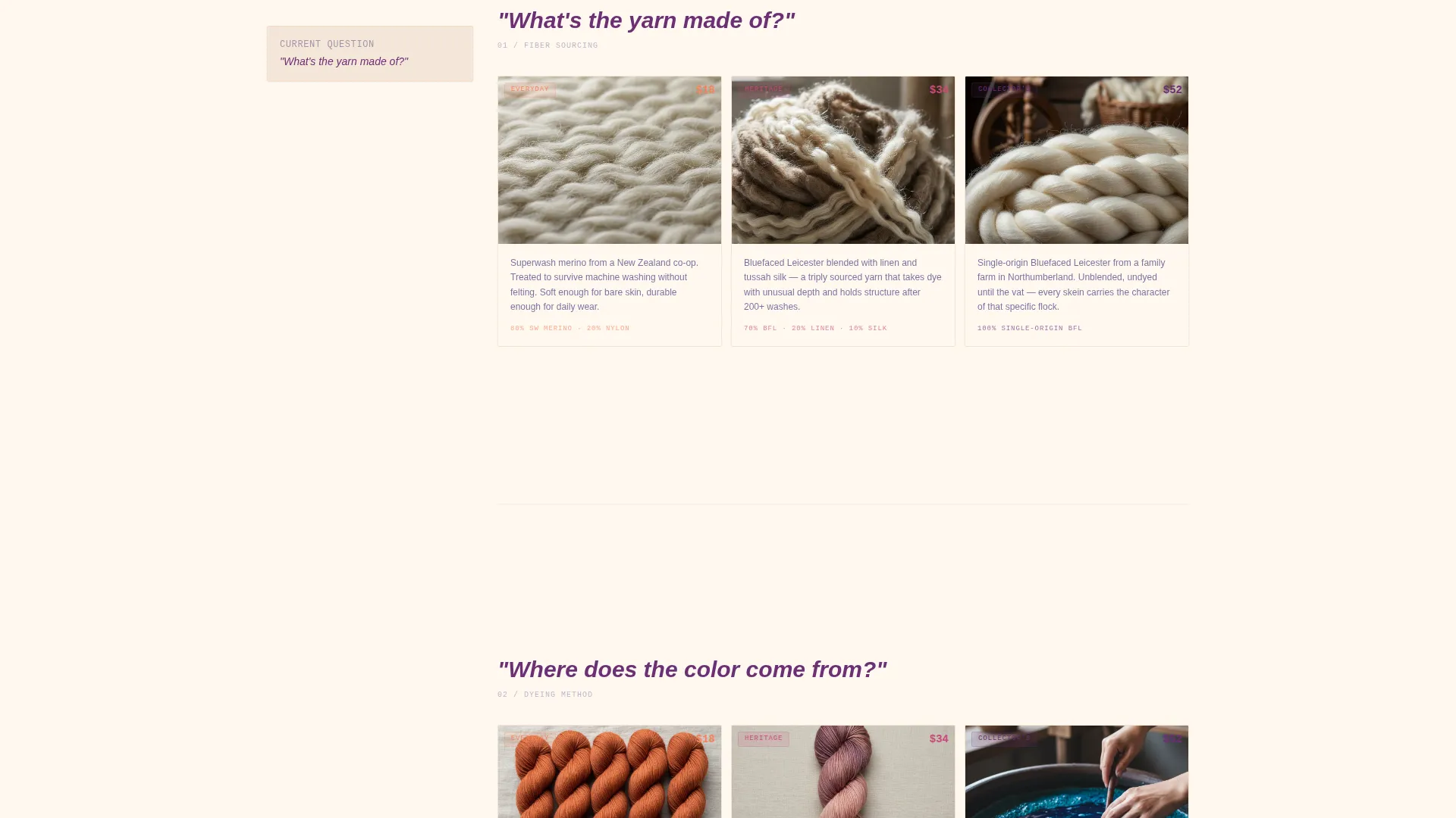
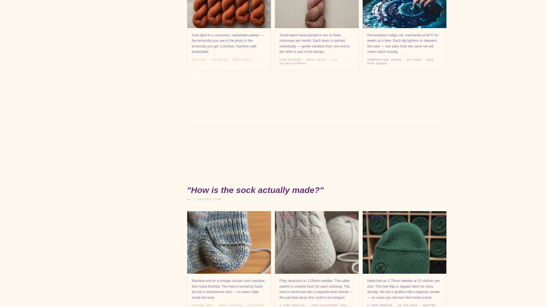
- Layered Comparison Journey sections that unpack fiber sourcing, dyeing method, and construction technique with side-by-side close-up card pairs
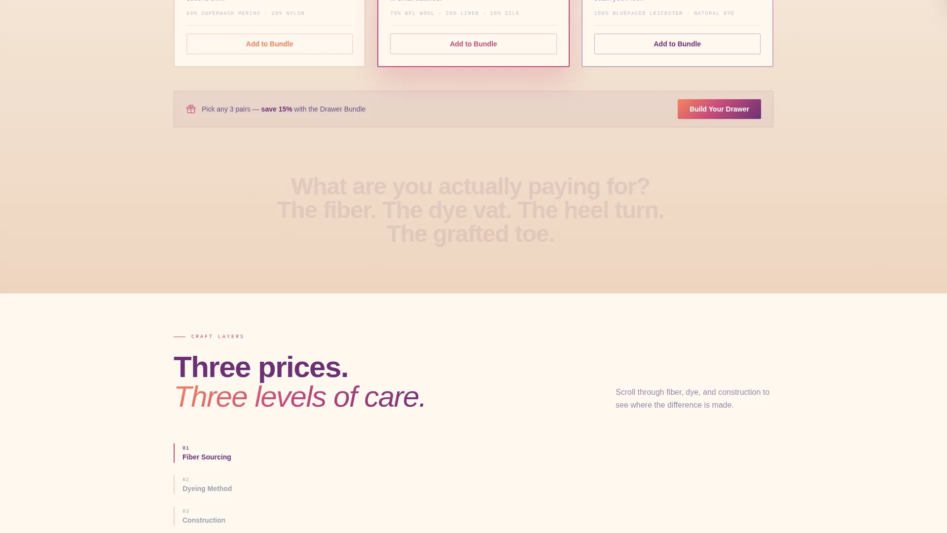
- A drawer-builder flow with live bundle discount recalculation and per-card "Add to Bundle" buttons alongside the primary "Build Your Drawer" call to action
Feature list
This template delivers six core capabilities drawn directly from the design brief.
Price-Anchored Three-Card Header
Three oversized product cards sit side by side at the top of the viewport. Each card holds a flat-lay sock photograph on raw wood, a tier name, and a clear price. The center card is slightly elevated and bordered in rosehip with a "Most Loved" tag, creating an instant visual anchor for the mid-tier.
Comparison Journey Scroll Sections
Below the header, each section unpacks one craft layer: fiber sourcing, dyeing method, and construction technique. Side-by-side close-up cards show how the Everyday, Heritage, and Collector tiers differ at each stage. The visitor watches the care gap widen with every scroll, making the premium tier feel earned rather than expensive.
Live Drawer-Builder Bundle Flow
The primary call to action is "Build Your Drawer," which opens a bundle-builder flow directly on the page. Visitors pick any three pairs across the three tiers, and the page recalculates a bundle discount live. This interaction lowers the perceived cost of the Collector tier when combined with everyday picks.
Per-Card Upsell Buttons
Every product card carries an "Add to Bundle" button alongside its price. This micro-interaction feeds directly into the drawer-builder and keeps the upsell path available at every scroll point without interrupting the craft narrative.
Subtle Shipping Urgency Cue
A quiet, persistent reminder reads "Pairs knit this month ship in 5 days." It creates gentle urgency without a countdown clock or high-pressure messaging, which fits the artisan tone and keeps the page feeling honest.
Sunset Gradient Modular Card Grid
The layout uses a modular grid of cards styled in a sunset gradient palette. Apricot and rosehip wash across section backgrounds, plum anchors headlines and tier labels, twilight navy grounds the footer, and linen white keeps each product card breathable. The system is consistent and repeatable across every section.
Page sections overview
| Section | Purpose |
|---|---|
| Price-Anchored Header | Introduce three product tiers with flat-lay photography and clear pricing |
| Fiber Sourcing Cards | Compare raw material quality across Everyday, Heritage, and Collector tiers |
| Dyeing Method Cards | Show the craft difference in color process for each tier side by side |
| Construction Technique Cards | Reveal heel, toe, and seam detail differences between tiers |
| Bundle Builder Flow | Let visitors pick three pairs and see a live bundle discount update |
| Footer and Shipping Cue | Ground the page with contact details and the five-day shipping reminder |
Design & branding system
The visual identity follows a Directory and Discovery theme expressed through a sunset gradient color system. The palette moves from warm apricot at the edges to twilight navy at the center, always shifting the way a west-facing sky does at dusk.
- Core palette: warm apricot (#F4845F), deep rosehip (#C74B7A), dusky plum (#6B3074), twilight navy (#1B1464), and linen white (#FFF8F0) for card backgrounds
- Apricot and rosehip wash section backgrounds in gentle gradients; plum anchors headlines and tier labels; twilight navy grounds footer text; linen white keeps product cards tactile and open
- Flat-lay product photography on raw wooden boards is the only imagery style, keeping the visual focus on knit texture, color, and craft detail
Mobile & speed optimization
The modular card-grid structure is built to reflow cleanly across screen sizes. Cards that sit side by side on a wide viewport stack vertically on smaller screens without losing the comparison logic.
- Three-column header cards collapse to a single-column stack on mobile, preserving the tier labels, prices, and "Most Loved" callout
- Comparison Journey sections reorder to show each tier's close-up card in full width before the next craft layer appears, keeping the scroll narrative intact
- The drawer-builder flow and "Add to Bundle" interactions are designed to remain accessible and functional within the same single-page layout on any device
How this template helps you convert
This template is structured around a deliberate purchase psychology. Every design and layout decision moves the visitor one step closer to adding a bundle to their drawer.
- The price-anchored header sets a mental range immediately, making the Collector tier feel reachable once the bundle discount is applied, and the "Most Loved" tag on the center card guides first-time buyers toward a safe starting point.
- The Comparison Journey builds perceived value scroll by scroll, so by the time a visitor reaches the bundle-builder, they already understand why a hand-dyed, grafted-toe sock costs more and they feel good about it.
- The live bundle discount recalculation removes the mental math barrier and gives buyers a tangible reward for mixing tiers, which increases average order size naturally.
Other information about this template
This template sits at intersection score 9 out of 10 for the artisan socks and hosiery retail category. It was designed with the Comparison Journey creative direction and the Directory and Discovery theme, which means it prioritizes informed browsing over impulse buying. The layout style follows an overlap and layered card approach, and the landing page direction is click-through, guiding visitors toward a single decisive action at each scroll depth.
- The template is a single-page landing page, not a multi-page website, so all product tiers, craft comparisons, and the bundle builder live within one continuous scroll
- The "Pairs knit this month ship in 5 days" urgency cue is baked into the footer section as static copy, requiring no external timer or plugin
- This template is well suited for seasonal collections, limited colorway drops, or gift-season pushes where craft storytelling is more persuasive than discount codes alone
Theme
Directory & Discovery
Creative direction
Comparison Journey
Color system
Cloud Canvas
Style
Overlap/Layered
Direction
Click-Through
Page Sections
Price-anchored Three-card Header
Comparison Journey Scroll Sections
Live Drawer-builder Bundle Flow
Per-card Upsell Buttons
Subtle Shipping Urgency Cue
Sunset Gradient Modular Card Grid
Related questions
Can I change the three product tiers to match my own sock lineup?
Does the bundle-builder flow require any external tools or plugins?
Is this template suitable for a gift-market campaign?
Can I use this template for a limited-edition colorway drop?
What photography style works best with this template?



