Local Brick & Mortar Business Professional Website Template
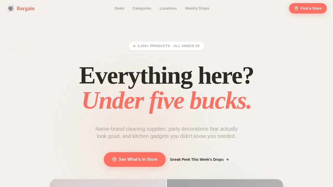
The Bargain Surprise & Delight Dollar Store landing page template is a scroll-reveal, single-page experience built for discount and dollar store retailers. It combines a dramatic Before/After hero slider, animated product grids, customer haul carousels, and a sticky call-to-action bar to turn curious visitors into eager shoppers. Every section is designed to feel like opening a new aisle, bright, fast, and full of irresistible finds under five dollars.
by Rocket studio
Quick summary
The Bargain Surprise & Delight Dollar Store landing page template is a high-energy, scroll-reveal single page built to drive foot traffic and weekly email signups for discount and dollar store retailers. It opens with a draggable Before/After hero slider, cascades through animated product grids and customer haul photos, and closes with a sticky coral call-to-action bar that keeps the store visit one tap away anytime a visitor is ready.
Who this template is for
This landing page was designed for discount store owners and local retail operators who need to prove value fast and convert mobile browsers into in-store shoppers. It fits neatly into the Retail and E-Commerce space, specifically for Local Brick and Mortar businesses selling everyday goods at accessible prices.
- Budget-conscious families, college students furnishing first apartments, and small party planners who search for deals every week
- Dollar store and discount store owners who want a modern, eye-catching landing page without a lengthy setup
- Retail operators ready to launch a fresh digital presence and capture weekly flyer subscribers anytime they push new drops
What problem this template solves
Most people who walk past a dollar or discount store have no idea what treasures are waiting on the shelves that week. A plain, cluttered store website does nothing to spark curiosity or urgency. This landing page solves the discovery gap by making the shopping experience feel alive before visitors ever leave home.
- Visitors lose interest when they cannot see real products, real prices, or real proof that the store is worth the trip
- Discount stores often struggle to speak to their shoppers in a tone that feels fun and trustworthy at the same time
- Without a clear call to action and a way to submit their email, interested shoppers leave and never come back
What you get with this template
This template delivers a complete, production-ready landing page layout with every section pre-built and ready to fill with your own content. You get a polished, animated page that earns trust and drives clicks from the very first scroll, anytime you share the link.
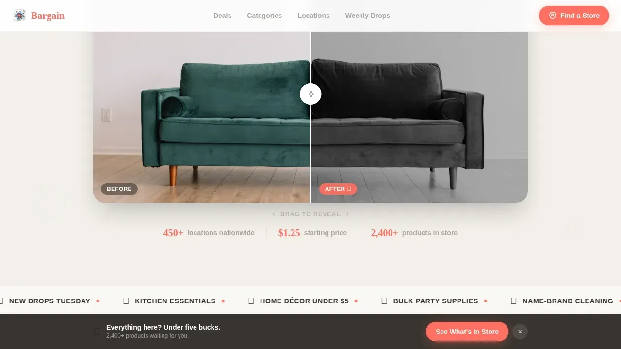
- A draggable Before/After hero slider, animated product silhouette grid, customer haul photo carousel, category bento tiles, and an email capture section with a sticky bottom call-to-action bar
- A Playful Geometric visual identity using the Cloud Canvas color system: soft cloud white, pencil-sketch gray, sky-window blue hover states, and warm pop-coral price callouts and buttons
- Scroll-reveal animations powered by Intersection Observer, geometric shape rotations, and an animated counter all built into the layout so you can launch without writing a line of code
Feature list
This landing page template is packed with prompt-backed, carefully considered features. Each one was chosen to make discount store shopping feel like an event worth showing up for. Here is a closer look at what is included.
Draggable Before/After Hero Slider
The header opens with a split-screen slider. The left side shows a muted, empty apartment corner. Drag right and a fully styled space explodes into view, complete with throw pillows, wall art, organiser bins, and fairy lights, each piece tagged with a floating $1.25 label. A handwritten-style headline fades in as the slider moves, anchoring the brand message instantly. This is an amazing way to speak the store's value proposition without a single word of explanation.
Scroll-Reveal Product Grid with Animated Counter
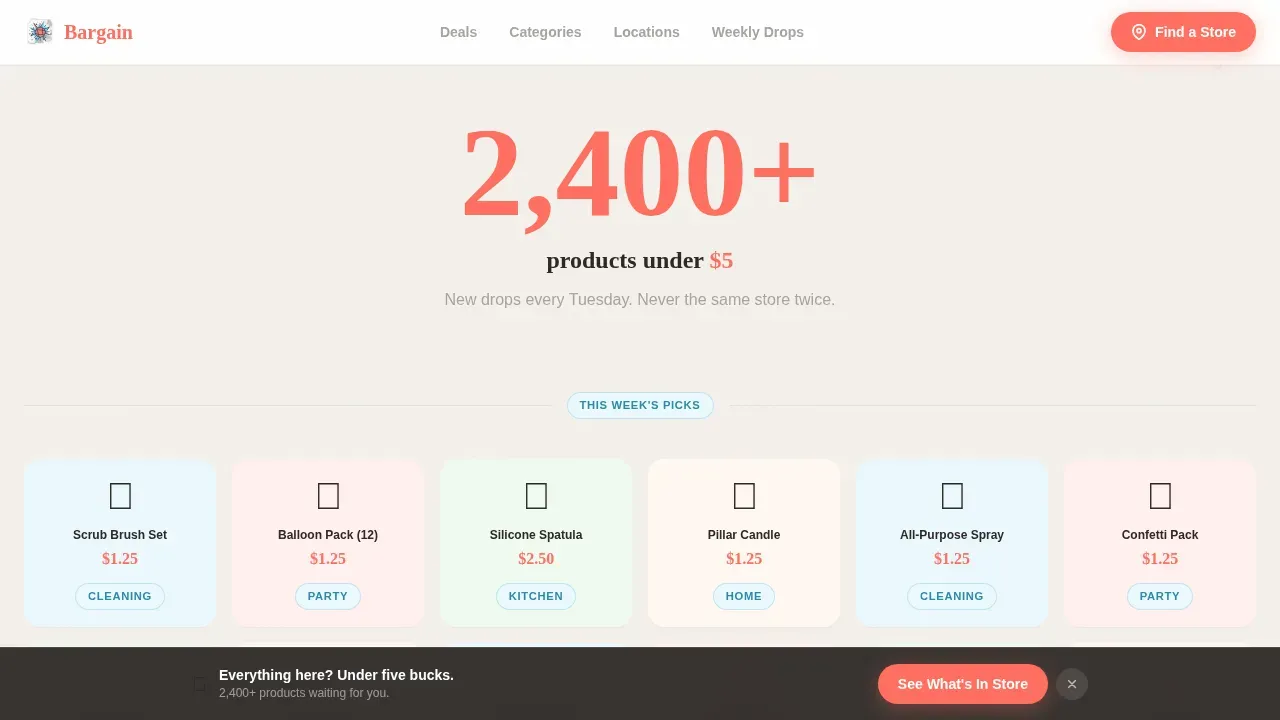
As visitors scroll, product silhouettes fill with color and price tags in real time. An animated counter ticks upward to display "2,400+ products under $5," making the store's scale feel tangible and exciting. The Intersection Observer approach means each reveal fires at exactly the right moment, keeping the page feeling alive anytime a new row enters the viewport. This section is a helpful visual tool for communicating discount depth at a glance.
Customer Haul Carousel with Social Proof
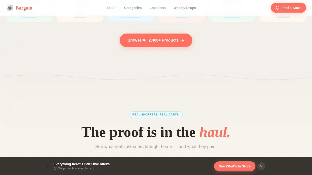
A rotating carousel shows real shopping cart photos, each tagged with a total spent, for example, "This entire cart: $22.50." These testimonials do the heavy lifting that reviews and written endorsements often struggle to deliver. Real haul stories speak directly to budget-conscious shoppers and answer the unspoken question: is this store actually worth the trip? Social proof like this builds trust faster than any headline.
Category Bento Grid with Geometric Bursts
Four asymmetric category tiles, Cleaning, Party, Kitchen, and Home, appear with geometric burst animations on scroll. Each tile uses sky-window blue badges and pencil-gray outlines, keeping the layout modern and easy to scan. The bento grid format lets visitors quickly find the category most relevant to their week's shopping plan, whether that is stocking up on food storage, party decorations, or cleaning supplies.
Sticky Bottom Call-to-Action Bar and Email Capture
The primary call-to-action, "See What's In Store," appears beneath the hero slider and again as a sticky bar after the second scroll section. It links directly to the store locator and weekly deals page. A secondary call-to-action, "Sneak Peek This Week's Drops," captures an email in a single field so visitors can submit their address anytime and receive the weekly flyer. This dual approach means the page serves both walk-in shoppers and repeat digital visitors.
Playful Geometric Animation System
Geometric triangles, circles, and squiggly dividers float between sections like confetti frozen mid-air. Shapes rotate and bounce subtly on scroll, delivering a toy-store kinetic energy that keeps fingers swiping and eyes engaged. The animation system uses CSS transforms only, keeping the page feeling fast and smooth across devices.
Page sections overview
| Section | Purpose |
|---|---|
| Hero Slider | Drag to reveal styled room with $1.25 price tags and headline |
| Product Reveal Grid | Silhouettes fill with color and price on scroll |
| Animated Deal Counter | Ticks up to show 2,400+ products under $5 |
| Customer Haul Carousel | Cart photos tagged with total spend for social proof |
| Category Bento Tiles | Four category tiles with geometric burst animations |
| Email Capture Section | Weekly flyer signup with single-field email form |
| Sticky call to action Bar | Persistent bottom bar linking to store locator and deals |
| Footer Row | Linear single-row footer with essential store links |
Design & branding system
The visual identity follows a Playful Geometric theme using the Cloud Canvas color system. The palette feels like a freshly opened sketchbook where someone has started doodling sale signs in colored pencil, light, airy, and impossible to take too seriously. Every color has a job, and every shape has a reason to be there.
- Cloud white (#F4F1EB) as the dominant background, pencil-sketch gray (#A8A4A0) for body text and thin geometric outlines, sky-window blue (#7EC8E3) on hover states and category badges, and warm pop-coral (#FF6F61) reserved exclusively for price callouts and call-to-action buttons
- Typography pairs Plus Jakarta Sans for body and interface text with Fraunces for display headlines, giving the page a handwritten-display feel that matches the Surprise and Delight creative direction
- Geometric triangles, circles, and squiggly section dividers in pencil gray float throughout the layout, adding visual rhythm without cluttering the store's core message
Mobile & speed optimization
This landing page is designed mobile-first, which makes sense given that the primary shoppers, budget moms, college students, and party planners, are almost always browsing on their phones. Every section stacks cleanly on small screens, and the scroll-reveal animations are timed to feel natural on touch devices anytime a visitor swipes through.
- Scroll-reveal animations use Intersection Observer so elements only activate when they enter the viewport, keeping the experience smooth on both modern phones and older devices
- The sticky call-to-action bar is sized for thumb-friendly tapping, and the email capture field is a single line so users can submit without friction
- CSS transforms power all geometric shape animations, avoiding layout reflows and keeping visual engagement high without heavy overhead
How this template helps you convert
An effective landing page captures attention with a compelling value proposition that speaks directly to what the visitor needs. This template is engineered to guide visitors down a clear, frictionless path toward a single action: visiting the store or signing up for the weekly flyer. Every scroll section stacks proof on top of proof until the visitor feels genuine FOMO about not being inside the store right now.
- The Before/After slider and animated product grid prove value visually before a single word of copy is read. By the time visitors reach the first call-to-action, they have already seen dozens of products at prices that feel like a glitch, making the click feel obvious rather than effortful.
- Customer haul photos, cart totals, and the animated deal counter work together as layered social proof. Using testimonials and reviews on landing pages helps build trust and significantly influences purchasing decisions, and this template puts that principle to work in every scroll section.
- The sticky call-to-action bar ensures the store visit prompt is visible anytime a visitor pauses, scrolls back, or takes a moment to think, removing the need to hunt for the next step and keeping the conversion path clean.
Other information about this template
This template is a strong starting point for any dollar or discount store that wants to stand out in search results and attract more weekly shoppers. There are several additional details worth knowing before you launch.
- Using free templates like this one is often faster than building a landing page from scratch. No-code tools allow users to build landing pages without extensive technical knowledge, so setup is straightforward.
- AI tools can generate landing page copy quickly to fill this template, making it easier to overcome writer's block and get your store online faster. AI can assist in creating interactive and personalized landing pages that feel tailored to your specific audience.
- Offering discounts and promoting free finds each week is an effective way to retain customers and encourage repeat visits. Customer engagement strategies are essential for retaining customers and increasing their lifetime value, and this landing page is built to support that goal week after week.
- The email capture section helps you build a direct line to your shoppers. Personalized marketing tactics, like a weekly flyer sent to your list, can significantly improve engagement and keep your store top of mind.
- Many successful landing pages combine click-through elements and lead generation forms, which is exactly what this template does. The primary call-to-action drives foot traffic while the secondary call-to-action grows your email list anytime someone is not yet ready to visit in person.
- Platforms like Rocket.new make it possible to build full, production-ready apps and websites from natural-language prompts, which means you can use this template alongside modern no-code software and free landing page builder tools to launch even faster.
- HubSpot's Landing Page Builder provides a drag-and-drop website builder with free landing page themes and templates, making it a helpful companion tool for companies that want to test different versions of their page and optimize over time.
- This bargain surprise delight dollar store landing page template is suited to discount retailers who want an amazing first impression in search results. It is one of several templates designed specifically for the Retail and E-Commerce category, and it pairs well with weekly promotional campaigns, in-store signage that mentions the site address, and social media posts that link back to the page.
- Beauty, food, home, and party product categories can all be highlighted using the bento tile section, making this template versatile beyond the core dollar store niche.
- Partnerships with local community groups, family-friendly organisations, or neighborhood associations can be promoted through the email capture section to grow the subscriber list quickly.
- A/B testing different versions of the hero headline or call-to-action button copy is a straightforward way to optimize conversion rates over time. Test at least two versions before settling on your final messaging. Good reviews and honest testimonials added to the carousel section will further strengthen trust and address any complaints or hesitations shoppers might have.
- If your store has a phone number or a physical address, include both in the footer row so visitors can find you anytime without having to search further.
Theme
Playful Geometric
Creative direction
Surprise & Delight
Color system
Cloud Canvas
Style
Scroll Reveal (Progressive)
Direction
Click-Through
Page Sections
Draggable Before/after Hero Slider
Scroll-reveal Product Grid and Counter
Customer Haul Photo Carousel
Asymmetric Category Bento Grid
Sticky Call to Action Bar and Email Capture
Playful Geometric Animation System
Related questions
Can I edit the colors and fonts to match my store's brand?
Does this template include the Before/After slider out of the box?
Is this landing page suitable for mobile shoppers?
How does the email capture section work?
Can I use this template if I have no coding experience?



