Franchise Consulting Advanced Booking Website Template
Dealmaker is a single-page franchise broker landing page template built for elite franchise consultants. It combines a commanding manifesto header, a scrolling logo wall, a three-column comparison table, anonymized case study blocks, and a two-step booking form. Every section is designed to turn a qualified executive's curiosity into a confirmed strategy call.
by Rocket studio
Quick summary
Dealmaker is a high-authority franchise broker landing page template built around one goal: earning the strategy call. It opens with a typographic manifesto, rolls through social proof via a logo wall, makes the case through a side-by-side comparison table, and closes with anonymized deal tombstones. The two-step booking form converts intent into a confirmed calendar slot.
Who this template is for
This template is built for franchise brokers and franchise consultants who work with serious, investment-ready buyers. It speaks directly to a broker whose clients arrive with capital, credentials, and a clear exit from corporate life.
- Franchise brokers placing mid-career executives with $150K or more in liquid capital
- Consultants serving multi-unit operators who are scouting additional brands for an existing portfolio
- Independent franchise advisors who want their page to carry the weight of their track record
What problem this template solves
Most franchise broker pages look like brochures. They list services, add stock imagery, and hope the visitor calls. That approach fails with the exact audience this broker serves, which is experienced, skeptical, and comparison-shopping with real money on the line.
- Visitors leave without understanding why a broker adds value over solo research
- The broker's access to off-market deals and vetting process goes invisible on a generic page
- High-intent buyers have no frictionless path from interest to a booked conversation
What you get with this template
You get a complete, structured landing page ready to represent a premium franchise consulting practice. Every section has a specific job, and together they build the credibility stack a serious buyer needs before committing thirty minutes of calendar time.
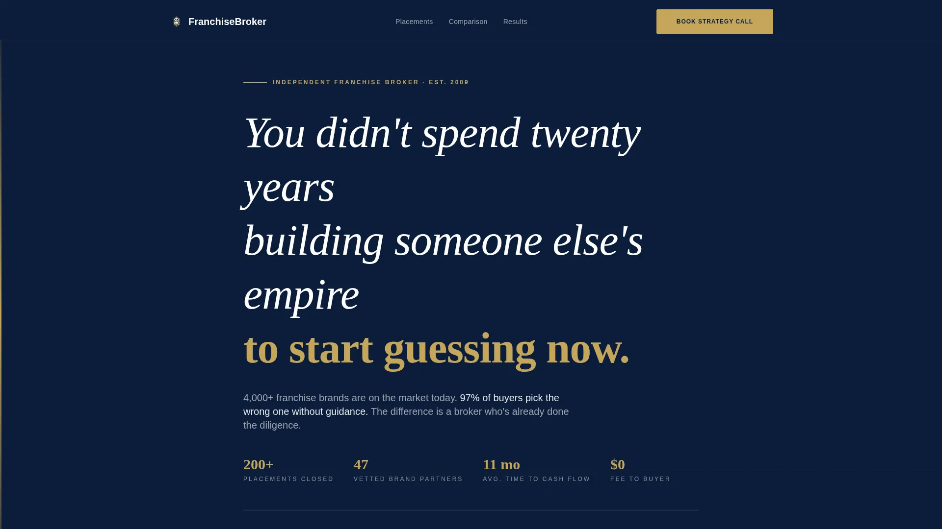
- A Quote/Manifesto header section with bold white typography on deep navy, no imagery required
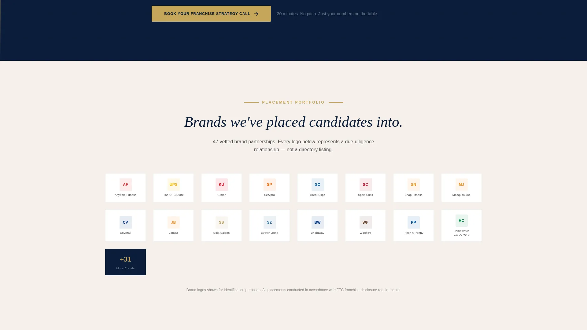
- A grayscale-to-color logo wall that animates on scroll to surface brand placement history
- A three-column comparison table, three anonymized case study blocks, and a two-step progressive booking form
Feature list
This section covers the core functional and design components included in the template.
Typographic Manifesto Header
The header opens with a full-width navy panel and white display type. No photography, no illustration. The headline and a single line of subtext do all the work, establishing authority through restraint. This is where the visitor decides whether the broker is worth their time.
Scroll-Activated Logo Wall
A grid of franchise brand logos sits immediately below the manifesto. Logos render in muted grayscale on load, then shift to full color as the visitor scrolls past each one. Each logo functions as a silent proof point of the broker's placement history.
Three-Column Comparison Table
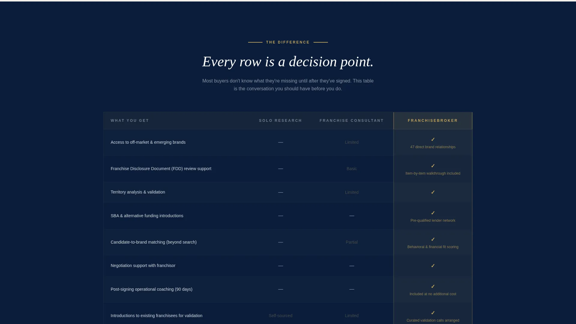
The comparison table sets three columns side by side: Solo Research, Franchise Consultant, and Working With the Broker. Rows cover access to off-market brands, Franchise Disclosure Document (FDD) review support, funding introductions, and post-signing operational coaching. The brushed gold accent highlights the broker's column throughout.
Anonymized Case Study Blocks
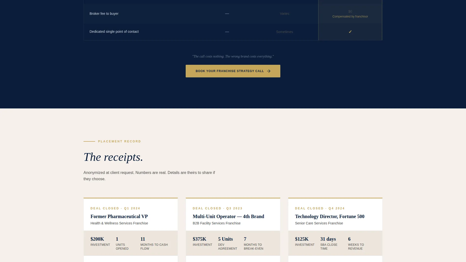
Three deal tombstone paragraphs appear below the comparison table. Each reads like a brief deal summary: a role, an investment figure, and a result. For example, a former pharma VP investing $200K who reached cash-flow positive in eleven months. They serve as evidence without naming names.
Two-Step Progressive Booking Form
The primary call to action is a booking form that qualifies before it schedules. Step one collects investment range via dropdown ($50K to $100K, $100K to $250K, or $250K and above), target timeline, and geographic preference. Step two reveals the calendar embed. There is no email-only path.
Repeating Call-to-Action Placement
The "Book Your Franchise Strategy Call" button appears three times across the page: beneath the manifesto, after the comparison table, and after the case studies. Repetition meets the visitor at each decision point without feeling aggressive.
Page sections overview
| Section | Purpose |
|---|---|
| Manifesto Header | Opens with authority using headline and subtext only |
| Logo Wall Grid | Demonstrates brand placement history on scroll |
| Comparison Table | Contrasts three paths to franchise ownership |
| Case Study Blocks | Provides anonymized deal evidence |
| Primary Booking Form | Qualifies visitor then reveals calendar |
| Mid-Page call to action | Repeats booking prompt after comparison table |
| Final call to action Block | Closes page with a third booking prompt |
Design & branding system
The Executive Suite visual identity is built around the Navy Authority color palette. Every color choice reinforces the message that decisions made here carry real financial weight.
- Boardroom navy (#0B1D3A) and polished charcoal (#2C2C2C) form the primary surface and text palette, grounding the page in corporate authority
- Ivory linen (#F5F0EB) provides contrast and breathing room without softening the tone
- Brushed gold (#C5A55A) is reserved strictly for call-to-action buttons, comparison table highlights, and credential badges, giving it maximum visual impact
Mobile & speed optimization
The layout is structured to read clearly on any screen size. A page targeting corporate executives must perform on mobile, since a significant share of that audience reviews content on a phone between meetings.
- The manifesto header, comparison table, and booking form are each designed with a single-column mobile reflow in mind
- The progressive two-step form keeps mobile interactions short and focused, reducing drop-off before the calendar appears
How this template helps you convert
Every section is sequenced to reduce the visitor's perceived risk and raise the perceived cost of not booking.
- The manifesto header establishes stakes immediately, naming the odds (97% of buyers choose incorrectly without guidance) before asking for anything.
- The logo wall and comparison table stack proof of access and process, so by the time the visitor reaches the booking form, the broker's value is already demonstrated rather than claimed.
- The three repeated call to action placements and the two-step form qualification flow work together to turn a high-intent visit into a confirmed franchise strategy call with minimal friction.
Other information about this template
This template is built specifically for the franchise consulting niche inside the broader professional services category. It is a single landing page, not a multi-page site, so all conversion work happens in one focused scroll.
- The template style is a comparison table layout, which is particularly effective when buyers arrive already comparing options
- The header concept is a Quote/Manifesto, meaning the page leads with perspective and conviction rather than a product pitch
- The creative direction is a Logo Wall Authority approach, using brand recognition as the primary visual trust signal
- The booking and scheduling direction means the entire page is oriented toward one conversion event: a completed calendar booking
- This template fits franchise brokers who represent multiple brands and need to demonstrate breadth of access rather than depth on a single opportunity
Theme
Executive Suite
Creative direction
Logo Wall Authority
Color system
Navy Authority
Style
Comparison Table
Direction
Booking/Scheduling
Page Sections
Typographic Manifesto Header
Scroll-activated Logo Wall
Three-column Comparison Table
Anonymized Case Study Blocks
Two-step Progressive Booking Form
Repeating Call to Action Architecture
Related questions
Can I customize the broker name and brand logos in the comparison table?
Does the booking form connect to a calendar tool?
What makes the comparison table effective for this audience?
Is this template suitable for a newer franchise consultant without many case studies?
Can I change the color palette to match an existing brand?



