Decathlon Pricing Website Template
The Decathlon Elite Academy landing page is a card grid template built for multi-event training programs. It pairs a cinematic short-form reel header with a community gallery of athlete story tiles. Ruby and chrome branding, pulsing neon interactions, and a slide-in checkout panel make it easy for visitors to find the right training package and buy in one tap.
by Rocket studio
Quick summary
The Decathlon Elite Academy template is a single-page, modular card grid designed for multi-event athletic training programs. It opens with a looping twelve-second reel, flows into a community-proof gallery, and closes every section with a direct purchase path. The visual identity runs on a deep charcoal, chrome, and ruby palette that feels like a sports instrument cluster at night.
Who this template is for
This template is built for coaches, academies, and training programs that teach multiple track-and-field disciplines under one roof. It works best when the offer involves tiered packages and the audience spans several competitive levels.
- High school athletes chasing state qualifying marks across multiple events
- Masters competitors and former college specialists returning to the sport
- Decathlon academies selling structured training packages with clear pricing tiers
What problem this template solves
Most training program pages look like brochures. They list services without building conviction. Visitors leave before they reach the price because there is nothing pulling them through the scroll. This template solves that by weaving athlete proof directly into the product grid, so every price card is surrounded by real results.
- Generic program pages fail to communicate the energy and credibility of a multi-event training environment
- Visitors bounce when pricing appears without surrounding context or social proof
- A disconnected checkout flow adds friction and loses buyers at the final step
What you get with this template
You get a fully structured single-page layout with a defined visual hierarchy. Every section has a clear role: attract, prove, and convert. The layout is modular, so cards can be reordered or swapped without breaking the overall rhythm of the page.
- A cinematic looping video header with timed text reveal after the first full reel cycle
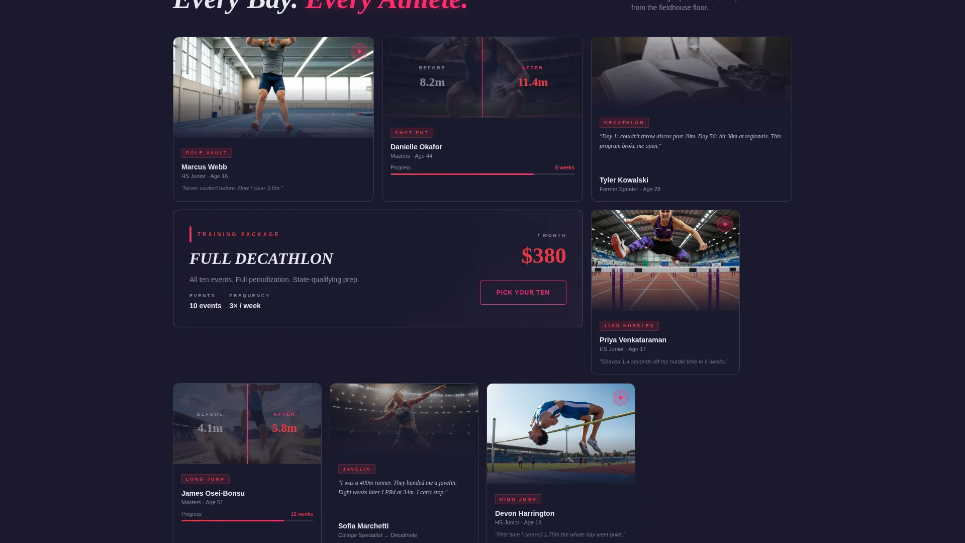
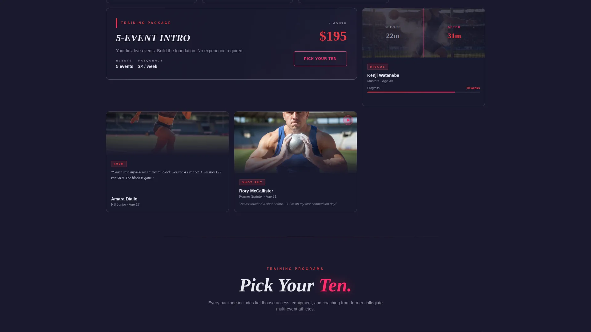
- A modular community gallery grid mixing training clips, personal record splits, and journal quote cards
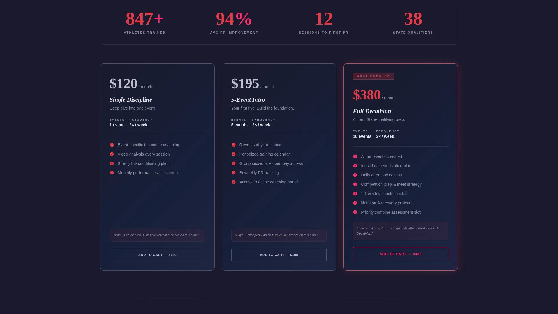
- Package purchase cards with pricing, session details, and a slide-in checkout panel trigger
Feature list
A brief overview of the core capabilities built into this template.
Cinematic Short-Form Reel Header
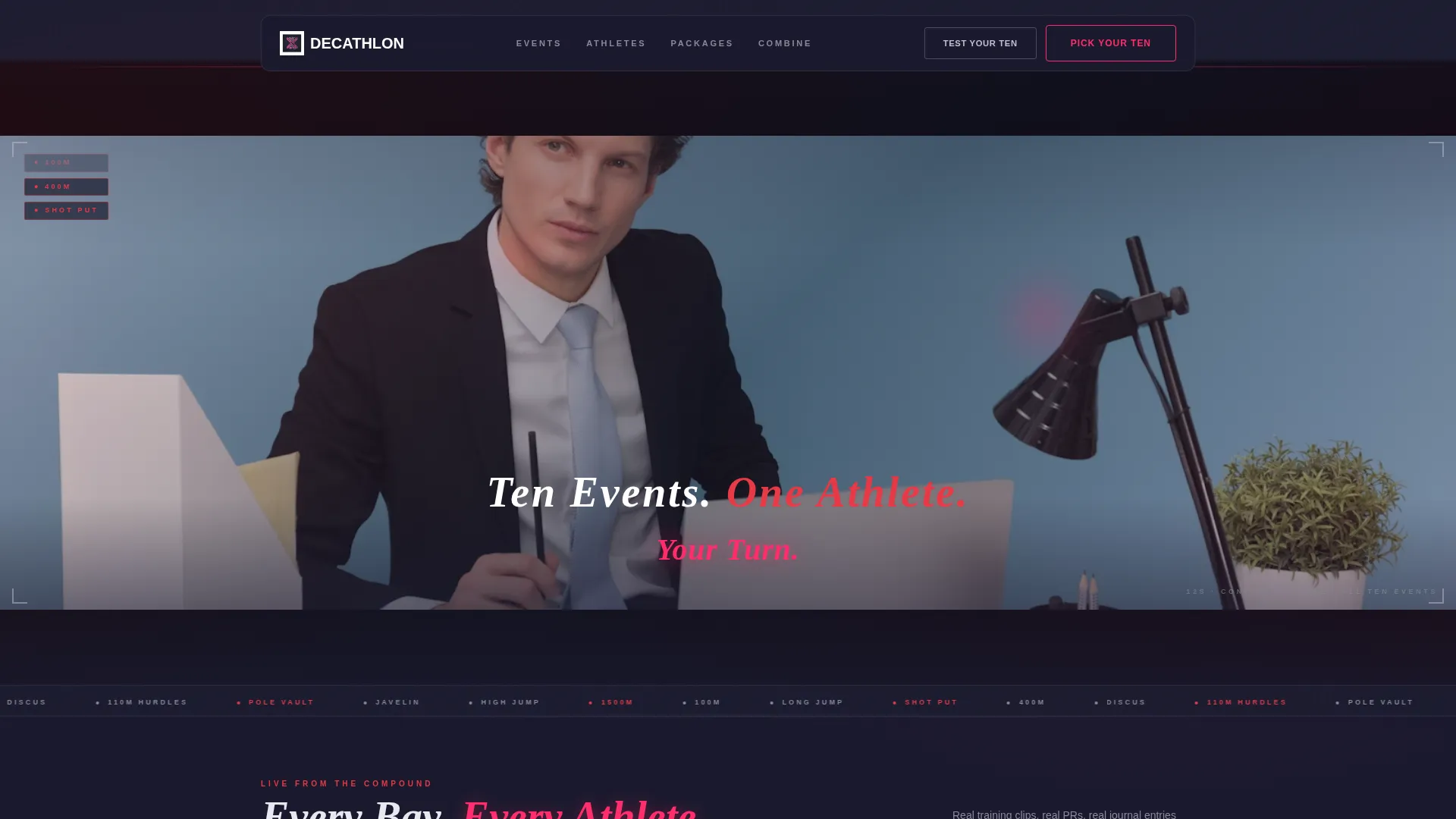
The header houses a vertical-ratio video letterboxed into a widescreen cinematic frame. The reel loops at twelve seconds. Text appears only after the first full cycle, revealing the line "Ten Events. One Athlete. Your Turn." The audio layer uses breathing, impact sounds, and a sub-bass pulse synced to each event transition, with no voiceover.
Modular Community Gallery Grid
Athlete story tiles fill the card grid in uniform sizes with varied content formats. Some cards autoplay fifteen-second training clips. Others display before-and-after personal record boards or photographed journal quotes. Wider accent cards break the grid rhythm every few rows to spotlight a training package, creating a pattern of proof followed by offer.
Tiered Training Package Cards
Each package card displays the event count, session frequency, and price in bold ruby type. The primary call to action, "Pick Your Ten," is rendered in neon pink on a chrome-bordered button. The button pulses subtly when it scrolls into view, drawing attention without disrupting the reading flow.
Slide-In Checkout Panel
Tapping "Add to Cart" on any package card triggers a slide-in checkout panel. The purchase completes without redirecting the visitor to a separate page. This keeps the buyer inside the page experience from first scroll to final confirmation.
Free Combine Assessment Form
A secondary conversion path captures name, age group, and current strongest event through a short form labeled "Test Your Ten." The form funnels submitted data into a personalized package recommendation email, giving hesitant buyers a low-commitment entry point before they commit to a paid package.
Ruby and Chrome Interaction System
Chrome dominates card borders and divider lines. Ruby anchors headlines and pricing figures. Neon pink activates on hover and interaction states: buttons glow, cards lift, and progress bars shift color. The deep charcoal background keeps every card visually isolated, like a screen floating in a mission control room.
Page sections overview
| Section | Purpose |
|---|---|
| Reel Header | Opens with a looping cinematic video and timed headline reveal |
| Community Gallery Grid | Displays athlete story tiles mixing clips, records, and journal quotes |
| Package Spotlight Cards | Breaks the grid rhythm to present tiered training package offers |
| Pricing Tier Cards | Shows event count, session frequency, and price with a buy trigger |
| Slide-In Checkout Panel | Completes purchase without leaving the page |
| Combine Assessment Form | Captures athlete details and routes them to a package recommendation |
Design & branding system
The visual identity is built around a Futuristic Neon theme using a four-color Ruby and Chrome palette. Every design decision references the metaphor of a sports car instrument cluster at night: dark surfaces, metallic reflections, and red telemetry data pulsing steadily.
- Deep charcoal (#1A1A2E) as the page shell, keeping cards visually elevated against the background
- Polished chrome silver (#C0C0D0) for card borders, divider lines, and structural accents
- Electric ruby (#E63946) anchoring headlines, pricing figures, and key labels
- Reactive neon pink (#FF2D6B) firing on hover states, active buttons, and progress bar fills
Mobile & speed optimization
The card grid layout is modular by design, which means it adapts cleanly to narrower viewports without restructuring content. Video content in the header is letterboxed, keeping the cinematic ratio intact on any screen size.
- Uniform card sizing across the gallery grid keeps the layout predictable on mobile devices
- The slide-in checkout panel replaces full-page redirects, reducing navigation steps on touchscreens
- Autoplay clips inside gallery cards are scoped to fifteen seconds, keeping media load contained
How this template helps you convert
The page is structured as a proof-then-offer engine. Every product card is preceded by an athlete story tile that builds the case for buying. The layout removes hesitation by placing evidence before the ask.
- The community gallery builds trust before any price appears, so visitors arrive at package cards already warmed by real athlete results from the same program.
- The "Pick Your Ten" button pulses on scroll-into-view and triggers a slide-in checkout panel, reducing the number of steps between decision and purchase.
- The "Test Your Ten" assessment gives undecided visitors a free next step, capturing their details and delivering a personalized recommendation that guides them back to a paid package.
Other information about this template
This template is categorized under Sports and Recreation with a specific focus on decathlon academy and training use cases. It is well suited for programs that sell structured multi-event coaching in tiered formats.
- The template style is a Card Grid with a modular layout, making individual sections easy to update independently
- The header concept is a Short-Form Reel, a format that communicates athletic intensity faster than static imagery
- The creative direction is Community Gallery, which positions real athlete stories as the primary trust signal throughout the page
- The landing page direction is Direct Sales, with every structural decision built to move visitors toward a package purchase
Theme
Futuristic Neon
Creative direction
Community Gallery
Color system
Ruby & Chrome
Style
Card Grid (Modular)
Direction
Direct Sales
Page Sections
Cinematic Reel Header with Timed Text
Modular Community Gallery Grid
Tiered Package Cards with Ruby Pricing
Slide-in Checkout Panel
Free Combine Assessment Path
Ruby and Chrome Interaction States
Related questions
Can I use this template if I only teach a few track events rather than all ten?
How does the slide-in checkout panel work for buyers?
What kind of video works best in the reel header?
Who is the 'Test Your Ten' assessment designed for?
Can the card grid layout be reordered to suit different content volumes?