Parking Structure Construction Professional Website Template
Deck is a split-screen landing page template built for parking structure architecture firms. It opens with an address-input header, guides visitors through a five-step site assessment quiz, and tells project stories as left-panel constraints paired with right-panel resolutions. The Warm Stone color system and Corporate Precision theme give the page the quiet authority of well-engineered concrete.
by Rocket studio
Quick summary
Deck is a single-page template designed for parking structure architecture firms. It combines a location-input header, case study narrative scroll, and a five-step quiz that classifies each visitor's site before any human conversation begins. The Warm Stone palette and 50/50 split-screen layout communicate structural confidence without visual noise.
Who this template is for
This template is built for firms that specialize in parking structure design and engineering. It speaks directly to the professionals who need to earn complex, high-stakes clients before a first meeting.
- Municipal transportation directors negotiating bond financing for public parking infrastructure
- Commercial developers who need maximum stall counts on constrained urban parcels
- Hospital campus planners whose visitors arrive stressed and need intuitive, frictionless parking
What problem this template solves
Parking structure firms struggle to communicate technical depth without overwhelming a non-engineering audience. Generic portfolio pages fail to show how a firm handles site-specific constraints. This template solves that by making the visitor's own project the center of the experience from the first second.
- Visitors cannot immediately see whether the firm understands their specific site constraints
- Case studies presented as static galleries fail to build a logical argument for the firm's capabilities
- Generic contact forms ask for commitment before the firm has demonstrated any value
What you get with this template
You get a fully structured single-page layout that moves a visitor from curiosity to qualified lead through a clear, deliberate sequence. Every section earns the next click before asking for one.
- A location-input header with a muted aerial photograph that subtly responds as the visitor types
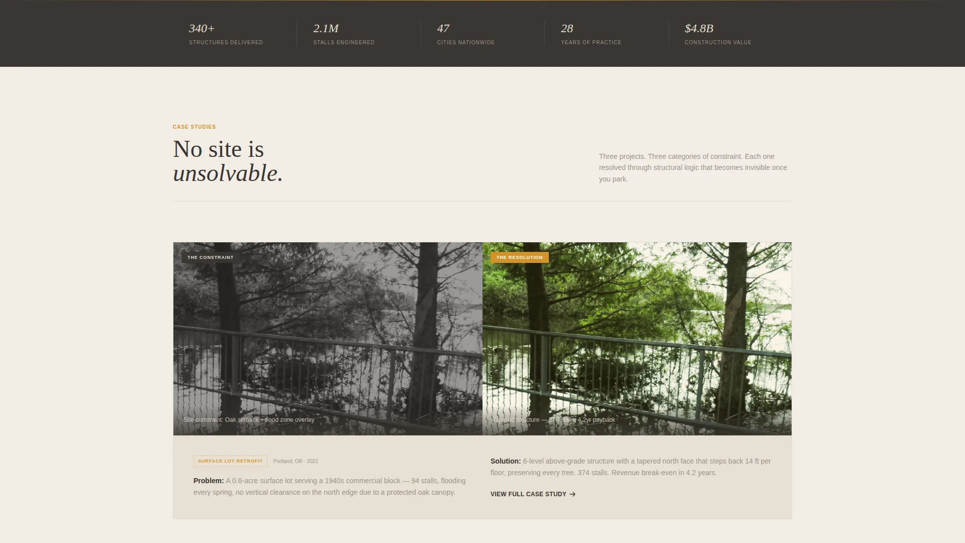
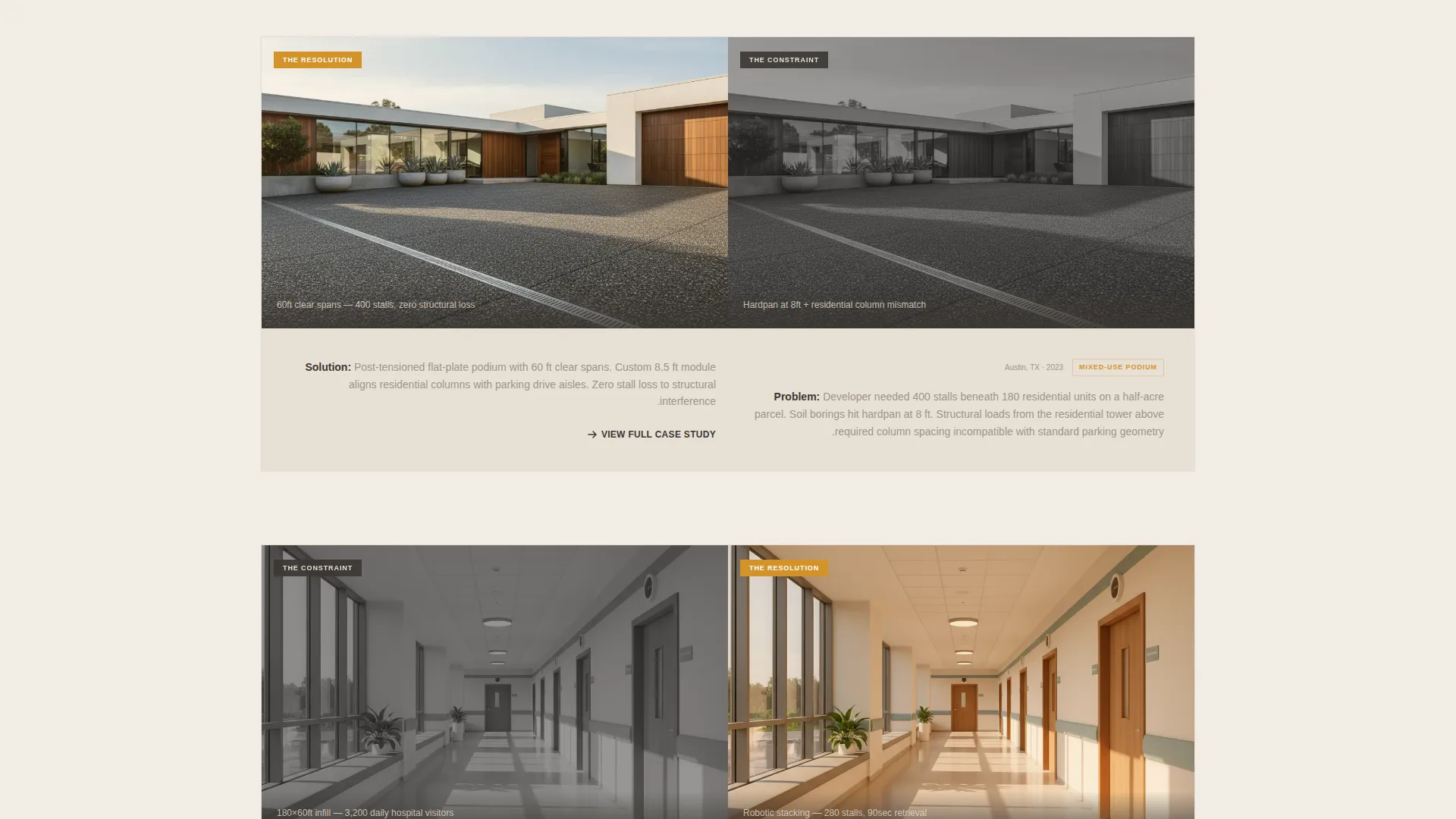
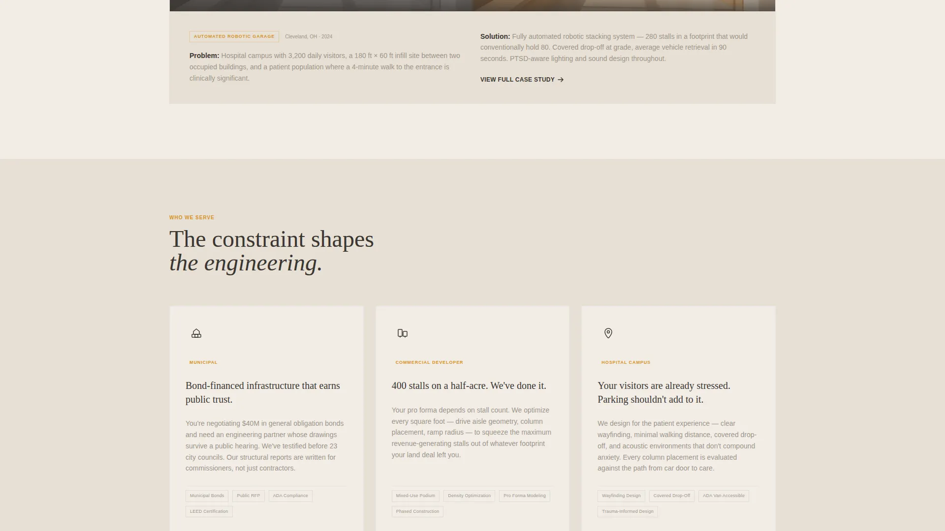
- A scrolling case study section with left-panel site constraints and right-panel project resolutions
- A five-step site assessment quiz with a progress bar, instant site classification, and a call scheduling prompt
Feature list
This template is built around three interlocking mechanics: an interactive header, a narrative case study scroll, and a diagnostic quiz. Together they replace a static portfolio with a consultative experience.
Location-Input Header
The header centers a minimal search field over a muted aerial photograph of a dense urban block. The surrounding image subtly shifts as the visitor types a project address, implying active site analysis. No headline competes with the input. The interaction itself is the hook.
Case Study Narrative Scroll
After the header, the page descends into a sequence of real project stories. Each case study escalates in complexity, moving from a surface lot retrofit to a mixed-use podium to an automated robotic garage. Left panels hold site constraints; right panels reveal the engineered resolution.
Five-Step Site Assessment Quiz
The primary call to action launches a five-step diagnostic. Steps cover project location, required stall count range, site footprint, primary user type, and timeline urgency. Each step appears on a single screen with a progress bar in wayfinding amber, keeping the experience focused and low-friction.
Instant Site Classification Output
The quiz final screen delivers a preliminary recommendation: surface, above-grade, below-grade, or automated. This result proves the firm's engineering logic before any human interaction takes place, earning the visitor's trust and priming them to schedule a feasibility call.
Split-Screen 50/50 Layout
The split-screen structure runs throughout the case study section. One side holds the problem; the other holds the resolution. The format makes complex engineering decisions readable at a glance, even for non-technical clients.
Wayfinding Amber Call-to-Action System
The wayfinding amber accent color is reserved exclusively for calls to action, interactive highlights, and directional cues including the quiz progress bar. This restraint keeps the amber meaningful, guiding the visitor's eye exactly where the page needs it to go.
Page sections overview
| Section | Purpose |
|---|---|
| Location Input Header | Hooks visitors by centering their own project address as the opening interaction |
| Aerial Photo Background | Sets an urban density context that validates the firm's core problem space |
| Case Study: Surface Lot | Opens the narrative sequence with a relatable, lower-complexity project story |
| Case Study: Mixed-Use Podium | Escalates complexity and demonstrates multi-stakeholder design capability |
| Case Study: Automated Garage | Peaks the argument with the most technically demanding project type |
| Quiz Entry call to action | Transitions the visitor from reading to participating with an "Assess Your Site" prompt |
| Quiz Step One | Captures or confirms project location, pre-filled from the header input |
| Quiz Step Two | Collects required stall count range for preliminary classification |
| Quiz Step Three | Records site footprint in square feet to inform structural recommendation |
| Quiz Step Four | Identifies primary user type: daily commuter, visitor, or mixed use |
| Quiz Step Five | Captures timeline urgency to calibrate the feasibility conversation |
| Classification Result Screen | Delivers instant site type recommendation and prompts a feasibility call booking |
Design & branding system
The Warm Stone color system draws from cast-in-place concrete: warm where you expect cold, refined where you expect utilitarian. Every color choice has a structural purpose and nothing is decorative for its own sake.
- Limestone cream (#E8E0D5) and exposed aggregate gray (#9B9489) form the neutral base for backgrounds and body text
- Structural charcoal (#3A3632) anchors headings, panels, and high-contrast interface elements
- Wayfinding amber (#D4922A) is used only for calls to action, the quiz progress bar, and interactive directional cues
Mobile & speed optimization
The 50/50 split-screen layout adapts naturally to narrower viewports by stacking panels vertically. The quiz's single-screen-per-step format is especially effective on mobile, keeping each interaction focused and thumb-friendly.
- Split panels reflow to a single-column stacked layout on smaller screens, preserving the constraint-then-resolution narrative order
- The quiz progress bar remains visible on every step, giving mobile visitors a clear sense of how far they have come and what remains
How this template helps you convert
Conversion here is not about pressure. It is about earning the next step by delivering value at every stage of the scroll.
- The location-input header makes the visitor feel seen before a single word of copy is read, reducing the psychological distance between "browsing" and "engaging with this firm specifically."
- The escalating case study sequence builds a logical argument across three complexity levels, so by the time the visitor reaches the quiz call to action they already believe the firm can solve their problem.
- The five-step quiz delivers a real preliminary recommendation, giving the visitor something concrete to take into their own organization before scheduling a feasibility call, which lowers the commitment barrier significantly.
Other information about this template
This template is a strong fit for parking structure architects who pitch complex infrastructure projects to public-sector and institutional clients. The quiz-first approach suits decision cycles where early trust and demonstrated expertise matter more than a standard contact form.
- The template style is Split Screen (50/50), and the creative direction is Case Study Narrative, making it well suited for firms with a portfolio of varied project types to showcase
- The header concept is Location Input, a pattern that works particularly well for architecture and engineering firms whose services are inherently site-specific
- The landing page direction is Quiz/Assessment, which is ideal for firms whose scope of work depends on site variables that differ significantly from client to client
- The Corporate Precision theme signals reliability and technical authority, which aligns with the trust expectations of municipal and institutional procurement audiences

Theme
Corporate Precision
Creative direction
Case Study Narrative
Color system
Warm Stone
Style
Split Screen (50/50)
Direction
Quiz/Assessment
Page Sections
Location-input Header with Aerial Background
Escalating Case Study Narrative
Five-step Site Assessment Quiz
Instant Site Classification Result
Wayfinding Amber Call to Action System
Related questions
Can I use this template without a portfolio of multiple project types?
Does the quiz deliver a site classification to the visitor automatically?
Who is this landing page template designed to reach?
Can the location-input header work if a visitor skips the address field?



