Professional Organizer Booking Website Template
The Declutter trusted reviews booking landing page template is a single-column, proof-first landing page built for professional organizers. It opens with an animated headline stat, flows through layered social proof, video testimonials, before-and-after photo pairs, and closes with a three-step inline booking form. Every section is designed to convert visitors into booked consultations through calm, functional design.
by Rocket studio
Quick summary
The Declutter landing page is purpose-built for professional organizers who rely on social proof to fill their calendar. It leads with hard numbers, layers in real client stories, and drives every scroll toward a single desired action: booking a free walkthrough. The clean layout, sky-blue call to action buttons, and inline booking form make the entire experience easy for visitors to navigate and act on.
Who this template is for
This landing page template is designed for independent professional organizers and small organizing businesses operating in the United States market. If your value proposition rests on real client outcomes rather than polished marketing language, this template gives that proof the stage it deserves. It understands the target audience on both sides of the transaction: the organizer who needs bookings, and the overwhelmed homeowner who needs to trust before they commit.
- Professional organizers looking to convert visitors through social proof and booking tools
- Service providers whose target audience includes busy parents, downsizing retirees, and small business owners with chaotic back offices
- Organizers ready to move past a generic web page and into a high converting landing page built around client results
What problem this template solves
Most professional organizer pages lead with a pitch. They describe the service, explain the process, and then ask for trust. That sequence does not work well for a target audience already paralyzed by overwhelm. This landing page flips the order. It leads with social proof, aggregate stats, and real client voices, so potential customers arrive at the booking form already convinced. The page eliminates the distraction of a busy navigation bar and keeps every element pointed toward one clear conversion goal.
- Visitors leave before booking because the page fails to establish instant credibility early enough in the scroll
- The pain point of clutter is emotional, not logical, so generic copy fails to connect with overwhelmed site visitors
- A complicated or multi-page booking flow raises entry barriers and causes drop-off before the appointment is confirmed
What you get with this template
This landing page template includes five fully structured sections, each built to move a potential customer one step closer to booking. You get a proof-first hero, an anchored stats-and-testimonials band, a before-and-after gallery, a video testimonials block, and a three-step inline booking form with a linear single-row footer. Every component reflects a distraction free design philosophy: clean layout, abundant white space, and a clear value proposition at every scroll depth.
- Animated headline counter, sky-blue stat pills, and a prominently displayed primary call to action above the fold
- Layered social proof sections including video testimonials, testimonial cards, before-and-after photo pairs, and a live running review counter
- Three-step inline booking form covering zip code, room type selection, and a live calendar picker for real-time scheduling
Feature list
This landing page template is built around a specific set of high-converting features. Each one is grounded in the source brief and chosen to serve the professional organizer's core goal: earning the booking before the visitor scrolls away.
Animated Proof-First Hero Section
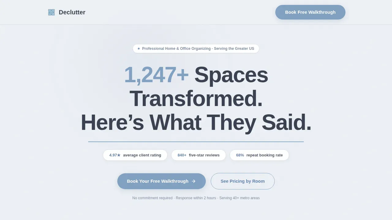
The hero opens with a giant centered headline and an animated counter that ticks upward on page load before settling on the total spaces transformed figure. Below it, a thin sky-blue rule separates the headline from three horizontal stat pills showing average client rating, total five-star reviews, and repeat booking percentage. This benefit focused headline and stat display establishes instant credibility without a single word of self-promotion. Clear messaging at the top of the landing page helps guide visitors toward the desired action before any pitch is made.
Stats-Anchored Testimonial Cards
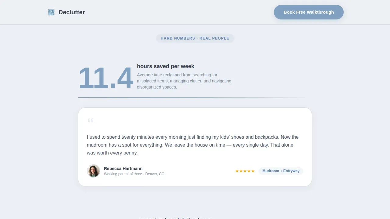
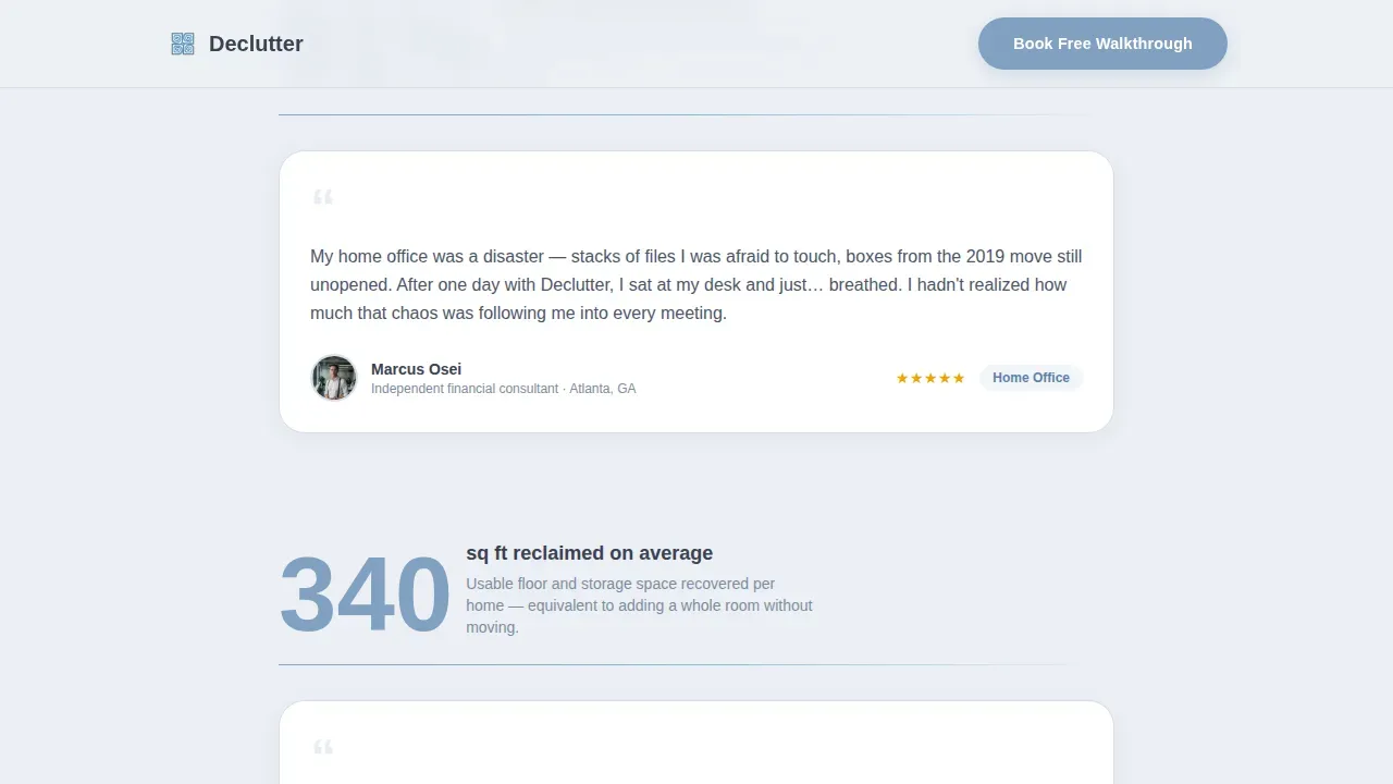
The first scrollable section surfaces three impact statistics, each one anchored directly to a real client testimonial card beneath it. Average hours saved per week, percentage of clients who report reduced daily stress, and square footage reclaimed are each paired with a specific client story. This pairing makes the data feel human and the testimonials feel verifiable. Specific details in testimonials, including results and numbers, are far more compelling than vague praise, and this section is built on that principle.
Before-and-After Photo Gallery
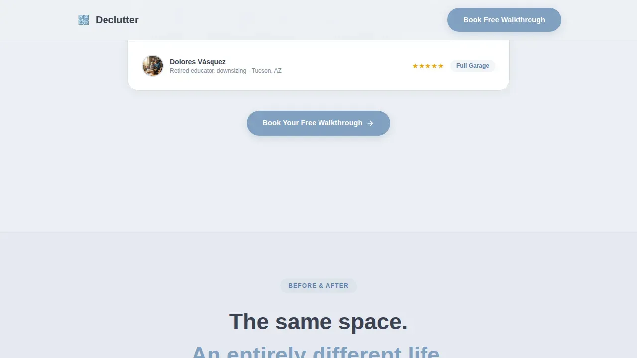
Rotated photo pairs slide in as the visitor scrolls, each pair stamped with a turnaround timestamp that shows how quickly results were achieved. High quality images do the persuasive work that paragraphs cannot. Visual proof of transformation is one of the most effective forms of social proof for a service like professional organizing, where the before state is the exact pain point the visitor is living. The gallery is designed to draw attention through motion and contrast without breaking the calm, functional visual tone.
Muted Auto-Play Video Testimonials
Video testimonials play automatically on mute with captions enabled, so the message lands whether or not the visitor has audio on. A running sidebar counter quietly tallies total reviews read as the visitor scrolls through this section, compounding the sense of aggregate trust. Presenting video testimonials in this format respects the visitor's browsing context while still delivering the authenticity that real faces and real voices provide. Including video testimonials on a landing page significantly increases the time visitors spend engaging with social proof.
Three-Step Inline Booking Form
The booking form is the primary call to action destination for the entire landing page. It is structured as a step-by-step guide: zip code entry first to confirm service area, then room type checkboxes covering kitchen, garage, closet, full home, and office, then a live calendar picker showing real availability. A live availability calendar allows users to immediately see options and book in real time, reducing inquiries and friction. The lead capture form is minimal, purposeful, and designed to maximize conversion without overwhelming the visitor.
Secondary Pricing Path
A secondary call to action labeled "See Pricing by Room" gives visitors not yet ready to book a low-pressure off-ramp. This path links to a simple rate card that ends with the same booking form, so the page captures leads from both the ready-to-book visitor and the still-comparing visitor. Offering multiple calls to a single conversion goal, without multiplying the distractions, is a hallmark of a great landing page built for a service business. This secondary path lowers entry barriers and keeps potential customers in the funnel.
Page sections overview
| Section | Purpose |
|---|---|
| Hero Headline Block | Animated counter, stat pills, primary call to action |
| Stats and Testimonials | Three impact stats each anchored to a client card |
| Before-and-After Gallery | Photo pairs with turnaround timestamps for visual proof |
| Video Testimonials Block | Muted auto-play cards with captions and review counter |
| Three-Step Booking Form | Inline zip, room type, and calendar picker flow |
| Linear Footer Row | Single-row footer with essential links and branding |
Design & branding system
The visual identity follows a Service Utility theme built around the Slate and Sky color system. Every design decision reinforces the emotional promise of the service: calm where there was chaos, clarity where there was noise. The palette feels like a freshly cleared desk beside an open window, and that feeling is not accidental. It is the visual appeal that makes a first-time visitor trust the page before they read a single word. A clean layout with generous white space and high quality images throughout gives the page its authority.
- Color system: cloud gray (#ECEFF4) as the dominant background, deep charcoal (#3B4252) for primary text, open-sky blue (#81A1C1) for buttons and highlighted stats, and crisp white (#FFFFFF) for card surfaces
- Typography: Plus Jakarta Sans for headings, DM Sans for body copy, both visually appealing and highly legible at all sizes
- No navigation bar linking to other pages, no distracting sidebars, and no dark background sections that break the calm tone of the page
Mobile & speed optimization
Over 50 percent of bookings occur on mobile devices, so this landing page template is built desktop-first with excellent mobile responsive behavior across all sections. Mobile optimization is not an afterthought here. The three-step booking form, before-and-after gallery, and video testimonials all reflow cleanly on smaller screens. Every button is easy to tap, and the stat pills stack gracefully for mobile users without losing their visual impact.
- Responsive single-column flow ensures mobile users see the same logical scroll sequence as desktop visitors, with no content hidden or reordered
- Easy-to-tap call to action buttons and minimal form fields reduce friction for mobile devices with smaller touch targets
- Scroll-reveal animations and staggered testimonial card entry are implemented to respect mobile performance while maintaining visual engagement
How this template helps you convert
A high converting landing page does not rely on a single persuasive moment. It builds a case across every scroll depth, and this template is structured to do exactly that. Each section escalates from individual client stories to aggregate data, creating compounding social proof that makes the booking decision feel obvious rather than risky. The page earns the click by letting satisfied clients make the argument first, ultimately leading the visitor to book with confidence rather than hesitation.
- Social proof is prominently displayed from the very first fold, with an animated counter, star ratings, and stat pills visible before the visitor scrolls, establishing instant credibility and reducing the impulse to scroll past without engaging. The design of the landing page guides the visitor's eye from the headline straight to the call to action, ensuring the primary call to book is always easy for visitors to find and act on.
- The three-step inline booking form lowers entry barriers by breaking the commitment into small, logical steps. Zip code first, then room type, then a live calendar. This streamlined booking workflow reduces friction at every stage, making it easy for visitors to complete the desired action without feeling pressured. A lead capture form this focused keeps potential customers moving forward rather than second-guessing.
- Multiple calls to the same booking goal appear at calculated intervals throughout the landing page, first beneath the hero stats, then after every third testimonial section, then as the final destination of the pricing path. This recurring call to action strategy helps encourage visitors who were not ready earlier to take action when the evidence has built sufficiently, converting landing page visits into confirmed appointments.
Other information about this template
This template is a single-column flow landing page built with a stats-first creative direction. It is not a signup landing page, an event registration page, or one of the entertainment landing pages built for passive browsing. It is a high converting landing page with one purpose: scheduling a professional organizing consultation. Understanding how different landing pages serve different goals helps clarify what makes this one effective. A signup landing page might prioritize a sign up form above all else. An event registration page focuses on date and logistics. This template focuses on cascading social proof followed by a seamless booking path.
- The page is a standalone web page with no navigation bar linking away, keeping focus entirely on the primary conversion goal, which aligns with landing page design best practices that recommend eliminating links that invite visitors to leave before booking
- Page examples from high-converting service businesses like those modeled on clean single-page experiences show that removing the navigation bar and focusing on one clear value proposition consistently improve conversion rate optimization results
- The value proposition of this template is proof-first: let real client outcomes do the selling. This unique selling point separates it from generic organizer pages that lead with credentials instead of results. Effective landing pages built around social proof have been shown to increase conversions by up to 270 percent, because 88 percent of consumers trust online reviews as much as personal recommendations
- The template supports a secondary pricing path as well, which functions as a soft lead generation tool for visitors not yet ready to book, using concise messaging and concise descriptions to communicate room-by-room rates without overwhelming the reader
- Review platforms and aggregate rating data are referenced in the header stat pills, giving the page the kind of instant credibility that comes from prominently displayed third-party validation rather than self-authored copy
- User testimonials and customer testimonials are displayed with real names and specific situations, increasing authenticity. Visual elements like before-and-after photo pairs and video testimonials add visual proof that text alone cannot deliver
- The template's search functionality is limited by design: there is no internal search bar, because this is a focused converting landing page, not a content library. The goal is to keep potential clients moving forward, not browsing sideways
- Trust building elements are woven throughout, from the animated review counter to the star ratings on every testimonial card, to the prominently displayed "Book Your Free Walkthrough" call to action that appears multiple times. This approach is consistent with effective landing pages that rely on social proof, value proposition clarity, and a distraction free design to encourage visitors to complete the desired action
- The template's visual elements and high quality images are designed to shape perception and credibility throughout the scroll, consistent with best practices that state visual content should be used to demonstrate service value rather than decorate
- For professional organizers looking to start free trial campaigns or offer a risk free trial booking, the three-step form can support a no-commitment walkthrough offer framed as a start free trial or risk free trial call to action variation. This lowers entry barriers further and can improve lead generation for new markets
- The page does not use a dark background at any point, keeping the entire experience in the calm Slate and Sky palette. This is an intentional landing page design choice that reinforces the brand promise of clarity and calm
- Valuable insights from page examples across service industries confirm that a great landing page built around real client outcomes, prominently displayed social proof, and a frictionless booking flow will consistently outperform a credential-led page for direct sales conversion. This is what makes the Declutter template a great landing and a dependable foundation for professional organizer lead generation
- The template's approach to concise messaging at every scroll depth keeps the value proposition clear without overwhelming the visitor. Every section communicates one key idea, making it easy for visitors to absorb the evidence and take the next step. This is what separates high converting pages from pages that simply look good without delivering results
- Satisfied customers and satisfied clients are represented across the template in multiple formats: stat cards, before-and-after galleries, video testimonials, and written testimonial cards with real names and situations. This multi-format approach to social proof gives every visitor at least one form of evidence they find personally compelling, ultimately leading more of them to complete the booking
Theme
Service Utility
Creative direction
Stats-First Impact
Color system
Slate & Sky
Style
Single Column Flow
Direction
Booking/Scheduling
Page Sections
Animated Proof-first Hero with Stat Pills
Stats-anchored Testimonial Card Grid
Before-and-after Photo Gallery with Timestamps
Muted Auto-play Video Testimonials with Review Counter
Three-step Inline Booking Form
Secondary Pricing Path with Rate Card
Related questions
Can I customize the color system and typography in this template?
How does the three-step booking form work?
Is this template suitable for organizers who are just starting out?
Does the page include an option for visitors who are not ready to book?
Will this landing page work well on mobile devices?



