Art Deco Interior Designer Landing Page Template
Deco is an overlap and layered landing page template built for art deco interior designers. It pairs monumental gold typography on obsidian black with a cinematic scroll sequence, editorial photography layouts, and a lead magnet download form. The result is a single-page experience that feels more like a luxury editorial spread than a standard portfolio page.
by Rocket studio
Quick summary
Deco is a single-page landing page template designed for an art deco interior design practice. It opens with an enormous gold headline on pure obsidian black, then pulls visitors through a layered, scroll-driven editorial sequence. The page ends at a sourcebook download form that trades a curated PDF for a name, an email, and one room-choice answer.
Who this template is for
This template suits design professionals whose work carries a strong visual identity and a specific clientele. It is built for practitioners who need their page to do more than show photos, it needs to position, persuade, and convert.
- Art deco interior designers and studio principals seeking a high-impact portfolio presence
- Boutique hoteliers and restaurateurs who commission bespoke interior work and want a project showcase
- Homeowner-facing design practices offering premium renovation services for pre-war apartments
What problem this template solves
Generic portfolio templates cannot hold the weight of a luxury design practice. They present work flatly, without rhythm or atmosphere, and they give visitors no reason to stay, scroll, or share their contact details. Deco solves this by treating the landing page like an editorial spread, every section is a scene, not a slide.
- Flat portfolio grids fail to communicate craft, lineage, or atmosphere to high-end clients
- No clear lead capture means visitors browse and leave without a conversion point
- Standard templates lack the visual authority that a luxury interior brand demands
What you get with this template
You get a fully structured, single-page landing page with every section pre-built and copy-ready for an art deco interior design practice. The layout is overlap and layered throughout, meaning content panels, images, and text blocks intentionally intersect rather than stack cleanly.
- A monumental hero section with animated rule-draw and a rising interior photograph
- A cinematic scroll sequence with full-bleed room reveals, material close-ups, and an archival grayscale-to-color image overlay
- A sourcebook download form with three peek-through preview cards and four illustrated room-choice icons
Feature list
This template delivers a focused set of purpose-built features, each chosen to match the editorial magazine aesthetic and the content-resource conversion goal.
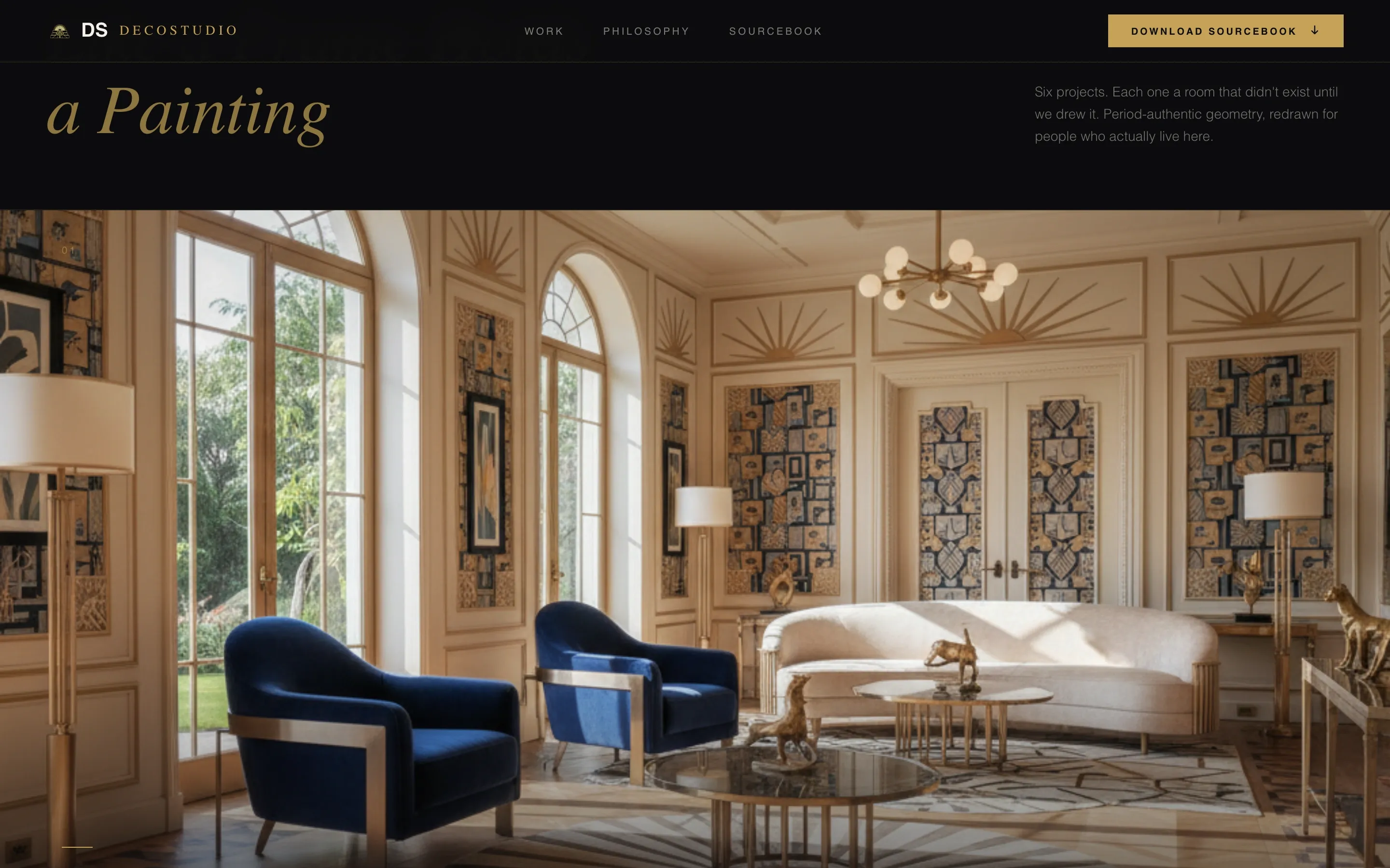
Monumental Hero with Animated Rule Draw
The hero opens with an ultra-condensed serif headline in antiqued gold on obsidian black. After a beat, a thin gold rule draws itself beneath the headline using a CSS keyframe animation. A full interior photograph then rises from below, overlapping the headline and pulling the visitor into the scroll.
Cinematic Scroll Sequence
The scroll experience is structured like turning pages of a high-production editorial. Full-bleed room photographs alternate with intimate material detail close-ups. Layers slide over one another at intentional angles. A black-and-white archival photograph of an original 1925 interior overlaps a modern color reinterpretation, making the design lineage immediate and visible.
Three-Client Positioning Section
A dedicated section names the three core client types, homeowners, boutique hoteliers, and restaurateurs, each paired with a signature project. This positions the practice clearly without requiring a wall of text.
Material Philosophy Section
This section presents the practice's living material palette with editorial copy. It directly addresses the "too precious to live in" objection, framing the materials as choices for rooms that are used, photographed, and remembered.
Sourcebook Download Form with Preview Cards
The lead capture form asks for first name, email, and a single illustrated question: which room are you reimagining? Four icon choices cover living room, bedroom, dining room, and lobby. Three peek-through cards preview spreads from the sourcebook, visible enough to prove value, obscured enough to earn the exchange.
Editorial Color and Typography System
The design uses Fraunces for display type and DM Sans for body text. The color system is obsidian black (#0B0B0D), antiqued gold (#C5A258), ivory parchment (#F5F0E8), and deep lacquer green (#1A3C34). Gold appears in thin rules, monogram details, and hover states rather than as a dominant fill.
Page sections overview
| Section | Purpose |
|---|---|
| Hero Headline | Opens with monumental gold typography on obsidian and animated rule draw |
| Rising Photograph | Interior image rises from below, overlapping the headline on scroll |
| Cinematic Sequence | Scroll-driven alternation of room reveals and material detail close-ups |
| Archival Color Overlay | B&W 1925 photograph layered beneath a modern color reinterpretation |
| Three Clients | Names homeowners, hoteliers, and restaurateurs with one project each |
| Material Philosophy | Editorial copy and palette addressing the "too precious" objection |
| Sourcebook Call to Action | Download form, peek-through preview cards, and room-choice icons |
| Footer | Logo and tagline left, navigation links right, minimal layout |
Design & branding system
The design system is drawn from a 1929 editorial magazine aesthetic, heavy stock, metallic ink, and typography with the authority of carved stone. Every color and type decision serves that atmosphere without tipping into costume or pastiche.
- Color palette: obsidian black (#0B0B0D) as the dominant field, antiqued gold (#C5A258) for type and ruled lines, ivory parchment (#F5F0E8) for body text, and deep lacquer green (#1A3C34) as a secondary accent
- Typography: Fraunces serif for all display and headline use; DM Sans for body copy and captions; small caps with generous leading for editorial caption blocks
- Gold is used with restraint, thin rules, hover state blooms, and monogram-style details rather than broad fills
Mobile & speed optimization
The cinematic layered scroll sequence is designed with a desktop-first priority, as the overlap and layer behavior is inherently suited to larger viewports. The template is built to degrade gracefully on smaller screens so the core content remains readable and usable.
- CSS animations are preferred throughout, keeping the animation layer lightweight and browser-native
- IntersectionObserver drives scroll-reveal behavior, triggering animations only when elements enter the viewport
- Native CSS smooth scroll is used for in-page navigation, avoiding heavy JavaScript dependencies
How this template helps you convert
Conversion on this template is structured around a single high-value lead magnet: the Deco Sourcebook PDF. Every section before the form is designed to build trust, demonstrate craft, and create the desire to go deeper.
- The cinematic sequence and client-type positioning build credibility before any ask is made, so visitors arrive at the form already convinced of the practice's authority.
- The three peek-through sourcebook preview cards make the PDF feel tangible and worth downloading, while the four illustrated room-choice icons lower the friction of the form by making it feel like a preference exercise rather than a data capture.
Other information about this template
This template is built as a content and resource destination, meaning its primary goal is lead generation through a downloadable asset rather than direct service booking. The secondary call to action, Browse the Full Portfolio, anchors visitors who are not ready to download but want to explore further.
- The template is categorized under Architecture and Design, specifically within the Art Deco Architecture subcategory
- The overlap and layered template style means sections and images are intentionally positioned to intersect, creating depth and editorial tension across the full page
- The footer follows a split layout: logo and tagline on the left, navigation links on the right, kept deliberately minimal to maintain the atmosphere of the page above it
- The page targets the New York and global luxury market, with English-language copy and an implicit premium positioning


Theme
Editorial Magazine
Creative direction
Cinematic Sequence
Color system
Obsidian & Gold
Style
Overlap/Layered
Direction
Content/Resource
Page Sections
Monumental Hero with Animated Rule Draw
Cinematic Scroll Sequence
Three-client Positioning Section
Material Philosophy Section
Sourcebook Download Form with Preview Cards
Editorial Color and Typography System
Related questions
Who is this landing page template designed for?
What is the primary conversion goal of this template?
Can I adapt this template for a different interior design style?
How does the cinematic scroll sequence work?
Does the template include the sourcebook PDF content?


