Optometrist Booking Website Template
Clarity is a single-page landing page template built for virtual optometry practices. It combines a bold typographic hero, FAQ-driven zigzag sections, and a five-step vision quiz that converts curious visitors into booked consultations. Designed for remote workers, parents, and contact lens wearers, it turns a simple scroll into a guided clinical conversation.
by Rocket studio
Quick summary
Clarity is a landing page template for virtual optometry consultations. It opens with a stacked typographic hero, moves visitors through patient-voiced FAQ sections in a zigzag layout, and closes with a five-step guided vision assessment that ends at a calendar booking screen. Every design choice supports one outcome: turning a first-time visitor into a qualified, scheduled patient.
Who this template is for
This template is built for optometry practices offering virtual or telehealth consultations. It fits solo practitioners and small clinics ready to reach patients outside a traditional waiting room.
- Remote workers dealing with digital eye strain after long monitor hours
- Parents tracking changes in how their child holds a screen or reads
- Contact lens wearers whose prescriptions have lapsed and need a quick, accessible path back to care
What problem this template solves
Many people delay eye care because booking an in-person visit feels like a commitment they keep deferring. They know something is off but they need a low-friction entry point that earns their trust before asking for an appointment.
- Visitors arrive with specific, unspoken worries and need those worries acknowledged before they act
- The gap between "I should get my eyes checked" and "I just booked" is rarely about cost; it is about clarity and convenience
- A generic contact form does not convert this audience; a structured, reassuring experience does
What you get with this template
You get a fully structured single-page layout that guides visitors from curiosity to a confirmed booking. Every section serves a defined role in that journey.
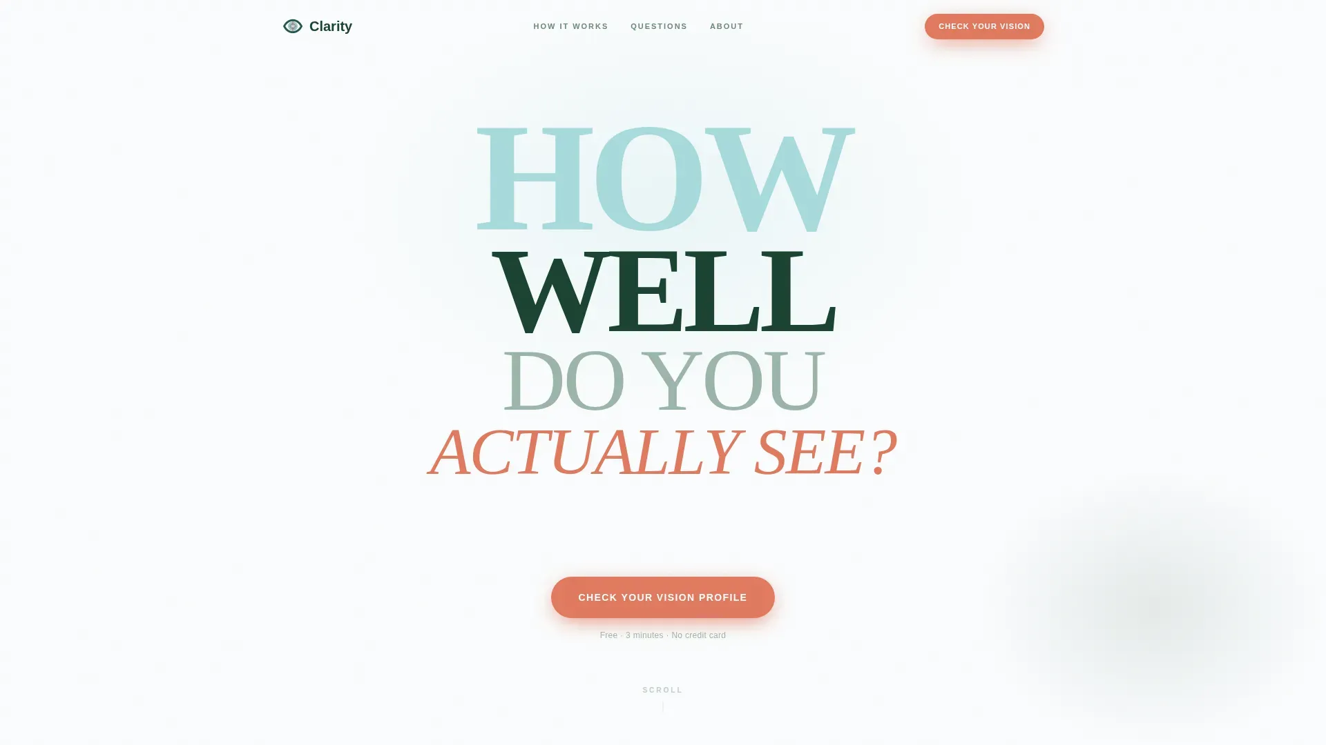
- A Stacked Type Tower hero with a blinking cursor and an immediate call-to-action button
- Three FAQ zigzag sections, each pairing a real patient question with a visual answer
- A five-step quiz modal with a wildflower-accent progress bar leading directly to a calendar picker
Feature list
This template combines visual design, interactive components, and conversion-focused layout into one coherent build.
Stacked Type Tower Hero
The hero uses four stacked lines of display type in distinct weights and colors, reading like an eye chart in reverse. The phrase builds from "HOW" down to "ACTUALLY SEE?" with a blinking cursor beneath inviting the first click. Negative space carries the composition without competing imagery.
FAQ-Driven Zigzag Layout
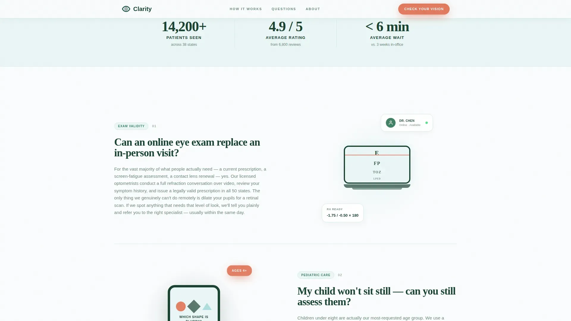
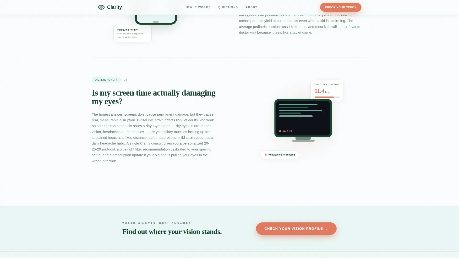
Each section leads with a real patient question as the heading, then answers it in a short paragraph paired with a diagram or animated micro-interaction on the opposite side. The alternating left-right rhythm creates a natural scroll pace that keeps visitors engaged section by section.
Five-Step Vision Assessment Quiz
The primary conversion path is a guided quiz modal. It collects screen hours, last exam date, current symptoms, corrective lens use, and age range across five full-screen steps. A wildflower-accent progress bar tracks completion, and the final step delivers a personalized vision priority score.
Calendar Picker Booking Screen
The quiz ends on a booking screen rather than a generic thank-you page. Visitors move from their vision priority score directly to a calendar picker where they can select their virtual consultation slot while their motivation is highest.
Repeated "Check Your Vision Profile" call to action
The primary call-to-action button appears first below the hero and repeats after every third FAQ section. This placement keeps the conversion entry point visible without interrupting the educational scroll.
Inline Social Proof Stats
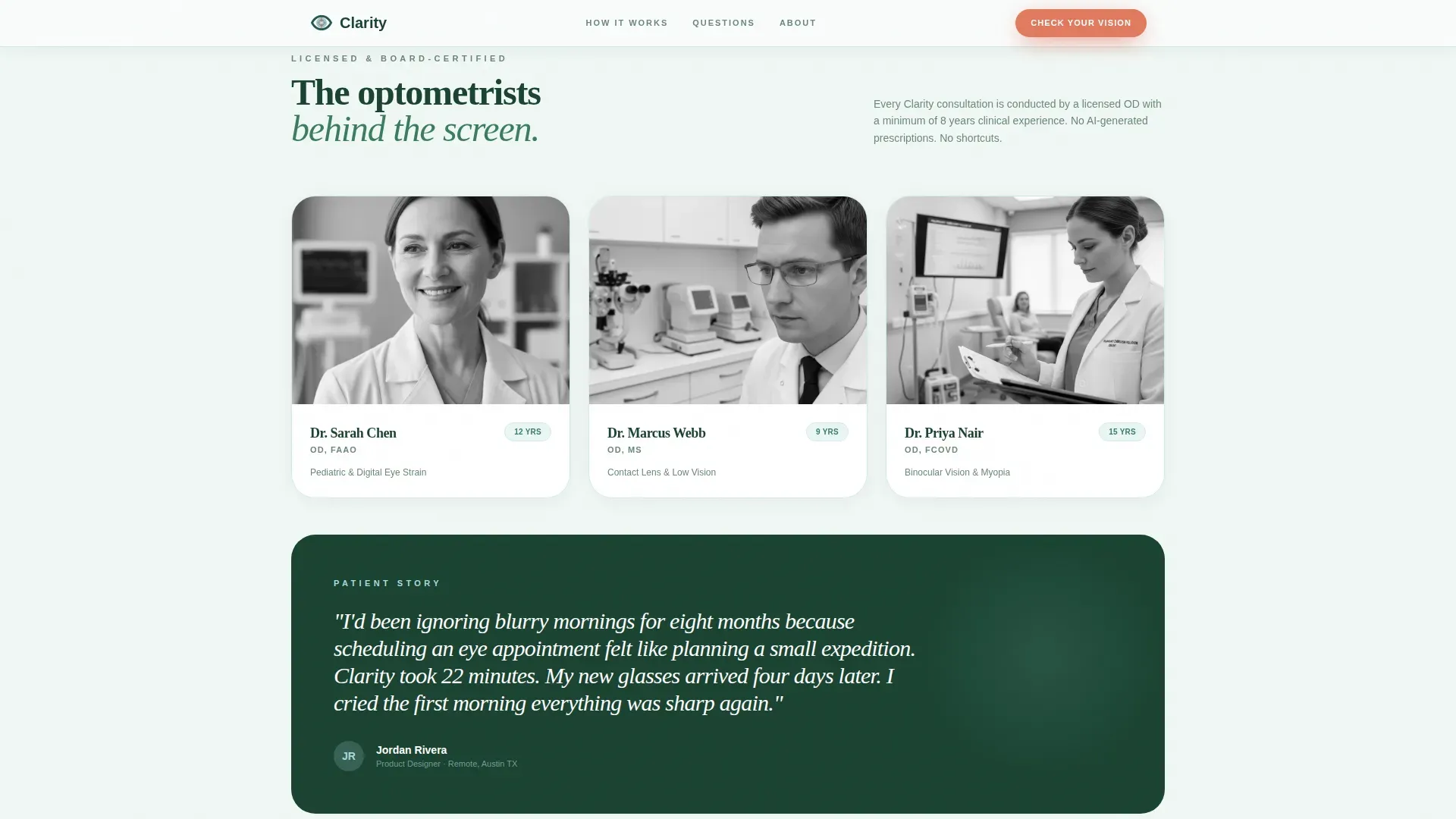
The layout includes inline statistics covering patients seen, satisfaction score, and average wait time. These figures sit within the flow of the page rather than isolated in a testimonial block, reinforcing trust at the moment a visitor needs it.
Page sections overview
| Section | Purpose |
|---|---|
| Hero Type Tower | Opens with bold stacked typography and blinking cursor to hook attention immediately |
| FAQ Zigzag One | Addresses whether an online eye exam can replace an in-person visit |
| FAQ Zigzag Two | Reassures parents that a child assessment is possible virtually |
| call to action Quiz Break | Launches the "Check Your Vision Profile" five-step assessment modal |
| FAQ Zigzag Three | Answers whether screen time causes lasting eye damage |
| Quiz Modal Flow | Guides visitor through five steps and delivers a vision priority score |
| Calendar Booking Screen | Converts the quiz result into a scheduled virtual consultation |
| Footer Single Row | Closes with a linear single-row footer for practice links and contact |
Design & branding system
The visual identity follows an Educational Guide theme using the Alpine Fresh color system. The palette feels clean and clinical without being cold, drawing on the contrast of mountain light and pine shadow.
- Snow white (#FAFCFD) backgrounds, evergreen (#1B4332) headlines, glacier meltwater (#A8DADC) for cards and dividers, and wildflower (#E07A5F) reserved for buttons, progress indicators, and interactive highlights
- Typography pairs Fraunces serif display for headings with DM Sans for body copy, creating an authoritative but readable voice
- Animation is set to medium intensity: a blinking cursor in the hero, scroll-triggered reveals, staggered FAQ entries, and smooth quiz step transitions
Mobile & speed optimization
The template is built with equal priority for desktop and mobile users. Remote workers on laptops and parents on phones both need a smooth, uninterrupted path through the page.
- The quiz modal is built as a client-side component only, keeping the rest of the page static-first for faster initial load
- The zigzag layout adapts naturally to single-column stacking on smaller screens without losing the question-and-answer pairing
How this template helps you convert
Every structural decision in this template pushes toward one action: a booked virtual consultation. The conversion path is layered but never pushy.
- The FAQ sections use questions visitors have already asked themselves at midnight, building trust before any ask is made; the "Check Your Vision Profile" button then appears at exactly the right moment of readiness.
- The five-step quiz qualifies visitors by collecting symptom data and exam history, so the booking that follows is not a cold inquiry but an informed, motivated appointment request.
Other information about this template
This template is designed for the United States market. Localization is set to English, USD pricing where applicable, and MM/DD/YYYY date formatting throughout, including the calendar picker.
- The footer follows a linear single-row pattern, keeping the close of the page clean and uncluttered
- Device priority is equal across desktop and mobile, reflecting the dual audience of office-based remote workers and on-the-go parents
- The quiz symptom dropdown includes pre-written options such as "headaches after reading," "halos around lights," and "difficulty with night driving," giving visitors a vocabulary for concerns they may not have been able to name
Theme
Educational Guide
Creative direction
FAQ-Driven
Color system
Alpine Fresh
Style
Zigzag/Alternating
Direction
Quiz/Assessment
Page Sections
Stacked Type Tower Hero
Faq-driven Zigzag Sections
Five-step Vision Assessment Quiz
Calendar Picker Booking Screen
Repeated Primary Call to Action Placement
Inline Social Proof Statistics
Related questions
Can I customize the quiz questions and symptom dropdown options?
Does the calendar picker connect to a live scheduling system?
Is the vision assessment quiz a separate page or part of the landing page?
Can this template be adapted for a general in-person optometry practice?
What animations are included in the template?



