Dental Practice Policy & Insurance Comparison Website Template
This dental transparent policy comparison landing page template turns dense practice agreements into a scannable, interactive experience. Built on a Tech Glass aesthetic with a Carbon Fiber color system, it features an animated JSON code-snippet hero, a live policy comparison tool, and six expandable policy-module cards. Office managers, associate dentists, and patients all land in the right place to read, compare, and act.
by Rocket studio
Quick summary
This landing page is specifically designed for dental practices that want to present their terms of service with radical clarity. It opens with an animated code-snippet headline, guides visitors through a side-by-side policy comparison tool, and delivers six modular policy cards that expand from plain-language summaries into full legal text. Every design decision builds trust before asking for anything.
Who this template is for
This dental landing page serves three distinct readers who each arrive with different goals. Office managers need operational clarity to evaluate practice management platforms. Associate dentists need a readable format to review agreements before signing. Patients follow appointment confirmation links and need confidence that the fine print is honest.
- Office managers evaluating practice management platforms and comparing policy categories side by side.
- Associate dentists reviewing employment and practice agreements before signing, seeking plain-language summaries.
- Patients who click the link in their appointment confirmation email and want readable, trustworthy terms.
What problem this template solves
Most dental practice policies are buried in PDFs, padded with legal jargon, and impossible to compare against anything. Potential patients, dentists, and managers all leave more confused than when they arrived. This page solves the readability and credibility gap in one focused layout.
- Hidden complexity, waiting periods, co-pays, cancellation fees, and consent scope are surfaced clearly instead of hidden in fine print.
- Lack of comparison context, visitors cannot easily tell whether a dental practice's policies are fair without a benchmark, so the comparison tool closes that gap.
- Lost conversions, when patients and dentists cannot parse terms, trust breaks down and conversion rates drop before any appointment is ever booked.
What you get with this template
You get a complete, production-ready landing page layout with every section pre-built and ready to customize. The template includes high-interactivity components that go far beyond a static homepage or a generic legal page.
- Six-section page structure covering hero, comparison tool, policy card grid, trust metrics, call to action section, and a linear single-row footer.
- Interactive comparison tool with toggleable policy categories and a two-column "Industry Standard versus. Our Policy" card format.
- Expandable policy module cards, each card shows a plain-language summary first, then reveals full legal text on a second tap.
Feature list
This template is built around functional blocks that each serve a precise purpose. Every feature listed here is present in the source template design.
Animated JSON Code-Snippet Hero
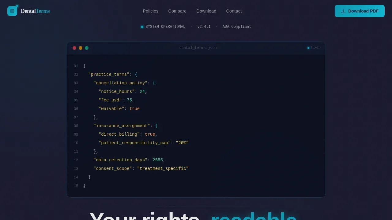
The hero opens with a syntax-highlighted pseudo-legalese block rendered in JetBrains Mono on a deep carbon background. Each key-value pair, such as cancellation notice hours, fee amount, and waivable flag, staggers in line by line using GSAP animation. Below the snippet, a single headline fades up: "Your rights, readable." This approach captures the visitor's attention immediately and frames dense policy content as something engineered and precise.
Policy Category Comparison Tool
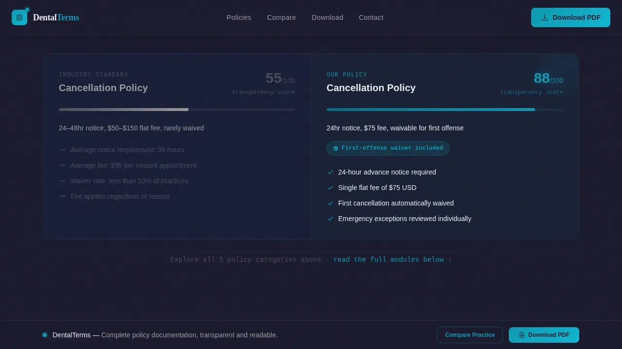
Before any terms content loads, visitors interact with a toggle-based comparison tool. They can switch between five policy categories, cancellation, insurance assignment, consent scope, data retention, and payment plans, and instantly see how this practice's terms compare against industry standard and competitor norms. Each toggle state renders a two-column card: "Industry Standard" on the left in muted graphite and "Our Policy" on the right in electric fluoride blue, with key differences highlighted. This is the core conversion driver and earns a visitor's decision before asking for any data.
Expandable Policy Card Grid
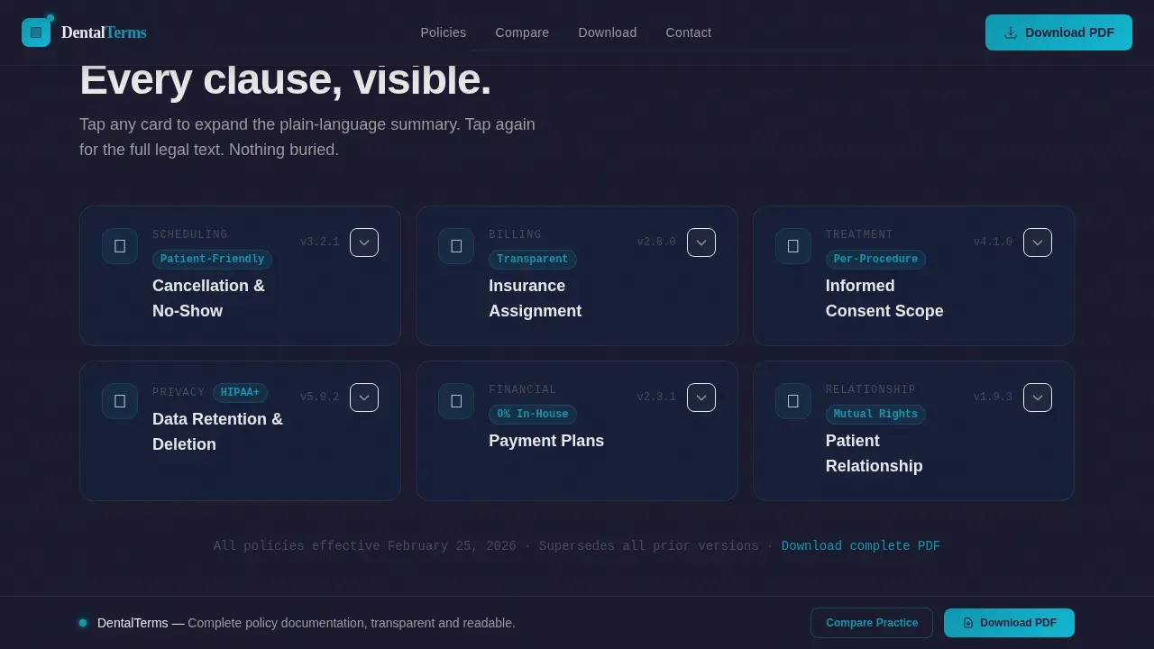
Six self-contained policy module cards are arranged in a modular card grid. Each card starts collapsed, showing a plain-language summary. Tapping once expands the full legal text. This progressive-disclosure approach guides visitors through necessary information at their own pace, preventing the overwhelm that kills conversion rates on standard terms pages. The scrolling experience is designed to feel like flipping through transparent slides, each adding specificity without burying earlier content.
Trust Metrics Strip and Marquee
A dedicated trust metrics section displays counter-animated statistics and a horizontally scrolling marquee of trust indicators. This section provides the social proof layer that high-converting dental landing pages rely on. Trust signals, patient experience data, and compliance figures are presented here to build trust with every visitor who scrolls past the comparison tool.
Dual Call-to-Action System
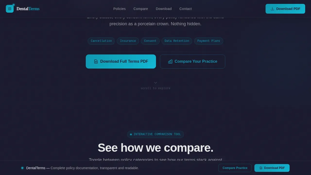
The primary call to action is a "Download Our Full Terms PDF" button placed above the fold and repeated as a sticky bottom bar that persists on scroll. A secondary call to action offers a "Compare Your Current Practice Agreement" path. This short form requests practice name, state, and email, then delivers a personalized policy comparison report. Placing a clear call at the top and reinforcing it throughout the page follows best practices for conversion rates on dental landing pages.
Sticky Bottom call to action Bar
The sticky bottom bar keeps the primary call to action visible at all times without interrupting content consumption. This persistent element guides visitors toward the PDF download at every scroll depth, ensuring the call to action reaches people whether they skim or read in full.
Page sections overview
| Section | Purpose |
|---|---|
| Hero Code Snippet | Opens with animated JSON pseudo-legalese and the headline "Your rights, readable." |
| Policy Comparison Tool | Lets visitors toggle policy categories and compare practice terms against industry norms side by side. |
| Policy Card Grid | Displays six expandable modules covering key policy areas with tap-to-reveal full legal text. |
| Trust Metrics Strip | Shows counter-animated stats and a marquee of trust indicators to reinforce credibility. |
| Call to Action Section | Combines PDF download button and the "Compare Your Practice" short form for lead capture. |
| Linear Single-Row Footer | Provides essential links and contact details in a clean, minimal footer row. |
Design & branding system
The visual identity uses a Tech Glass aesthetic built on the Carbon Fiber color system. Every design choice communicates precision and transparency, making the page feel like a clinical instrument rather than a marketing brochure.
- Color palette, deep carbon black (#1A1A2E) for backgrounds, woven graphite (#16213E) for card surfaces, surgical chrome (#E8E8E8) for body text and borders, and electric fluoride blue (#0F97B1) for all interactive highlights, hover states, and "Our Policy" column accents.
- Typography pairing, JetBrains Mono is used for all code-snippet and policy data displays, while Manrope handles headlines and body copy for high readability.
- Visual tone, the palette references the interior of a dental milling machine: dark composite housing, metallic precision rails, and a single glowing status light that signals everything is operating correctly.
Mobile & speed optimization
This dental landing page is built desktop-first because the primary audience is office managers working on workstations. Full mobile support is included so patients and associate dentists can access it comfortably on mobile devices.
- Responsive card grid, the six policy module cards reflow into a single-column stack on smaller screens, keeping the tap-to-expand interaction intact.
- Performance architecture, static sections use Server Components while interactive elements such as the comparison tool and expandable cards use Client Components, keeping the page lightweight and ensuring it loads quickly enough to protect conversion rates.
How this template helps you convert
Designing a landing page for comparing transparent dental policies requires focusing on clarity, trust, and ease of decision-making. This template layers those three qualities into every section so that visitors move naturally from reading to acting.
- Earn trust before asking, the comparison tool shows transparency first. Visitors see exactly how this practice's terms differ from industry standards before any form appears. This use of social proof elements and visible trust signals reduces friction at the moment of the visitor's decision.
- Remove every barrier to action, the sticky call to action bar keeps the PDF download reachable at all times, the appointment request form uses progressive disclosure to minimize user effort, and clear headlines guide visitors through each section without confusion.
- Build credibility through structure, patient-centered messaging, plain-language summaries, and counter-animated trust metrics work together as trust elements and psychological triggers. High-converting dental landing pages layer multiple trust signals throughout the user journey, and this template follows that pattern precisely.
Other information about this template
This template fits naturally into a broader content strategy for dental practices that want to strengthen their dental practice's online presence through transparency. A well-designed landing page can increase patient conversion rates and improve a practice's overall online reputation. Search engines prioritize high-quality landing pages in their results, and this one is built to support better search engine rankings through clear structure, scannable text, and a fast-loading layout.
- The template is specifically designed for US dental industry standards, using English, USD, and US regulatory language conventions, making it directly useful for any dental clinic operating in the American market.
- Well-designed landing pages for dental services typically aim for a load time under two seconds to protect conversion rates; this template's component architecture supports that goal.
- The average conversion rate for health-related landing pages including dental services is 7.4%, and creating demographic-specific pages with tailored messaging can triple that figure, this template addresses all three primary audience segments with distinct page sections.
- Tips for getting the most from this template include replacing placeholder policy text with your actual terms, customizing the comparison tool's industry-standard data for your state, and using real patient photos or high quality images of your practice rather than stock photos wherever brand guidelines allow.
- You can use analytics tools to track visitor behavior and test headlines, card copy, or call to action button labels to improve conversion rates over time; the modular layout makes it straightforward to isolate and test individual sections.
- The secondary "Compare Your Practice" form creates a path to attract more patients and new patients by delivering personalized value before any sales conversation begins; it can also be used to offer a free consultation framing as part of the follow-up email flow.
- Well designed landing page structures like this one are also adaptable for cosmetic dentistry landing contexts, such as a cosmetic dentistry services page that presents consent scope and treatment plan details alongside pricing transparency.
- Practices looking to improve more traffic to their terms page can link to this landing page from appointment confirmation emails, patient intake portals, and their main website homepage, increasing the reach of the page across the full patient journey.
- For cosmetic dentistry use cases, the comparison tool can be configured to display cosmetic dentistry procedure-specific consent categories, making the page relevant beyond general terms of service.
- The modular card layout makes it practical to create a new landing page variant for each service line, enabling practices to publish a dedicated dental landing for each major policy category.
- Customer testimonials and patient testimonials can be incorporated into the trust metrics section to layer additional social proof across the page, making the credibility signal visible at every scroll depth.
Theme
Tech Glass
Creative direction
Calculator/Tool First
Color system
Carbon Fiber
Style
Card Grid (Modular)
Direction
Comparison/Versus
Page Sections
Animated JSON Code-snippet Hero
Toggle-based Policy Comparison Tool
Expandable Six-card Policy Grid
Trust Metrics Strip with Marquee
Dual Call-to-action with Sticky Bar
Related questions
Who is this landing page template built for?
Can I customize the policy categories in the comparison tool?
Does this template support mobile users?
How does the comparison tool help build trust with visitors?
What do I need to launch this landing page?



