Military Checking Account Landing Page Template
The Barracks landing page template is a zero-fee military checking account page built for active duty service members, reserve personnel, and veterans. It uses a zigzag alternating layout, a four-step enrollment form, stats-first impact sections, and a Corporate Precision visual identity in Monochrome Steel tones to move visitors from first glance to account enrollment in minutes.
by Rocket studio
Quick summary
Barracks is a purpose-built landing page template for a zero-fee military checking account. It targets service members who live by the 1st-and-15th pay cycle, manage allotments across multiple destinations, and need an account that works across duty stations and deployments. The layout is zigzag alternating, the visual tone is Corporate Precision, and the conversion path is a progressive four-step enrollment form.
Who this template is for
This template is built for military finance brands, credit unions, and fintech companies serving the United States military community. It speaks clearly to the people sitting on the other side of the screen: the E-3 stretching a paycheck across a car note and a barracks room, the O-2 managing a first mortgage, and the military spouse running household finances solo for months at a time. Military banking in 2026 demands trust, accessibility, and lifestyle-specific perks. This template is engineered to deliver all three.
Anyone building or marketing a military checking account will find this template a strong fit. The page communicates specific benefits immediately and keeps the enrollment process moving from the very first scroll. It is designed for teams who want personalized, conversion-focused pages rather than generic financial templates, because personalized landing pages are shown to perform significantly better than generic ones in attracting military customers.
- Military fintech startups and challenger banks targeting active duty and veteran customers
- Credit unions and community banks offering military checking account products with no monthly service fee and no minimum balance requirement
- Finance marketing teams who need a conversion-ready page that can speak directly to service members, military spouses, family members, and eligible veterans
What problem this template solves
Most checking account landing pages are built for a generic civilian audience. They talk about standard features, minimum balance thresholds, and monthly service fee structures that do not reflect how military pay actually works. Service members deposit on the 1st and 15th. They send money via allotments to different parties, including a savings account for an emergency fund, a family account for a spouse back home, and a loan servicer for a car note. Generic bank pages ignore all of this.
The Barracks template solves that mismatch directly. It leads every section with a specific, concrete data point that a service member will immediately recognize as relevant. It frames the checking account around military life rather than making the visitor translate civilian banking language into their own situation. This specificity builds trust fast, and trust is what converts a curious visitor into a completed enrollment.
Key problems this template is specifically designed to address:
- Generic bank landing pages fail to highlight early direct deposit, zero ATM fees at overseas locations, or allotment routing features that military personnel actually need
- Most financial landing pages are not mobile-first, even though service members often access banking pages from mobile devices or low-bandwidth environments between training, duty assignments, and deployments
- Standard checking account pages bury the enrollment process deep in a form that feels disconnected from the page content, causing drop-off before the visitor reaches the call to action
What you get with this template
You get a complete, single-page landing page template structured as a zigzag alternating layout with five major content zones and a footer. Every section is designed to carry the visitor one step further into the enrollment process. The page opens mid-action with Step 1 of a four-step form already visible, and each subsequent zigzag section ends with the next form step so the visitor is partially enrolled before they reach the bottom of the page.
The design system uses a Monochrome Steel color palette: gunmetal gray, brushed aluminum, dress-blue navy, and a single service gold accent reserved for calls to action and key data points. Typography combines Plus Jakarta Sans for body and interface text with DM Mono for numbers and stats, giving every oversized figure the weight and clarity it deserves. The template is built to feel like a tactical briefing, not a bank brochure.
Included components and sections at a glance:
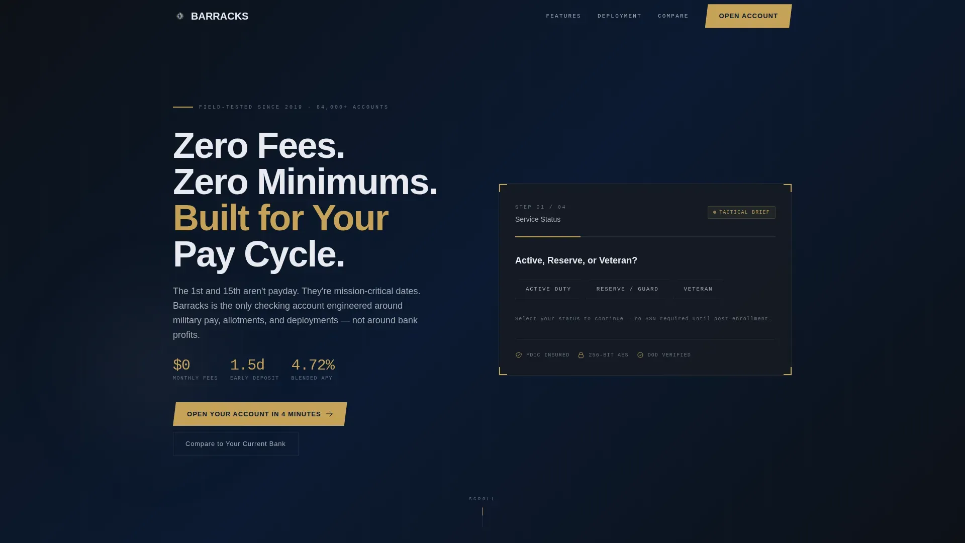
- Hero section with a topographic contour background, a multi-step form using dog-tag toggle selectors, and the headline "Zero Fees. Zero Minimums. Built for Your Pay Cycle."
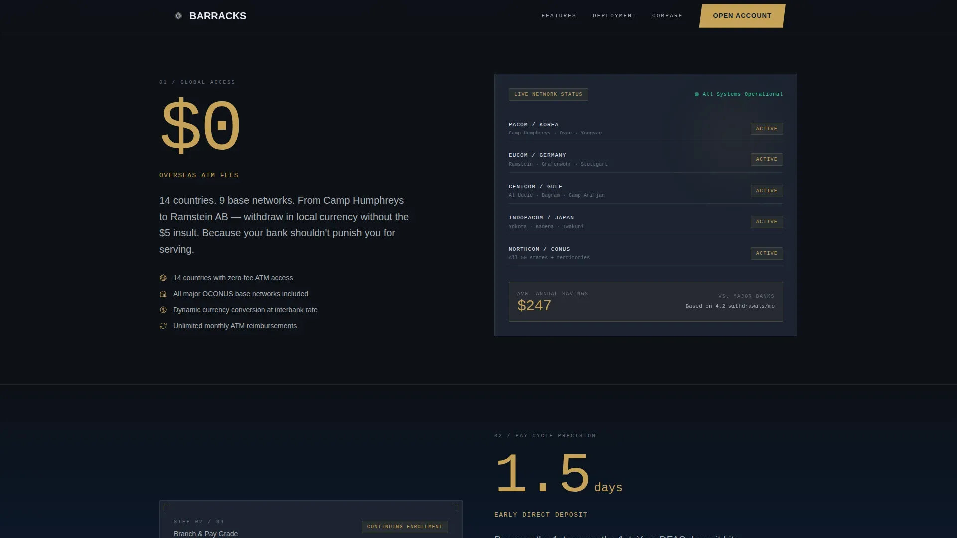
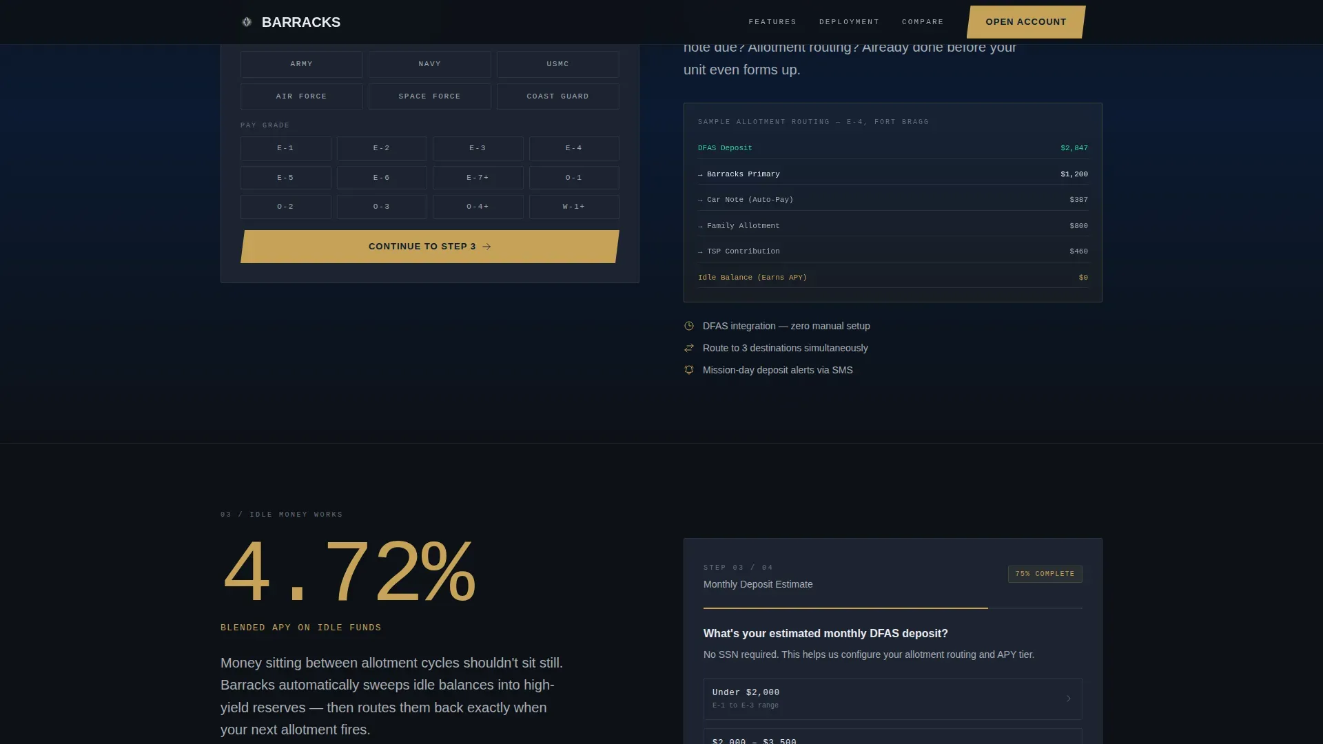
- Three zigzag stats sections leading with oversized service-gold numbers covering overseas ATM fees, early direct deposit timing, and blended annual percentage yield on idle funds between allotments
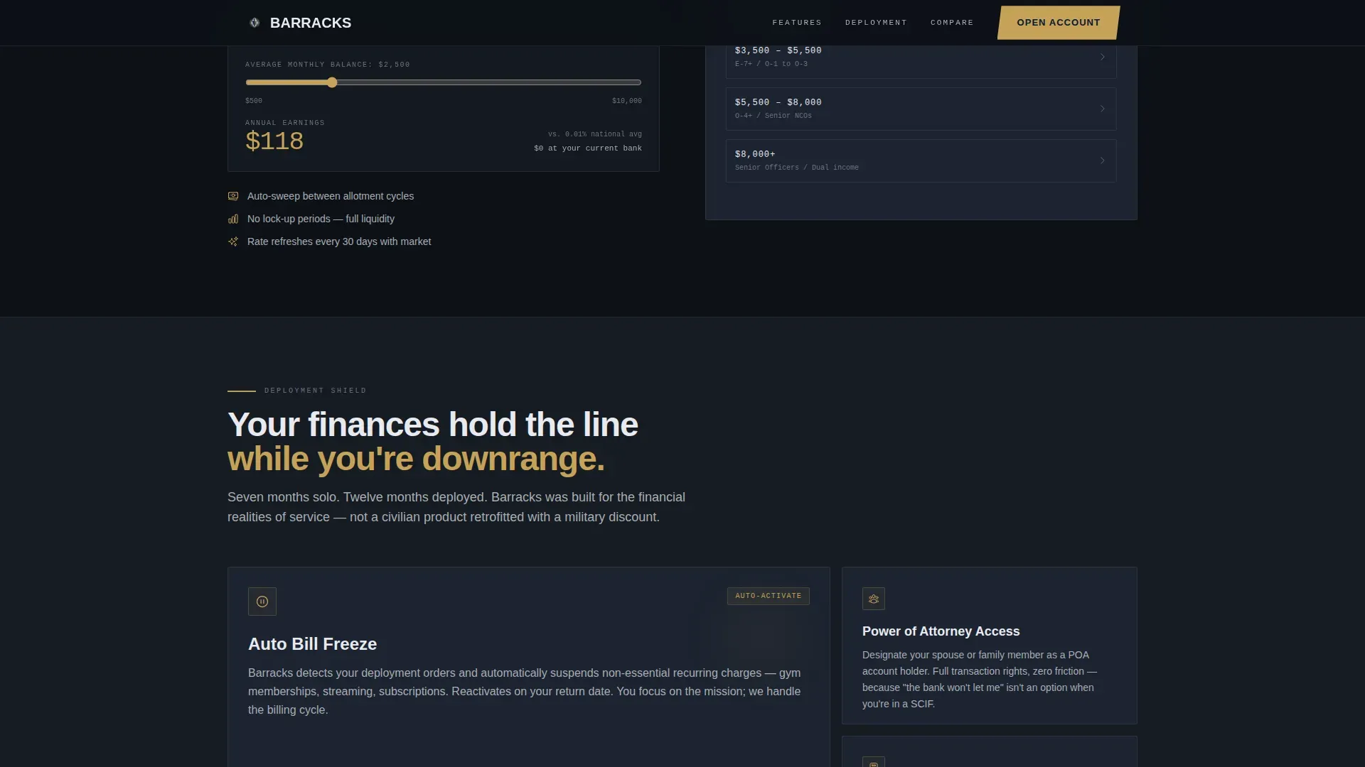
- A Deployment Shield bento grid section covering auto-bill freeze, power-of-attorney account access, and combat-zone tax optimization features
- A footer styled in a developer-minimal pattern with privacy, terms, and status links
Feature list
This template includes a carefully planned set of features drawn from the project brief. Each one serves a specific purpose in converting military visitors into enrolled account holders.
Stats-First Zigzag Layout
The alternating zigzag structure places a single oversized stat in service gold on one side and a feature explanation on the other. The layout alternates left-right-left across three sections, mimicking the rhythm of a drill cadence and keeping the eye moving diagonally down the page. Each stat lands like a data point that demands attention: zero dollar overseas ATM fees across 14 countries and 9 base networks, 1.5 days early direct deposit so the 1st means the 1st, and a 4.72 percent blended annual percentage yield on idle funds between allotments. This creative direction makes every claim feel concrete and credible rather than promotional.
Progressive Four-Step Enrollment Form
The multi-step form is built into the page flow itself, not bolted onto a separate page. Step 1 asks whether the visitor is Active, Reserve, or Veteran using three dog-tag toggle selectors styled in the template's steel palette. Step 2 captures branch of service and pay grade. Step 3 asks for estimated monthly deposit amount. Step 4 collects email and phone. No Social Security Number is requested until after initial conversion, which lowers friction at the most sensitive stage of the process. By the time a visitor reaches the footer, they have already begun the account opening process.
Deployment Shield Bento Grid
The Deployment Shield section is a bento-style grid that groups three deployment-specific account features together visually. Auto-bill freeze lets the primary account owner pause scheduled payments during a combat deployment without losing service continuity. Power-of-attorney account access lets trusted family members manage the account on behalf of a deployed service member. The combat-zone tax optimization feature surfaces relevant tax considerations specific to service in designated combat zones. These features are presented as a coherent shield rather than a scattered list, reinforcing the idea that this checking account was designed around the full lifecycle of military service.
Fee Calculator Modal
A secondary conversion path runs alongside the main enrollment form. The "Compare to Your Current Bank" call to action opens a side-by-side fee calculator modal that lets visitors input their current bank's fee structure and see a direct comparison. This tool builds urgency without pressure. It lets the numbers do the work. A visitor who is wondering whether switching is worth it can arrive at their own conclusion using their own inputs. The modal supports the template's Stats-First Impact creative direction by extending the data-driven tone into an interactive format.
GSAP Scroll Animations and Stat Counters
The template is built for high animation fidelity using GSAP scroll reveal effects and staggered stat counters. As the visitor scrolls into each zigzag section, the oversized stat animates upward to its final number. Mouse parallax adds depth to the hero's topographic contour background. These motion elements are not decorative; they reinforce the Stats-First creative direction by making each key data point feel earned rather than simply displayed. Client-side components handle the form and animations while server components handle static sections for performance balance.
Mobile-First Responsive Structure
Service members often access banking pages from mobile devices between duty assignments, training rotations, and deployments. The template is built mobile-first, with a scannable layout that works cleanly on small screens. The dog-tag toggle selectors in the form are touch-optimized. The zigzag layout collapses gracefully to a stacked single-column view on phones. Every font size, button target, and spacing value is calibrated for a person reading on a phone with one hand while managing a dozen other priorities.
Page sections overview
| Section | Purpose |
|---|---|
| Hero with Form | Opens mid-action with dog-tag toggle Step 1 and topographic background |
| Stats Zigzag One | Leads with zero dollar overseas ATM fee stat, left stat right detail |
| Stats Zigzag Two | Leads with 1.5-day early deposit stat, right stat left detail |
| Stats Zigzag Three | Leads with 4.72% blended yield stat, left stat right allotment features |
| Deployment Shield | Bento grid for auto-bill freeze, power-of-attorney access, combat-zone tax |
| Minimal Footer | Privacy, terms, and status links in developer-minimal pattern |
Design & branding system
The Barracks template uses a Corporate Precision design theme. The visual identity is Monochrome Steel: matte, cold, and zero ornamentation. The palette draws from four values, where service gold appears only where it matters most. Every design decision reflects the brief's stated intent: the only shine should come from something that earns it.
- Color system: gunmetal gray (#3B3F45) for base surfaces, brushed aluminum (#A8ADB3) for secondary text and patterns, dress-blue navy (#0B1A32) for section backgrounds, and service gold (#C5A258) strictly reserved for calls to action, key data points, and stat figures
- Typography: Plus Jakarta Sans for all body text and user interface elements, DM Mono for numbers, stats, and data displays, creating a clear visual hierarchy between prose and precision figures
- Background texture: a faint topographic contour pattern in brushed aluminum on gunmetal sits behind the hero form, replacing stock photography of saluting soldiers or flags entirely
Mobile & speed optimization
Mobile performance is not an afterthought in this template. Service members often access bank pages from phones in environments where connectivity is inconsistent. The template addresses this directly with a mobile-first build approach and a component architecture that balances animation richness with load efficiency.
- Server components handle all static sections including the zigzag content blocks and the Deployment Shield bento grid, reducing the JavaScript payload for visitors on low-bandwidth connections
- Client components are scoped only to the form, GSAP animations, and fee calculator modal, keeping interactivity fast and purposeful without bloating the static portions of the page
- The mobile layout stacks zigzag sections into a clean single-column flow, touch-optimizes form toggles and button targets, and preserves the stat-first visual hierarchy on small screens so the gold numbers still land with impact
How this template helps you convert
The Barracks template is built around a single conversion goal: complete account enrollment. Every layout decision, section order, and interactive element is positioned to move the visitor one step closer to that goal. The page does not ask the visitor to find the form. The form finds the visitor at every stage of the scroll.
- The hero section opens with Step 1 of the enrollment form already visible and active, so the visitor begins the process before they consciously decide to enroll. The dog-tag toggle selectors make the first interaction feel tactile and immediate rather than administrative. A visitor who clicks Active, Reserve, or Veteran has already committed a micro-action.
- Each zigzag section ends with the next form step embedded in the layout, so the visitor is completing the enrollment process as they consume the content. By the time Step 4 captures email and phone, the visitor has already read three stat-driven reasons to trust the account. The secondary "Compare to Your Current Bank" fee calculator path catches visitors who need one more data point before they decide, converting consideration into certainty without pressure.
Other information about this template
The Barracks template sits in the Finance and Insurance category under the Military Finance subcategory, with a niche focus on military checking account products. It is appropriate for any financial institution, credit union, or fintech that serves active duty personnel, reserve members, or veterans and wants to offer a checking or savings account with clear, benefit-driven positioning.
The template is relevant to the growing segment of military banking products that emphasize trust, accessibility, and lifestyle-specific perks as the dominant signals for military customers. Military banking in 2026 is increasingly digital-first, and visitors expect to begin the process of opening an account entirely online without a visit to a branch location. This template supports that expectation directly: the entire four-step process is self-contained in the page, and no branch visit is required to begin enrollment.
Financial literacy is a real challenge for many service members. Military personnel are often experiencing their first career-level job when they join, and many are managing a paycheck for the first time without prior guidance. Many military personnel spend money on unnecessary items due to a lack of financial education. A well-designed checking account landing page can serve as a first point of contact for financial education by clearly stating what costs nothing, what earns a return, and what the visitor can do to keep more money in their account. This template is structured to communicate those points quickly and clearly.
The importance of credit score health is also relevant for military customers. Many service members are working to build or protect their credit while managing car loans, personal loans, and base housing costs simultaneously. A military checking account that imposes no monthly service fee and requires no minimum balance removes two common sources of account-related credit damage: overdraft fees and account closures for falling below a minimum. Presenting these facts clearly on the page is one of the most effective things a military finance landing page can do.
The template also addresses the transition process that military families face when moving between duty stations. Transitioning banking services when moving involves several steps, including notifying your current bank about the move. It is advisable to review banking options and compare services and fees before deciding on a new bank. Opening a new account can generally be started online. Setting up direct deposit for paychecks with a new bank ensures timely access to funds after a move. The Barracks template makes that online enrollment process clear and immediate.
Early warning services are a consideration for any bank account product. Many military banking institutions work with early warning services systems to verify new account applicants and reduce fraud exposure. Service members who are new to banking or who have had prior account issues may be subject to these checks. A transparent page that communicates the enrollment process honestly builds trust with this audience.
Multi-factor authentication, or MFA, and 24/7 fraud monitoring are security features that military banking customers expect to see. Displaying these clearly builds trust at a point in the page where the visitor is being asked to share personal information. This template includes a Deployment Shield section specifically designed to address account security and access needs during deployment, including power-of-attorney access for family members and automatic bill management.
The template is wholly owned in its design and layout by the purchasing team. All visual components, section structures, and form elements are editable within the standard template environment. There are no locked sections or platform-specific dependencies beyond the listed technology stack.
The page is built for a United States audience with USD amounts, military pay grades from E-3 through O-3, and 24-hour clock references throughout the content. All stated figures, including the $0 overseas ATM fee, 1.5-day early deposit, and 4.72% blended annual percentage yield, are sourced directly from the project brief and should be verified against current product terms before publishing. This is a limited time offer framing opportunity: the page includes space to surface any promotional deposit bonus or rate-based incentive at the call-to-action level.
Additional contextual notes for buyers and builders using this template:
- The "Compare to Your Current Bank" fee calculator modal is a secondary conversion path designed to serve visitors who are interested but not yet ready to begin the enrollment form directly
- The footer follows a developer-minimal pattern with copyright, privacy policy, terms of service, and status page links, keeping the bottom of the page clean and functional
- Social proof blocks with rank, branch, and specific dollar savings figures are planned within the template structure to support credibility at key scroll-depth points
- The template does not require a Social Security Number at any stage of the four-step on-page form; that step occurs post-conversion, which reduces drop-off at the most sensitive data-collection point
- Buyers should note that all interest rate figures, annual percentage yield values, ATM network counts, and country coverage numbers displayed in the template are placeholder values drawn from the project brief and must be updated to reflect current, accurate, and compliant product disclosures before the page goes live
- Family members who are spouses or dependents of service members are a secondary audience this template addresses directly through the power-of-attorney account access section and allotment routing features
- The template supports a freemium and trial conversion model where the visitor opens an account with no upfront fee, no minimum balance, and no monthly service fee, with the full account experience available from day one
Theme
Corporate Precision
Creative direction
Stats-First Impact
Color system
Monochrome Steel
Style
Zigzag/Alternating
Direction
Freemium/Trial
Page Sections
Stats-first Zigzag Layout with Gold Impact Numbers
Progressive Four-step Enrollment Form
Deployment Shield Bento Grid
Fee Calculator Modal Comparison Tool
GSAP Scroll Animations and Stat Counters
Mobile-first Responsive Layout
Related questions
What type of financial product is this template designed to promote?
Who are the primary visitors this landing page is built for?
Does the template include a way for visitors to compare fees against their current bank?
How does the four-step enrollment form work within the page?
Is this template suitable for a credit union or community bank, not just a fintech startup?



