Developer & Tech Portfolio Pre-Launch Website Template
Deploy is a bold brutalist landing page template built for DevOps and cloud engineering practices. It combines a cursor-reactive photo mosaic header, four scroll-driven interactive sections, and a persistent waitlist form to convert technically savvy visitors into signups. The template targets CTOs, platform leads, and founding engineers who need infrastructure expertise fast.
by Rocket studio
Quick summary
Deploy is a single-page waitlist landing page for a DevOps and cloud engineering practice. It uses a terminal-dark aesthetic, scroll-triggered animations, and a problem-aware signup form to turn high-intent technical visitors into waitlist members. Every section mirrors a real deployment lifecycle step, making the page feel like a live system rather than a static portfolio.
Who this template is for
This template is purpose-built for independent DevOps engineers and cloud infrastructure consultants who want to launch a waitlist before opening their client roster. It speaks directly to a technically fluent audience that has no patience for marketing fluff.
- Solo cloud architects offering Kubernetes, CI/CD pipeline, and multi-cloud infrastructure services
- Platform engineering consultants targeting Series B startups with growing AWS costs and mounting ops debt
- Founding engineers moving into independent practice who need a fast, credible web presence
What problem this template solves
Most portfolio templates are built for designers, not engineers. They lead with aesthetics and bury the value proposition. For a DevOps practice, that is the wrong signal entirely. Your prospects are CTOs reviewing options between meetings. They need to feel competence instantly.
- Generic templates do not communicate infrastructure expertise or technical depth at a glance
- Standard waitlist pages lack the problem-specific framing that converts ops-burdened engineering leaders
- Most landing pages treat social proof as testimonials, not urgency signals tied to real demand
What you get with this template
You get a full storybook landing page built around the four stages of an infrastructure engagement: Assess, Architect, Automate, and Monitor. Each stage is its own full-viewport section with a distinct interactive element. The page is designed desktop-first, reflecting how CTOs and platform leads actually browse.
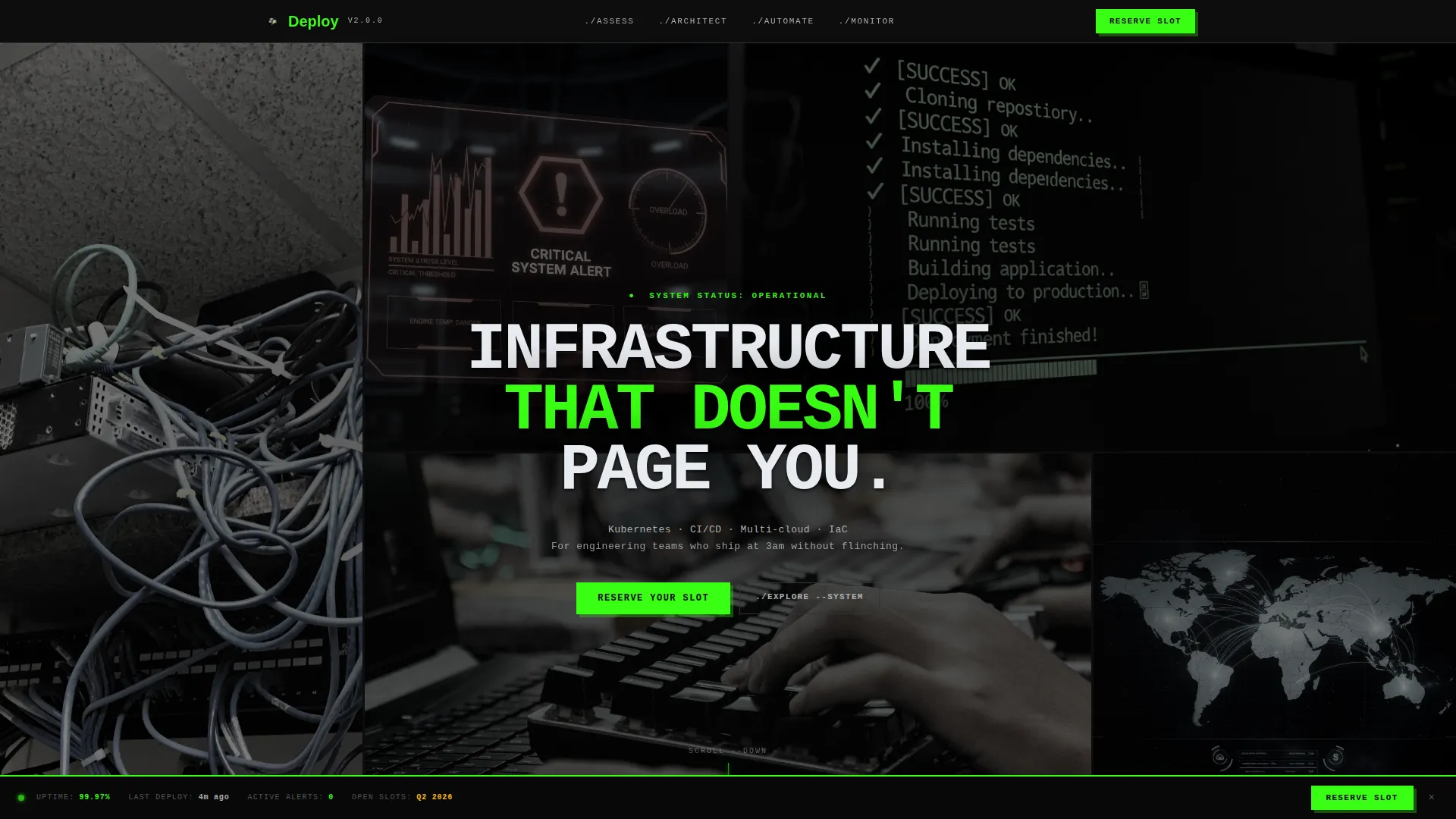
- A cursor-reactive photo grid mosaic header with a monospaced headline punching through the center
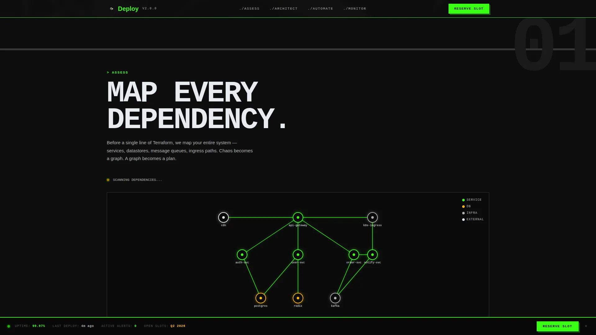
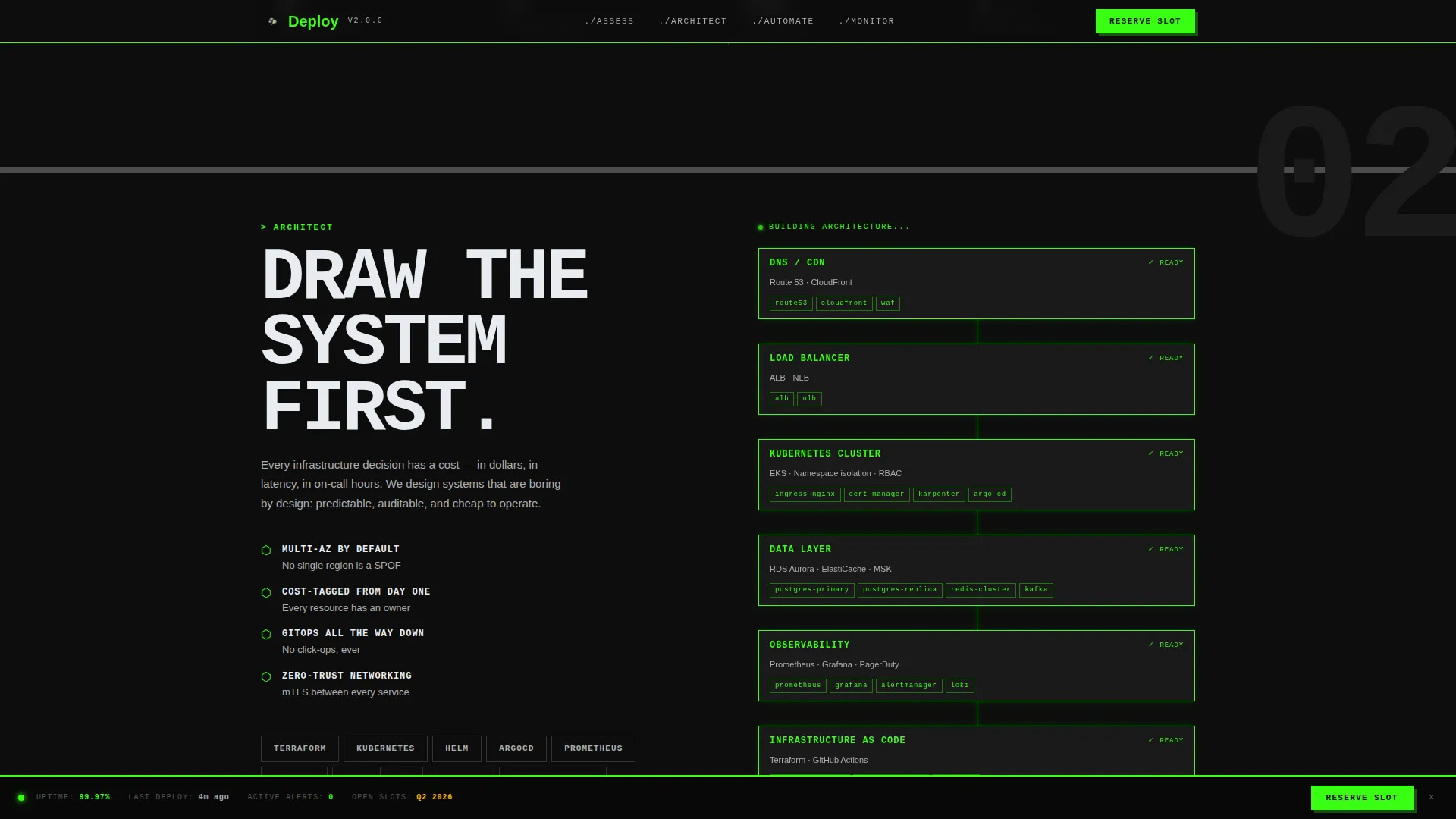
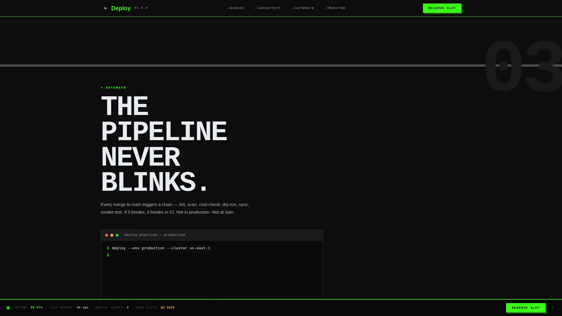
- Four scroll-driven interactive sections including an animated dependency graph, a self-drawing infrastructure diagram, a simulated deployment terminal, and a mock observability dashboard
- A persistent bottom-bar waitlist form with a work email field, company name field, a problem-select dropdown, and a live waitlist position counter
Feature list
This section covers the core interactive and structural capabilities built into the Deploy template.
Cursor-Reactive Photo Grid Header
The header fills the entire viewport with sharp-cornered image tiles arranged in a brutalist mosaic. Tiles shift subtly on cursor movement, scaling a pixel or two to create the sensation of hovering over a live control surface. A single monospaced headline in cloud white reads "Infrastructure that doesn't page you."
Scroll-Driven Lifecycle Sections
Four full-viewport sections guide visitors through the Assess, Architect, Automate, and Monitor phases of an infrastructure engagement. Each section transition is a hard cut with no fade or easing, reflecting a direct tmux-pane switch rather than a smooth animation curve.
Animated Dependency Graph
The Assess section opens with an SVG dependency graph that starts tangled and resolves itself on entry. This animation communicates the core value proposition visually before a single word is read: complexity comes in, clarity comes out.
Self-Drawing Infrastructure Diagram
As the visitor scrolls into the Architect section, an infrastructure diagram draws itself line by line. The scroll position controls the drawing progress, so visitors move through the architecture at their own pace.
Simulated Deployment Terminal
The Automate section presents a typewriter-style terminal window where pipeline stages resolve in sequence. Each line appears as if the deploy is running live, giving technically fluent visitors an immediate reference point for the kind of work on offer.
Persistent Waitlist Status Bar
A signal-green call-to-action button labeled "Reserve Your Slot" stays fixed at the bottom of the viewport at all times. Below the form, a live waitlist position counter renders at 120 pixels, fusing social urgency with real-time social proof.
Page sections overview
| Section | Purpose |
|---|---|
| Hero Mosaic Header | Sets terminal aesthetic, captures attention with reactive image grid and central headline |
| Assess Node | Animated dependency graph communicates problem-to-clarity value proposition visually |
| Architect Node | Scroll-linked diagram builds infrastructure layout as visitor moves down the page |
| Automate Node | Simulated terminal shows pipeline stages resolving, signaling hands-on technical capability |
| Monitor Node | Mock observability dashboard with ticking metrics conveys ongoing reliability focus |
| Waitlist Status Bar | Persistent bottom-bar form collects email, company, and problem context with live counter |
| Footer | Single-row minimal footer in GitHub developer style |
Design & branding system
The visual identity follows a Bold Brutalist direction using the Cloud Canvas color system. Every design decision reinforces the terminal environment: matte black backgrounds, thick concrete-gray section dividers, signal-green interactive states, and heavy white type that reads like monospaced system output on metal.
- Color palette: void black (#0D0D0D) for backgrounds, raw concrete (#B0B0B0) for dividers, signal green (#39FF14) for all interactive elements and live state indicators, and cloud white (#E8ECF1) for typographic emphasis
- Typography: JetBrains Mono handles all headlines and terminal-style output; DM Sans carries body copy for readability contrast
- No rounded corners, no decorative padding, no gradient overlays; images and blocks butt directly against each other like server rack panels
Mobile & speed optimization
The template is built desktop-first. The primary audience, CTOs and platform leads, browse on laptop or desktop hardware, and the scroll-linked animations are optimized for that context. The template still functions on smaller viewports without breaking the core layout.
- Scroll-triggered animations use IntersectionObserver so sections activate only when visible, avoiding unnecessary processing
- All movement effects use GPU-accelerated CSS transforms via requestAnimationFrame for smooth frame delivery
- Cursor-reactive mosaic behavior is handled with lightweight transform-only updates to keep interaction responsive
How this template helps you convert
The page is structured around a single conversion goal: getting technically qualified visitors to join the waitlist. Every design and copy decision serves that goal without distraction.
- The problem-select dropdown ("What's on fire?") with options like "Cloud costs," "Deployment frequency," "Incident response," and "All of the above" lets visitors self-identify their pain point, increasing form relevance and completion likelihood.
- The live waitlist position counter creates genuine urgency without fabricated scarcity, giving visitors a real reason to act now rather than return later.
- A secondary signup path lets visitors drop a GitHub or LinkedIn profile URL instead of filling out fields, reducing friction for engineers who prefer that route.
Other information about this template
This template ships as a storybook full-page build, meaning every section is composed as a complete visual scene rather than a modular block. It is intended as a complete, ready-to-customize starting point for a DevOps or cloud engineering practice launch.
- The template is categorized under Portfolio and Agency, specifically the Developer and Tech Portfolio subcategory, targeting the DevOps and Cloud Engineer niche
- The footer follows a GitHub Developer Minimal pattern: a single row, no heavy navigation, keeping the exit path clean
- The "What's on fire?" dropdown doubles as a lightweight qualification signal, helping practitioners understand what problems their waitlist audience is facing before a single sales call
- Typography and color choices are locked to the Cloud Canvas system and Bold Brutalist theme, but both font families and hex values are standard and straightforward to update in any modern code editor
Theme
Bold Brutalist
Creative direction
Interactive Explorer
Color system
Cloud Canvas
Style
Storybook/Full-Page
Direction
Waitlist/Coming Soon
Page Sections
Cursor-reactive Photo Grid Mosaic
Scroll-driven Lifecycle Sections
Animated SVG Dependency Graph
Simulated Deployment Terminal
Persistent Waitlist Status Bar
Mock Observability Dashboard
Related questions
Who is this landing page template designed for?
What interactive elements are included in the template?
What does the waitlist form collect from visitors?
Can the colors and fonts be customized?
Is this template suitable for mobile visitors?