Tech Job Board Landing Page Template
Deploy is a single-column tech job board landing page built for engineers, designers, and product managers. It combines live data counters, filterable role cards, and scroll-triggered testimonials into a dark-mode IDE aesthetic. The page converts both candidates and hiring managers with two dedicated call-to-action flows, all before asking for a single keystroke.
by Rocket studio
Quick summary
Deploy is a dark-mode tech job board landing page designed to convert both job seekers and hiring managers. Live ticking counters open the page with instant credibility. Filterable role cards let visitors prove inventory before signing up. Scroll-triggered testimonials close the deal. Every section is built to escalate urgency and reduce friction.
Who this template is for
This template is built for founders and operators who need a high-signal recruiting presence without enterprise complexity. It works equally well for platforms targeting candidates and companies.
- Mid-career engineers and designers running a stealth job search who want curated, high-quality roles with real salary ranges
- Bootcamp graduates hunting their first position with a meaningful equity package
- Startup hiring managers who want to attract senior talent directly, without paying agency fees
What problem this template solves
Most job board pages fail on two counts: they show no live proof of inventory, and they ask candidates to register before they can see anything worth registering for. That friction kills conversion on both sides of the market.
- Ghost listings and enterprise HR portals that bury real opportunities behind walls of bureaucracy
- Job boards that hide salary data and make candidates apply on faith instead of evidence
- Hiring pages that treat candidates and employers as the same audience with the same message
What you get with this template
You get a fully structured single-column landing page that guides visitors through a complete narrative arc from pain to proof to action. Every section is purposeful and sequenced.
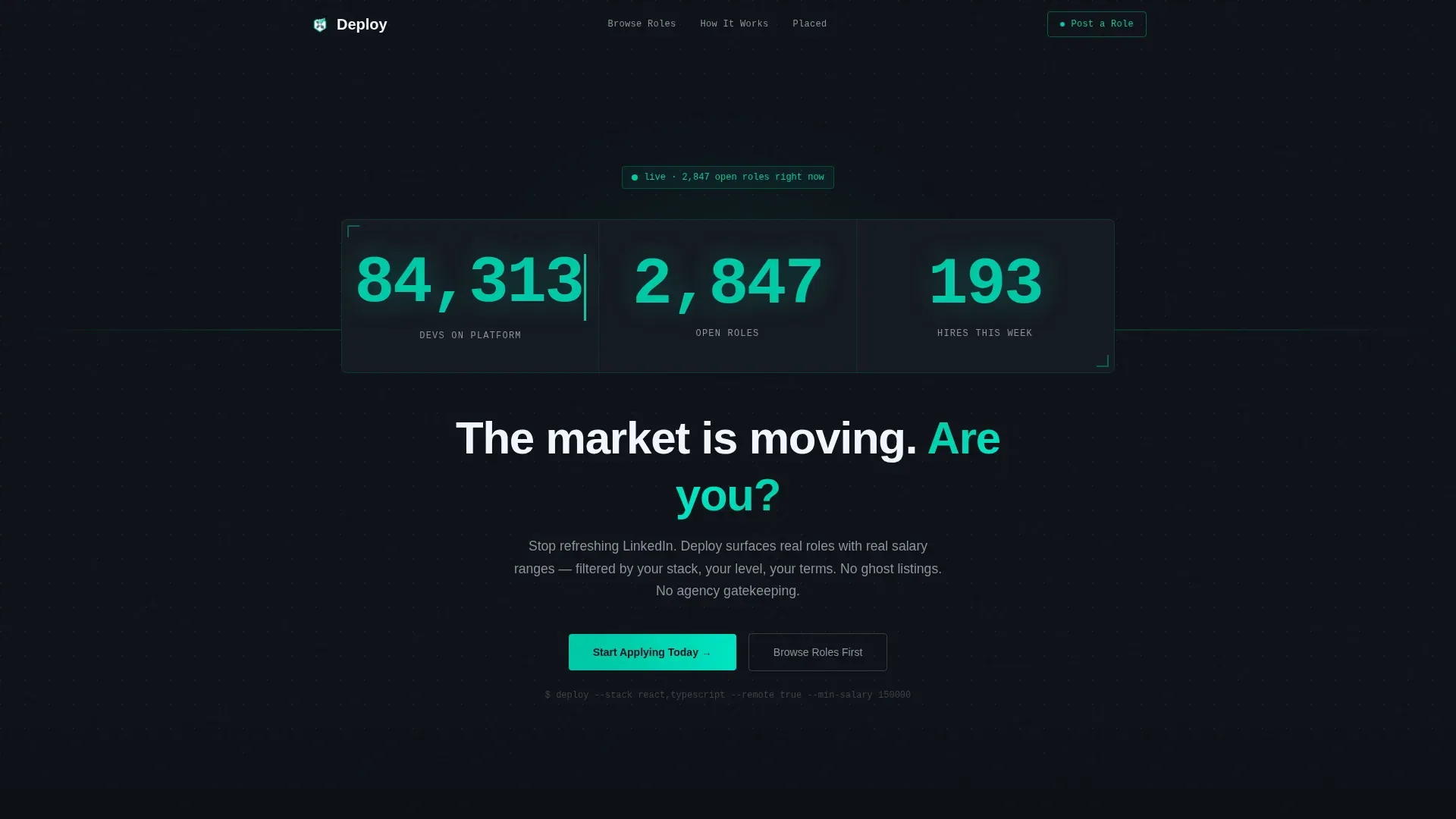
- A live User Count Ticker header showing total developers, open roles, and hires made this week in real-time monospaced counters
- Interactive role cards filterable by tech stack, salary band, and remote policy, so visitors can explore real inventory before committing
- Dual call-to-action flows: a two-field inline candidate form and a separate hiring manager section with company name and work email fields
Feature list
This template delivers a focused set of high-interactivity components, each grounded in the brief.
Live Ticker Header
Three monospaced counters sit at the top of the page: total developers on the platform, open roles live right now, and hires made this week. The numbers increment in real time against a terminal-black background, creating the immediate impression of a healthy, active marketplace.
Animated Days-to-Hire Comparison
Two animated counters race side by side, comparing average days-to-hire on legacy job boards versus this platform. The visual contrast is immediate and visceral. It sets the stakes before the visitor has scrolled past the first section.
Filterable Role Cards
Visitors can filter job listings by tech stack, salary band, and remote policy without leaving the page. The role cards prove depth of inventory before asking for any personal information. Filter transitions are animated for a fluid, responsive feel.
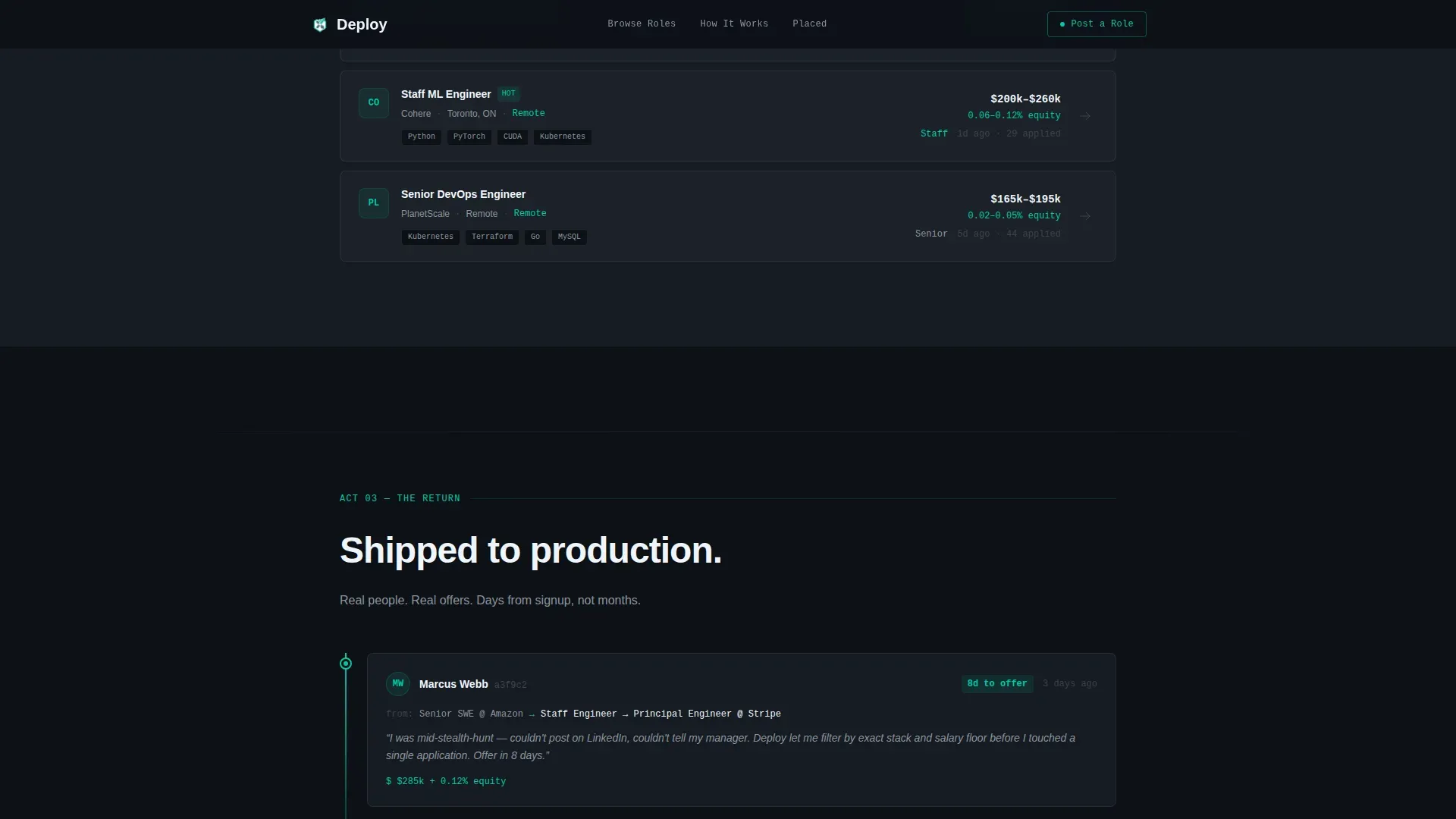
Scroll-Triggered Testimonial Cards
Placed candidate cards reveal on scroll in a git-commit log pattern. Each card shows the candidate's new role title, the company logo, and the exact number of days from signup to offer. The staggered reveal builds momentum as the visitor scrolls deeper into the page.
Dual Call-to-Action System
The primary candidate call-to-action captures email and primary language or framework in a clean two-field inline form placed directly after the role cards. A persistent top-navigation link reading "Post a Role" anchors to a separate bottom section with a company-name and work-email form for hiring managers.
Developer-Minimal Footer
The footer follows a GitHub developer minimal pattern, keeping the page clean and consistent with the terminal aesthetic. No clutter, no extra marketing noise.
Page sections overview
| Section | Purpose |
|---|---|
| Live Ticker Header | Displays real-time developer, role, and hire counts to establish instant credibility |
| Pain versus. Deploy | Animated counter race shows days-to-hire comparison against legacy boards |
| Filterable Role Cards | Interactive job listings let visitors explore by stack, salary, and remote policy |
| Testimonial Log | Scroll-triggered placed-candidate cards with role, company, and days-to-offer |
| Dual Call-to-Action | Candidate inline form and hiring manager post-a-role form in one section |
| Developer Minimal Footer | Clean footer styled after a GitHub developer minimal pattern |
Design & branding system
The visual identity channels a dark-mode IDE running at full intensity. Every color choice reinforces signal over noise, mirroring the experience of a clean terminal output.
- Deep terminal black (#0D1117) as the page background, electric teal (#00C9A7) for every interactive surface and data highlight, muted slate (#8B949E) for secondary text and dividers, and crisp white (#F0F6FC) for card surfaces and primary type
- JetBrains Mono for all numerical displays and code-style elements, paired with DM Sans for body copy and interface labels, creating a clear hierarchy between data and context
- High-density layout with scan-line details, stagger-reveal animations, and live counter transitions that make the page feel like a live system rather than a static brochure
Mobile & speed optimization
The template is designed desktop-first, reflecting the reality that engineers and designers primarily browse on their development machines. Mobile support is still solid throughout.
- Monospaced ticker numbers and role cards reflow cleanly for smaller screens without losing the data-dense terminal aesthetic
- Server Components handle static sections for fast initial load, while Client Components manage the live counters, filter interactions, and form validation independently
How this template helps you convert
The page is structured as a three-act narrative that earns the click by showing live proof before asking for anything.
- The pain section uses animated counters to make the problem concrete and urgent, converting passive browsers into motivated candidates before they reach the role cards
- The filterable role cards let visitors self-qualify by exploring real listings, which means the candidate form gets submitted by people who have already seen something they want
- The dual call-to-action system captures both sides of the marketplace in one page, giving hiring managers a dedicated entry point without diluting the candidate experience
Other information about this template
This template sits at the intersection of the tech job board niche and the broader HR and hiring category. It is built specifically for two-sided tech marketplaces where both supply and demand need to be converted on the same page.
- The single-column flow keeps the scroll path linear and intentional, reducing decision fatigue for visitors arriving mid-job-hunt
- The template style is classified as Startup Velocity, meaning pacing, animation density, and data presentation are all calibrated for an audience that values speed and precision over polish
- The Hero's Journey creative direction is baked into the section sequence: pain first, transformation through role cards, resolution through testimonials
- The Teal Catalyst color system is specifically designed to signal technical credibility without relying on stock photography or generic illustrations
- This template is a strong fit for platforms positioning against legacy job boards, staffing agency portals, or enterprise applicant tracking system products that engineers find frustrating to navigate


Theme
Startup Velocity
Creative direction
Hero's Journey
Color system
Teal Catalyst
Style
Single Column Flow
Direction
Recruitment/Hiring
Page Sections
Live Real-time Counter Header
Animated Days-to-hire Comparison
Filterable Interactive Role Cards
Scroll-triggered Testimonial Log
Dual Call-to-action Conversion System
Related questions
Can this template work for a brand-new job board with limited listings?
Does the page handle both candidates and hiring managers at the same time?
How customizable are the role card filters?
Is this template designed for desktop users first?


