Low Income Finance Pricing & Packages Website Template
Deposit is a single-column landing page template built for a zero-fee checking account targeting Americans left behind by traditional banking. It leads with three animated $0 stats, walks visitors through a fee-comparison exposé, and ends with a clear call to action. The design is clean, data-forward, and engineered to earn trust before asking for a click.
by Rocket studio
Quick summary
Deposit is a click-through landing page template for a no-fee checking account. It opens with three counter-roll $0 statistics, builds trust through a fee-comparison section and a realistic transaction timeline, then drives visitors to an account-opening flow. The layout is single-column, mobile-first, and styled to feel transparent rather than promotional.
Who this template is for
This template is built for fintech founders and consumer banking teams who need a high-converting landing page for an underserved audience. If your product genuinely charges zero monthly fees and no overdraft penalties, this template gives you the layout to prove it.
- Night-shift workers, gig drivers, and single parents who need a checking account with no minimums
- Fintech teams launching or promoting a low income checking account to underbanked Americans
- Marketers running paid campaigns who need a focused click-through page with no distractions
What problem this template solves
Traditional bank marketing pages bury fees in footnotes. The people most hurt by those fees are also the least likely to trust a page full of lifestyle photography and vague promises. This template flips that dynamic by leading with data and letting the numbers make the case.
- Visitors arrive skeptical; the $0 hero stats answer their first question immediately
- Most checking account pages hide fee comparisons; this template puts them front and center
- Hesitant scrollers get a secondary prompt mid-page so no one falls through the gap
What you get with this template
You get a fully structured, single-column landing page ready to customize for a zero-fee checking account. Every section has a defined purpose, and the flow moves deliberately from problem awareness to product proof to conversion.
- A hero section with three animated counter-roll $0 statistics and a primary call to action button
- A fee-comparison section with feature rows comparing your $0 costs against named competitor fees
- A transaction timeline, social proof testimonials, a fixed bottom call to action, and a linear single-row footer
Feature list
This template includes the following built-in sections and design features drawn directly from the project brief.
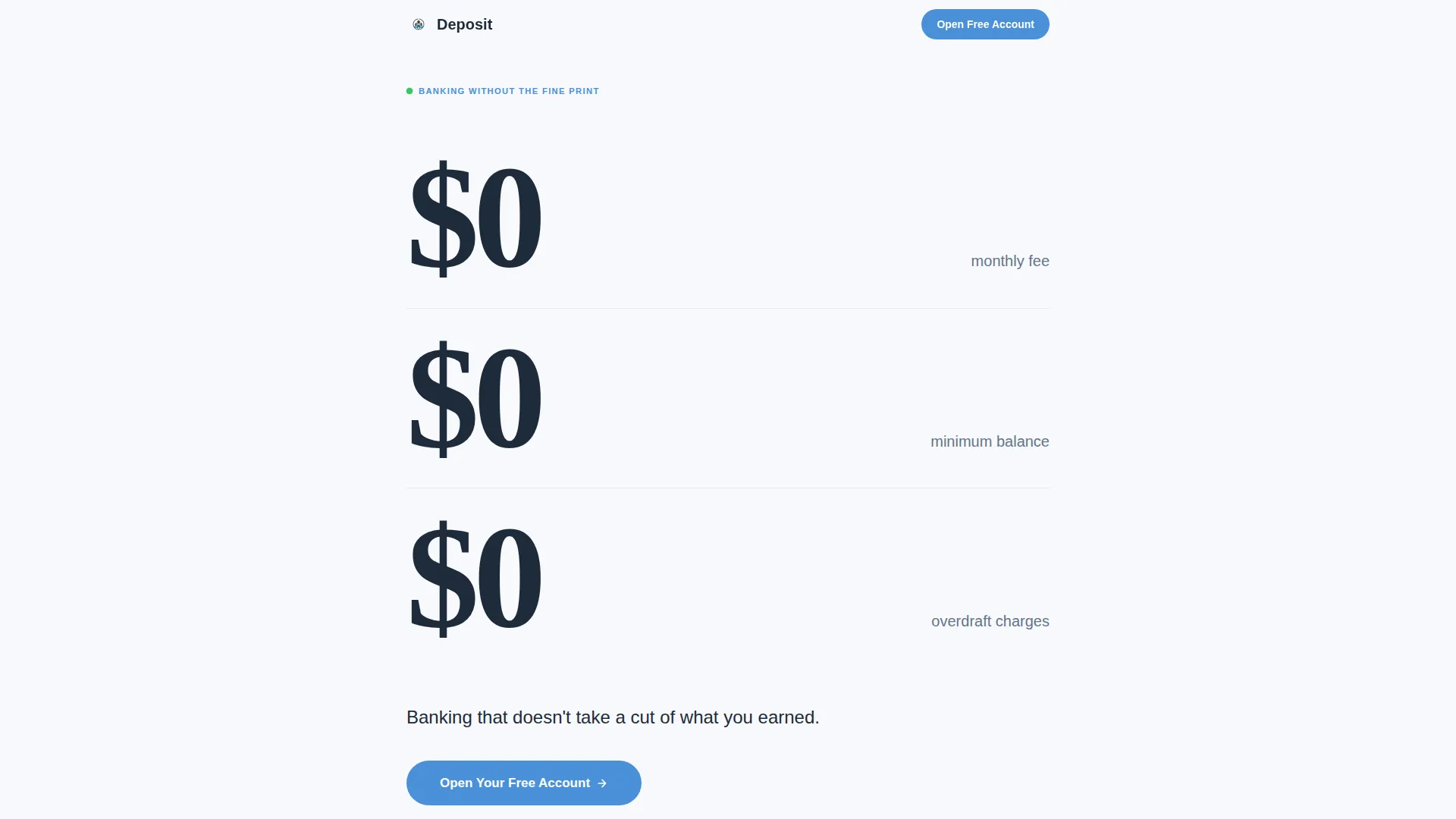
Animated $0 Hero Statistics
Three oversized typographic numbers animate in sequentially using a counter-roll effect, each landing on zero with deliberate precision. Set against a cloud white background in Fraunces display type, they answer the visitor's most important question before a single word is read.
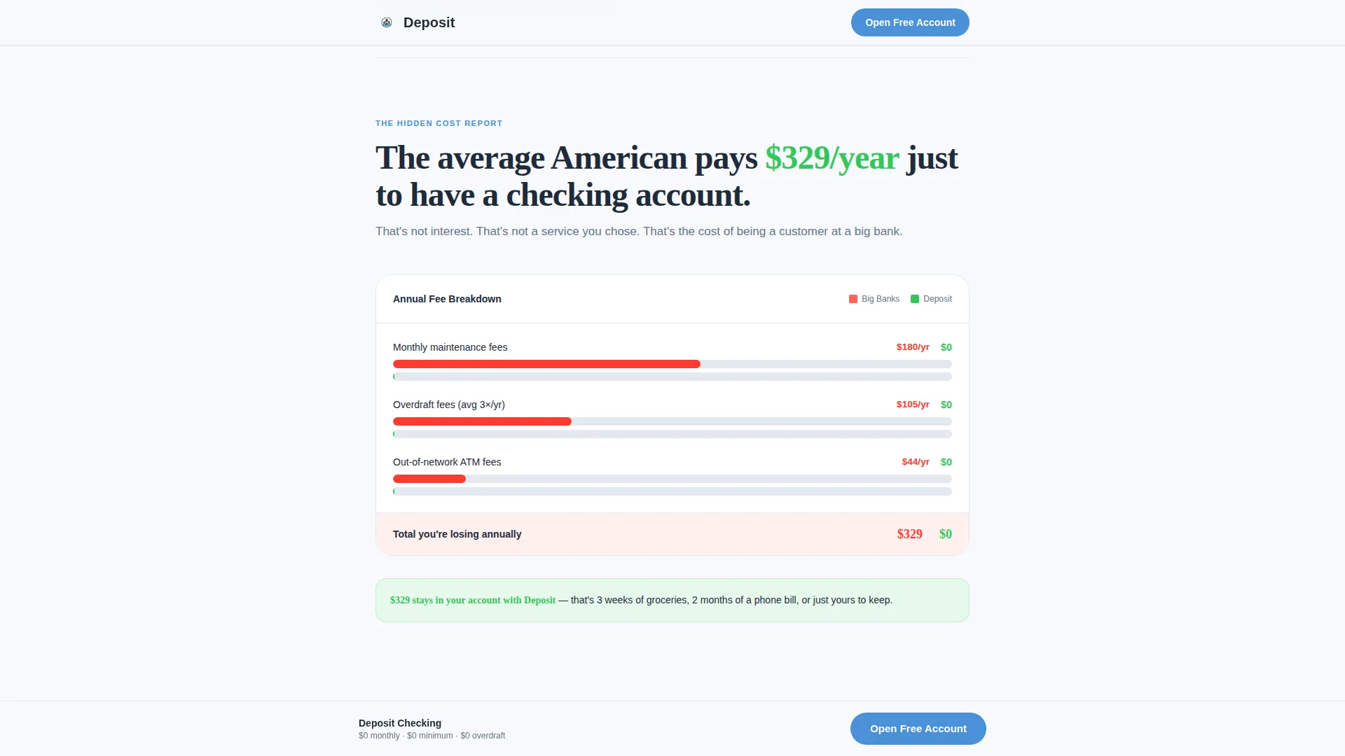
Hidden Cost Bar Chart
An animated bar chart fills on scroll to visualize the average American's $329 per year in checking fees. This section builds the emotional and financial case for switching before the product details appear.
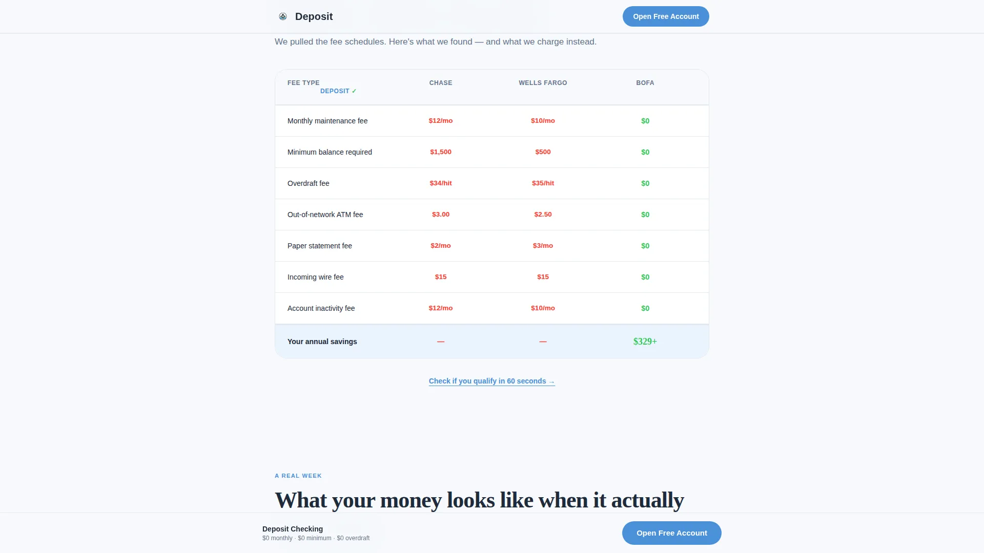
Fee Comparison Rows
Side-by-side feature rows compare this account's $0 line items against standard fees charged by competing banks. Each row uses staggered reveal animations and hover states to keep the comparison interactive and easy to scan.
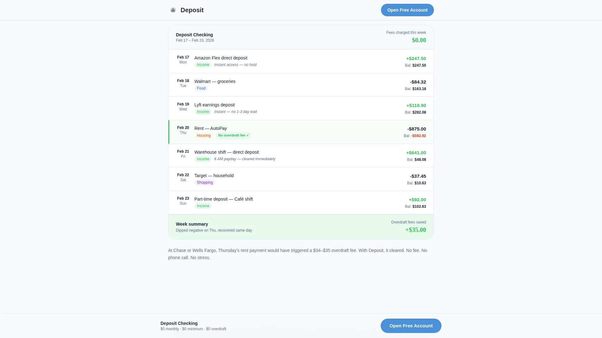
Realistic Transaction Timeline
A sample week of real-world deposits and purchases is displayed in a timeline layout showing zero penalties applied at any point. This section makes the zero-fee promise tangible and concrete for visitors who have been burned before.
Fixed Bottom Call to Action
A persistent call to action button stays anchored to the bottom of the viewport as the visitor scrolls. It reads "Open Your Free Account" and ensures the conversion path is always one tap away without interrupting the reading flow.
Social Proof Testimonials
A testimonials section features names, roles, and specific dollar amounts saved to ground the social proof in real financial outcomes. This section reinforces trust at the point where hesitant visitors are deciding whether to click.
Page sections overview
| Section | Purpose |
|---|---|
| Hero Stats Block | Open with three $0 counter-roll stats and primary call to action |
| Hidden Cost Exposé | Animated bar chart showing average annual fee burden |
| Fee Comparison Rows | Line-by-line $0 versus competitor fee breakdown |
| Transaction Timeline | Sample week of deposits and purchases with no penalties |
| Social Proof | Testimonials with names, roles, and savings amounts |
| Footer | Linear single-row pattern with links and legal copy |
Design & branding system
The visual identity follows a Startup Velocity theme built on the Cloud Canvas color system. Every color choice has a specific function: the background reduces anxiety, the headline color carries authority, the button color signals action, and the green is reserved exclusively for positive financial outcomes.
- Cloud white (#F7F9FC) background, confident charcoal (#1E2A3A) for headlines and data, sky blue (#4A90D9) for buttons and interactive elements
- Warm signal green (#34C759) used only for positive financial indicators such as deposits and savings figures
- DM Sans for body text and Fraunces for hero numbers, creating a contrast between approachable reading and typographic gravitas
Mobile & speed optimization
This template is built mobile-first, reflecting the reality that its primary users are on phones, not desktops. The single-column flow requires no horizontal scrolling or layout switching between breakpoints.
- Single-column layout adapts cleanly to small screens without collapsing complex grid structures
- Animations use scroll-triggered reveals and counter-roll effects scoped to client components, keeping static sections lightweight
- Fixed bottom call to action is optimized for thumb reach on mobile viewports
How this template helps you convert
The page is structured as a financial exposé that earns the click before asking for it. Visitors move through a deliberate sequence: see the proof, understand the cost they are currently paying, then encounter a frictionless path to act.
- The hero's $0 statistics answer the fee question instantly, reducing the most common reason visitors bounce from financial product pages
- The fee comparison and transaction timeline sections build compounding proof so that by the final call to action, the visitor has already done the math
- The secondary text link "Check if you qualify in 60 seconds" appears mid-page for hesitant visitors, offering a lower-commitment entry point before the full account-opening click
Other information about this template
This template is designed for the Low Income Finance subcategory within Finance and Insurance. It is purpose-built for fintech products targeting underbanked Americans and aligns with the Industry Report creative direction, which structures the scroll as a data-led argument rather than a branding exercise.
- The account-opening flow linked from this page requires only name, email, and Social Security Number, keeping the conversion path as short as possible
- The Industry Report creative direction means every section earns the next; no section exists purely for decoration
- This template works well for teams running performance marketing campaigns where ad spend needs a focused, distraction-free destination
Theme
Startup Velocity
Creative direction
Industry Report
Color system
Cloud Canvas
Style
Single Column Flow
Direction
Click-Through
Page Sections
Counter-roll Hero Statistics
Scroll-triggered Fee Chart
Interactive Fee Comparison Rows
Transaction Timeline Section
Persistent Bottom Call to Action
Testimonials with Specific Savings
Related questions
Does this template include the account-opening form?
Can I update the fee amounts and comparison rows to match my product?
What animations does this template include?
Who is this landing page template designed for?
Is this a standalone page or part of a multi-page kit?



