Dermatologist Patient Education Landing Page
Dermis is a dermatologist patient education landing page built for evidence-first medical practices. It combines a stats-driven hero, zigzag condition education panels, an anonymized patient journey timeline, and a three-step progressive booking form. The design uses a warm clinical palette to feel approachable yet authoritative, guiding new and returning patients confidently toward booking a skin assessment.
by Rocket studio
Quick summary
Dermis is a single-page dermatology landing page that leads with data and closes with action. Three animated statistics open the experience, condition-specific zigzag panels educate patients in plain language, and a three-step booking form converts interest into a scheduled appointment. Every design choice builds the quiet trust that a competent, evidence-led practice is paying attention.
Who this template is for
This template is built for dermatology clinics that want to attract informed, ready-to-book patients rather than passive browsers. It works especially well for practices that serve adults dealing with chronic or recurring skin conditions.
- Dermatologists who want to educate patients before the first visit
- Clinics offering both in-person and teledermatology appointment formats
- Practices targeting adults aged 18 to 45 with conditions like melasma, rosacea, or acne
What problem this template solves
Many dermatology patients wait months before seeking help because they feel overwhelmed, dismissed, or confused by generic health content. This template removes that friction by combining clinical credibility with plain-language education.
- Patients arrive without context and leave without booking because nothing earns their trust quickly
- Generic medical pages rarely explain the "why" behind a condition, leaving visitors to self-diagnose
- Practices struggle to communicate their evidence-based approach before the first appointment
What you get with this template
You get a fully structured, single-page layout designed specifically for a dermatologist patient education hub. Every section serves a clear role: build trust, explain conditions, show the patient journey, and close with a booking path.
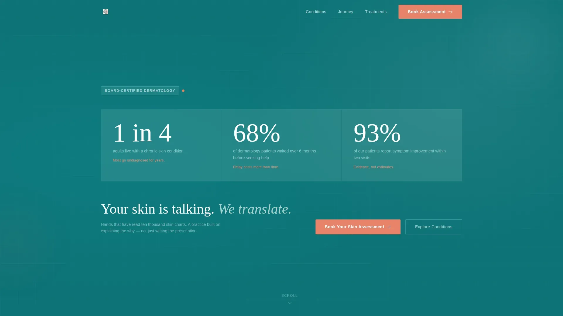
- A stats-driven hero section with three animated count-up numbers on a deep teal background
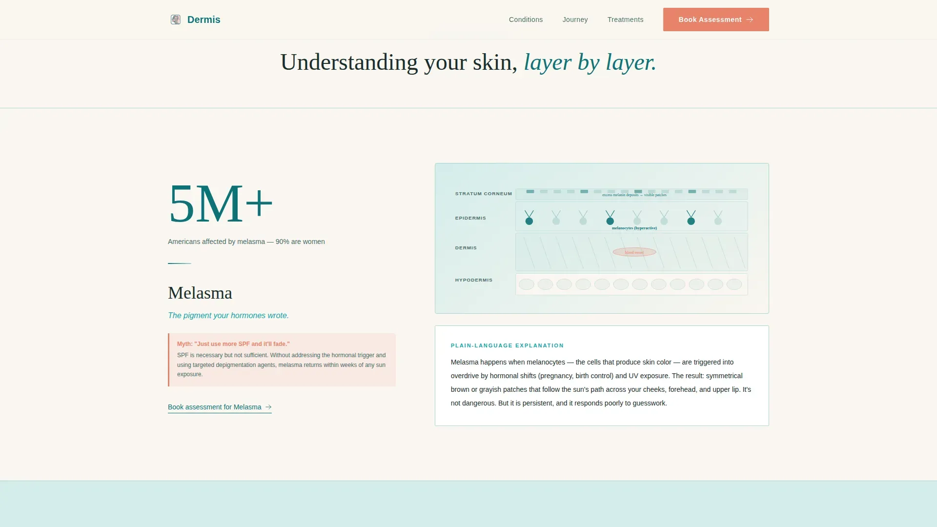
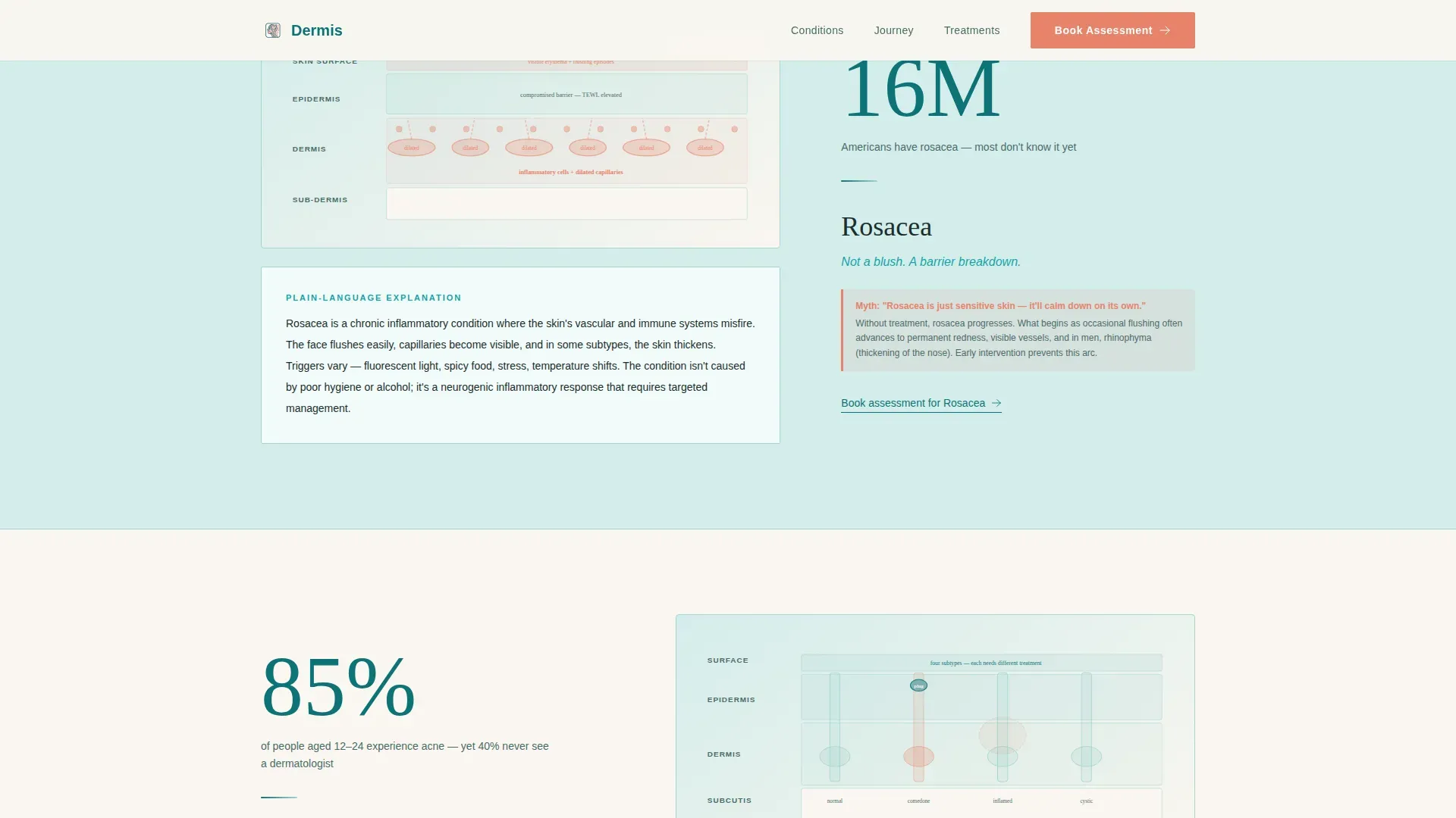
- Alternating zigzag condition panels covering melasma, rosacea, and acne or eczema, each with a myth-debunking callout in coral-pink
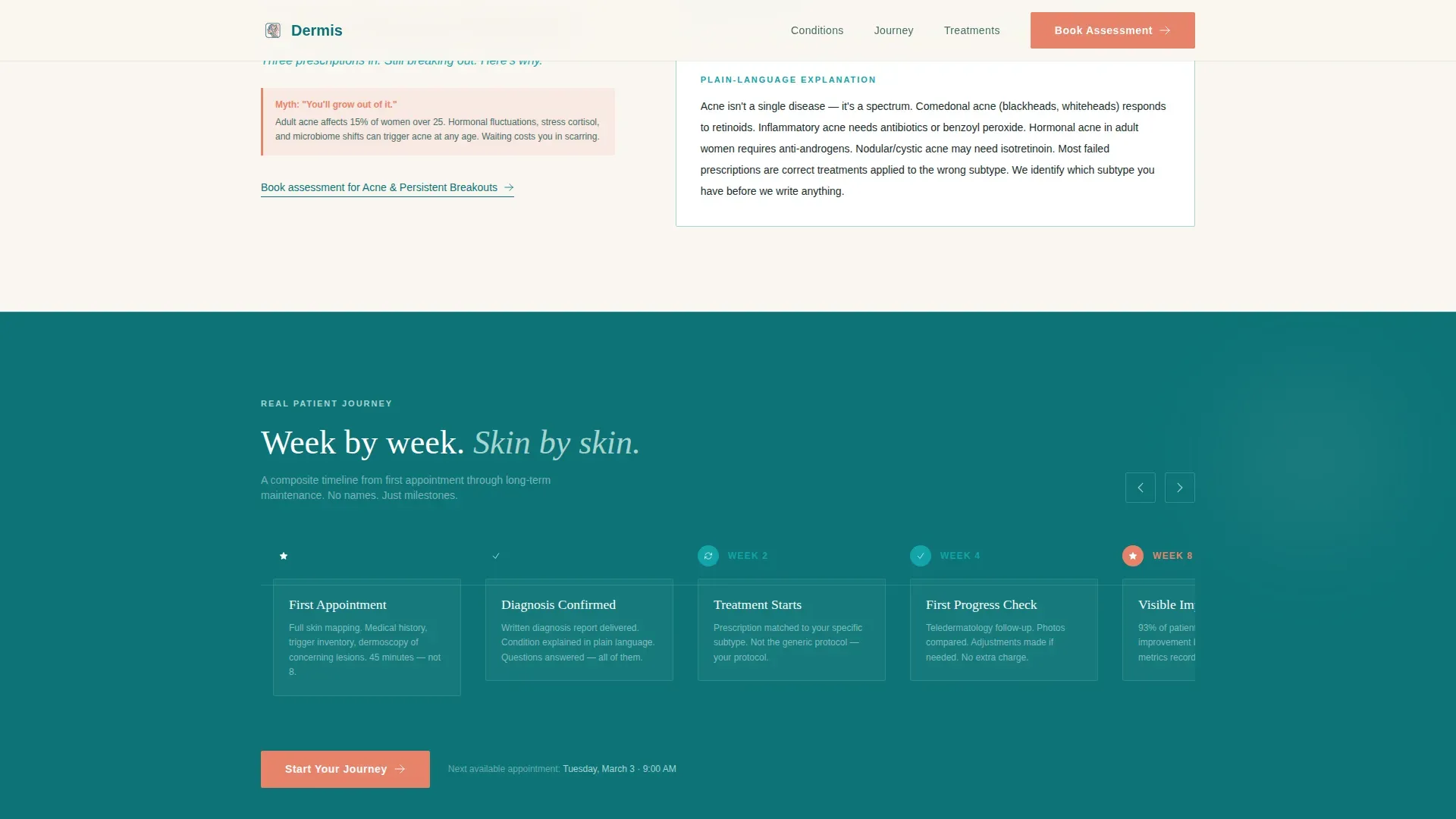
- A horizontal scrolling patient journey timeline, a three-step progressive booking form, and a secondary email-capture path for visitors not yet ready to book
Feature list
This template packs a focused set of high-impact features drawn directly from the brief. Each one plays a defined role in educating visitors and moving them toward a booked appointment.
Animated Stats Hero
Three oversized count-up numbers load against a deep teal background on page entry. Each figure carries a single supporting subline, delivering immediate credibility before the visitor reads a single word of body copy.
Zigzag Condition Education Panels
Alternating left-right content panels pair a bold statistic with a plain-language condition explanation. Each panel includes a labeled cross-section illustration and a myth-debunked callout rendered in coral-pink type.
Horizontal Patient Journey Timeline
A horizontally scrolling timeline walks visitors through a real, anonymized patient experience from first appointment through diagnosis to maintenance. Week markers and skin-progress illustrations replace names and personal details.
Three-Step Progressive Booking Form
The booking flow discloses one step at a time: concern type selection, preferred visit format, and a calendar date picker showing next-available slots highlighted in teal. This reduces friction and keeps the form from feeling overwhelming.
Fixed Mobile Booking Button
After the first scroll on a mobile device, a "Book Your Skin Assessment" button stays fixed to the bottom of the viewport. Visitors always have a clear next action, no matter how far they scroll.
Secondary Email Capture Path
A "Download Our Skin Condition Guide" option gives visitors a low-commitment alternative to booking. This positions the practice as an educator first and captures contact details from people who need more time before deciding.
Page sections overview
| Section | Purpose |
|---|---|
| Hero Stats Wall | Opens with three animated statistics and a primary booking call to action |
| Melasma Education Panel | Explains postpartum melasma with a statistic, illustration, and myth debunk |
| Rosacea Education Panel | Covers rosacea triggers with a statistic, illustration, and myth debunk |
| Acne and Eczema Panel | Addresses chronic acne or eczema with evidence and a myth-debunking callout |
| Patient Journey Timeline | Horizontal scroll showing anonymized week-by-week skin progress |
| Treatment Approach Panels | Evidence-led zigzag sections with condition cross-section illustrations |
| Booking Form Section | Three-step progressive disclosure leading to a calendar date picker |
| Footer Arc Split | Logo and tagline on the left, navigation links on the right |
Design & branding system
The visual identity follows an Organic Flow theme. The palette feels clinical without being cold, and warm without losing seriousness. Every color plays a specific role so the hierarchy is always clear.
- Deep teal (#0D7377) anchors headers and section dividers; soft celadon (#A8D5D1) washes alternating content panels; warm ivory (#FAF6F0) serves as the primary breathing space between sections
- Coral-pink (#E8836B) is reserved exclusively for calls to action, myth-debunking callouts, and urgent visual accents
- Typography pairs DM Sans for body text and user interface elements with Fraunces serif display headings for section titles, balancing clinical precision with approachable warmth
Mobile & speed optimization
The template is designed mobile-first, with equal attention given to the desktop experience. Interactive elements are built to stay functional and fast on small screens.
- The fixed booking button activates on mobile after the first scroll, keeping the primary call to action permanently visible without interrupting the reading flow
- The horizontal patient journey timeline is scroll-triggered and touch-friendly, so it works naturally on both mobile swipe and desktop mouse interaction
- Static sections use server-rendered components to keep load behavior efficient; the booking form and count-up animations use client-side components scoped only where interactivity is needed
How this template helps you convert
Conversion is built into the page structure, not added as an afterthought. The layout moves visitors from skepticism to confidence to action in a deliberate sequence.
- The stats hero establishes immediate clinical credibility before the visitor reads any marketing language, reducing the instinct to bounce.
- Zigzag education panels build condition-specific trust by answering the "why" question most patients never get answered, making booking feel like a logical next step rather than a leap of faith.
- The three-step booking form and the secondary email-capture path create two conversion routes, so visitors with different levels of readiness both have a clear, low-pressure way to stay connected with the practice.
Other information about this template
This template is a strong fit for dermatology practices looking to modernize their digital patient intake experience. A few additional details worth knowing before you customize it.
- The page uses staggered fadeInUp animations and scroll-triggered reveals to create a sense of progressive discovery without feeling gimmicky
- No stock photography is used in the hero; the design relies on data typography and illustration to establish authority
- The footer follows an Arc Split pattern with the logo and tagline on the left and navigation links on the right, keeping the closing section clean and branded
- The booking form supports four concern categories out of the box: acne, rosacea, moles, and eczema, plus a "not sure" option for first-time patients
- The overall layout and color system are designed to feel like a trusted medical resource, not a generic wellness brand
Theme
Organic Flow
Creative direction
Stats-First Impact
Color system
Teal Catalyst
Style
Zigzag/Alternating
Direction
Booking/Scheduling
Page Sections
Animated Count-up Stats Hero
Zigzag Condition Education Panels
Horizontal Patient Journey Timeline
Three-step Progressive Booking Form
Fixed Mobile Booking Button
Secondary Email Capture Path
Related questions
What skin conditions does this template cover?
Can this template support teledermatology as well as in-person visits?
Does the booking form require a third-party calendar tool?
Is this template suitable for a practice new to digital patient education?
Can the colors and typography be customized?



