Review Landing Page Template
A single-page dermatologist testimonial and review landing page built for trust-skeptical patients. It guides visitors through a three-step self-assessment, then surfaces verified patient reviews matched to their exact skin concern. A metrics comparison table, a five-step process timeline, and a gated resource download work together to move cautious researchers toward a confirmed booking.
by Rocket studio
Quick summary
This landing page template is designed for dermatology clinics that need to earn patient trust before asking for a booking. A multi-step intake form filters reviews by skin concern, a comparison table benchmarks clinic metrics against city averages, and a downloadable prep guide captures leads. Every section is built to answer the next patient objection before it surfaces.
Who this template is for
This template suits dermatology practices where word-of-mouth alone is not enough to convert late-night researchers. It is also a strong fit for clinic marketing teams building a dedicated social proof destination separate from the main website.
- Dermatology clinics wanting to turn skeptical review-readers into booked appointments
- HR benefits coordinators vetting in-network dermatology specialists for employee directories
- Post-procedure patients and practice managers aiming to showcase verified patient outcomes
What problem this template solves
Patients researching dermatologists at 11 p.m. face a wall of unfiltered reviews, unverified credentials, and vague clinic claims. They need evidence that is specific to their concern, not a generic five-star summary. This template structures that evidence so each scroll answers the next doubt.
- Generic review pages fail patients with niche concerns like mole changes or recurring cystic acne
- Patients cannot easily compare a clinic's response time or board certification count against local alternatives
- First-time visitors leave when they cannot find practical prep information before their appointment
What you get with this template
The template delivers a complete, single-page trust-building flow. Every section feeds the next, from self-assessment to filtered proof to a downloadable resource. Nothing is left for the visitor to figure out on their own.
- A three-step self-assessment form that filters testimonials by the visitor's specific skin concern
- A side-by-side comparison table showing clinic metrics versus anonymized city averages
- A five-step process timeline with real appointment photos from booking through follow-up
- A gated PDF resource, "Questions to Bring to Your First Derm Visit," collected behind an email field with optional zip code
- Unedited patient reviews with visible timestamps and verified-visit badges
Feature list
This section covers the core functional and design capabilities built into the template, as described in the source brief.
Three-Step Self-Assessment Form
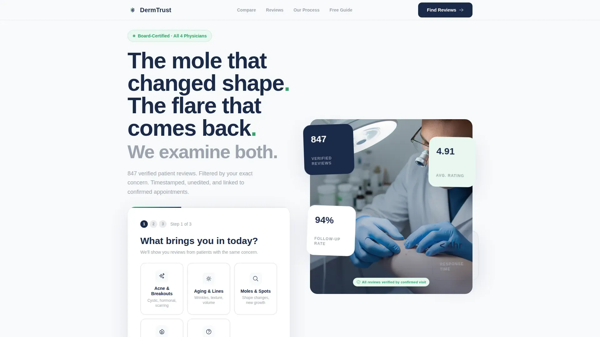
The header form opens with icon-driven concern tiles covering acne, aging, moles, rosacea, and other conditions. Step two asks a simple yes or no about prior dermatologist visits. Step three reveals testimonials curated to match the visitor's selected concern, making the page feel like a personalized intake rather than a marketing funnel.
Metrics Comparison Table
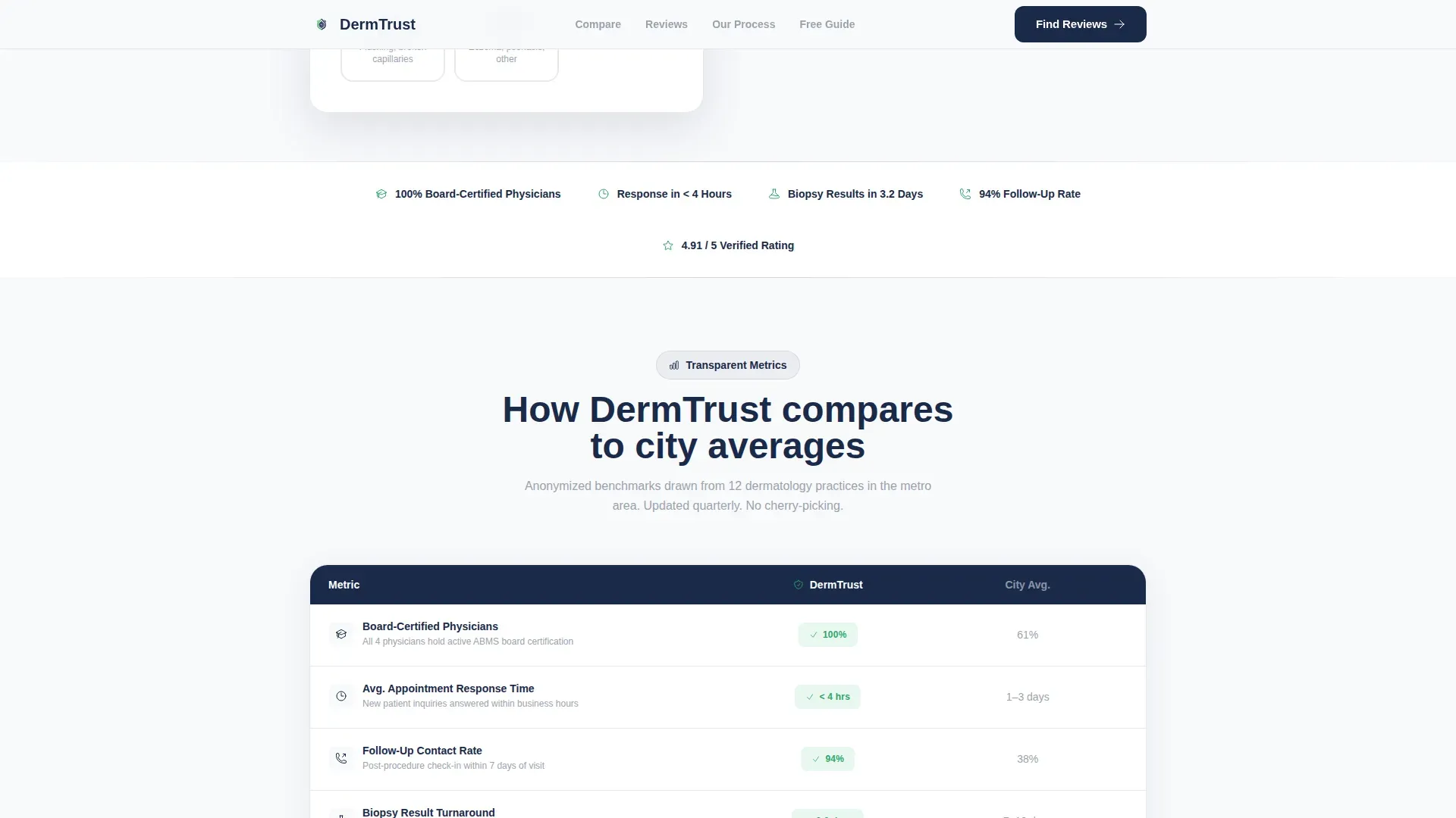
A structured comparison table places the clinic's key performance indicators alongside anonymized city averages. Rows cover response time, board certification count, and follow-up rate. Hover interactions highlight individual rows, making it easy for skeptical readers to scan the data that matters most to them.
Verified Patient Reviews Section
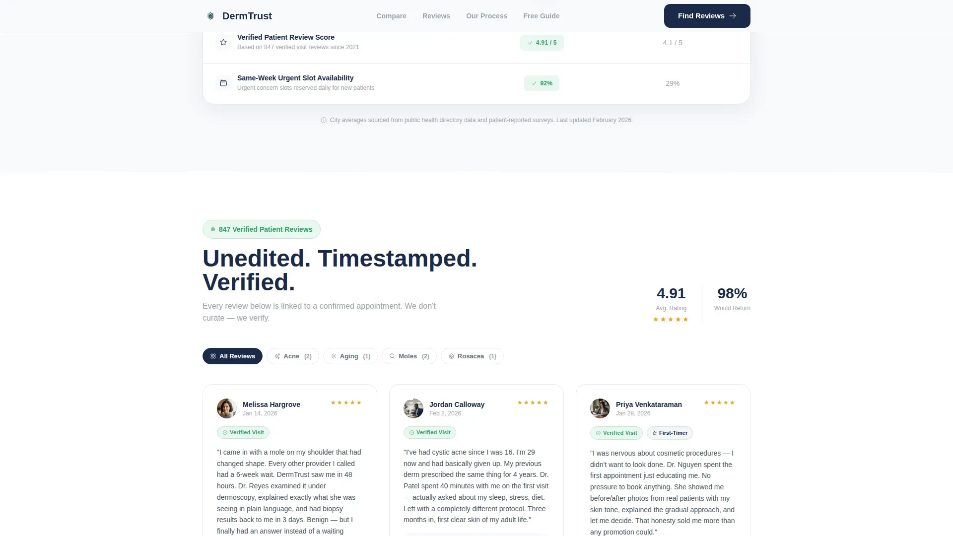
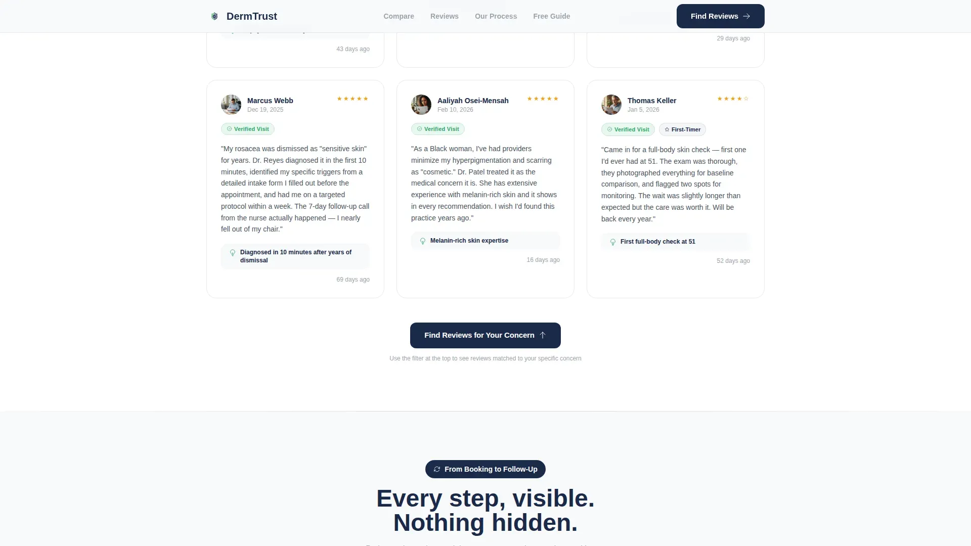
Patient reviews appear unedited with visible submission timestamps and verified-visit badges. The green verification indicators signal confirmed appointments, not solicited testimonials. This section builds the credibility stack that turns a cautious browser into a confident caller.
Five-Step Booking Timeline
A numbered process timeline walks visitors through every stage from initial booking to post-visit follow-up. Real appointment photos accompany each step. This visual walkthrough removes the uncertainty that often prevents first-time patients from committing.
Gated Resource Download
A downloadable PDF guide, "Questions to Bring to Your First Derm Visit," sits behind a simple email capture field. Visitors can also enter an optional zip code for provider matching. The resource delivers value before asking for a commitment, lowering the psychological barrier to sharing contact details.
Page sections overview
| Section | Purpose |
|---|---|
| Hero Self-Assessment | Guide visitors through a three-step concern filter to surface relevant testimonials |
| Metrics Comparison Table | Benchmark clinic performance against anonymized city averages |
| Verified Reviews Feed | Display unedited, timestamped, badge-confirmed patient testimonials |
| Process Timeline | Show the five-step journey from booking to follow-up with real photos |
| Resource Download Gate | Capture email leads with a practical pre-visit PDF guide |
| Linear Footer | Provide essential clinic links in a single-row footer layout |
Design & branding system
The visual identity follows a Corporate Precision theme that feels sterile without being cold. Clinical Arctic White dominates eighty percent of background space, keeping focus on the content rather than the chrome. Every color in the palette plays a specific trust role.
- Background uses clinical white (#F8F9FB) with instrument-grade silver (#D1D5DB) separating comparison rows and structural dividers
- Consultation-room navy (#1B2A4A) anchors all headings, pull-quotes, and the navigation progress bar
- Verification green (#2FA66A) appears only on trust badges, confirmed-patient indicators, and credential markers
Mobile & speed optimization
The template is built mobile-first, reflecting the reality that most patients research dermatologists on their phones late at night. Interactive components use a client-side rendering approach while static sections rely on server components to keep load behavior lean.
- Multi-step form, comparison table hover states, and FAQ accordion are handled as client-side interactive components
- Static sections such as the timeline and footer use server components to reduce unnecessary rendering overhead
- Staggered reveal animations, counter animations, and scroll-linked transitions are set to a medium intensity to stay smooth on mobile without feeling sluggish
How this template helps you convert
The page is structured as a Transparent Process destination that peels back every layer a skeptical patient would otherwise question. Each section earns the next click by giving value before asking for anything in return.
- The self-assessment form personalizes the experience immediately, so visitors see proof relevant to their exact concern rather than a generic review wall, increasing the likelihood they stay and explore.
- The comparison table gives fact-conscious visitors objective data to evaluate, reducing hesitation by replacing vague claims with visible metrics and board certification counts.
- The gated PDF resource converts passive browsers into leads by offering a practical takeaway, with the primary call to action looping them back to filtered testimonials and a secondary path capturing their email for provider matching.
Other information about this template
This template is specifically designed for the dermatologist testimonial and review page niche within the Health and Medical category. It is built for the United States market, in English, with USD-denominated service context in mind. The template style is a Comparison Table layout, and the landing page direction is Content and Resource.
- Typography uses DM Sans for all headings and Plus Jakarta Sans for body text, maintaining a clinical yet approachable reading rhythm
- The primary call to action, "Find Reviews for Your Concern," loops visitors back into the filtered testimonial engine seeded by their header selections
- Animation intensity is set to medium with staggered reveals, counter animations, tab transitions, and scroll-linked effects to keep engagement without distraction
Theme
Corporate Precision
Creative direction
Transparent Process
Color system
Arctic White
Style
Comparison Table
Direction
Content/Resource
Page Sections
Three-step Self-assessment Form
Side-by-side Metrics Comparison Table
Verified Patient Review Feed
Five-step Process Timeline
Gated Pre-visit Resource Download
Related questions
How does the verified-visit badge system work in the reviews section?
Is the comparison table data pre-filled or do I enter my own clinic metrics?
What does the gated PDF download section capture from visitors?
Can HR benefits coordinators use this page to evaluate a clinic for an employee directory?



