Game Designer Portfolio Landing Page Template
Designcraft is a horizontal scroll landing page built for game designers who want their portfolio to feel like a sketchbook in progress. It moves visitors through a timeline of shipped work, from early student projects to independent releases, and closes on a waitlist panel for an unannounced project. The layout is editorial, tactile, and built to hold the attention of studio directors and indie publishers.
by Rocket studio
Quick summary
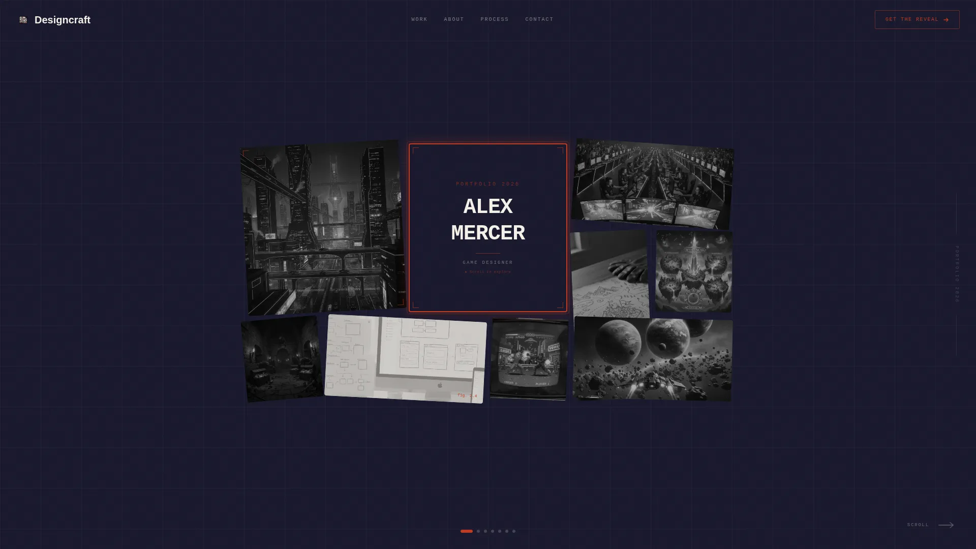
Designcraft is a single-page horizontal scroll portfolio template for game designers. It opens with a photo grid mosaic header, guides visitors through a project timeline with awards and contribution details, and ends on a waitlist panel teasing an unannounced title. The visual style draws from ink, parchment, and editorial markup to create a sketchbook-like atmosphere.
Who this template is for
This template is built for game designers who want their portfolio to do more than list job titles. It speaks to designers with a body of shipped work and something new in the pipeline.
- Game designers ready to attract studio creative directors, indie publishers, or game jam organizers
- Designers with multiple shipped titles who want to show progression and contribution depth
- Independent and mid-career designers building anticipation around an upcoming unannounced project
What problem this template solves
A generic grid portfolio does not communicate design thinking or creative range. Most portfolio templates treat game design work the same as graphic design or photography, losing the narrative that makes a game designer's process compelling.
- Visitors leave before they understand the scope of your contribution to each project
- A flat layout cannot show momentum or build curiosity about what you are working on next
- There is no natural moment to capture interest or grow an audience before a project launches
What you get with this template
You get a fully structured one-page horizontal scroll layout that takes the visitor on a deliberate journey. Every section has a clear role, from the first-impression header to the final waitlist capture panel.
- A photo grid mosaic header with desaturation hover effects and parallax tile behavior
- A left-to-right project timeline with per-panel contribution labels, key frames, and award laurels
- A closing waitlist panel with a teaser frame, email capture field, and a live waitlist counter for social proof
Feature list
This template is built around a specific set of visual and structural decisions that serve game designer portfolios directly.
Horizontal Scroll Project Timeline
The main content area scrolls left to right, presenting each shipped title as its own panel. Panels grow slightly larger as the timeline progresses, reinforcing the sense of a career building in scale and recognition.
Photo Grid Mosaic Header
The header arranges game screenshots, hand-drawn mechanic sketches, and award laurels in a rotated tile grid. Tiles are desaturated by default and bloom into full color on hover, with a subtle parallax shift that makes the grid feel physical and alive.
Per-Panel Contribution Detail
Each project panel names the designer's specific role on that title, such as narrative systems, level flow, or economy balancing. This gives studio visitors and publishers exactly the detail they need without forcing them to read a wall of text.
Award Laurels and Festival Stamps
Awards and festival selections are pinned to each project panel like passport stamps. The red editorial markup accent intensifies across the timeline as recognition grows, giving the page a visual rhythm that rewards attentive scrolling.
Waitlist Capture Panel
The final panel shows a blurred teaser frame from an unannounced project, a "Get the Reveal First" call to action, a single email input field, and a live counter showing the current waitlist size. The counter acts as on-page social proof without requiring a separate tool.
Ink and Paper Color System
The palette uses deep manuscript black, warm parchment, pencil graphite, and red editorial markup. The combination feels like a freshly printed independent zine, deliberate and tactile, where the red accent is reserved for awards and interactive hover states.
Page sections overview
| Section | Purpose |
|---|---|
| Photo Grid Mosaic Header | First impression with hover-activated color and parallax effect |
| Designer Name Tile | Central identity marker set in monospaced type with red border frame |
| Project Timeline Scroll | Left-to-right career narrative across shipped game titles |
| Per-Panel Contribution Label | Shows the designer's specific role on each project |
| Award and Laurel Stamps | Visual recognition markers pinned to each project panel |
| Unannounced Project Teaser | Blurred key frame to provoke curiosity and build anticipation |
| Waitlist Capture Panel | Email field, call to action headline, and live waitlist counter |
Design & branding system
The design language is built around a Lens and Frame theme with an Ink and Paper color system. Every visual choice reinforces the idea of a physical sketchbook or editorial zine rather than a polished digital product catalog.
- Color palette: deep manuscript black (#1A1A2E), warm parchment (#F5F0E8), pencil graphite (#4A4A4A), and red editorial markup (#C23B22) for awards and hover states
- Typography: a monospaced typeface anchors the designer's name tile, keeping the editorial and contact-sheet reference intact throughout
- Red accent usage is intentional and limited, reserved for award badges, hover states, and the intensifying laurel stamps across the project timeline
Mobile & speed optimization
The horizontal scroll interaction is designed for intentional desktop browsing, which suits the primary audience of studio directors and publishers reviewing work on a full screen. The layout is structured to keep each panel focused and uncluttered.
- Each project panel contains only its key frame, contribution label, and any laurels, avoiding visual noise that would slow comprehension
- The waitlist panel is self-contained, keeping the email capture action simple and easy to reach after the full scroll journey
How this template helps you convert
The entire page is a structured argument that leads the visitor to one moment: the waitlist sign-up. The layout earns that final action by building trust and curiosity across every panel before the ask arrives.
- The project timeline builds credibility progressively, showing growth from student work to independent releases before the visitor reaches the waitlist panel
- The blurred teaser frame and live waitlist counter make the final panel feel like an exclusive opportunity rather than a generic newsletter sign-up
Other information about this template
This template is part of the Designcraft collection and sits within the Portfolio and Agency category, specifically the Game Designer One-Page Portfolio niche. It is a strong fit for designers who want a creative portfolio landing page that stands apart from standard resume-style pages.
- The template is designed as a single horizontal scroll landing page, ideal for game jam featured creator profiles and GDC portfolio reviews
- The Lens and Frame theme and Ink and Paper palette can be adapted by swapping the parchment and graphite tones to match a personal brand while keeping the editorial structure intact
- The Waitlist and Coming Soon direction makes this template useful not just as a portfolio but as a pre-launch tool for independent game releases



Theme
Lens & Frame
Creative direction
Award & Recognition
Color system
Ink & Paper
Style
Horizontal Scroll
Direction
Waitlist/Coming Soon
Page Sections
Horizontal Scroll Project Timeline
Photo Grid Mosaic Header
Per-panel Contribution Detail
Award Laurels and Festival Stamps
Waitlist Capture Panel
Ink and Paper Color System
Related questions
Can I use this template if I am still early in my career?
What goes in the waitlist panel if I do not have an unannounced project yet?
How many projects should I include in the timeline?
Is this template suited for freelance game designers?
Can the color palette be changed to match my personal brand?



