Healthcare Strategy Consultant Landing Page Template
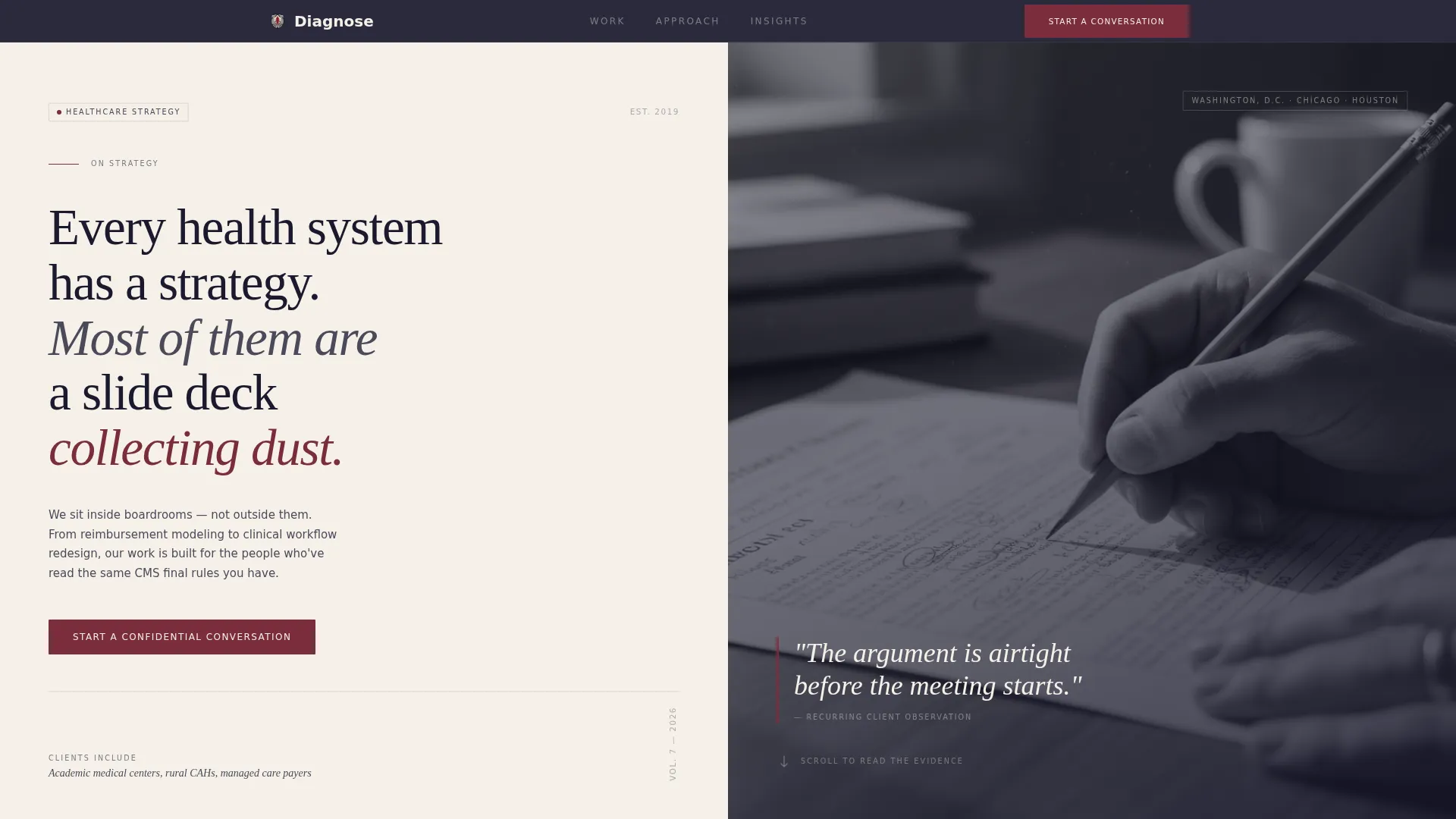
Diagnose is a split-screen landing page template built for healthcare strategy consultants who work at the executive level. It pairs a provocative manifesto header with a testimonial mosaic scroll structure, a restrained Ink and Paper color system, and a dual-path conversion design. The result is a page that earns trust through specificity before it ever asks for a meeting.
by Rocket studio
Quick summary
Diagnose is a single-page template designed for a healthcare strategy consultancy that advises chief medical officers, health system chief executive officers, and payer strategy leads. It uses a 50/50 split-screen layout, a manifesto-style header, and a scrolling testimonial mosaic to build credibility before presenting a primary call to action. The visual tone is editorial and restrained, built to resonate with senior healthcare executives who read policy briefs before meetings.
Who this template is for
This template is built for consultants operating at the intersection of healthcare policy, clinical operations, and executive decision-making. It speaks the language of the boardroom, not the brochure rack.
- Healthcare strategy consultants advising chief medical officers and health system chief executive officers on value-based care transitions and network mergers
- Payer strategy advisors who work with vice president-level leads at managed care organizations and need credibility before the first call
- Boutique healthcare consulting firms serving academic medical centers, rural critical access hospitals, and Medicaid managed care organizations
What problem this template solves
Most professional services pages try to say everything and end up saying nothing. For a senior healthcare executive scanning a page at 6 a.m., generic language is an immediate trust signal in the wrong direction. This template is built to solve that specific problem.
- Generic consulting pages lack the specificity that earns trust from chief medical officers and health system executives
- Visitors with high intent but low urgency have no soft entry point, so they leave without converting
- Strategy firms with deep credentials have no structured way to show range across healthcare sub-sectors without writing an essay
What you get with this template
You get a fully structured single-page layout with every section purpose-built for B2B conversion in a high-trust professional services context. No filler sections, no decorative elements without function.
- A 50/50 split-screen manifesto header that opens with a provocation and pairs it with a quiet, context-setting image
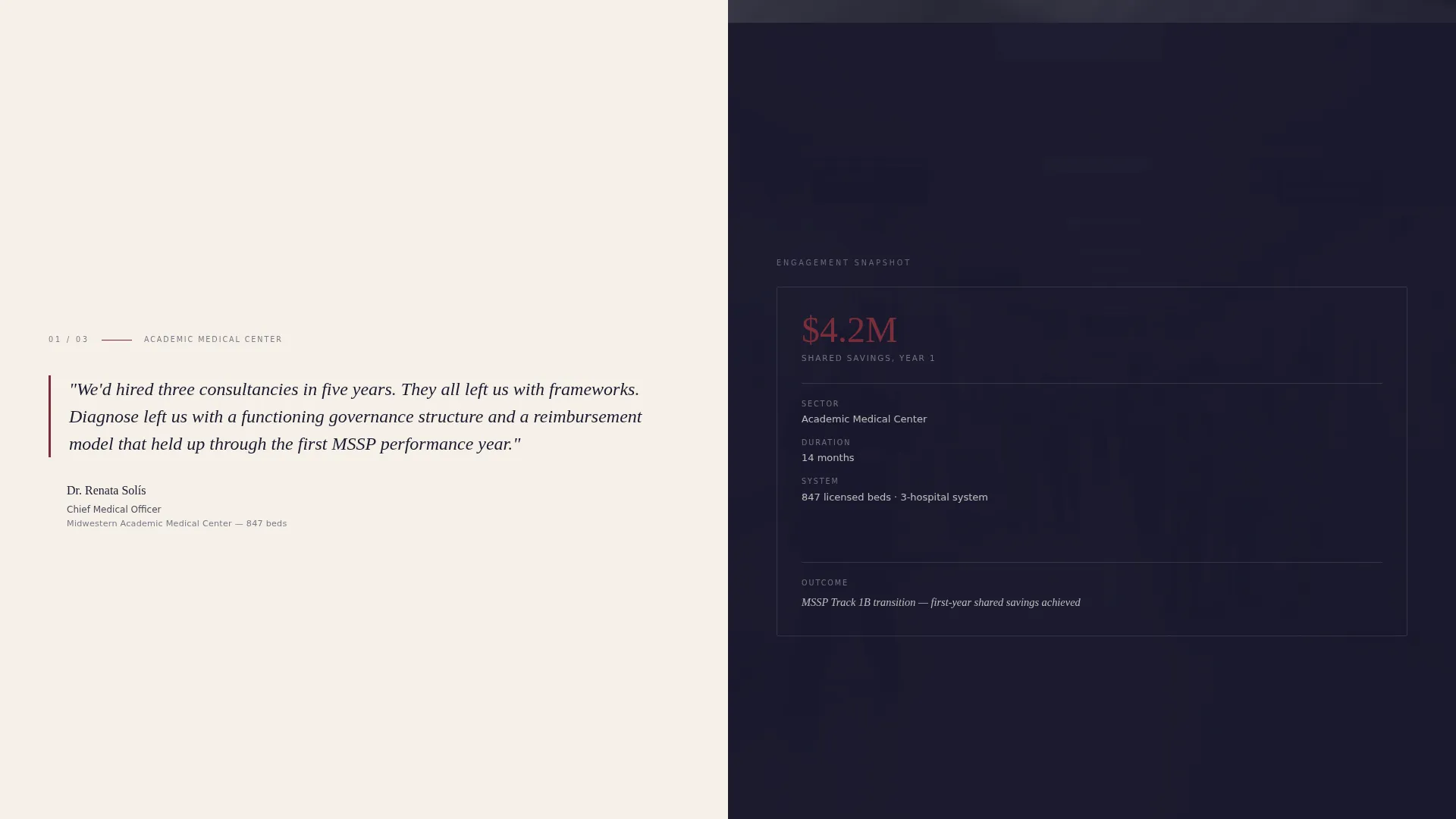
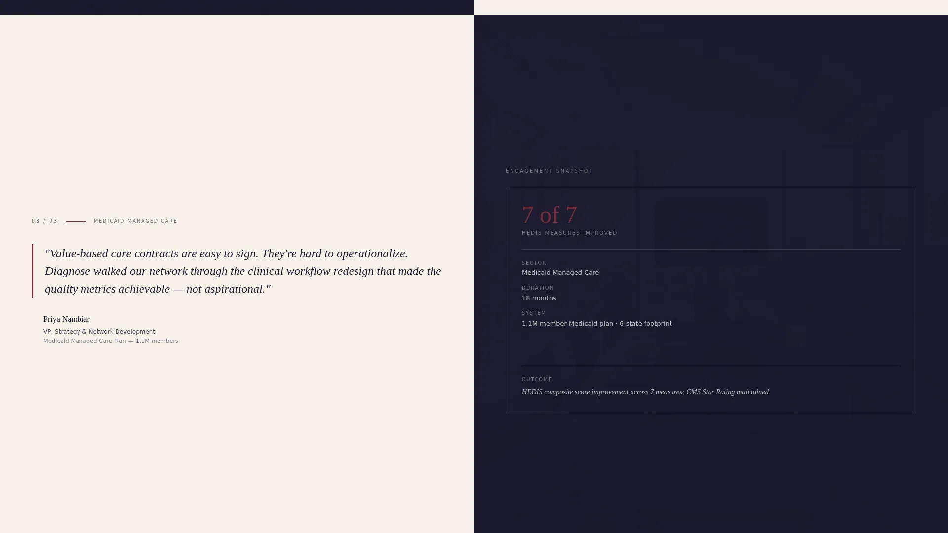
- A scrolling testimonial mosaic with dedicated engagement snapshots showing timeline, system size, and outcome metric alongside each client quote
- A dual-path conversion setup: a primary contact form for ready buyers and a gated whitepaper download for earlier-stage visitors
Feature list
This section covers the core capabilities built into the Diagnose template as described in the source brief.
Split-Screen Manifesto Header
The header divides the screen evenly. The left panel holds a single provocative serif statement set against warm archival cream. The right panel carries a still, muted photograph of a conference table shot from above, with scattered printouts and a pen mid-annotation. No faces appear. The contrast between blunt language and quiet imagery creates the tension that earns the scroll.
Scrolling Testimonial Mosaic
Each scroll section splits the screen between a client quote and a structured engagement snapshot. The snapshot includes timeline, system size, and a specific outcome metric. The mosaic covers distinct healthcare sub-sectors across its tiles, demonstrating range through specificity rather than volume.
Dual-Path Conversion Design
The primary call to action reads "Start a Confidential Conversation" and appears after the third testimonial tile. The contact form captures name, title, organization, and one open-field question. A secondary path offers a gated whitepaper download requiring only an email address and system type, catching visitors not yet ready for direct engagement.
Editorial Ink and Paper Color System
The palette uses deep editorial black, warm archival cream, muted graphite for body text, and a single oxblood red accent reserved for pull quotes and call-to-action states. Every color choice signals restraint and authority without visual noise.
Serif-Led Typography Hierarchy
Large serif type anchors the header manifesto and pull quotes throughout the page. Body copy uses muted graphite to maintain readability without competing with the accent color. The typographic system reinforces the university press monograph feel described in the brief.
Sector-Specific Credibility Structure
The testimonial mosaic is organized to reveal coverage across healthcare sub-sectors: academic medical centers, rural critical access hospitals, and Medicaid managed care. Each tile adds a distinct dimension to the consultancy's demonstrated range without requiring the visitor to read a capabilities document.
Page sections overview
| Section | Purpose |
|---|---|
| Manifesto Header | Opens with a provocative serif statement paired with a still conference-table photograph to earn the scroll |
| Testimonial Tile One | Pairs a client quote with an engagement snapshot covering timeline, system size, and outcome metric |
| Testimonial Tile Two | Adds a second healthcare sub-sector to the credibility mosaic |
| Testimonial Tile Three | Completes the three-tile mosaic and establishes range before the primary call to action appears |
| Primary call to action Form | Captures name, title, organization, and an open strategic question for direct engagement |
| Whitepaper Download | Secondary gated path requiring email and system type for earlier-stage visitors |
Design & branding system
The design follows an Educational Guide theme expressed through an Ink and Paper color system. Every visual decision reinforces the feeling of a well-annotated policy brief rather than a marketing page.
- Color palette: deep editorial black (#1A1A2E) for structure, warm archival cream (#F5F0E8) for backgrounds, muted graphite (#4A4A5A) for body text, and oxblood red (#7B2D3B) used sparingly for pull quotes and call-to-action states
- Typography: large serif type for manifesto statements and pull quotes; a restrained body type in graphite that keeps long-form credibility content readable without visual competition
- Photography: still, muted, face-free imagery that functions as context rather than decoration, keeping the intellectual weight on the written content
Mobile & speed optimization
The 50/50 split-screen layout adapts cleanly to single-column stacking on smaller screens. The mosaic scroll structure remains legible and purposeful at every viewport width.
- Split-screen panels reflow to a vertical single-column format on mobile, preserving the quote-and-context pairing without losing the structural logic
- The restrained color system and minimal image treatment reduce visual complexity on smaller screens, keeping the editorial tone intact across devices
How this template helps you convert
The conversion architecture in Diagnose is sequenced deliberately. Authority is established before any ask is made, and two distinct paths are available for visitors at different stages of readiness.
- The manifesto header and three-tile testimonial mosaic build credibility in sequence, so the primary call to action appears only after the visitor has seen specific evidence of expertise across multiple healthcare sub-sectors
- The dual-path conversion design captures both high-intent visitors ready to start a conversation and earlier-stage visitors willing to exchange an email for a gated whitepaper, widening the top of the engagement funnel without weakening the primary offer
Other information about this template
Diagnose is designed for a professional services context where trust is the primary purchase driver and direct outreach is a significant commitment. The template reflects that reality at every structural level.
- The page is suited for healthcare consulting firms that compete on intellectual depth rather than scale, including strategy boutiques serving payer organizations, integrated delivery networks, and government health programs
- The whitepaper gating mechanism uses a lightweight two-field form, making it low-friction enough to capture visitors who arrived through referral or a specific search for healthcare strategy resources
- The template works as a standalone engagement page for a consultancy with an existing web presence, or as the primary web presence for a boutique firm where one well-executed page outperforms a sprawling multi-page site

Theme
Educational Guide
Creative direction
Testimonial Mosaic
Color system
Ink & Paper
Style
Split Screen (50/50)
Direction
Partnership/B2B
Page Sections
Split-screen Manifesto Header
Scrolling Testimonial Mosaic
Dual-path Conversion Design
Ink and Paper Color System
Sector-specific Credibility Structure
Serif-led Typography System
Related questions
Can I update the testimonial quotes and engagement snapshots with my own client data?
What does the primary contact form collect?
Is the whitepaper download separate from the primary contact form?
How many testimonial tiles does the mosaic include?
Can a solo healthcare strategy consultant use this template effectively?



