Comprehensive Mental Health Education Landing Page Template
Clarity is a psychiatrist patient education landing page template built for plain-language health understanding. It combines an interactive symptom checklist, side-by-side medication comparison tables, and a visual treatment timeline to help patients make sense of their diagnosis. The design is calm, clinical, and mobile-first, built for the person searching their prescription name at midnight.
by Rocket studio
Quick summary
Clarity is a single-page patient education landing page template designed for psychiatrist websites and mental health resource hubs. It gives visitors a structured, empathetic path from vague worry to informed questions. The layout pairs an interactive symptom checklist with side-by-side comparison tables and a medication timeline, all wrapped in a clean Arctic White visual system that feels like a well-printed medical handout.
Who this template is for
This template is built for mental health professionals who want to provide real educational value online. It suits psychiatrists, psychiatric nurse practitioners, and mental health clinics that serve patients navigating a new diagnosis or evaluating treatment options. It also fits health content teams who create digital resources for anxious patients and their families.
- Psychiatrists and psychiatric clinics building a patient-facing education hub
- Mental health professionals who want to move visitors from confusion to clarity before the first appointment
- Health content teams publishing structured guides for newly diagnosed adults and parents of recently evaluated teenagers
What problem this template solves
Patients who receive a psychiatric diagnosis often leave their appointment with more questions than answers. They turn to search engines at night, land on pages dense with clinical language, and feel more overwhelmed than when they started. This template solves that gap by presenting treatment information, medication comparisons, and therapy explanations in plain, readable language that anyone can follow.
- Visitors arrive confused and anxious; the template gives them a structured, calm path to clarity
- Side-by-side comparison tables eliminate the need to open ten browser tabs to understand treatment options
- The download form collects only what is needed, so patients get helpful resources without unnecessary friction
What you get with this template
This template delivers a complete, ready-to-customize landing page built around the patient education experience. Every section has a defined purpose and a clear visual rhythm. You get a layout that effectively communicates clinical information without overwhelming the reader.
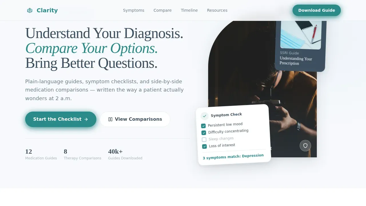
- A portrait-centered hero section with a headline that sets a calm, focused tone
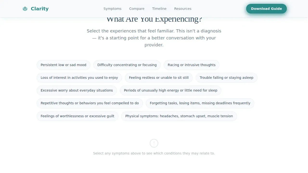
- An interactive symptom checklist that highlights condition overlaps as visitors toggle their experiences
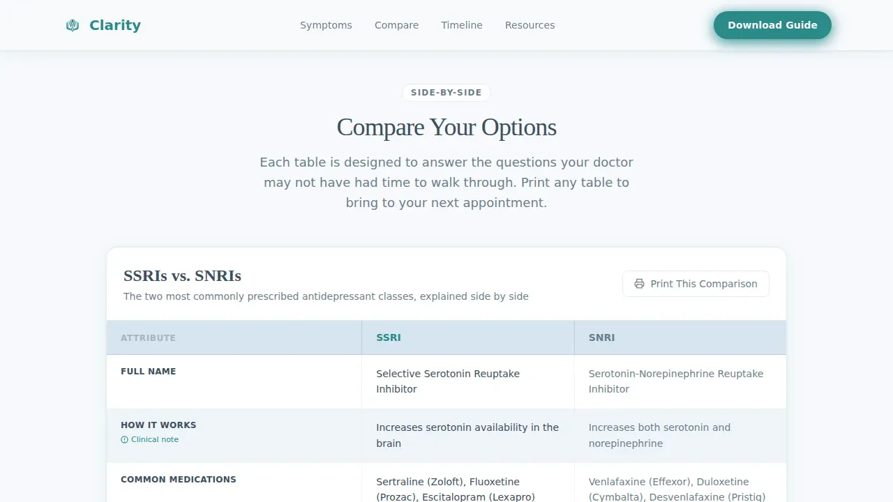
- Side-by-side comparison tables covering medication classes and therapy types, with per-row ice blue alternation for easy reading
- A week-by-week medication timeline that sets honest expectations for treatment effects and side effects
- A gated download form and a no-form print option on every table, giving visitors two paths to value
- Patient testimonials and clinician credential badges that support building trust throughout the scroll
Feature list
This template ships with a focused set of features that serve patient education and support building trust with every scroll.
Interactive Symptom Checklist
The checklist section lets visitors toggle symptoms they are experiencing. As they select items, the interface subtly highlights which conditions share those symptoms. This process guides visitors toward more specific conversations with their therapist or prescribing clinician. It turns vague unease into something actionable before the first appointment.
Side-by-Side Medication Comparison Tables
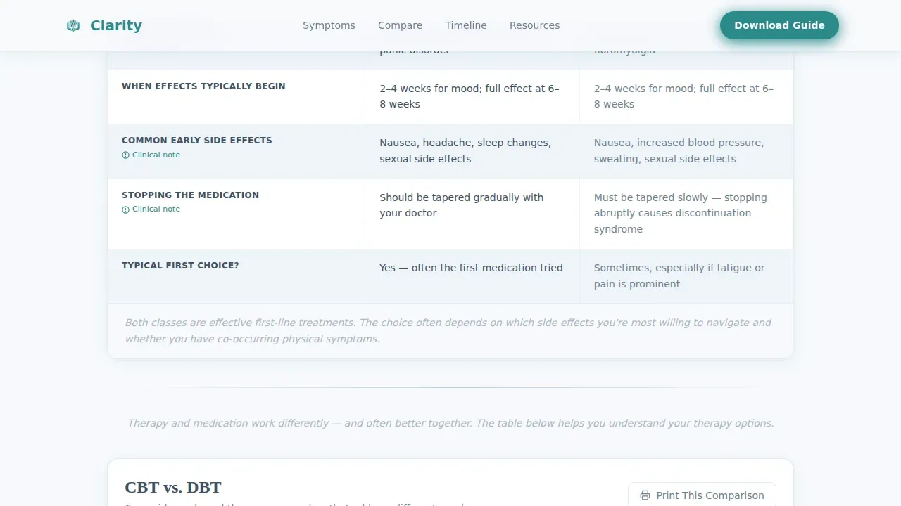
The template includes pre-structured comparison tables for medication classes such as selective serotonin reuptake inhibitors (SSRIs) versus serotonin-norepinephrine reuptake inhibitors (SNRIs), as well as therapy types mapped against common conditions. Each table row uses pale ice blue alternation so the eye never loses its place. A "Print This Comparison" button appears on every table, offering immediate access to the information without requiring a sign-up. This approach to showcasing services and treatment options builds transparency and builds trust naturally.
Visual Medication Timeline
A week-by-week medication timeline shows patients when effects typically begin and when side effects generally fade. This section is one of the most practically important in any patient education resource. It sets honest expectations and reduces the anxiety that comes from not knowing what to expect from a new treatment plan. The timeline supports ongoing care by encouraging patients to stay the course and communicate with their provider.
Downloadable Personal Guide with Form Gate
After interacting with the checklist and tables, visitors are invited to download a personalized guide. A short form asks for first name, the condition they are researching from a dropdown, and email. This low-friction approach to patient engagement collects only essential information. The form is prominently displayed after the second comparison table, at the moment when trust has already been built through free value.
Portrait-Centered Hero Section
The hero section features a warm, softly lit photograph of a psychiatrist at a desk. The clinician looks directly into the camera with patience rather than authority. The headline beside the portrait reads: "Understand Your Diagnosis. Compare Your Options. Bring Better Questions." No decorative elements compete with the human face and the clear promise. This personal touch sets the emotional connection from the first second.
Patient Testimonials and Credential Badges
Social proof is woven into the template through patient testimonials with specific quotes and clinician credential badges. Incorporating testimonials on mental health landing pages enhances credibility with potential clients. These elements are positioned near the download call to action, where building trust matters most.
Page sections overview
| Section | Purpose |
|---|---|
| Portrait Hero | Sets calm tone and frames the core promise for visitors |
| Symptom Checklist | Interactive self-assessment that maps symptoms to conditions |
| Medication Comparison | Side-by-side SSRIs versus. SNRIs table with print option |
| Therapy Types Table | Maps therapy approaches against common mental health conditions |
| Medication Timeline | Week-by-week visual for treatment and side effect expectations |
| Download call to action Form | Gated personal guide with condition-specific dropdown field |
| Testimonials and Badges | Social proof and clinician credential section near the call to action |
| Footer | Horizontal flow footer with navigation and supporting links |
Design & branding system
The visual identity follows an Educational Guide theme built on an Arctic White color system. The palette applies color theory with restraint: soft colors anchor the layout in calm rather than clinical sterility. Every color has an assigned role, so the design never competes with the content it carries.
- Clinical white (#F7F9FC) across open backgrounds, soft graphite (#3D4F5F) for body text, pale ice blue (#D6E4F0) for table row alternation and section dividers, and steady teal (#2A8A8A) for interactive states and primary buttons
- Fraunces serif for display headings and DM Sans for body copy, pairing editorial authority with everyday readability
- Generous whitespace throughout creates a sense of pacing, turning each scroll step into a calm moment rather than an information flood
Mobile & speed optimization
This template is built mobile-first. The primary users are people searching symptoms on their phones during private, often late-night moments. The layout is designed for that context. Mental health website design decisions here prioritize readable font sizes, touch-friendly toggle interactions, and a scroll experience that never feels congested.
- Static hero section loads without delay; interactive components such as the checklist toggles and table highlights are isolated to client-side rendering only
- Medium animation level: checklist toggle interactions, scroll reveals, and table row highlights are smooth without adding unnecessary load
- The print button on each table and the download form are easy to reach on small screens without pinching or horizontal scrolling
How this template helps you convert
Landing page templates for mental health services must include clear calls to action to guide visitors toward taking the next step. This template earns conversion through accumulation of trust rather than pressure. Each section proves the next one is worth reading, and the call to action arrives only after the visitor has already received real value.
- The free "Print This Comparison" button on every table gives value before any form appears, so visitors experience the template as genuinely helpful resources rather than a gate. This reduces bounce rate and keeps visitors engaged through the full scroll.
- The download form appears after the second comparison table, once the visitor has already interacted with the checklist and read through clinical comparisons. At that point, a user friendly experience makes the sign-up feel like a natural next step. The form asks only for first name, condition dropdown, and email, keeping friction low and user satisfaction high.
Other information about this template
This template is well-suited for mental health care providers who want their website to do more than list services. It is designed to create a safe space for patients who are overwhelmed and to support accessible care through structured, plain-language content. The layout supports clear pricing transparency where needed and can be adapted to include easy appointment scheduling or a link to schedule appointments from within the footer or a secondary call to action.
- The design prioritizes user friendly navigation so that visitors can move between sections without confusion, which helps lower bounce rate and keeps potential clients engaged
- The template supports showcasing services such as therapy modalities, medication management, and condition-specific guides in a way that effectively communicates value without feeling like a sales pitch
- Treatment plans are referenced throughout the content structure as a roadmap for care, helping patients understand that treatment is a patient-centered process with goals chosen in collaboration with their provider
- A well-structured treatment plan template ensures that patients, treating clinicians, and any other involved professionals understand the overall direction and purpose of treatment; this template supports that understanding visually
- Including goals, objectives, and interventions in treatment plans makes it easier to measure progress; this template creates space to present that information in plain language
- SMART goals, specific, measurable, achievable, relevant, and time-bound, are a key component of effective treatment plans, and this template can surface those concepts in patient-friendly language
- Treatment plan templates help ensure comprehensive documentation of clinical reasoning and patient roles; the Clarity template supports that educational layer by helping patients arrive at appointments better informed
- The landing page is built to support mental wellness conversations and ongoing care, not just one-time downloads; the resource structure encourages patients to return as their treatment evolves
- The Clarity understand your diagnosis psychiatrist patient education hub landing page template is designed to serve newly diagnosed adults, parents of teenagers with recent evaluations, and therapy clients considering whether medication is right for them
- For mental health professionals looking to attract new clients through search engines, the clean professional design and user friendly design structure supports visibility and builds confidence in prospective patients who land on the page
- The template supports easy access to clinical data presented in plain language, giving visitors digital tools they can actually use before and after appointments
- Seamless integration of the symptom checklist, comparison tables, and download form creates a seamless journey from first scroll to guide download
- The design reinforces trust through authentic imagery, credential badges, and transparency builds trust throughout every section
- Overall health is addressed holistically: the template covers therapy, medication, and lifestyle context, helping patients see their treatment as part of a broader wellness plan
- For practices that want to book same day appointments or offer easy appointment scheduling, a secondary call to action can be added to the footer or hero section with just a few clicks
Theme
Educational Guide
Creative direction
Checklist & Audit
Color system
Arctic White
Style
Comparison Table
Direction
Content/Resource
Page Sections
Interactive Symptom Checklist
Side-by-side Medication Comparison Tables
Visual Medication Timeline
Gated Personal Guide Download
Portrait-centered Hero with Headline
Testimonials and Credential Badges
Related questions
Who is the Clarity template designed for?
Can I customize the comparison tables and checklist for my specific services?
Does the template support a no-form path for visitors not ready to sign up?
What makes this template different from a standard health website template?
Can this template support appointment scheduling alongside the education content?



