Appointment Booking Landing page Template
A hub-and-spoke gastroenterologist appointment booking landing page built around an interactive symptom checklist, flip-card condition library, and a three-step progressive booking form. Designed for anxious patients who need education before they commit, the page guides visitors from self-recognition through reassurance to a confirmed appointment, using teal, seafoam, and amber to hold attention and prompt action.
by Rocket studio
Quick summary
This is a single-page, anchor-nav gastroenterologist appointment booking landing page. It uses an interactive symptom checklist, condition flip cards, a first-visit walkthrough, and a three-step booking form to guide hesitant patients from self-audit to scheduled consultation. The Educational Guide visual style makes every section feel calm, credible, and clinically warm.
Who this template is for
This template is built for gastroenterology practices that want their website to pre-qualify and convert patients before the first phone call. It fits practices actively accepting new patients and offering both in-person and telehealth visits.
- GI specialists wanting to reduce front-desk intake friction
- Practices targeting adult professionals with unaddressed digestive symptoms
- Clinics serving parents navigating a teen's new GI diagnosis or follow-up care
What problem this template solves
Most patients sit on GI symptoms for months because they are unsure whether their issue is serious enough to warrant a specialist. A generic "book an appointment" page does nothing to resolve that doubt. This template closes the gap between symptom awareness and booked visit.
- Patients arrive uncertain and leave with a clear next step
- The checklist-and-progress-ring format turns vague worry into a concrete, personalized nudge
- Progressive form disclosure reduces the intimidation of a long intake form on first view
What you get with this template
You get a fully structured, single-page layout with five distinct content spokes connected by a sticky anchor navigation bar. Every section has a defined purpose in the conversion journey, from first recognition to confirmed booking.
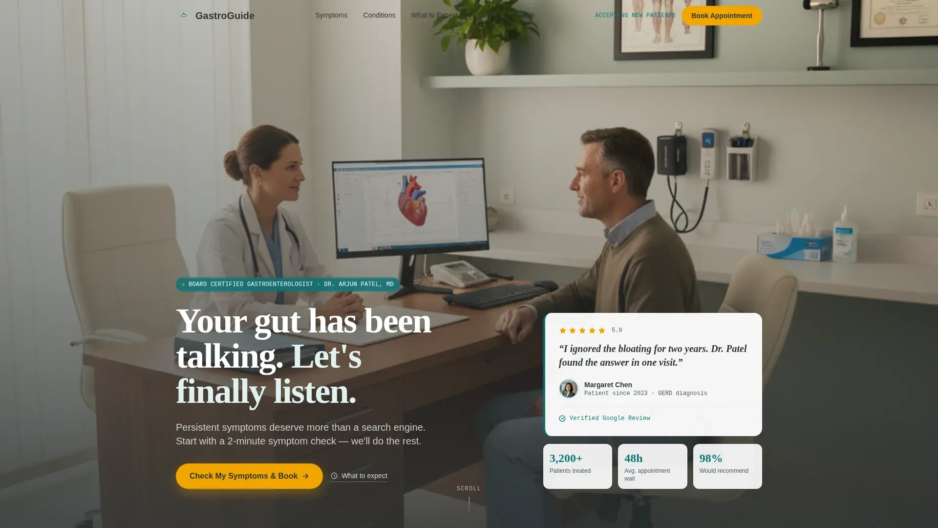
- Hero section with a floating testimonial card, fade-in headline, and a primary amber call-to-action button
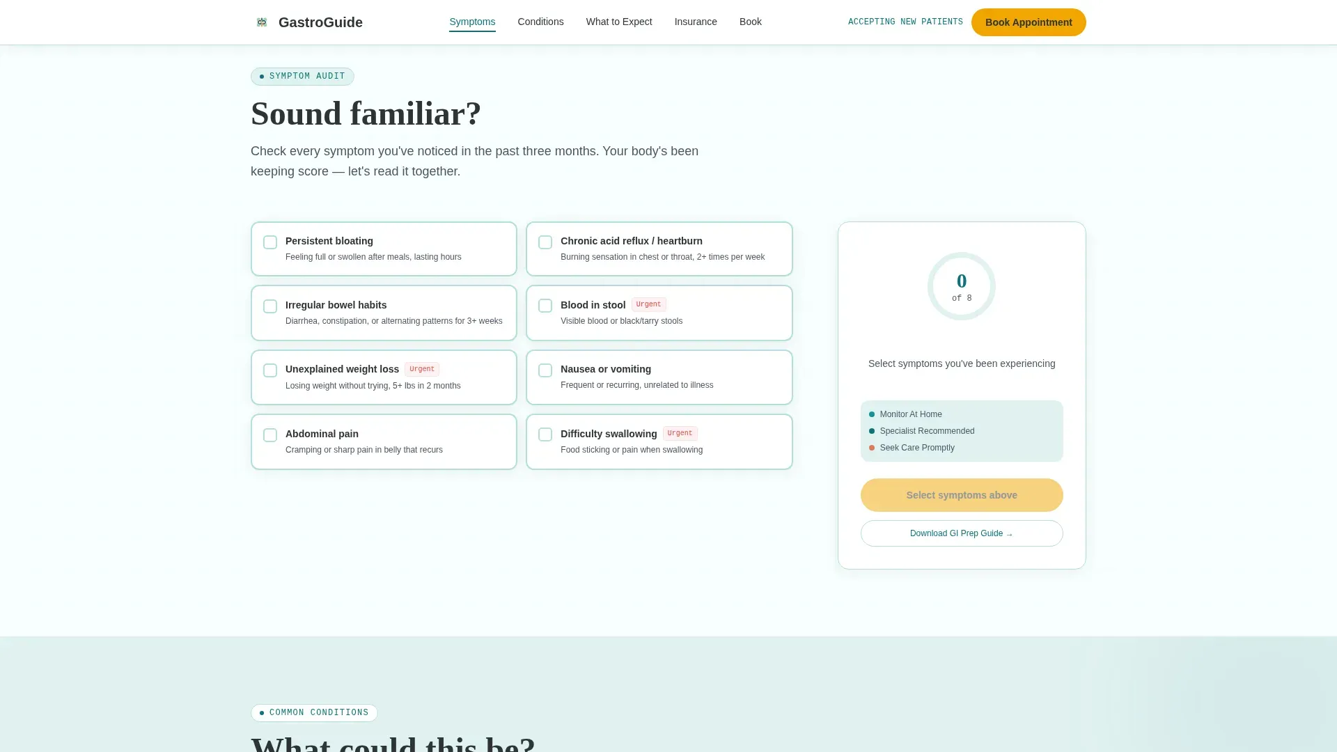
- Interactive symptom checklist with a live teal progress ring and personalized end-state message
- Condition flip cards, a numbered first-visit walkthrough, a three-step progressive booking form, and a secondary email-capture path for patients not yet ready to book
Feature list
This template is built around six tightly scoped, prompt-backed capabilities.
Anchor Navigation with Active States
A sticky navigation bar pins to the top of the page with spoke labels for Symptoms, Conditions, What to Expect, Insurance, and Book. Each label updates its active state as the visitor scrolls, so orientation is never lost.
Interactive Symptom Checklist
The Symptoms spoke presents a clickable checklist covering bloating, acid reflux, irregular bowel habits, and unexplained weight loss. As visitors select items, a teal progress ring fills in real time and delivers a personalized nudge based on how many boxes are checked.
Condition Flip Cards
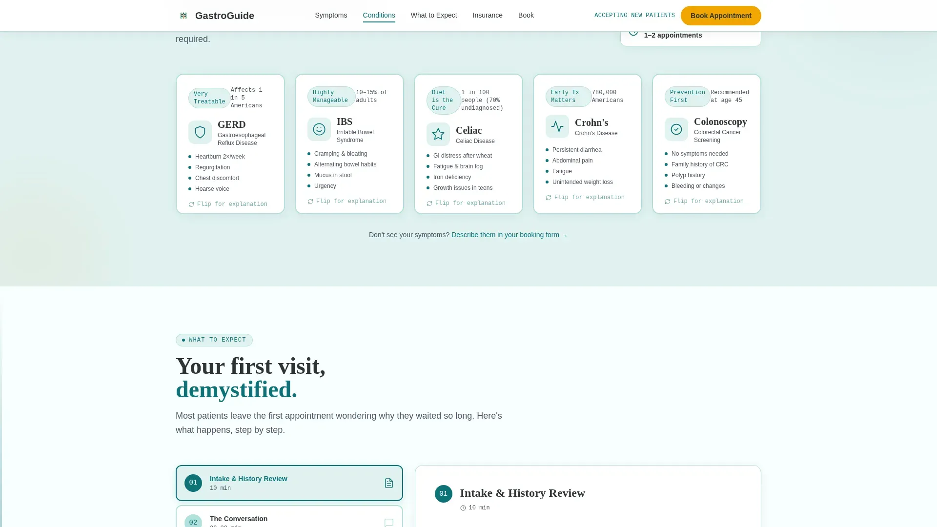
Five condition cards covering IBS, GERD, Celiac disease, Crohn's disease, and colonoscopy flip on interaction to reveal plain-language explanations on the reverse. The 3D card-flip animation makes clinical information feel approachable rather than overwhelming.
Three-Step Progressive Booking Form
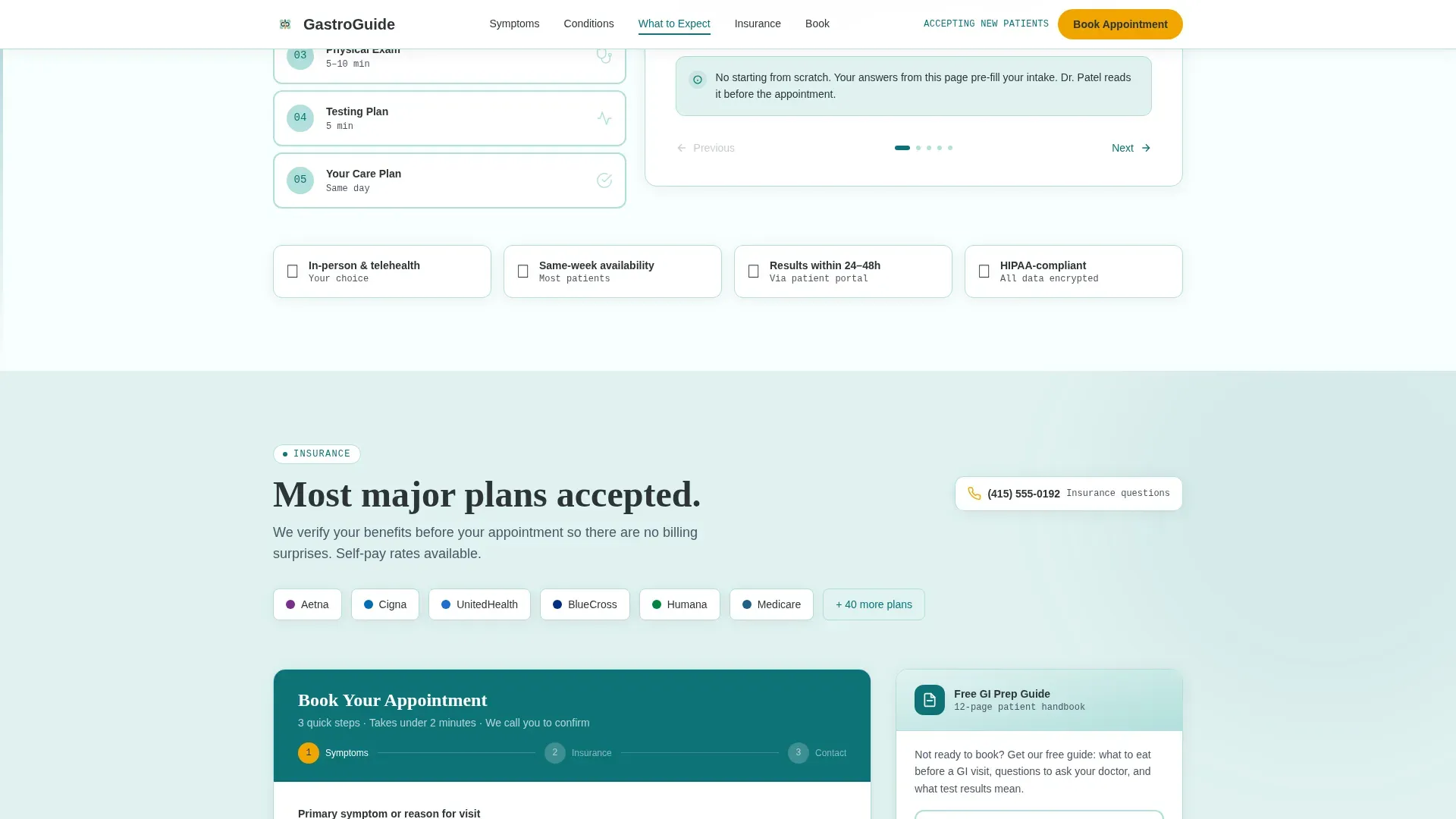
The booking form uses progressive disclosure across three steps: primary symptom and symptom duration in step one, insurance provider and visit type in step two, and contact details with preferred callback window in step three. Spreading the form across steps lowers perceived effort.
First-Visit Walkthrough
The What to Expect spoke breaks a first consultation into numbered steps with small illustrations. It addresses the fear of the unknown directly, making the visit feel familiar before the patient ever arrives.
Secondary Email Capture Path
A "Download Our GI Prep Guide" option sits alongside the primary booking form. It captures email addresses from visitors who need more time, creating a nurture path for patients who are not yet ready to book.
Page sections overview
| Section | Purpose |
|---|---|
| Hero / Header | Float testimonial card, fade-in headline, primary call to action |
| Symptoms Spoke | Interactive checklist with live progress ring |
| Conditions Spoke | Flip cards with plain-language condition backs |
| What to Expect | Numbered first-visit step walkthrough |
| Insurance & Book | Three-step form and email-capture secondary path |
| Footer | Single-row linear footer pattern |
Design & branding system
The template follows an Educational Guide visual theme using the Teal Catalyst color system. The palette feels like a well-used medical reference book: authoritative without being cold, warm without being casual.
- Deep clinical teal (#0D7377) anchors headings and key user interface elements; soft seafoam (#E0F2F1) washes section backgrounds so the eye rests between text blocks; charcoal (#2D3436) handles all body text for maximum readability
- Warm amber (#F0A500) appears exclusively on calls to action and interactive highlights, so every button reads as a clear, deliberate prompt
- Typography uses Fraunces for serif headings, DM Sans for body copy, and JetBrains Mono for labels and monospaced details
Mobile & speed optimization
The template is designed desktop-first and scales down to full mobile responsiveness. Interactive components are built as client-side elements while static sections use server-side rendering to keep initial load light.
- A sticky bottom call-to-action bar appears on mobile after the visitor passes the second spoke, keeping the booking prompt visible without crowding the reading experience
- Scroll-triggered animations including the hero background blur, progress ring fill, card flip, and stagger reveals use an intersection observer so effects fire only when sections enter the viewport
How this template helps you convert
The page is structured so that conviction builds before the visitor reaches the form. Each section removes a specific layer of hesitation.
- The symptom checklist creates personal relevance early: visitors self-select into the target patient group and receive a direct, data-driven nudge to speak with a specialist, making the decision feel logical rather than pressured.
- The three-step progressive form and the secondary GI Prep Guide download give every visitor a clear next action, whether they are ready to book today or need one more educational touchpoint before committing.
Other information about this template
This template sits inside the Health and Medical category under the Gastroenterologist Website subcategory. It is scoped specifically for a gastroenterologist appointment booking page use case with a Hub and Spoke anchor-nav layout structure.
- The template is localized for the United States market with English copy, USD context, and standard US insurance terminology built into the form fields
- Trust indicators in the hero include a board-certified badge and an "accepting new patients" signal, both visible before the visitor scrolls
- The header concept is a Testimonial Card: a single patient quote displayed over a softly blurred clinical interior, with a white card body, teal left-border stripe, and a five-star amber rating row
- The creative direction follows a Checklist and Audit approach, meaning the visitor builds a personal case file as they scroll rather than being pushed toward booking from the first line
- The lead-generation direction means the primary conversion goal is a completed booking form, with a secondary goal of email capture through the downloadable GI Prep Guide
Theme
Educational Guide
Creative direction
Checklist & Audit
Color system
Teal Catalyst
Style
Hub & Spoke (Anchor Nav)
Direction
Lead Generation
Page Sections
Sticky Anchor Navigation Bar
Interactive Symptom Checklist with Progress Ring
Condition Flip Cards
Three-step Progressive Booking Form
First-visit Step Walkthrough
Secondary Email Capture Download
Related questions
Who is this landing page template designed for?
Can the symptom checklist be customized for different GI conditions?
What does the three-step booking form collect?
Is there a path for patients who are not ready to book immediately?
How does the anchor navigation work across the page?



