Restaurant Industry Blog & Data Website Template
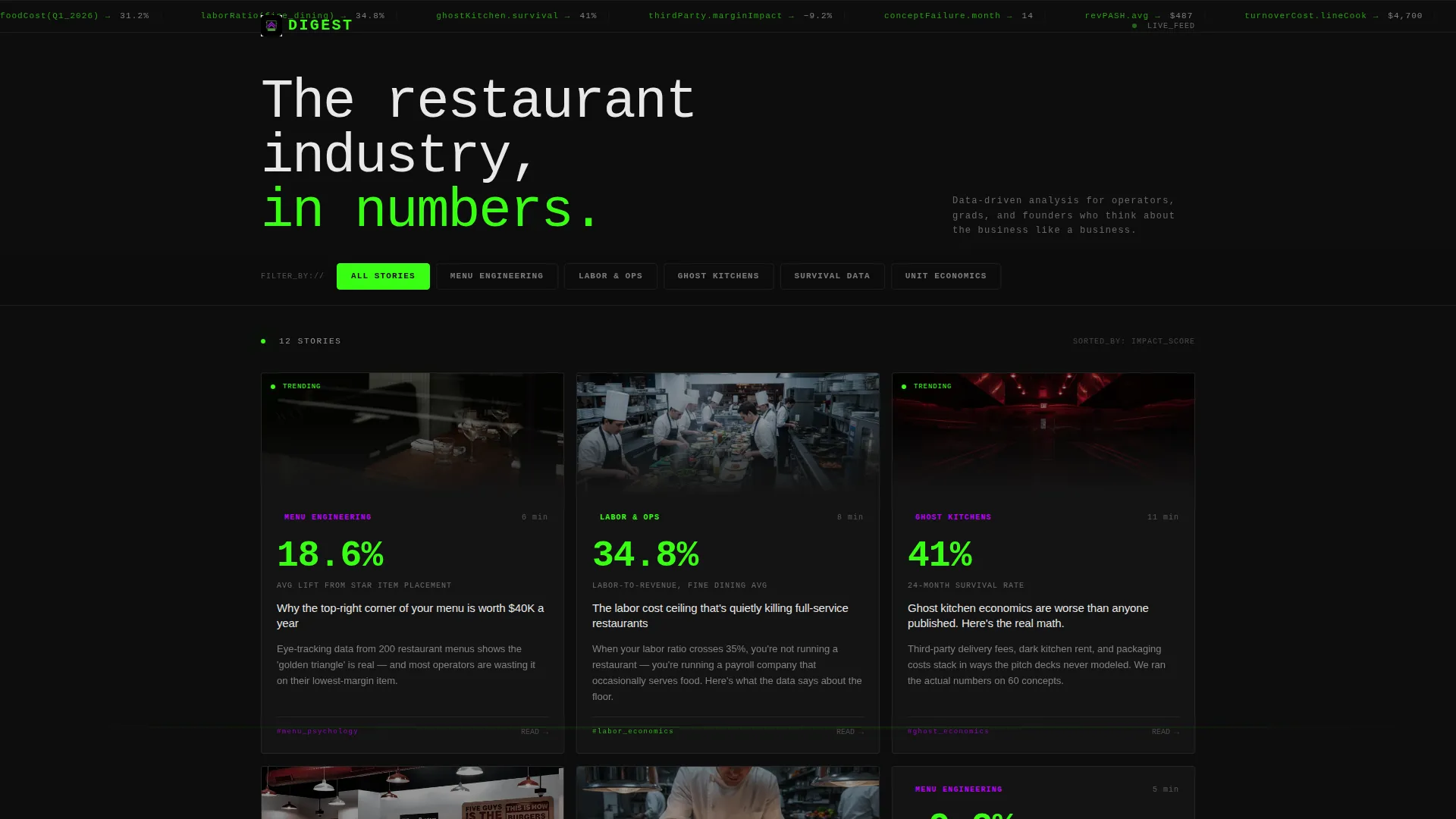
Digest is a dynamic restaurant blog landing page built for industry insiders who want data, not decoration. It opens with a terminal-style code animation displaying real industry stats, then reveals a modular card grid packed with bold figures and short-form analysis. The Acid Digital color palette and motion-driven layout make every scroll feel like a live data feed.
by Rocket studio
Quick summary
Digest is a single-page restaurant blog landing page with a modular card grid layout, a terminal code header, and a lead-generation structure designed to convert curious readers into weekly subscribers. The Acid Digital color system and Dynamic Motion theme make it feel like a Bloomberg Terminal rebuilt for the hospitality business.
Who this template is for
This template is built for people who think seriously about the restaurant industry and want a digital home that reflects that seriousness. It suits founders, operators, and educators who need to publish data-driven content without the warmth of a typical food blog.
- Independent restaurant owners who want to track industry trends between shifts
- Culinary school graduates and food-tech founders building business plans or pitch decks
- Content creators and publishers covering restaurant economics, ghost kitchens, and menu engineering
What problem this template solves
Most restaurant blog templates lean heavily on rustic textures, warm photography, and soft palettes built for recipe content. That aesthetic actively undermines the credibility of hard industry analysis. Digest solves the mismatch between serious business content and the templates available to publish it.
- There is no existing standard template that combines a terminal-style animated header with a filterable editorial card grid
- Restaurant industry data content tends to get lost inside generic blog layouts that do not signal authority at a glance
- Lead capture on content sites often feels intrusive; this template earns the opt-in before it ever asks for one
What you get with this template
You get a complete, single-page landing page layout built around a modular card grid and two distinct conversion paths. Every section is purpose-built for an analytical audience that values signal over style.
- A viewport-filling terminal code animation header with line-by-line stat rendering and a blinking cursor
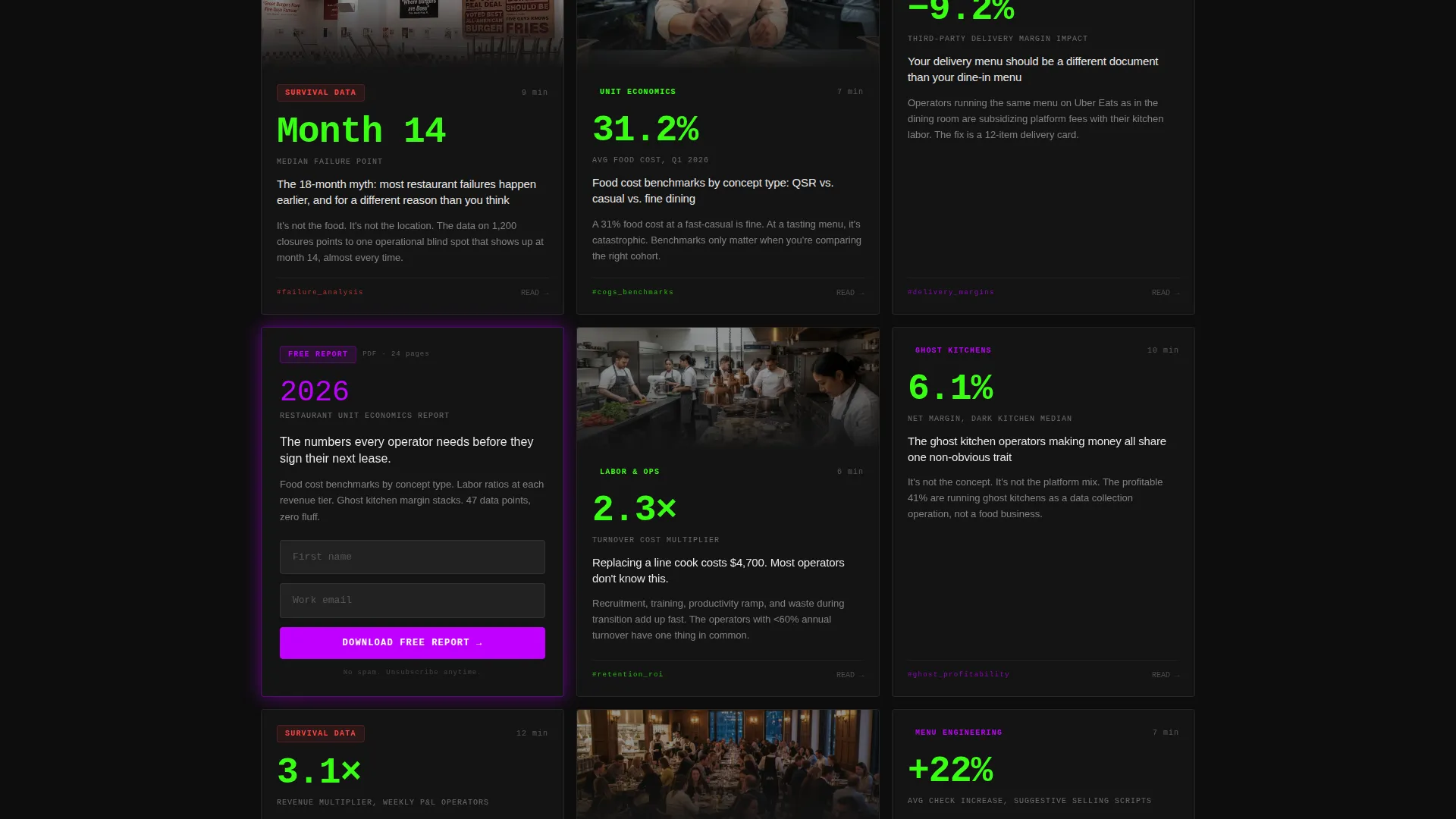
- A modular card grid where each card carries a bold stat headline, a three-line thesis, a category tag, and a read-time stamp
- A sticky "Get the Weekly Briefing" bar and a mid-grid interstitial card offering a gated downloadable report
Feature list
This template ships with a focused set of layout and interaction features drawn directly from the brief. Each one serves the editorial and lead-generation goals of the page.
Terminal Code Snippet Header
The header fills the viewport with a styled pseudo-code block. Each line renders one by one like a terminal compiling, displaying real industry statistics written as callable functions. The sequence ends with a return statement and a blinking cursor before the card grid rises into view.
Modular Card Grid Layout
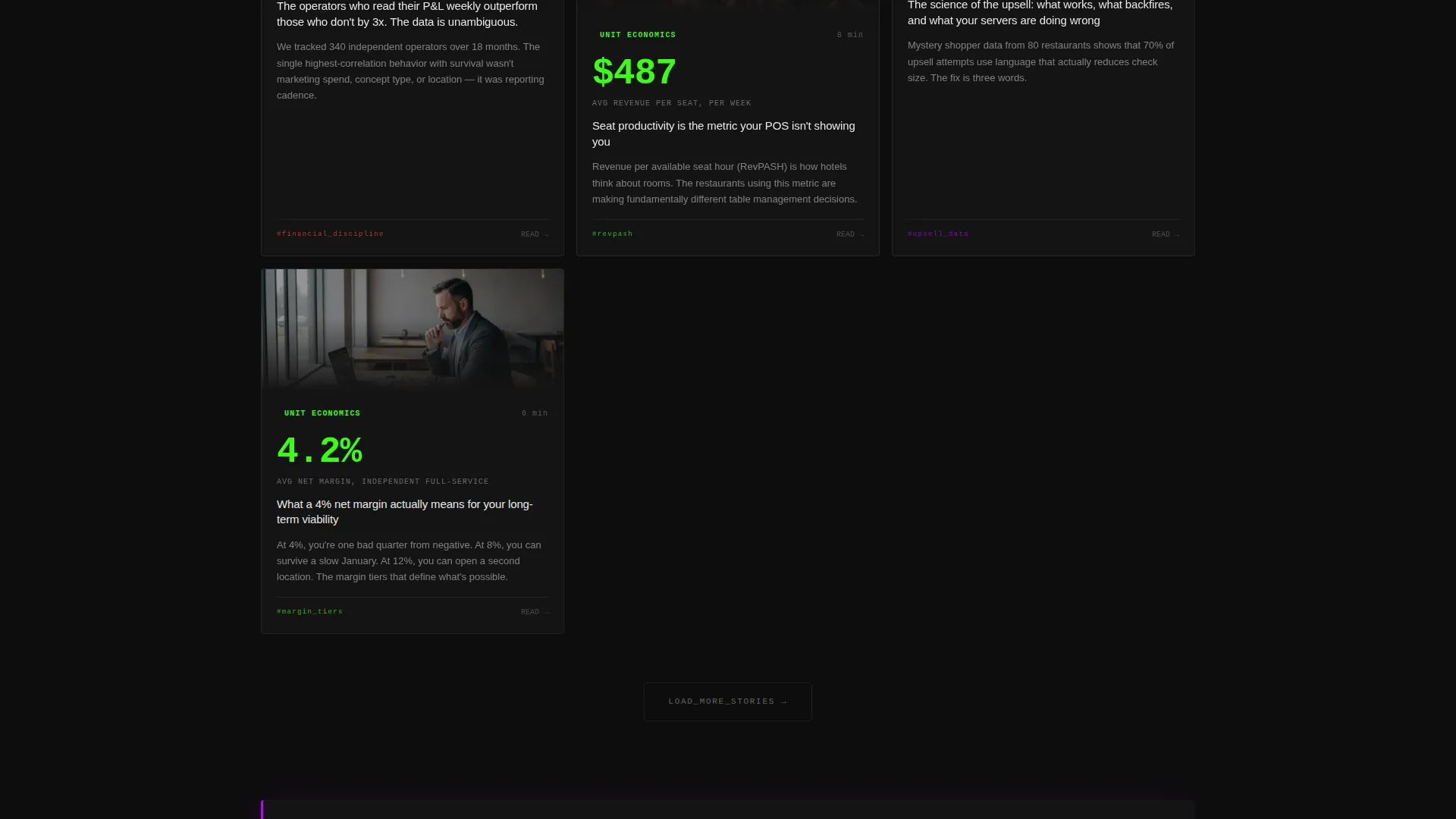
Cards are self-contained data story units. Each card includes a bold stat as the headline number, a three-line thesis, a category tag pill, and a read-time stamp. The grid reshuffles by category when filter pills are tapped, giving readers a fast way to navigate topics.
Stagger Scroll Animations
Cards animate into view with a subtle upward drift and opacity shift as the reader scrolls. Motion is tied to content arrival, not decoration. Every animation signals new information entering the viewport rather than adding visual noise.
Sticky Lead Capture Bar
A slim sticky bar pins itself to the screen after the visitor scrolls past the third card row. It carries a single email field and the call to action "Get the Weekly Briefing." Single-field design keeps friction at its lowest possible point.
Mid-Grid Interstitial Card
A conversion card sits inline with the editorial grid, styled identically to standard blog cards but marked with a violet border. It gates a downloadable report behind a name-and-email form. Its placement in the grid means it appears only after the reader has already consumed multiple free insights.
Category Filter Pills
Filter pills styled in electric violet sit above the grid. Tapping a pill reshuffles the visible cards to show only that category. The interaction keeps the grid dynamic and helps readers move through topic areas without leaving the page.
Page sections overview
| Section | Purpose |
|---|---|
| Terminal Code Header | Opens with animated industry stats rendered line by line |
| Category Filter Pills | Lets readers sort the card grid by topic area |
| Modular Card Grid | Delivers data story cards with stats, tags, and read times |
| Mid-Grid Interstitial | Captures name and email behind a gated PDF report |
| Sticky Briefing Bar | Collects email subscriptions after the third card row |
Design & branding system
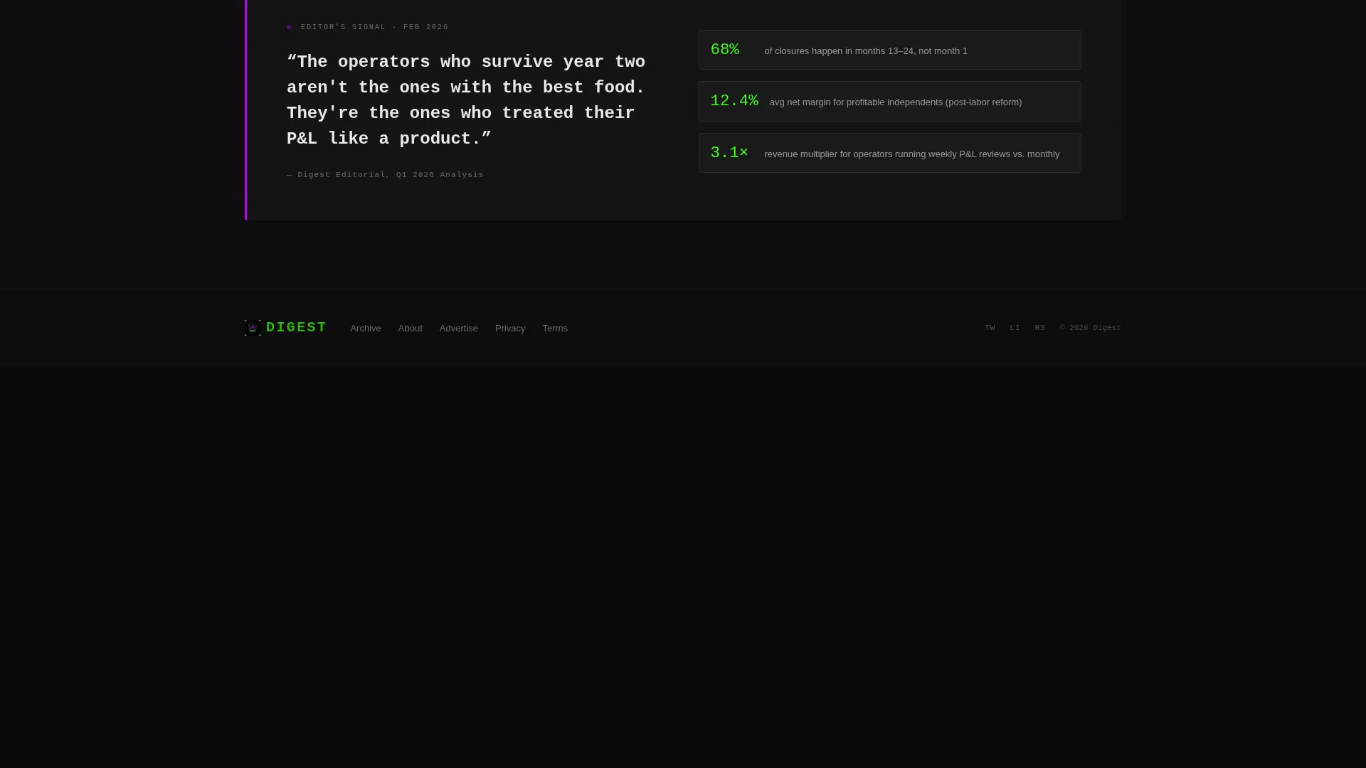
The visual identity runs on the Acid Digital color system. Void black (#0D0D0D) covers every background surface. Terminal green (#39FF14) marks live data points, hover states, and trending tag indicators. Electric violet (#BF00FF) fires on category pills, pull-quote borders, and the interstitial card border. Sharp cool white (#E8E8E8) handles all body text for fast reading against the dark ground.
- Typography is monospaced in the header to reinforce the terminal aesthetic, then shifts to clean sans-serif in the card grid for speed and legibility
- Motion follows a Dynamic Motion theme where stagger animations, opacity shifts, and filter transitions are tied to content state changes rather than ambient decoration
- The palette deliberately avoids warm tones, rustic textures, and food-photography conventions to signal analytical authority from first load
Mobile & speed optimization
The card grid is built on a modular layout that reflows naturally from multi-column desktop arrangements down to a single-column mobile stack. The sticky bar and filter pills remain accessible at smaller screen sizes without obscuring card content.
- Cards maintain their full data hierarchy (stat, thesis, tag, read time) at every viewport width
- The terminal header animation is designed to run on the same monospaced block at mobile scale, keeping the opening sequence intact on smaller devices
How this template helps you convert
The conversion architecture is deliberate and sequenced. The page earns trust through free content before it ever surfaces a form.
- The terminal header immediately signals data authority, setting an analytical tone that primes the right audience to keep reading
- The modular card grid delivers three or more free insights before the sticky email bar appears, so the opt-in request lands after demonstrated value rather than before it
- The mid-grid interstitial card offers a higher-commitment download behind a name-and-email gate, creating a second conversion path for readers who want deeper material
Other information about this template
This template is categorized under Restaurant Website Templates in the Technology category. It is specifically designed for the restaurant blog page niche and carries an Industry Report creative direction that distinguishes it from lifestyle-driven food content templates. The layout follows a Card Grid (Modular) template style, and the header concept is a Code Snippet.
- The page type is a single-page landing page, not a multi-page website
- The color system is labeled Acid Digital, a proprietary palette specification defined in the brief
- This template can support content strategies focused on ghost kitchen economics, menu engineering, and labor cost analysis
Theme
Dynamic Motion
Creative direction
Industry Report
Color system
Acid Digital
Style
Card Grid (Modular)
Direction
Lead Generation
Page Sections
Terminal Code Snippet Header
Modular Filterable Card Grid
Stagger Scroll Animations
Sticky Email Capture Bar
Mid-grid Interstitial Card
Acid Digital Color System
Related questions
What type of content is this template designed for?
How does the lead capture work on this page?
Is the card grid filterable out of the box?
Who is the primary audience for this template?
Can I customize the card content and color assignments?



