Gastroenterology Landing page Template
Digest is a single-column gastroenterologist landing page built for anxious patients and referring physicians alike. A multi-step symptom finder opens the experience, routing visitors to named-physician condition panels that explain GI issues in plain language. From reflux to fatty liver, every section earns trust before asking for a booking.
by Rocket studio
Quick summary
Digest is a specialist gastroenterology landing page that walks visitors from symptom to scope to solution. A conversational multi-step form greets them first, then named-physician condition panels provide layered, plain-language breakdowns. The design is calm and clinical, built mobile-first for patients searching at 2 a.m. and referring physicians who need a resource they can trust.
Who this template is for
This template is built for gastroenterology practices that want their online presence to match the quality of their clinical care. It suits any specialist team that treats a broad range of gastrointestinal conditions and wants to convert anxious web visitors into booked consultations without relying on generic medical copy.
- Gastroenterologists and GI specialist practices running a condition and treatment library
- Newly diagnosed patients with inflammatory bowel disease, Crohn's disease, or gastroesophageal reflux disease who need clear, trustworthy explanations
- Referring primary care physicians looking for a reliable patient resource they can confidently share
What problem this template solves
Patients searching for GI information online usually land in one of two places: an overwhelming clinical database or a contradictory patient forum. Neither earns their trust or moves them toward a real appointment. This template closes that gap by delivering diagnostic-quality explanations before asking for any commitment.
- Patients arrive anxious and leave informed, with a clear path to booking
- Referring physicians get a single resource that explains conditions, diagnostic steps, and treatment options in one place
- Practices stop losing potential patients to generic health sites that cannot offer a real next step
What you get with this template
You get a fully structured, single-column landing page designed around the patient journey from first symptom to scheduled consultation. Every section is purposeful, and the visual system reinforces calm confidence throughout the scroll.
- A multi-step symptom finder that routes visitors to the most relevant condition panel
- Expandable expert condition panels, each anchored by a named physician portrait and a layered breakdown of diagnosis and treatment
- A persistent booking call-to-action bar and a secondary email-capture path for visitors not yet ready to commit
Feature list
A brief introduction to the core components that power this template. Each feature is grounded in the source brief and designed to serve the specific needs of a gastroenterology practice.
Multi-Step Symptom Finder Form
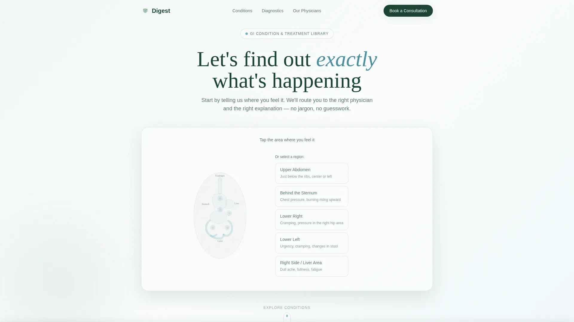
The header opens with a calm, conversational form placed over a subtle outline of the gastrointestinal tract. Visitors tap a region such as upper abdomen, lower right, or behind the sternum. A second step surfaces frequency, severity, and duration using plain patient language like "burning" or "comes and goes," making the experience feel like the first minute of a good appointment rather than intake paperwork.
Expandable Expert Condition Panels
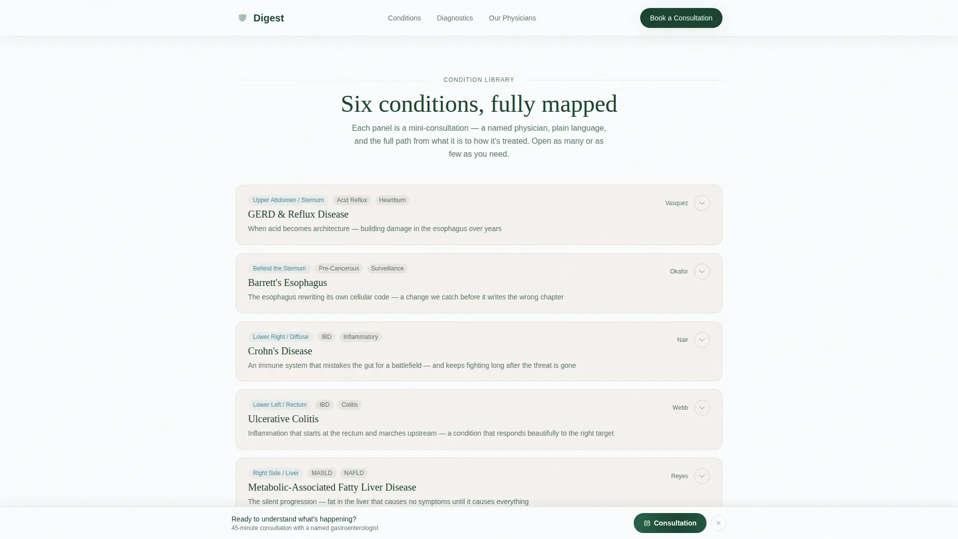
Each GI condition is presented as a mini-consultation anchored by a named physician portrait and quote card. Visitors see a plain-language explanation of the condition, how it is diagnosed including preparation and procedure expectations, and how it is treated covering medication tiers, lifestyle protocols, and when surgery enters the conversation. Cards expand and collapse so visitors control their depth without losing their place in the page.
Persistent Click-Through Call to Action
A "Book a Consultation" button is fixed to the bottom of the viewport after the first scroll, remaining visible throughout the entire reading experience. The primary call to action appears first as a soft text link inside the symptom finder results, so the ask feels earned rather than imposed.
Secondary Email-Capture Path
A "Download the Condition Guide" option gives visitors a lower-commitment alternative to booking. This path captures an email address for patients who are still in research mode, extending the practice's reach beyond visitors who are ready to act immediately.
Diagnostic Process Section
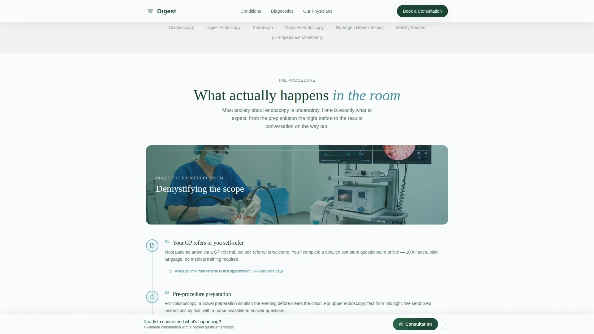
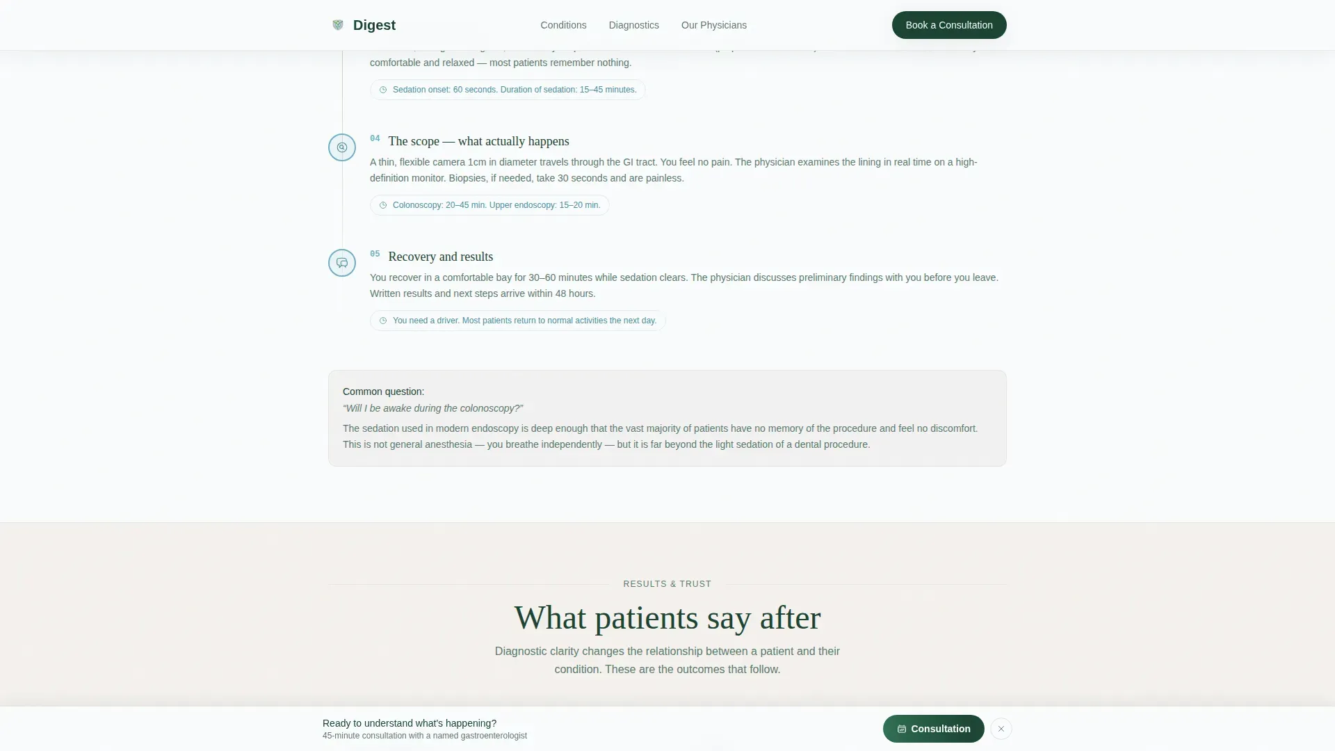
A dedicated step-by-step visual section explains what a real scope visit looks like. Visitors learn about preparation expectations and what the procedure actually involves, reducing the anxiety that often prevents patients from following through on a referral or self-referral.
Trust and Outcomes Section
Named physician quotes, patient outcome testimonials with specific results, and procedure volume statistics are structured into a dedicated social proof section. This section reinforces clinical credibility at the point where a visitor is closest to making a booking decision.
Page sections overview
| Section | Purpose |
|---|---|
| Symptom Finder Form | Route visitors to relevant condition panels via a two-step form |
| Expert Condition Panels | Present named-physician GI condition breakdowns in expandable cards |
| Diagnostic Process | Show step-by-step what a scope visit actually looks like |
| Trust and Outcomes | Build confidence with physician quotes, testimonials, and procedure stats |
| Book a Consultation | Close with a final call to action and persistent viewport-fixed button |
| Footer | Single linear row with practice links and secondary navigation |
Design & branding system
The visual identity follows a Medical Clarity theme using an Alpine Fresh color palette. The overall effect is a Swiss clinic built into a mountainside: clean surfaces, warm undertones, and light that steadies rather than overwhelms. Typography pairs Fraunces serif display headings with DM Sans for body text, creating a readable contrast between authoritative and approachable.
- Snow white (#FAFCFD) primary background, evergreen (#1B4332) headings, and glacial stream (#6DB3C4) for interactive accents and links
- Soft stone (#D6CFC7) used for divider bands and card backgrounds, giving condition panels a warm, grounded feel
- Scroll reveal animations, form step transitions, card expand and collapse interactions, and a subtle parallax grain layer add medium-level motion without distraction
Mobile & speed optimization
This template is built mobile-first, because the primary audience is patients searching on their phones at odd hours when symptoms feel most urgent. The interactivity is high, but the implementation keeps things lightweight.
- Multi-step form with region-tap input, expandable condition panels, and a persistent call-to-action bar are all designed for touch-first interaction
- Native CSS smooth scroll and IntersectionObserver-based reveal animations are used in place of heavy third-party libraries, keeping the page responsive on mobile connections
How this template helps you convert
The conversion strategy is built on trust earned before the ask. Every design and content decision is sequenced to demonstrate diagnostic fluency first, so the call to action feels like a natural conclusion rather than an interruption.
- The symptom finder personalizes the experience immediately, surfacing a soft "Book a Consultation" text link inside the results so the first mention of booking is contextual and low-pressure.
- Named physician panels and the diagnostic process section build compounding credibility as the visitor scrolls, so by the time they reach the persistent bottom bar, they have already experienced the quality of the practice's explanations and trust the team behind them.
Other information about this template
This template is categorized under Health and Medical, specifically within the Gastroenterologist Website subcategory and the Gastroenterologist Condition and Treatment Library niche. It is structured as a single-column flow landing page, meaning all content lives within one continuous scroll rather than across multiple pages.
- The template is built for the US market with English-language copy, USD references, and US date formatting in mind
- The single linear-row footer pattern keeps navigation minimal and focused, directing attention back to the primary booking call to action
- The Expert Panel creative direction and Click-Through landing-page direction are core intersection context signals that shaped every structural and visual decision in this template
Theme
Medical Clarity
Creative direction
Expert Panel
Color system
Alpine Fresh
Style
Single Column Flow
Direction
Click-Through
Page Sections
Multi-step Symptom Finder
Expandable Expert Condition Panels
Persistent Booking Call to Action
Secondary Email Capture Path
Diagnostic Process Section
Trust and Outcomes Section
Related questions
Who is the intended visitor for this landing page?
Can the condition panels be customized with real physician names and photos?
Does this template support more than one call-to-action path?
How does the multi-step symptom finder work?
Is this template suitable for practices treating multiple GI conditions?



