Patient Portal Landing page Template
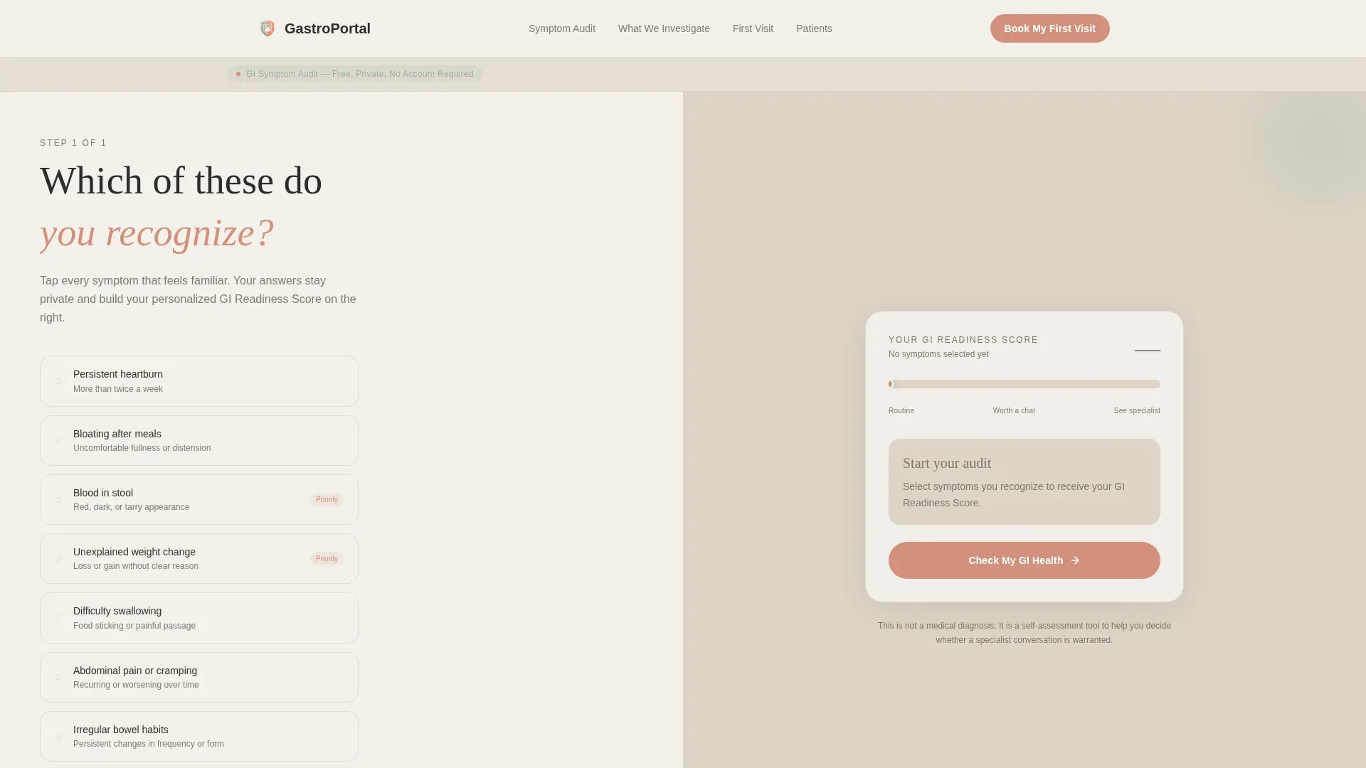
Digest is a split-screen gastroenterologist patient portal landing page built around an interactive Symptom Audit Calculator. Visitors check their symptoms, watch a live GI Readiness Score build in real time, then move through educational sections that reframe common assumptions. The design uses a warm Healing Space palette to ease anxiety before guiding patients toward booking their first visit.
by Rocket studio
Quick summary
Digest is a single-page gastroenterologist patient portal designed to turn symptom avoidance into informed action. The hero section presents a live Symptom Audit Calculator in a 50/50 split-screen layout. As visitors check their symptoms, a real-time GI Readiness Score builds on the right panel. Calm, educational sections follow, leading patients toward a frictionless booking click with no form required.
Who this template is for
This template is built for gastroenterology practices that want to attract self-qualifying patients and reduce the friction between a patient's first visit to the page and their first appointment booking.
- Gastroenterologists and GI clinics serving adults aged 30 to 65 with ongoing but ignored digestive symptoms
- Practices treating parents whose infants or young children have feeding and digestive concerns
- Clinics that want a warm, approachable patient portal without sacrificing clinical credibility
What problem this template solves
Many patients delay seeking GI care because their symptoms feel vague or manageable. They assume reflux is stress, or that bloating is just diet. This template addresses that gap directly, meeting patients in their hesitation and walking them forward.
- Symptom avoidance and delayed appointments driven by self-reassurance and uncertainty
- High page-bounce rates caused by cold, clinical web layouts that increase patient anxiety
- Booking friction from multi-step contact forms that interrupt the moment a patient feels ready to act
What you get with this template
This template delivers a fully structured, single-page landing experience for a gastroenterology practice. Every section is purposefully sequenced to move a visitor from uncertainty to confidence and then to a booking click.
- A hero section with a 50/50 Symptom Audit Calculator and animated GI Readiness Score gauge
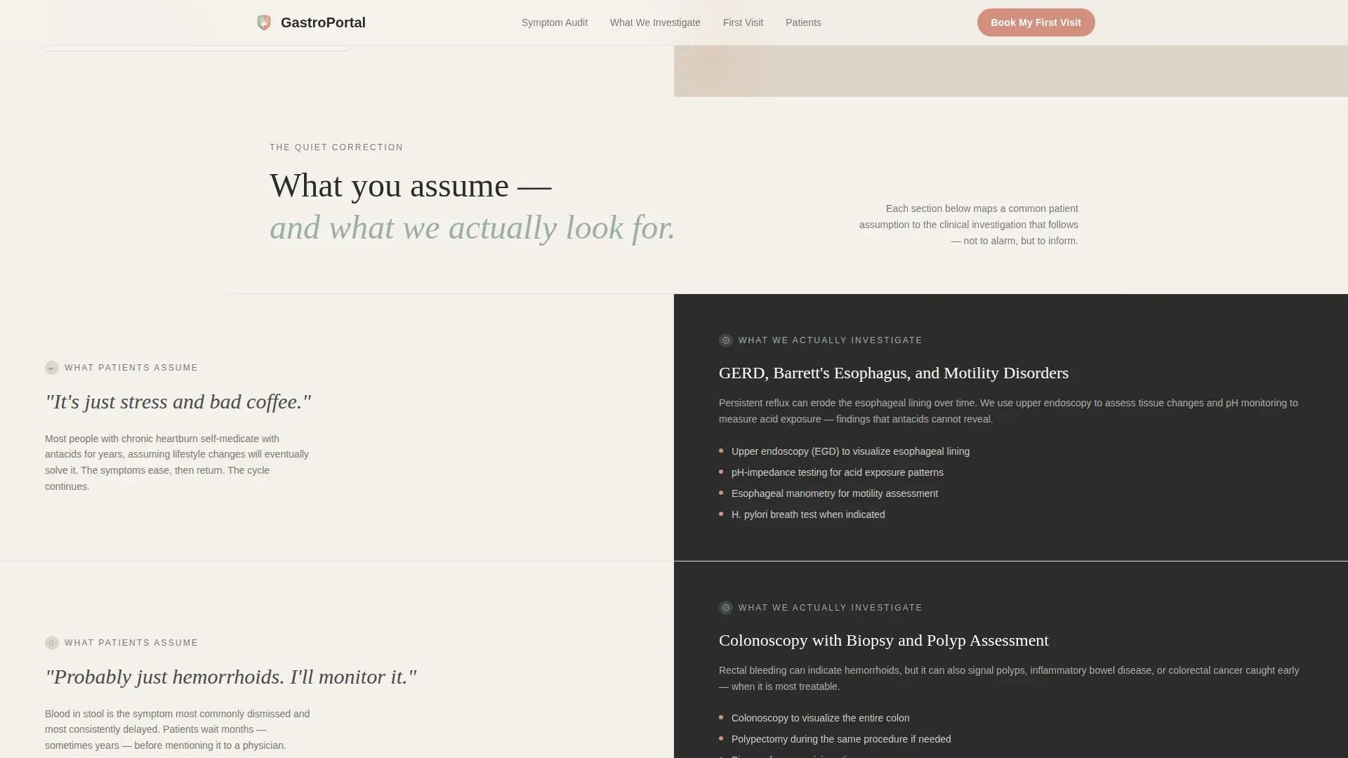
- A series of split-screen symptom education sections contrasting patient assumptions with clinical investigation
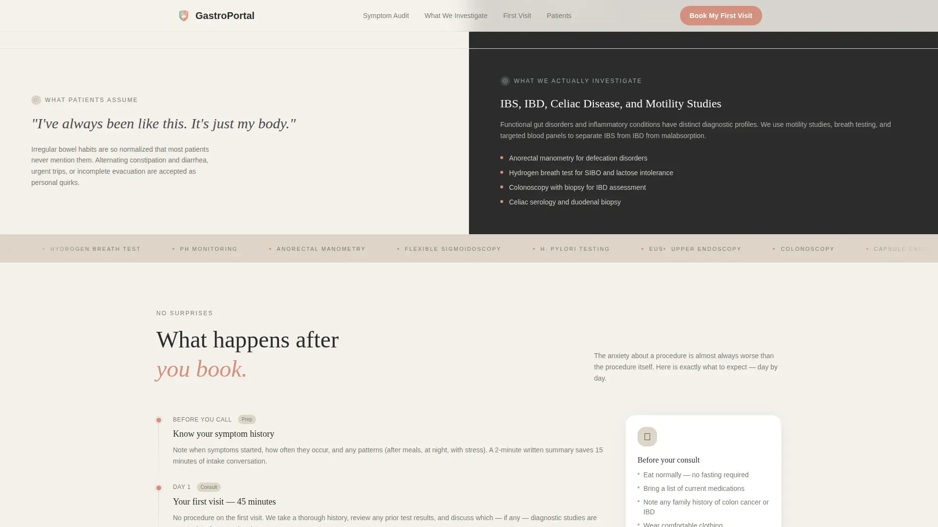
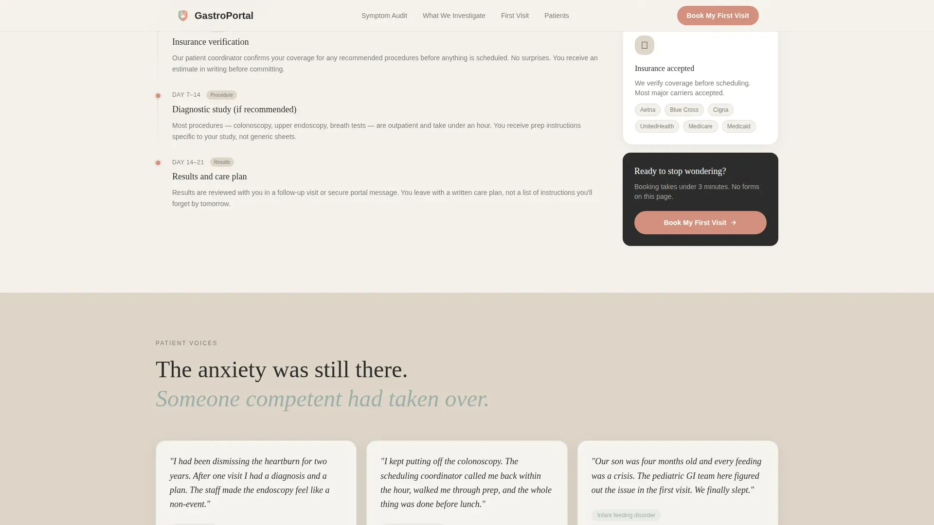
- A preparation and first-visit walkthrough section, a trust and social proof section, and a final pulsing call-to-action section with an inactivity-triggered coral button
Feature list
This template packages several interactive and visual components into a cohesive, calm experience.
Interactive Symptom Audit Calculator
The left panel of the hero section holds a clean, tappable checklist of common GI symptoms: bloating after meals, persistent heartburn, unexplained weight change, blood in stool, and difficulty swallowing. Each tap triggers a subtle coral pulse animation, making the interaction feel responsive and intentional.
Real-Time GI Readiness Score
As visitors check symptoms, the right panel assembles a personalized GI Readiness Score in real time. An animated gauge fills like a thermometer, moving from "routine check-in" to "time to see a gastroenterologist." The score is framed as a clinical nudge, not a diagnosis.
Assumption versus Investigation Split Screens
Below the calculator, each selected symptom category generates its own 50/50 split-screen section. The left side shows what patients typically assume; the right side shows what a gastroenterologist actually investigates. The tone is a quiet correction, not a scare tactic.
Frictionless Click-Through Booking Flow
There is no contact form on this page. The primary call-to-action reads "Check My GI Health" at the calculator and shifts to "Book My First Visit" after the audit sections, linking directly to the scheduling portal. This removes every barrier between decision and action.
Inactivity-Triggered Pulse Button
On the final call-to-action section, the coral booking button pulses once after five seconds of visitor inactivity. This gentle nudge re-engages visitors who have paused without leaving the page, encouraging them to complete the booking step.
Preparation and First-Visit Walkthrough
A dedicated section covers preparation timelines, what to eat before a consult, and insurance verification steps. By the time a visitor reaches the booking button, they have already pre-qualified themselves and know what to expect.
Page sections overview
| Section | Purpose |
|---|---|
| Hero: Symptom Calculator | Present the Symptom Audit Calculator and live GI Readiness Score in a 50/50 split |
| Symptom Education Screens | Reframe patient assumptions against what a gastroenterologist investigates |
| Preparation Timeline | Walk visitors through what to expect before and during their first visit |
| Trust and Social Proof | Display patient voice quotes and physician credentials to build confidence |
| Final Booking call to action | Deliver the inactivity-triggered pulsing coral button linked to the scheduling portal |
| Footer | Provide a linear single-row footer with essential practice links |
Design & branding system
The visual identity follows a Healing Space theme built to make clinical content feel warm and approachable. Every color and type choice is deliberate, pulling the body's tension down before the mind registers it.
- Color palette: morning fog white (#F4F1EB) for backgrounds, washed linen (#DDD5C7) for surface contrast, still-water sage (#9CAEA9) for secondary text and accents, and calm coral (#D4907E) reserved strictly for interactive elements and call-to-action buttons
- Typography: Fraunces serif for headlines to add warmth and character, DM Sans for body text to keep reading effortless and clean
- Animation style: high-motion scroll scrub, spotlight effects, text reveal transitions, gauge fill animation, and a pulse effect on the coral call-to-action button
Mobile & speed optimization
The template is built desktop-first to support the full calculator interaction, and is fully responsive for mobile visitors. The technical approach prioritizes smooth rendering without heavy dependencies.
- CSS smooth scroll and Intersection Observer handle scroll-triggered animations without loading large third-party libraries
- The split-screen layout reflows cleanly for smaller screens so the symptom checklist and score gauge remain usable on mobile devices
- High-animation elements are scoped to avoid layout shift, keeping the experience stable across screen sizes
How this template helps you convert
The conversion strategy is built around giving value before asking for anything. Visitors earn insight through their own answers, which makes the final booking click feel like a natural next step rather than a sales moment.
- The Symptom Audit Calculator delivers a personalized GI Readiness Score immediately, so visitors feel seen and informed before any call-to-action appears
- The assumption-versus-investigation sections deepen engagement by turning the visitor's own symptom selections into a personalized educational narrative, which extends time on page and builds trust
- The inactivity-triggered pulse on the final coral button re-engages hesitant visitors at the exact moment they are most likely to act, without adding friction or requiring a form submission
Other information about this template
This template is part of a broader Health and Medical category of patient-facing web experiences designed for specialty practices. A few additional details worth knowing before you build with it.
- The template is scoped as a single landing page, not a multi-page website, so it works best when paired with a separate scheduling portal or booking system
- The footer uses Pattern 1, a linear single-row layout, keeping the page exit clean and uncluttered
- Localization defaults are set for English language, United States dollar (USD) currency, and MM/DD/YYYY date formatting
- Device priority in the design system is desktop-first, meaning the calculator interaction is designed for larger screens before adapting down to mobile
Theme
Healing Space
Creative direction
Checklist & Audit
Color system
Soft Mist
Style
Split Screen (50/50)
Direction
Click-Through
Page Sections
Interactive Symptom Audit Calculator
Live GI Readiness Score Gauge
Assumption Versus Investigation Split Screens
Frictionless Click-through Booking Flow
Inactivity-triggered Pulse Button
Preparation and First-visit Walkthrough
Related questions
Does this template include a contact form?
Can this template work for a pediatric or family GI practice?
What does the GI Readiness Score tell a visitor?
How does the inactivity-triggered button work?
Is this a single landing page or a full multi-page website?



