Gastroenterology Virtual Consultation Landing Page
Digest is a single-page landing page built for a private gastroenterology telehealth practice. It combines oversized social-proof stats, a testimonial mosaic, and an interactive comparison table to convert anxious patients into booked virtual appointments. A three-step booking form and a two-minute symptom quiz guide every visitor toward scheduling a specialist visit within 48 hours.
by Rocket studio
Quick summary
Digest is a conversion-focused gastroenterology virtual consultation landing page. It leads with credibility stats, moves through human testimonials, and closes with a structured booking flow. The design feels warm and clinical at once, built to reassure patients who are worried, frustrated with wait times, or unsure whether their symptoms need a specialist.
Who this template is for
This template is designed for private gastroenterology practices offering direct-to-patient virtual consultations. It works particularly well for practices that want to bypass traditional referral bottlenecks and reach patients who are already searching for answers online.
- Gastroenterologists offering telehealth appointments without referral requirements
- GI practices targeting adults aged 25 to 55 with symptoms like acid reflux, irritable bowel syndrome, or Crohn's disease
- Practices frustrated by 6 to 8 week in-person wait times and ready to offer a faster path to care
What problem this template solves
Patients with gastrointestinal symptoms often face a frustrating system. They wait weeks to see a specialist, navigate referrals from primary care physicians, and leave appointments feeling unheard. This template addresses that friction directly and gives a practice the right tools to position itself as the faster, clearer alternative.
- Long wait times and referral gatekeeping that delay specialist access
- Patient distrust caused by opaque billing and inconsistent care experiences
- Hesitant visitors who need both data-driven credibility and human reassurance before booking
What you get with this template
You get a fully structured single-page layout with five distinct content sections, each designed to move a visitor one step closer to booking. The page is built to handle both the data-driven skeptic and the emotionally exhausted patient searching for help at midnight.
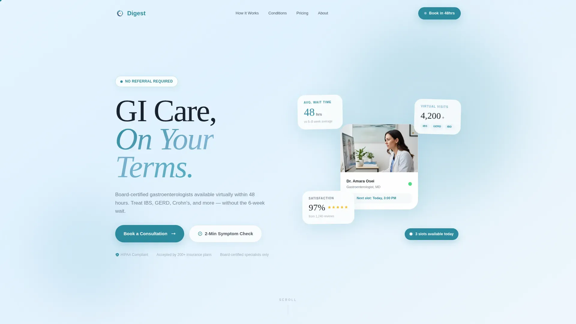
- A stats hero section with animated floating metric cards showing 48-hour appointments, 4,200-plus virtual visits completed, and 97 percent patient satisfaction
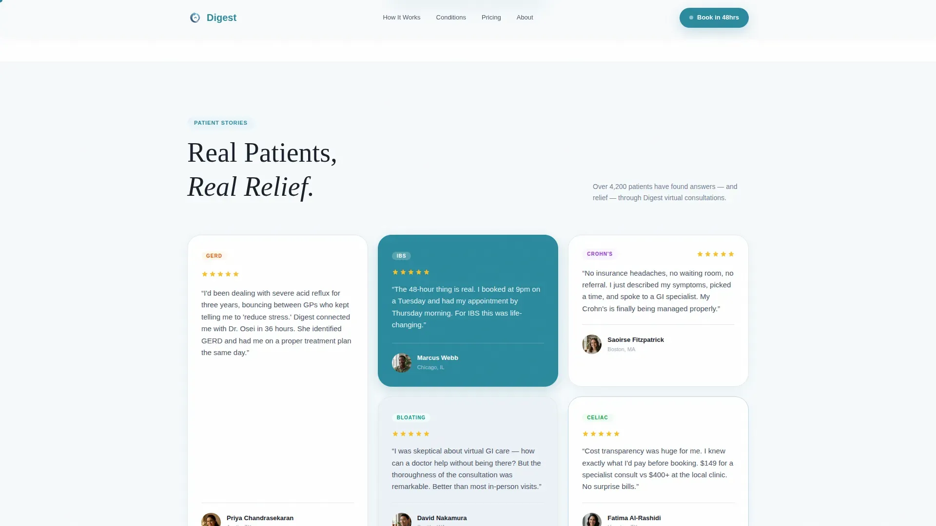
- A testimonial mosaic with asymmetric patient quote cards tagged by condition, interleaved with comparison tables contrasting virtual and in-person care
- A three-step booking form and a two-minute symptom quiz that pre-fills the form with patient answers before submission
Feature list
This template ships with a focused set of interactive and visual components, each grounded in the core goal of converting a worried patient into a booked appointment.
Animated Stats Hero Section
Three oversized metric cards display the practice's key proof points: 48-hour appointments, over 4,200 virtual visits completed, and 97 percent patient satisfaction. The cards use a subtle parallax drift on scroll, set against a sky-to-white gradient with slate typography and teal unit labels.
Interactive Comparison Table
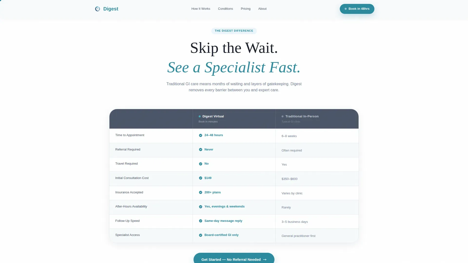
A side-by-side table contrasts virtual visits against in-person appointments across four dimensions: wait times, cost transparency, specialist access, and referral requirements. A toggle lets visitors switch between views, keeping the comparison feel active rather than static.
Testimonial Mosaic Grid
An asymmetric staggered grid of patient quote cards tiles across the viewport. Cards carry condition tags such as gastroesophageal reflux disease, irritable bowel syndrome, and Crohn's follow-up, along with star ratings and pull-quote typography in varied soft-gradient shades.
Three-Step Booking Form
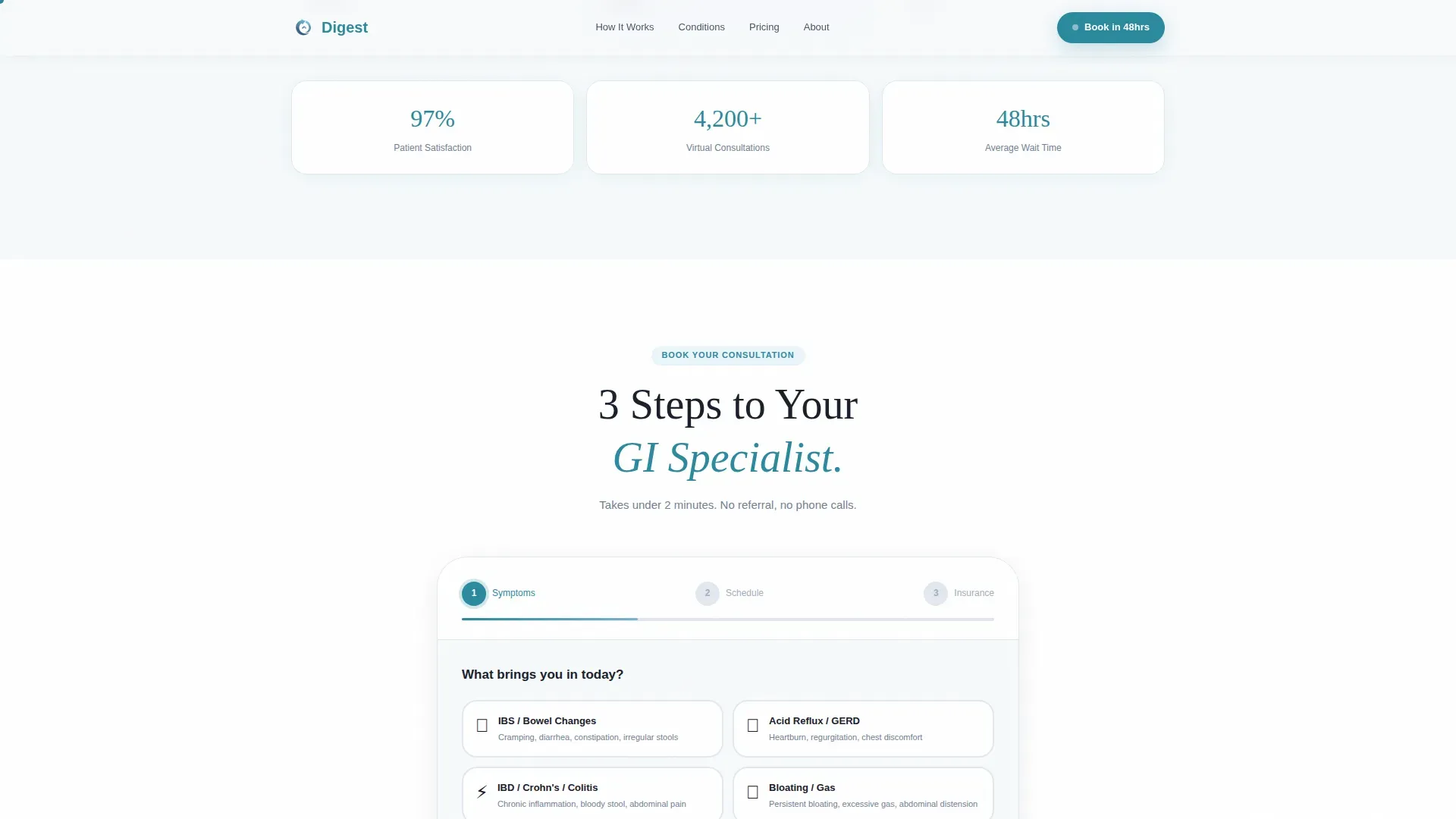
The booking form walks a patient through symptom category selection, preferred appointment window, and an insurance or self-pay toggle. All three steps are contained in a single clean flow, with a floating "Book Your Virtual Visit" call-to-action bar that appears after the first scroll.
Two-Minute Symptom Quiz
A micro-quiz with four questions guides hesitant visitors toward a care recommendation. At the end of the quiz, the booking form opens pre-filled with the patient's symptom answers, reducing friction at the final conversion step.
Floating Call-to-Action Bar
After the first scroll, a teal-on-white sticky bar stays pinned to the viewport. It carries the primary booking button alongside a secondary path labeled "Not sure yet? Take our 2-minute symptom check," capturing both the ready-to-book visitor and the one who still needs a nudge.
Page sections overview
| Section | Purpose |
|---|---|
| Stats Hero | Establish immediate credibility with animated proof metrics |
| Comparison Table | Show clear advantages of virtual over in-person visits |
| Testimonial Mosaic | Build human trust through tagged patient quote cards |
| Three-Step Booking Form | Guide patients from symptom selection to confirmed appointment |
| Symptom Quiz | Capture hesitant visitors and route them into the booking flow |
Design & branding system
The visual identity uses a Soft Gradient theme built on a Slate and Sky color system. Every color choice is intentional: slate grounds the typography in clinical authority, sky blue softens the page into something approachable, and teal reserves its energy for the moments that matter most.
- Clinical slate (#4A5568) for all primary body text and headings, cloud white (#F7FAFC) for section backgrounds that breathe, and calming sky blue (#7FB3D3) washing across gradient band backgrounds
- Quiet teal (#2B8A9E) used exclusively for buttons, interactive highlights, and call-to-action elements to draw the eye without shouting
- Fraunces serif for display headings and DM Sans for body text, creating a pairing that feels both warm and medically trustworthy
Mobile & speed optimization
The template is built with equal weight given to mobile and desktop experiences. Patients are most likely to book on a phone, so the layout and interactive components adapt cleanly to smaller screens without losing the mosaic's visual rhythm.
- The three-step booking form and symptom quiz are designed for touch-friendly interaction, with each step occupying its own clear screen area on mobile
- Scroll-triggered GSAP animations are set to medium intensity, keeping motion engaging without slowing the initial page load or distracting from form completion
- The floating call-to-action bar remains accessible on mobile throughout the scroll journey, so the booking path is never more than one tap away
How this template helps you convert
The page is structured as a deliberate sequence. Every section addresses a different layer of patient doubt before asking for commitment. The rhythm alternates between numbers, voices, and numbers again until a visitor has no remaining reason to leave without booking.
- The stats hero removes hesitation immediately by leading with measurable proof: appointment speed, visit volume, and satisfaction rate are visible before a single word of body copy is read.
- The testimonial mosaic, interleaved with comparison tables, answers the "but is this actually better?" question with both emotional and rational evidence side by side.
- The symptom quiz captures the visitor who is not yet ready to book, leads them through four simple questions, and delivers them directly into a pre-filled booking form, lowering the final barrier to a confirmed appointment.
Other information about this template
This landing page is built for the gastroenterology telehealth niche and is best suited to practices operating in the United States market. Content is written in English, uses USD pricing context, and references both Eastern and Pacific timezone options for appointment windows.
- Localization defaults: English language, US date format, EST and PST timezone references included in the appointment window step
- The template uses GSAP for scroll reveal animations, floating card entrance effects, and quiz step transitions
- All form interactions run client-side, meaning the booking flow feels fast and responsive without waiting on external calls during the selection steps
- The design system avoids stock medical photography entirely; the visual language relies on typography, gradient color fields, and structured data displays instead
Theme
Soft Gradient
Creative direction
Testimonial Mosaic
Color system
Slate & Sky
Style
Comparison Table
Direction
Booking/Scheduling
Page Sections
Animated Stats Hero with Parallax Cards
Toggle-enabled Comparison Table
Condition-tagged Testimonial Mosaic
Three-step Patient Booking Form
Two-minute Symptom Quiz
GSAP Scroll Reveal Animations
Related questions
Can I edit the comparison table content to match my practice?
Does the symptom quiz connect directly to the booking form?
Is this template suitable for a solo practitioner or a small group practice?
What appointment types does the booking form support?
Can I use this template without the symptom quiz?



