Gastroenterology Medicine Booking Website Template
Digest is a single-column gastroenterology telemedicine landing page built around a seven-question inline symptom assessment. It pairs a warm clinical visual identity with a Problem-to-Solution scroll arc that moves visitors from symptom recognition to a booked virtual consultation. The design speaks directly to people living with undiagnosed digestive issues who want real answers without a long wait.
by Rocket studio
Quick summary
Digest is a focused gastroenterology telemedicine landing page designed to convert visitors with chronic digestive symptoms into booked virtual consultations. A cinematic hero section, an interactive seven-question symptom quiz, physician credential panels, and anonymized patient timelines work together in a single-column scroll to build clinical trust and move visitors toward action.
Who this template is for
This template is built for gastroenterology telemedicine practices that serve patients who have been self-researching digestive symptoms online for too long. It suits clinics offering direct-to-consumer virtual consultations with board-certified specialists.
- Gastroenterology practices launching or expanding a telemedicine service
- Direct-to-consumer telehealth brands targeting adults with chronic, undiagnosed digestive conditions
- Healthcare marketers who need a conversion-focused landing page with built-in clinical authority
What problem this template solves
Most healthcare landing pages either feel too cold or too generic. Patients with sensitive digestive symptoms often abandon pages that do not immediately reflect their lived experience. This template closes that gap by opening in the visitor's discomfort before pivoting to solution.
- Visitors with irritable bowel syndrome, gastroesophageal reflux disease, or unexplained bloating do not see their specific symptoms named on typical clinic pages
- Adults delaying a colonoscopy conversation need a page that feels private and unhurried, not institutional
- Generic booking pages fail to build the trust that chronic-symptom patients require before they share personal health details
What you get with this template
You get a complete single-column landing page structured around a clinical Problem-to-Solution arc. Every section is purposefully sequenced to mirror the experience of a real patient consultation.
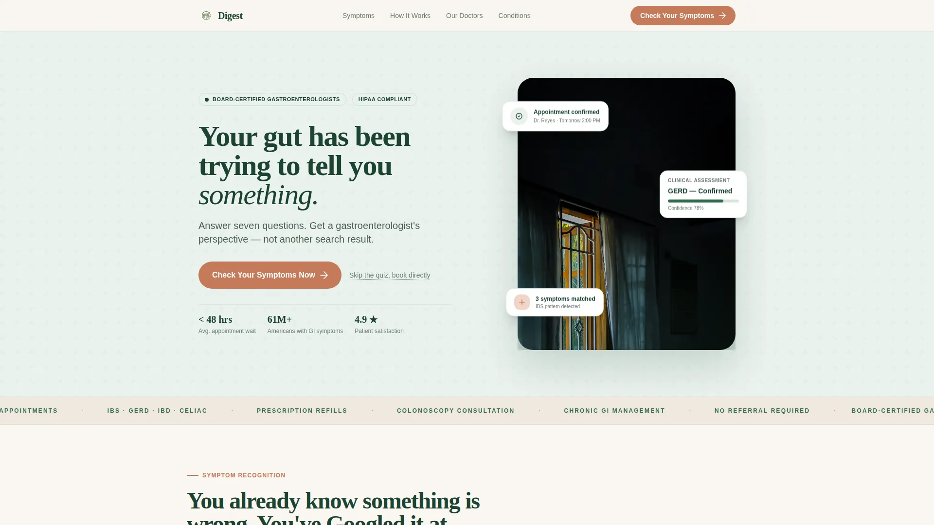
- A cinematic half-page hero with a symptom assessment call to action and a direct-booking fallback link
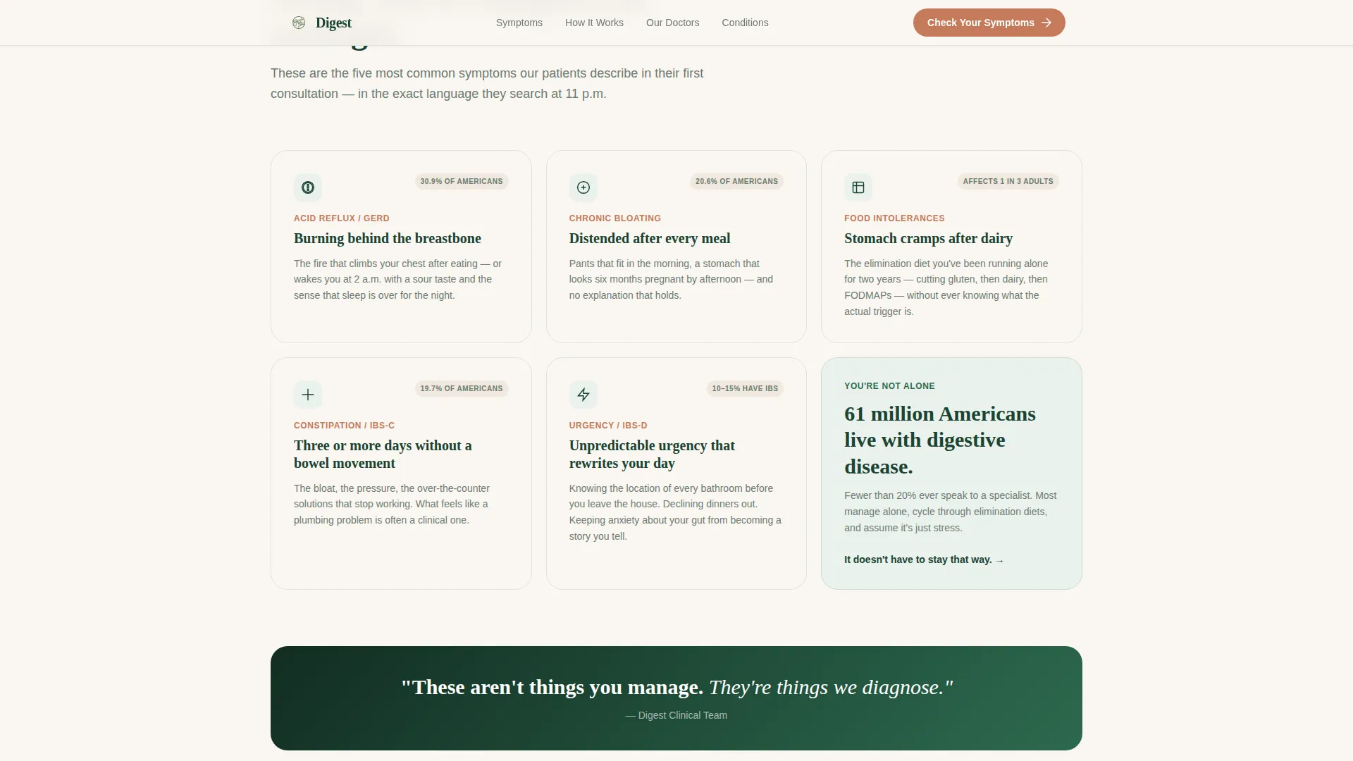
- Five interactive symptom recognition cards that visually respond to visitor attention
- A seven-step inline quiz with conditional logic, a three-step process explainer, physician credential panels, and anonymized patient timeline stories
Feature list
This template includes several purpose-built components that work together to establish trust and drive conversions for a gastroenterology telemedicine service.
Seven-Step Inline Symptom Quiz
The primary conversion tool lives directly on the page with no redirect. Seven progressive questions cover primary symptom selection, frequency, duration, dietary triggers, current medications, prior diagnoses, and preferred appointment window. Each answer shapes the next question like a real clinical intake, making visitors feel understood before they ever speak to a doctor.
Symptom Recognition Section
Five symptom cards name common digestive complaints in the plain language people actually search for at midnight. Each card uses a hover-darkening effect in deep evergreen to visually acknowledge the symptom the visitor recognizes. A single pivot line bridges the problem and solution halves of the page.
Physician Credential Panels
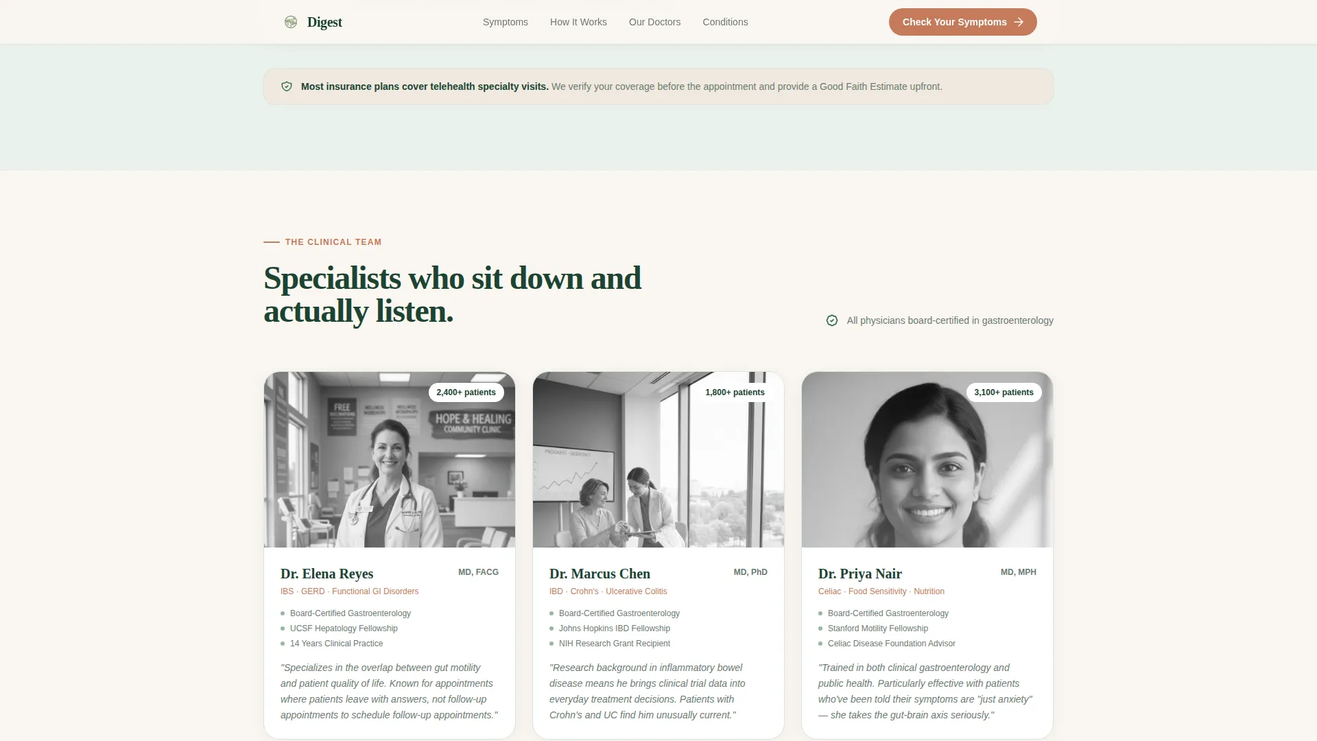
The physician team section displays board certification badges and photo-treated credential panels. This section gives visitors the clinical authority signals they need to trust a virtual consultation with a specialist they have not met in person.
Anonymized Patient Timelines
Real-feeling, anonymized patient journeys show the path from first symptom to diagnosis measured in days rather than months. These timelines serve as social proof and reduce the fear that virtual care means slower or less thorough care.
GSAP ScrollTrigger Animations
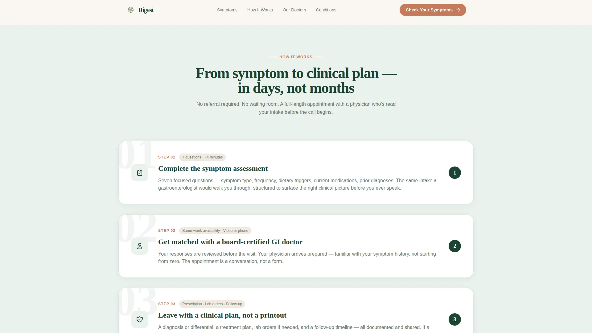
Section reveals use staggered GSAP ScrollTrigger animations throughout the page. The how-it-works three-step process and symptom cards animate in on scroll, keeping the page visually engaging without sacrificing clinical seriousness.
Cinematic Hero Section
The half-page hero uses a left-aligned headline over a soft sage field with a shoulder-level doctor photograph on the right. The composition avoids stock-photo clichés and establishes immediate clinical warmth. The primary call-to-action button and a secondary skip-to-booking text link appear beneath the headline.
Page sections overview
| Section | Purpose |
|---|---|
| Hero with Quiz call to action | Establish clinical tone and prompt symptom assessment entry |
| Symptom Recognition Cards | Name five common conditions in patient-friendly language |
| Problem-to-Solution Pivot | Single transitional line that shifts the page from problem to solution |
| How It Works | Three-step process for booking and attending a virtual visit |
| Physician Team | Display board-certified specialist credentials and photos |
| Patient Timelines | Anonymized journeys showing symptom-to-diagnosis speed |
| Final call to action with Quiz | Repeat assessment entry and direct-booking fallback link |
| Footer | Linear single-row links and contact context |
Design & branding system
The visual identity follows a Medical Clarity theme built on the Forest Trust color system. The palette feels like a private gastroenterologist's office with natural light and real plants, not a sterile hospital corridor.
- Deep clinical evergreen (#1B4332) anchors headers and navigation; soft sage (#95B8A2) washes section backgrounds; warm linen white (#FAF6F1) provides breathing room between content blocks
- Calm terracotta (#C47A5A) is reserved exclusively for buttons and interactive call-to-action prompts, keeping visual hierarchy clear
- Typography pairs Fraunces serif display headings with DM Sans body text for a balance of clinical authority and readable warmth
Mobile & speed optimization
The template is built desktop-first with full mobile responsiveness across all sections. Interactive components and animations are structured to maintain clarity on smaller screens.
- The inline quiz, symptom cards, and physician credential panels reflow cleanly for mobile viewports
- Server Components handle static content sections while Client Components manage the quiz logic and scroll animations, keeping page weight balanced
- GSAP animations are applied to interactive and scroll-triggered elements only, avoiding unnecessary rendering overhead on mobile devices
How this template helps you convert
Every design and copy decision in this template points visitors toward completing the seven-question symptom assessment or booking a direct virtual consultation.
- The hero section places the primary call to action immediately below the headline, so visitors with clear intent can act within seconds of landing on the page
- The symptom recognition cards create a moment of personal identification that lowers resistance before the quiz is presented a second time, making the assessment feel like a natural next step rather than a sales prompt
- Physician credential panels and anonymized patient timelines reduce the trust gap specific to telemedicine, addressing the two most common objections: "Is this doctor qualified?" and "Can a virtual visit actually diagnose me?"
Other information about this template
This template is built for the United States healthcare market and uses English copy and USD pricing context throughout. It is designed for a direct-to-consumer gastroenterology telemedicine service.
- The page targets two distinct audience segments: adults aged roughly 30 to 50 with chronic undiagnosed digestive symptoms, and adults over 50 who have been delaying a colonoscopy consultation
- A marquee strip animation is included as a supporting design element to reinforce social proof signals across the page
- The footer uses a Pattern 1 linear single-row layout, keeping the bottom of the page clean and uncluttered
Theme
Medical Clarity
Creative direction
Problem→Solution Arc
Color system
Forest Trust
Style
Single Column Flow
Direction
Quiz/Assessment
Page Sections
Seven-step Inline Symptom Quiz
Symptom Recognition Cards
Physician Credential Panels
Anonymized Patient Timelines
GSAP Scrolltrigger Animations
Cinematic Hero Section
Related questions
What type of healthcare practice is this template designed for?
Does the symptom quiz redirect visitors to another page?
Can I edit the symptom cards and quiz questions?
Is this a single-page or multi-page template?
What is the visual style of this template?



