Endometriosis Care Reviews Website Template
This endometriosis clinical trial finder landing page is built for patients, gynecologists, and research coordinators who need faster access to active studies. A zigzag layout guides visitors through a diagnostic-delay problem arc, a live trial-matching interface preview, and a stepped intake form that matches users to open enrollment windows by location and eligibility in under 90 seconds.
by Rocket studio
Quick summary
This landing page template is a clinical trial search engine built specifically for endometriosis. It uses a zigzag layout to walk visitors from the problem of years-long diagnostic delays to a clear, filtered matching interface. The primary conversion action is a stepped intake form that surfaces matched trials by location and eligibility. The design is pharmaceutical-grade: clean, authoritative, and built for trust.
Who this template is for
This template is designed for health-tech teams, patient advocacy platforms, and academic medical research organizations running endometriosis trial recruitment. It speaks directly to users who need both clinical credibility and accessible navigation.
- Women with confirmed or suspected endometriosis who have exhausted standard hormonal or surgical treatments
- Gynecologists referring complex Stage III or Stage IV cases to academic research programs
- Research coordinators at academic medical centers working to meet trial enrollment quotas
What problem this template solves
Women with endometriosis face an average diagnostic delay of six to ten years. By the time many patients reach a clinical trial search, they have already been through multiple misdiagnoses and dismissed symptoms. Standard treatment directories are not built for this audience. They lack urgency, clinical specificity, and trust signals that a research-ready patient actually needs.
- Patients cannot quickly find trials matched to their diagnosis stage, location, and eligibility
- Referring physicians lack a fast routing path for complex cases outside standard care
- Research coordinators struggle to fill enrollment quotas because discovery tools are scattered and generic
What you get with this template
You get a fully structured single-page layout built around a deliberate problem-to-solution content arc. Every section earns the next scroll rather than pushing a call to action before trust is established.
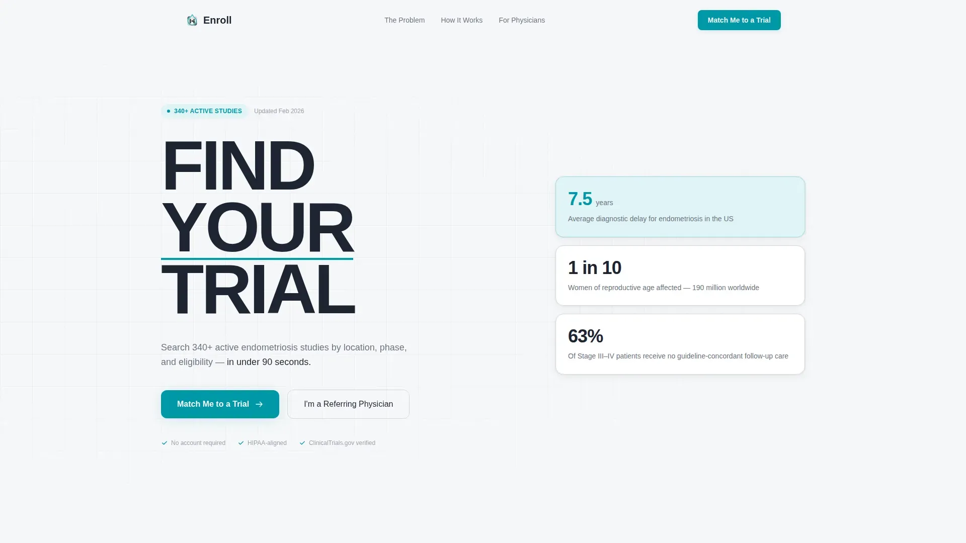
- A hero section with a stacked typographic tower, a teal pulse underline animation, and a primary call-to-action button
- A zigzag alternating layout covering the problem, the solution interface, the matching process, and social proof from research coordinators
- A stepped intake modal with three sequential steps: diagnosis status, zip code with radius slider, and matched trial results with site names and enrollment status
Feature list
This template delivers the following purpose-built features for clinical trial discovery.
Stacked Type Tower Hero
The hero uses 140-pixel condensed typography stacking "FIND YOUR TRIAL" vertically, left-aligned with a teal underline beneath "YOUR" that pulses once on page load. No imagery, no illustration. The composition signals serious research infrastructure from the first second.
Zigzag Problem-to-Solution Arc
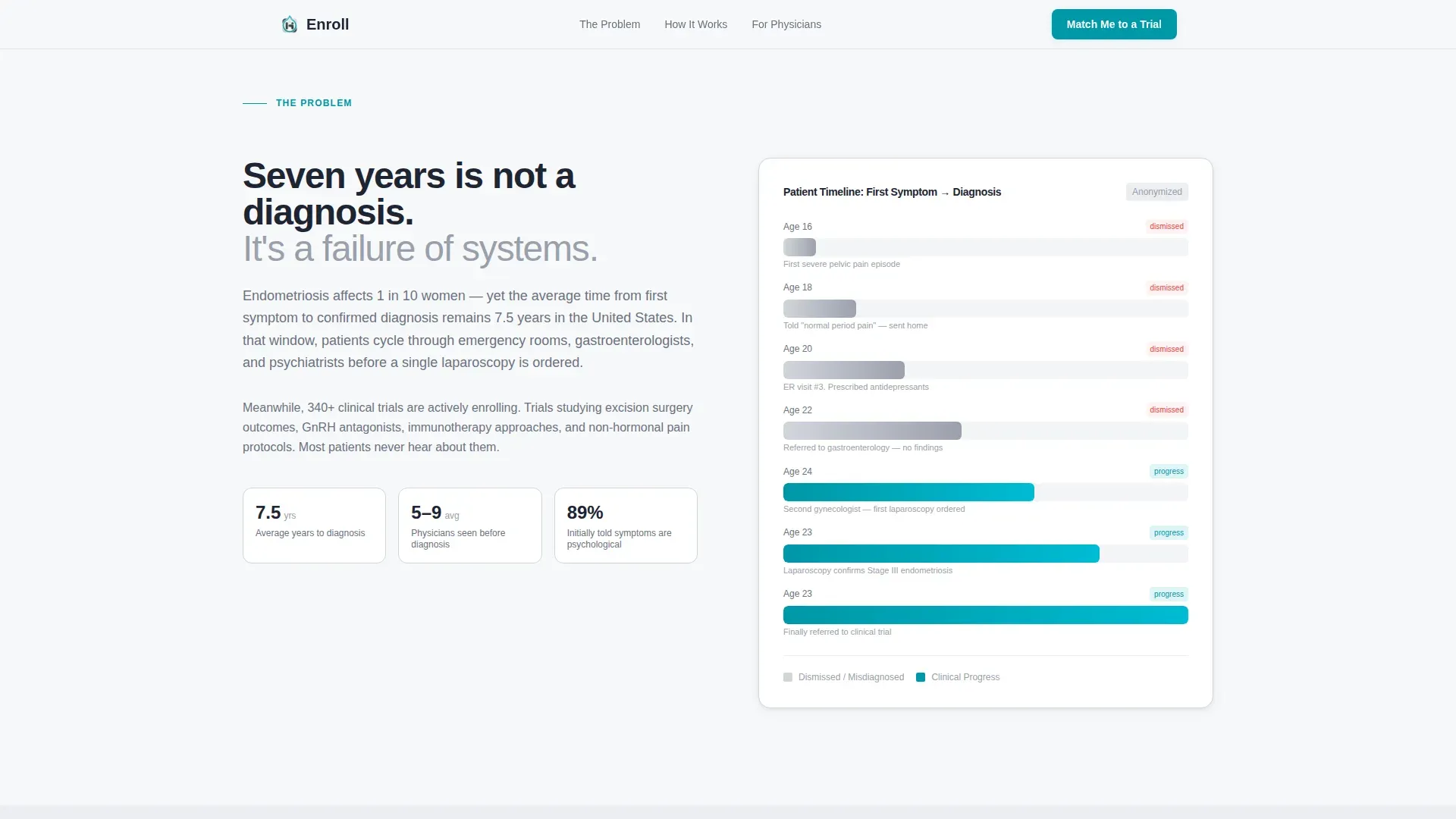
Five alternating content sections escalate specificity deliberately. The first panel presents the diagnostic delay problem using a horizontal bar chart showing a seven-year patient timeline rendered in calm institutional gray. Each subsequent panel builds clinical credibility until skepticism has nowhere left to stand.
Stepped Trial-Matching Intake
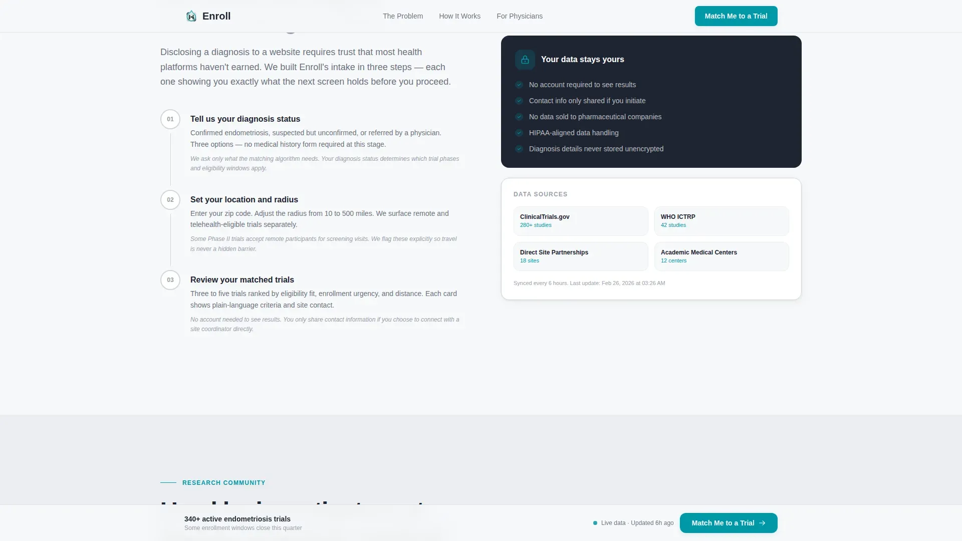
The primary call to action opens a three-step modal. Step one captures diagnosis status. Step two requests zip code and a radius preference. Step three presents three to five matched trials with site names and open enrollment windows. The logic is shown before personal data is requested.
Persistent Bottom Call-to-Action Bar
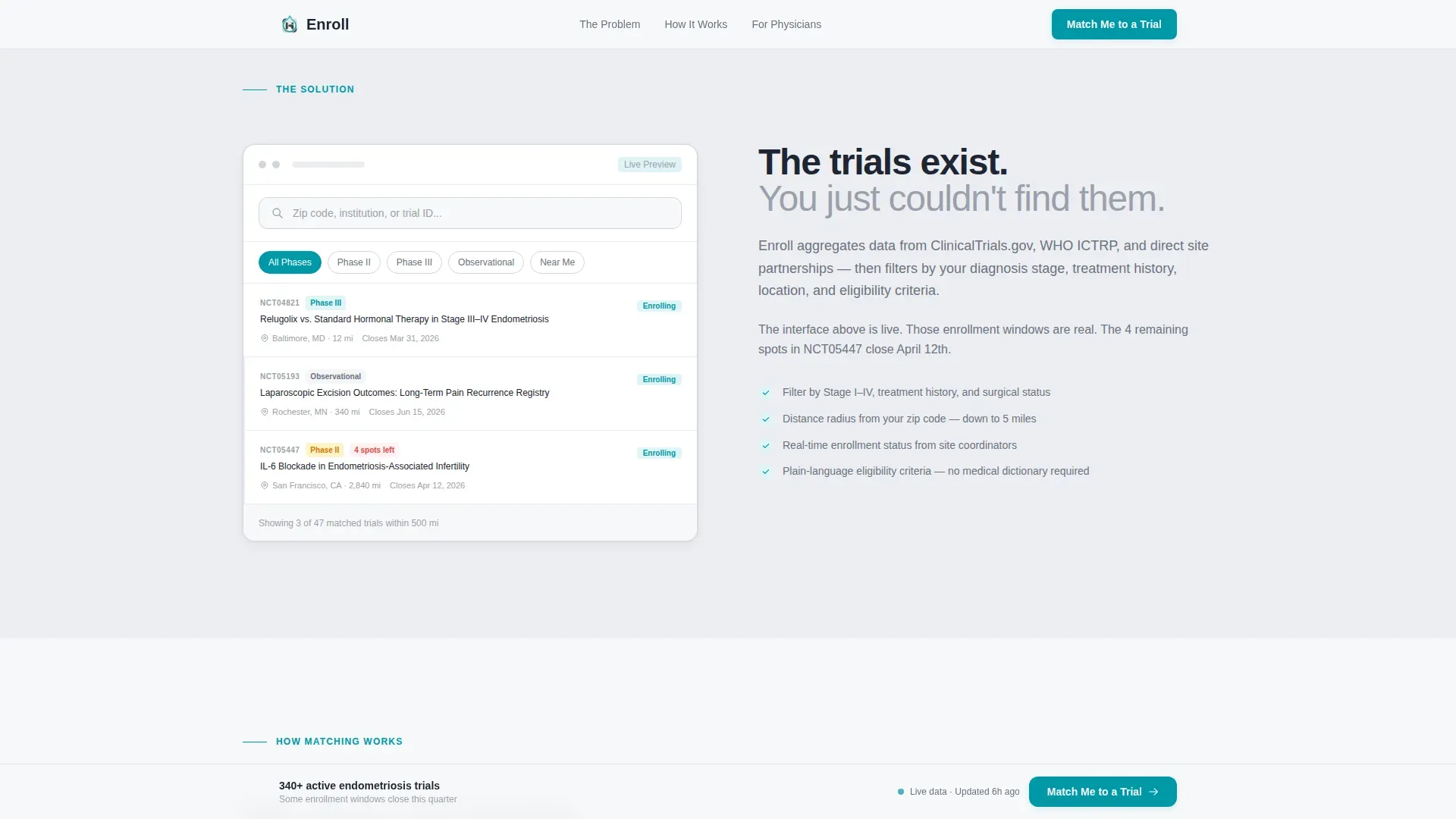
After the second scroll section, a sticky bottom bar anchors the "Match Me to a Trial" button to the viewport. Visitors can convert at any point without scrolling back to the top.
Physician Referral Path
A secondary intake path labeled "I'm a Referring Physician" routes to a shorter form requesting institution name, specialty, and approximate patient volume. This keeps the physician workflow separate and faster than the patient path.
Social Proof Section
Anonymized research coordinator quotes and academic institution references appear in the final zigzag panel. Enrollment numbers provide concrete evidence that the platform connects to active, real-world studies.
Page sections overview
| Section | Purpose |
|---|---|
| Hero Type Tower | Establish authority and present the primary call to action |
| Diagnostic Delay Problem | Visualize the seven-year patient timeline with a bar chart |
| Trial Interface Preview | Show the live matching interface with visible filters |
| How It Works | Walk through the three-step matching process |
| Social Proof Panel | Display coordinator quotes and academic institution references |
| Footer | Provide single-row navigation and secondary links |
Design & branding system
The visual identity follows a Corporate Precision theme using a Cloud Canvas color system. The palette is sterile but not cold. White space carries the emotional weight so that every teal element reads as a clear next step.
- Soft clinical white (#F7F8FA) dominates all backgrounds; calm institutional gray (#D2D6DC) structures supporting elements; deep charcoal (#1E2432) handles all body text
- A single decisive teal (#0097A7) is reserved exclusively for interactive elements, calls to action, and the hero underline animation
- Typography uses Manrope for headlines and DM Sans for body copy, creating a pharmaceutical-grade document feel without coldness
Mobile & speed optimization
The template is built desktop-first because physicians typically research on large screens. However, the layout is fully responsive so that patients researching on mobile devices get a clean, functional experience without layout breakdowns.
- IntersectionObserver-based scroll reveals animate sections into view progressively, reducing visual overload on smaller screens
- Server Components handle all static sections, while Client Components are scoped to the modal and interactive filter preview, keeping the initial load light
- The persistent bottom call-to-action bar adapts gracefully to mobile viewport heights without obscuring content
How this template helps you convert
This template earns clicks by reducing vulnerability before asking for personal information. The matching engine's logic is demonstrated visually before the intake form ever asks for a diagnosis.
- The hero section converts early by placing the "Match Me to a Trial" button immediately beneath the typographic tower, capturing motivated visitors before they scroll
- The zigzag arc builds trust section by section, so visitors who reach the intake modal already understand how matching works and what they will receive
- The persistent bottom bar removes friction for visitors who decided mid-scroll, so they never have to hunt for the conversion point
Other information about this template
This template is built for the endometriosis clinical trial finder niche within the broader Health and Medical category. It is suited for organizations that need to communicate clinical seriousness to a medically informed audience while remaining accessible to patients who are not researchers.
- The US localization uses zip-code-based location input, USD currency context, and US date format for enrollment windows
- The template references 340-plus active endometriosis studies in the hero subline, grounding the search engine's scope for first-time visitors
- Animation intensity is set to medium, using staggered card reveals and the single teal pulse to avoid visual noise in a clinical context
- The design deliberately avoids pink color associations, ribbon iconography, and awareness-campaign aesthetics to signal that endometriosis is treated as a serious research domain here
Theme
Corporate Precision
Creative direction
Problem→Solution Arc
Color system
Cloud Canvas
Style
Zigzag/Alternating
Direction
Booking/Scheduling
Page Sections
Stacked Type Tower Hero
Zigzag Problem-to-solution Layout
Three-step Matching Intake Modal
Persistent Bottom Conversion Bar
Physician Referral Form Path
Social Proof and Enrollment Data
Related questions
Who is the primary audience for this landing page template?
What does the stepped intake form collect?
Can referring physicians use a separate path from patients?
Does the template show how matching works before asking for personal data?
What visual style and color system does this template use?



