Delightful Science Subscription Landing Page Template
Specimen is a science subscription box landing page template built for curiosity-driven brands delivering monthly kits of prepared slides, reagent vials, and pocket optics. The overlap and layered layout mirrors the thrill of opening a new box, with a price-anchored header, tier comparison, and a low-friction email capture that turns browsers into subscribers.
by Rocket studio
Quick summary
Specimen is an overlap and layered landing page template designed for science subscription box businesses. It combines a price-anchored header, a surprise and delight scroll experience, and a clear upsell flow to move visitors toward a paid tier. The Cloud Canvas color system and soft gradient theme create an atmosphere that feels like light passing through a stained slide.
Who this template is for
This template is built for brands in a specific niche: hands-on science education delivered to the door. If you are launching or growing a science subscription box, this landing page gives you a focused, conversion-ready starting point.
- Homeschool curriculum builders who want a website that communicates real educational value
- Science kit companies serving gifted learners, amateur naturalists, and curious hobbyists
- Subscription box entrepreneurs who want to display multiple tiers and drive upgrades from existing subscribers
What problem this template solves
Designing a landing page for a science subscription box requires balancing educational value with the thrill of mystery. Generic store templates cannot hold that tension. They either look too clinical or too playful, and neither converts well for a niche audience that values substance.
- Most templates make it hard to display three subscription tiers clearly while keeping one tier visually elevated
- Standard layouts give no structural support for the unboxing narrative that science box customers respond to
- Visitors who are undecided need a low-friction entry point, and most templates bury or omit that element entirely
What you get with this template
This template gives you a complete, single-page layout built around the Specimen creative brief. Every section has a defined role in moving the visitor from curiosity to commitment. The packaging choices, visual hierarchy, and copy structure all work together.
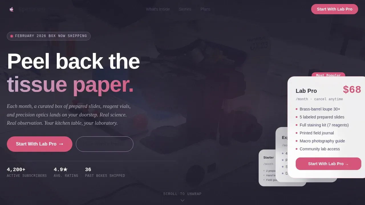
- A price-anchored hero section with the Lab Pro box displayed at full scale, contents fanned out in a flat-lay overhead format
- An interactive scroll experience where layered cards reveal past box contents the way unboxing videos reveal products one item at a time
- A three-tier comparison table with Lab Pro pre-selected, plus a single-field email capture with a secondary call-to-action for undecided visitors
Feature list
This template is built from a defined set of functional and visual components drawn directly from the Specimen brief. Each feature serves a clear purpose within the landing page flow.
Price-Anchored Hero with Tier Staircase
The header opens with the Lab Pro box at full scale. Its contents, a brass-barrel loupe, staining kit, five labeled slides, and a printed field journal, are displayed in an overhead flat-lay with the monthly price large and confident. Below it, the Explorer and Starter boxes appear at a smaller scale. Their prices create a visual staircase that makes the top box feel like the natural choice without aggressive persuasion.
Layered Unboxing Scroll Experience
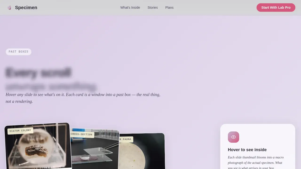
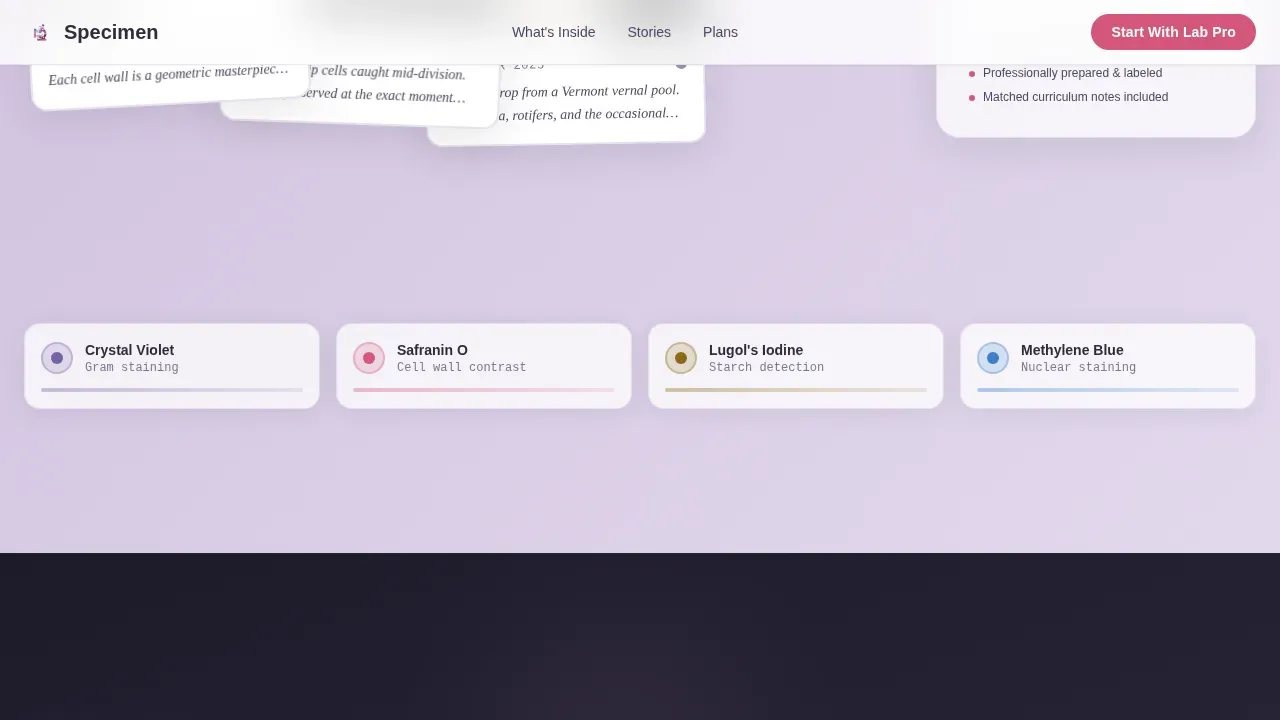
Each section past the header unwraps a single item from a past box. Layered cards slide and overlap to reveal what is beneath, echoing the rhythm of popular unboxing videos. A diatom slide appears first, then a macro photograph of its surface blooms behind it. A reagent bottle tilts into frame, then a stain sequence fans out underneath. The page rewards curiosity at every scroll point.
Hover-Activated Specimen Reveal
Users can hover a slide thumbnail and watch the microscope view expand behind it. Pausing on a journal page makes handwritten field notes legible. These interactions create a customer experience that feels closer to holding the actual product than reading about it. The motion is purposeful, not decorative, and it reinforces the value of what arrives in each box.
Smart Call-to-Action Switching
The primary call-to-action reads "Upgrade My Box" for existing subscribers and "Start With Lab Pro" for new visitors, determined by a URL parameter. This means the same landing page can serve two separate audiences without requiring a duplicate site. The message stays relevant and the conversion path stays clean.
Three-Tier Comparison Table
The comparison table lets visitors toggle between Starter at twenty-four dollars per month, Explorer at forty-two dollars per month, and Lab Pro at sixty-eight dollars per month. Lab Pro arrives pre-selected and visually elevated above the other tiers. Visitors can evaluate each tier's contents and decide which box fits their preferences and budget.
Email Capture with Sneak Peek Incentive
Below the comparison table, a single-field email capture invites visitors to sign up with the secondary call-to-action "See Next Month's Sneak Peek." This is the low-cost, low-friction entry for anyone not yet ready to subscribe. The incentive trades anticipation for contact, giving the business a way to nurture undecided visitors and grow its audience over time.
Page sections overview
| Section | Purpose |
|---|---|
| Hero tier staircase | Anchors price perception with Lab Pro at full scale |
| Unboxing scroll reveal | Delivers layered card animations for each past item |
| Specimen hover interaction | Expands microscope view on thumbnail hover |
| Past box showcase | Shows examples of curated contents to build anticipation |
| Tier comparison table | Displays all three subscription options with Lab Pro pre-selected |
| Email sneak peek capture | Collects contacts with a low-friction secondary call-to-action |
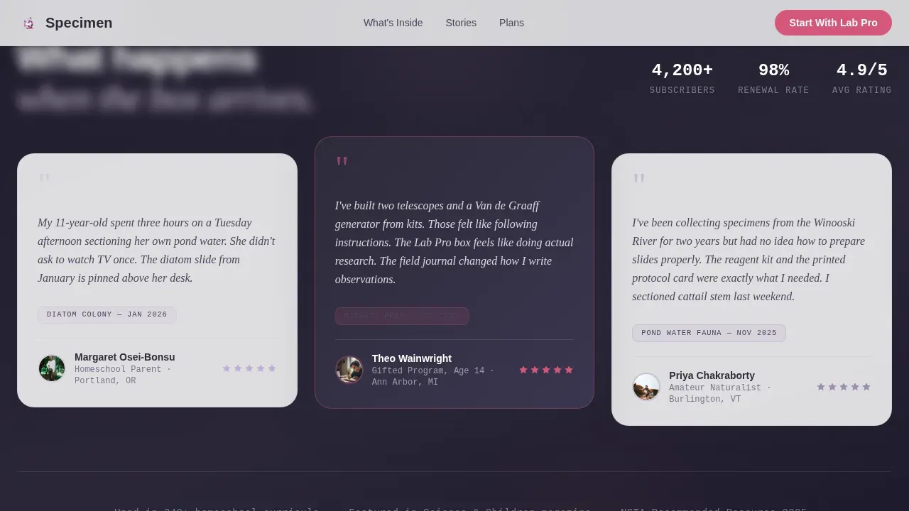
| Testimonial social proof | Displays feedback from current subscribers and educators |
| How it works | Explains the subscription process in a clear, scannable format |
Design & branding system
The template uses the Cloud Canvas color system built on four values that feel like light passing through a stained cross-section. Gradients wash across section backgrounds, and overlapping cards with subtle drop shadows create physical depth. The visual appeal in the packaging design communicates quality before a single word is read.
- Diffused lavender (#C4B1D4) and slide-glass frost (#EEF0F5) wash across section backgrounds as soft gradients
- Specimen-stain magenta (#D4567A) pulses on buttons and price callouts, creating a bold contrasting color for every call-to-action
- Deep eyepiece charcoal (#2E2B3A) anchors typography so the pastel palette stays grounded and readable on any device
Mobile & speed optimization
The landing page layout is structured for clean rendering on smaller screens. Easy-to-tap buttons, stacked tier cards, and a focused single-column flow on mobile ensure the customer experience holds across screen sizes. Removing the main website navigation keeps visitors focused on the subscription offer without distraction.
- The template removes outbound links from the primary layout to prevent visitors from leaving the page before converting
- Tier cards restack vertically on smaller screens, and the email capture field remains prominent and easy to interact with
- Hover interactions adapt gracefully so the reveal experience is not lost when a user accesses the site on a touch-based device
How this template helps you convert
The Specimen landing page is built around one idea: the moment before you know what is in the box is more powerful than the reveal itself. Every structural decision serves that emotional rhythm and guides visitors toward a subscription.
- The price-anchored header uses visual hierarchy to make Lab Pro feel like the obvious tier, while the staircase layout keeps Starter and Explorer visible for visitors with different budgets, so every visitor finds a relevant entry point and can decide with confidence.
- The layered scroll experience mirrors the format of popular unboxing videos, which are growing by fifty-seven percent a year according to Google, and user-generated video content serves as some of the most trusted social proof available to a subscription box brand.
- The email capture below the comparison table creates a low-friction path for undecided visitors, letting the business nurture leads and build brand loyalty over time rather than losing them on the first visit.
Other information about this template
This template is part of a retail and e-commerce category designed for subscription box businesses operating in specialty science markets. It is built to support growth at multiple stages, from a new company launching its first box to an established business trying to move subscribers up to higher tiers. The following points cover practical considerations for anyone evaluating this template.
- Subscription boxes require packaging that stands out from the competition, and this template's visual design reinforces the perceived value of the physical packaging before the box even arrives
- Including a personalized note or product information card in each box is common in this market category, and the template's "How It Works" section can surface that detail to build trust with new customers
- Engaging packaging experiences encourage social sharing, and the template's unboxing scroll narrative gives visitors a preview of what their own unboxing video could look like, creating an incentive to share on social platforms
- The template's aesthetic and structural approach can support advertising campaigns on social channels, where the unforgettable unboxing experience is the message that drives clicks back to the landing page
- Subscription boxes give customers the opportunity to discover new products each month, and this template's sneak peek email capture leans into that curiosity to grow a contact list even before a sale happens
- Unboxing-related posts on Instagram get shared an average of ninety-five million times per day, and delivering a strong visual identity on the landing page gives subscribers something worth photographing and posting
- Sending free samples to creators on YouTube can be more effective than traditional advertising, and this science landing page's visual language translates naturally into the kind of video thumbnails that perform well on that platform
- Birchbox built a category around the subscription box model and now has nearly a quarter-million unboxing videos dedicated to it on YouTube, which shows the long-term community and brand loyalty that a well-designed subscription experience can build
- Customer feedback and subscriber preferences can guide future box curation and customization options, and the template's email capture provides a natural starting point for that feedback loop
- Eco-friendly packaging materials are a growing point of differentiation among competitors in the subscription box market, and concise copy on the landing page can acknowledge that commitment clearly
Theme
Soft Gradient
Creative direction
Surprise & Delight
Color system
Cloud Canvas
Style
Overlap/Layered
Direction
Upsell/Upgrade
Page Sections
Price-anchored Hero with Tier Staircase
Layered Unboxing Scroll Experience
Hover-activated Specimen Reveal
Smart Call-to-action URL Switching
Three-tier Comparison Table
Sneak Peek Email Capture
Related questions
Can I use this template for a new subscription box launch or only for an existing one?
Does the template include the tier comparison table with all three price points?
How does the email capture section work for undecided visitors?
Can I customize the color palette and typography to match my existing brand?
Is this template suited for a science subscription box targeting both parents and young learners?



