Newsletter Writers Community Landing Page Template
Dispatch is an editorial landing page template built for newsletter writers Slack communities. It pairs a manifesto-driven hero with scroll-reveal chapters, a live community stats ticker, and editor's-note testimonials, all set in a warm botanical palette of fern, parchment, and mauve. The single call to action carries visitors straight to a Slack invite application.
by Rocket studio
Quick summary
Dispatch is a single-page, click-through landing page template designed for private newsletter writer communities. It uses an editorial magazine aesthetic rooted in a botanical color system. Every section is built around deep reading rhythm, not quick scanning, guiding visitors from a typographic manifesto to a Slack invite application with conviction and warmth.
Who this template is for
This template is built for community founders and operators who gather newsletter writers under one roof. It speaks directly to people who run invitation-only writing groups and need a landing page that earns trust through craft, not hype.
- Solo Substack operators and indie newsletter creators who run or want to launch a paid writing community
- Marketing leads and ghostwriters who manage editorial communities for professional writers
- Community builders in the newsletter space who need a click-through page leading to an application screen
What problem this template solves
Newsletter writers often build their craft in isolation. They guess at metrics, celebrate wins with nobody who truly understands, and have nowhere to workshop a subject line at midnight. A generic community page cannot communicate what a peer-driven writing room actually feels like.
- A bland community page fails to convey the intimacy and editorial depth that serious newsletter writers expect
- Most landing page templates are built for scanning, not for the slow, deliberate reading that newsletter audiences prefer
- Writers need social proof that speaks their language, not vanity metrics or corporate testimonials
What you get with this template
This template delivers a full editorial landing page structured as a series of chapters rather than sections. Every element, from the oversized serif manifesto to the bento grid of topic cards, is included and ready to customize.
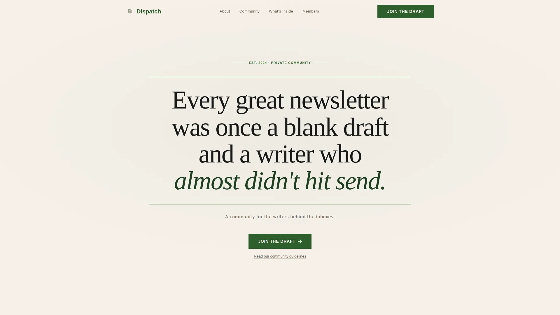
- A manifesto hero section with fern-green typographic rules, an editorial byline, and a primary call-to-action button labeled "Join the Draft"
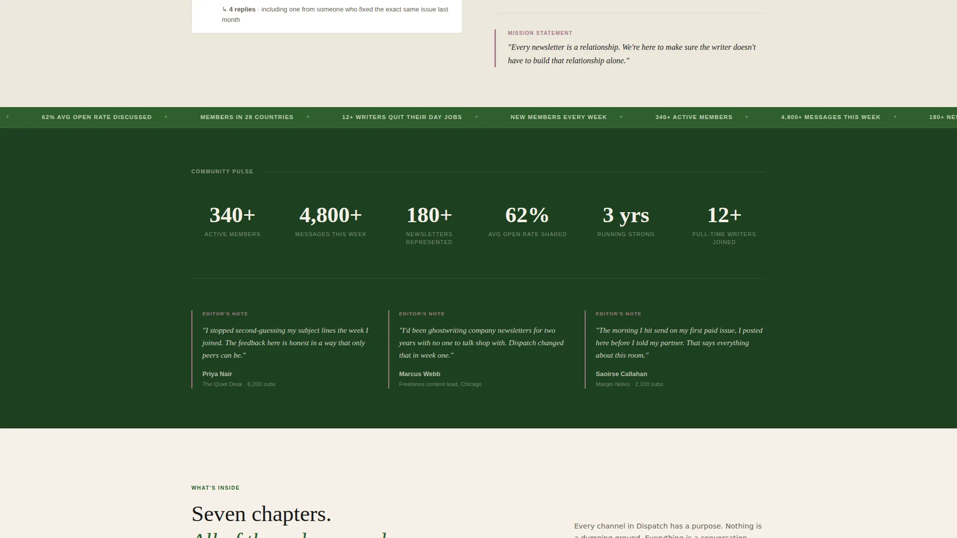
- A community stats ticker showing live member count, weekly message volume, and newsletters represented, paired with three editor's-note testimonials
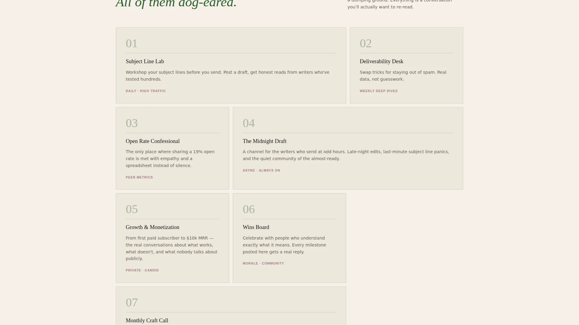
- An asymmetric bento grid of community chapter cards, a final call-to-action repeat, and a minimal horizontal footer
Feature list
This template includes the following built-in features, drawn directly from the design and structure brief.
Manifesto Hero with Typographic Rules
The hero opens with an oversized editorial serif headline set against a parchment cream field. Thin fern-green rules frame the statement above and below, giving it the weight of a limited-run broadsheet. No images are used, the copy carries the entire visual load with confidence.
Scroll-Reveal Chapter Navigation
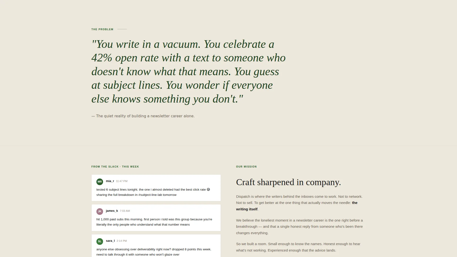
Content unfolds through scroll-reveal transitions designed to feel like turning a page. Full-width typographic statements alternate with tight two-column editorial blocks. Anonymized thread snippets and member growth milestones appear inside these blocks, making the reading rhythm deliberate and immersive.
Live Community Stats Ticker
A running ticker displays real-time community figures: active members, messages sent this week, and the number of newsletters represented. The ticker animates smoothly and grounds the page in social proof without requiring a separate testimonial section to carry that weight alone.
Editor's Note Testimonials
Three member testimonials are styled as editor's notes or marginalia, evoking the feeling of handwritten annotations in a well-loved field guide. This format builds trust through voice and specificity, not polished marketing quotes.
Mauve Interactive Elements
Every interactive element, including buttons, hover states, and toggles, blooms in pressed-flower mauve on activation. This creates a consistent and tactile feedback system that feels alive without relying on heavy animation frameworks.
Asymmetric Bento Topic Grid
A bento grid of chapter and topic cards lays out what is covered inside the community, from subject line workshops to deliverability tricks and open-rate analysis. The asymmetric layout keeps the eye moving and rewards careful reading.
Page sections overview
| Section | Purpose |
|---|---|
| Manifesto Hero | Anchors the page with a typographic statement and the primary "Join the Draft" call to action |
| The Problem Block | Full-width pull quote plus two-column editorial block articulating the cost of writing alone |
| Community Stats Ticker | Running ticker of live member, message, and newsletter figures alongside the first testimonials |
| What's Inside Grid | Asymmetric bento grid of community chapter and topic cards |
| Member Voices | Three testimonials styled as editor's notes or marginalia |
| Final Call to Action | Repeat of "Join the Draft" button with a quiet community guidelines text link beneath |
| Minimal Footer | Horizontal footer following a clean, minimal layout pattern |
Design & branding system
The template uses an Educational Guide theme interpreted through a botanical lens. The palette is warm, considered, and immediately recognizable to readers who value craft over noise.
- Core colors: deep fern (#2D5F2D) for headers and section dividers, parchment cream (#F5F0E8) as the page background, pressed-flower mauve (#A67B8A) for all interactive elements, and annotation ink (#1A1A1A) for body text
- Typography: Fraunces, an editorial serif, handles all headers and pull quotes; DM Sans handles body copy for clean readability at smaller sizes
- Visual language: no illustrations or photography in the hero; the design leans entirely on typographic weight, rule lines, and the botanical color system to create warmth and authority
Mobile & speed optimization
The template is designed desktop-first to match the working habits of newsletter writers, with a solid mobile experience layered on top.
- Desktop-first layout ensures the editorial column widths, pull quotes, and bento grid read as intended on larger screens before adapting to mobile viewports
- Animations are kept at a medium intensity level using scroll reveals and ticker motion, avoiding heavy scripts that would slow the experience on any device
- Server Components handle static content sections, keeping JavaScript to a minimum and supporting fast initial page loads
How this template helps you convert
Every design and copy decision in this template is oriented toward one goal: moving the right visitor to click "Join the Draft" with confidence.
- The manifesto hero establishes conviction immediately, filtering for writers who recognize their own experience in the words and building the emotional case before any feature is mentioned
- Social proof is layered in three distinct formats, specifically the stats ticker, the editor's note testimonials, and anonymized thread snippets, so visitors encounter evidence of community health at every scroll depth
- The secondary text link to community guidelines appears quietly beneath each call-to-action, answering unasked questions and reducing the hesitation that stops cautious applicants from clicking through
Other information about this template
This template sits in the Community and Nonprofit category with a Newsletter Writers Community subcategory focus. It was built specifically for the newsletter writers Slack community niche.
- The click-through direction means no form lives on the page itself; the "Join the Draft" button carries visitors to a separate short application screen, keeping the landing page clean and focused
- The template style is Editorial and Magazine, drawing on conventions from literary journals and independent publishing rather than standard software or product landing pages
- Community guidelines are surfaced as a quiet secondary link beneath each call to action, designed to reduce friction for cautious readers without disrupting the primary conversion path
- The footer follows a minimal horizontal layout pattern consistent with independent publishing aesthetics, keeping the exit experience as considered as the entrance
Theme
Educational Guide
Creative direction
Vision & Mission
Color system
Botanical
Style
Editorial/Magazine
Direction
Click-Through
Page Sections
Manifesto Hero with Typographic Rules
Scroll-reveal Chapter Transitions
Live Community Stats Ticker
Editor's Note Testimonials
Mauve Hover and Interactive States
Asymmetric Bento Topic Grid
Related questions
Does this template include a sign-up form on the page?
Can I update the community stats shown in the ticker?
How many testimonials does the template include?
Is this template suitable for a community that does not use Slack?
What makes this template different from a standard community landing page?