Travel Email Marketing Agency Landing Page
Dispatch is a travel email marketing agency landing page built for studios that turn inbox moments into booked trips. It uses an overlap and layered visual style, a dark iridescent color palette, and a case study narrative structure to let compounding proof do the persuading. Visitors scroll through real campaigns, real results, and a single compelling call to action.
by Rocket studio
Quick summary
Dispatch is a single-page, click-through landing page template for a travel email marketing agency. It layers editorial typography over atmospheric photography, unfolds three campaign case studies in scroll-driven narrative form, and closes with a primary call to action that earns its click through accumulated evidence rather than upfront promises.
Who this template is for
This template is built for agencies and studios whose work lives inside the inbox. If you write, produce, or strategize email campaigns for the travel industry, this page frames your craft in a way that speaks directly to the clients who need it most.
- Travel email marketing agencies pitching boutique tour operators and hotel groups
- Loyalty program consultants targeting airlines and travel brands with declining open rates
- Freelance email strategists who want a portfolio page that shows proof before it asks for anything
What problem this template solves
Most agency portfolio pages make claims. This one builds a case. The travel industry has a specific inbox problem: open rates are flat, unsubscribe spikes are real, and "Dear Valued Guest" templates have been circulating untouched for years. Clients need to see that you understand the problem before they trust you with their list.
- Generic agency pages lead with services instead of evidence, which loses skeptical buyers early
- Travel brand decision-makers need to see vertical-specific proof, not abstract capability lists
- A click-through page without a form demands that copy and design alone do the conversion work
What you get with this template
You get a fully structured, single-page layout built around narrative scroll depth. Every section is designed to stack proof visually and editorially, so the page does the selling while the visitor simply reads.
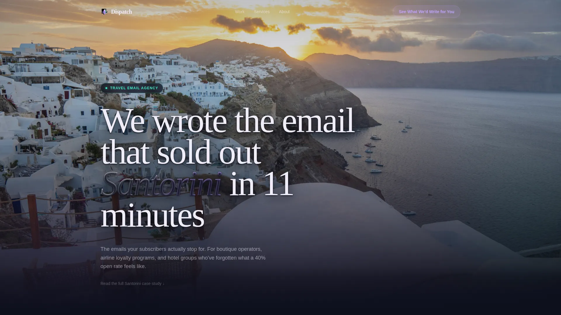
- A massive editorial header with type physically layered over a blurred aerial photograph
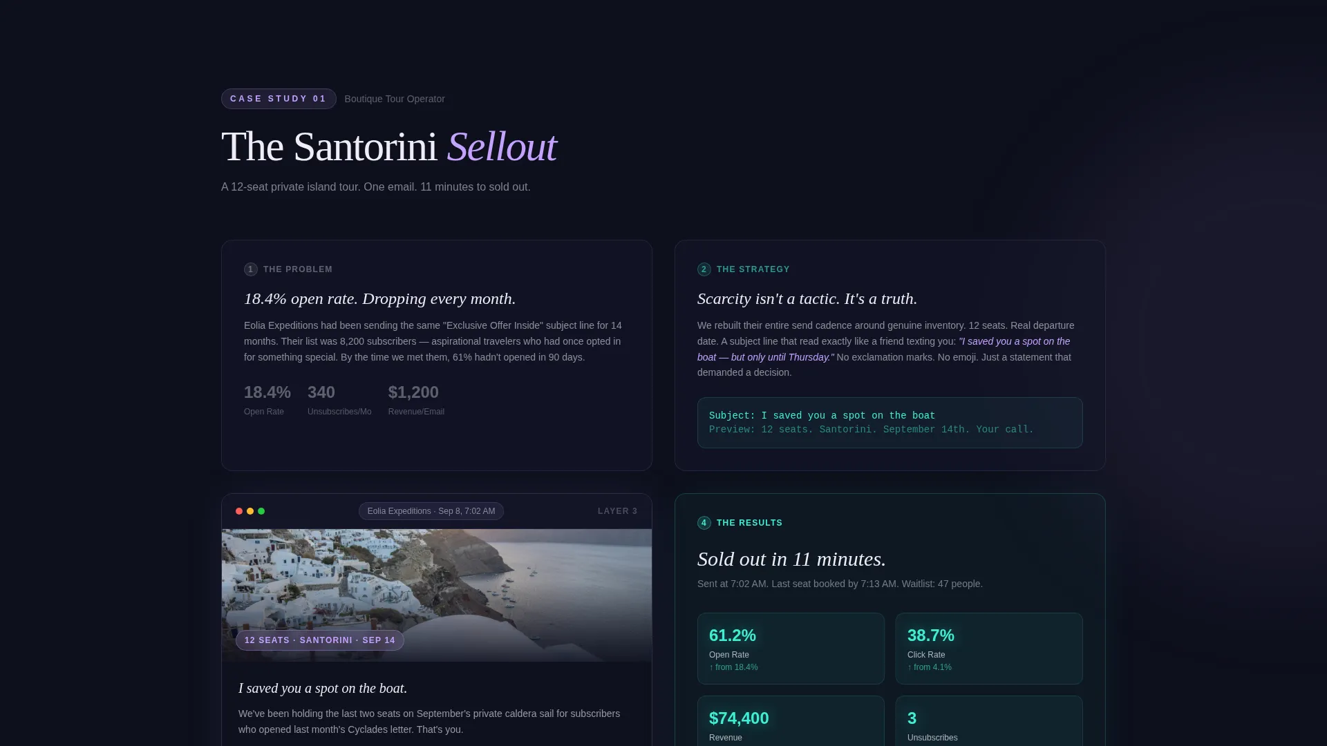
- Three scroll-driven case study sections, each revealing client problem, strategy, email design mockup, and results in overlapping layers
- A primary call-to-action button placed after the first case study and again at the bottom of each subsequent narrative block, plus a secondary text link for analytically curious visitors
Feature list
A paragraph overview of the feature set: this template packages a focused set of visual and structural capabilities drawn directly from its travel email agency brief. Each feature below reflects a specific design or layout decision described in the source prompt.
Oversized Editorial Header
The header opens with a typographic statement set in an oversized editorial serif. The headline sits physically on top of a blurred, dreamy aerial photograph, casting a layered shadow. A blinking cursor replaces the closing period, suggesting the subject line is still being written.
Overlap and Layered Case Study Sections
Each of the three case studies unfolds in a layered sequence: the client problem floats forward first, then the email strategy slides in underneath it, then a device mockup overlaps both, and finally the results animate on top. The structure builds argument through accumulated evidence.
Iridescent Dark Color System
The palette uses deep inbox black, holographic lilac, prismatic teal, and soft iridescent white. Backgrounds stack in translucent dark layers. Teal activates on hover states and metric highlights. Lilac washes over featured email screenshots. The effect feels like light refracting through a phone screen at night.
Compounding Call-to-Action Placement
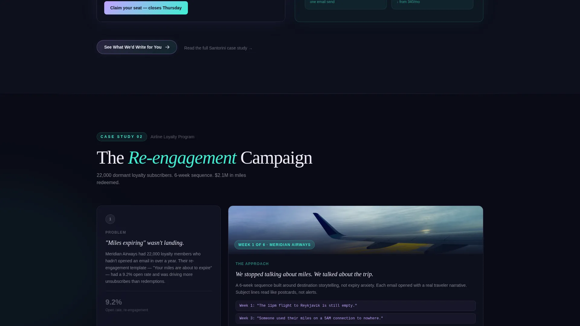
The primary call to action reads "See What We'd Write for You" and appears first after the opening case study. It then floats again at the bottom of each subsequent narrative layer. No form appears on the page. A secondary text link routes analytically curious visitors deeper into the funnel.
Type Over Image Header Concept
The Lens and Frame theme uses photography as a mood layer, not a background filler. The header image is blurred and dreamy so the editorial type remains the dominant visual. This keeps the first impression emotional and fast, without competing visual elements slowing the reader down.
Page sections overview
| Section | Purpose |
|---|---|
| Editorial hero header | Opens with the bold typographic claim layered over aerial photography |
| Case study one | Reveals the first campaign narrative in problem, strategy, mockup, results order |
| Primary call to action block | Places the first "See What We'd Write for You" prompt after case study one |
| Case study two | Unfolds a second travel vertical campaign in the same layered sequence |
| Floating call to action layer | Reintroduces the primary call to action beneath case study two |
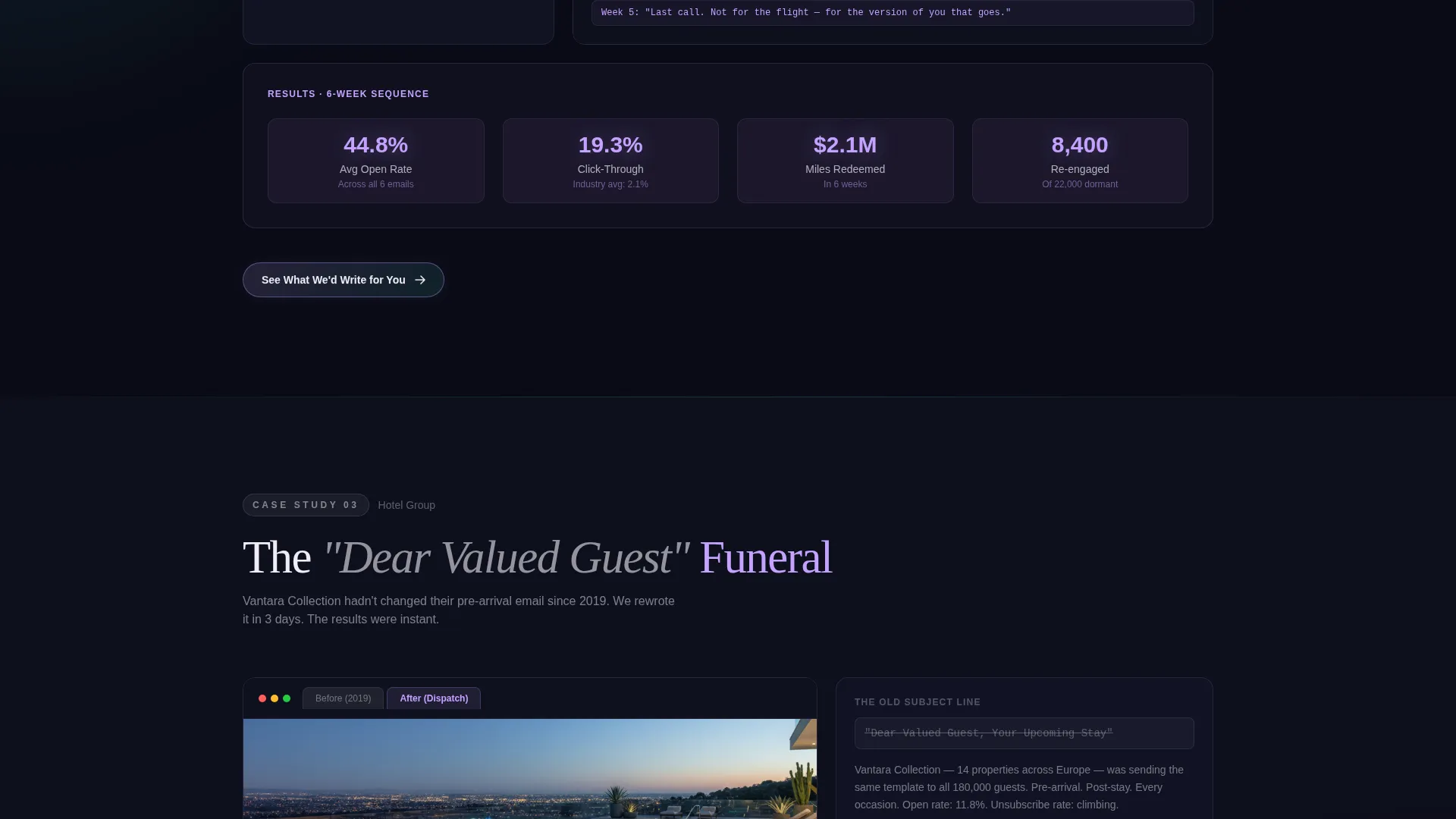
| Case study three | Delivers the most visually layered campaign narrative, with real revenue numbers |
| Secondary text link | Offers "Read the full Santorini case study" for deeper funnel routing |
| Final call to action anchor | Closes the page with the primary action button and the secondary text link |
Design & branding system
The visual identity follows a Lens and Frame theme expressed through an AI Iridescent color system. The palette is deliberately synthetic and luminous, as if every color sits mid-shift between two states. Typography is editorial and oversized in the header, then breathable and readable in the body.
- Deep inbox black (#0D0F1C) as the primary background, holographic lilac (#C4A1FF) over email screenshots, prismatic teal (#3EEFD4) on hover states and result metrics, and soft iridescent white (#F0EDF6) for body text
- Translucent dark layers stack behind content sections, creating visual depth without heavy gradients
- Blurred aerial photography grounds the header emotionally while keeping editorial type as the dominant visual element
Mobile & speed optimization
The overlap and layered layout is designed with scroll-depth storytelling in mind. Each narrative layer is structured so content stacks cleanly as the viewport shrinks, preserving the layered visual logic across screen sizes.
- Device mockups within case study sections are sized to remain legible and proportional on smaller screens
- The dark iridescent palette and translucent backgrounds maintain visual coherence without relying on wide-format spacing alone
- Call-to-action blocks are placed at natural scroll pauses so mobile visitors encounter them at the same emotional moments as desktop readers
How this template helps you convert
This landing page is a click-through format, which means the entire design is oriented around a single outcome: getting the visitor to press "See What We'd Write for You." The conversion logic is structural, not promotional.
- The hero header creates an immediate emotional hook with a specific, verifiable-sounding claim that invites skepticism and curiosity at the same time, pulling the visitor into the first case study.
- Three layered case studies build compounding proof across real campaign problems, strategies, email designs, and results, so by the third narrative block the visitor has seen enough evidence to act with confidence.
- The secondary text link catches visitors who want more before committing, routing them deeper into the funnel without interrupting the primary conversion path.
Other information about this template
This template sits at the intersection of portfolio design and travel industry marketing. It is built as a single-page, overlap-style layout with no on-page form, making it a strong fit for agencies that prefer a consultative first contact over a self-serve signup flow.
- The creative direction is Case Study Narrative, meaning the page argues through evidence rather than assertions
- The header concept is Type Over Image, a technique that keeps the emotional pull of destination photography without letting it overpower the agency's voice
- The template style is Overlap and Layered, where content elements physically stack and slide past each other as the visitor scrolls
- The landing page direction is Click-Through, designed to route qualified visitors to a separate services or booking page
- The Lens and Frame theme and AI Iridescent color system work together to give the page a night-screen luminosity that feels native to travel content and inbox culture simultaneously
Theme
Lens & Frame
Creative direction
Case Study Narrative
Color system
AI Iridescent
Style
Overlap/Layered
Direction
Click-Through
Page Sections
Oversized Editorial Header with Layered Type
Scroll-driven Case Study Narrative
AI Iridescent Color Palette
Compounding Click-through Call to Action Structure
Device Mockup Overlap Sections
Related questions
Does this template include a contact form or sign-up form?
Can I swap the case study content with my own campaigns?
Who are the ideal clients this landing page is designed to attract?
Is this template suited for a single agency niche or multiple travel verticals?
Can I use this template for a travel brand rather than an agency?



