Logistics Consulting Careers Website Template
Dispatch is a sidebar companion landing page template built for logistics operations consultants. It combines a data-atmosphere visual identity with a Stats-First layout to capture VP-level ops leaders, regional third-party logistics owners, and CFOs. Every section leads with a hard number, and a persistent sidebar quietly stacks the impact as visitors scroll toward the audit request form.
by Rocket studio
Quick summary
Dispatch is a lead generation landing page template designed for logistics operations consultants. It opens with a dark, data-charged header and escalates through metric-led sections toward a terminal audit request form. A fixed sidebar companion accumulates key stats as visitors scroll, making the case for an operations audit before the visitor even reaches the call to action.
Who this template is for
This template is built for consultants who work inside the hard edges of supply chain operations. It speaks the language of operations metrics, not marketing fluff.
- Logistics operations consultants targeting VP-level decision-makers at mid-market distributors
- Regional third-party logistics owners whose on-time delivery rates are slipping
- Independent supply chain advisors who need a lead generation landing page that qualifies prospects before the first call
What problem this template solves
Most consulting landing pages bury the proof. They lead with credentials and leave buyers guessing about real-world impact. Dispatch flips that sequence entirely.
- Ops leaders and CFOs need hard numbers before they agree to a conversation
- Generic service pages fail to signal operational depth or urgency to qualified buyers
- Without a persistent call to action, high-intent visitors leave before converting
What you get with this template
Dispatch delivers a complete single-page layout structured around proof, escalation, and conversion. Every design decision serves the lead generation goal.
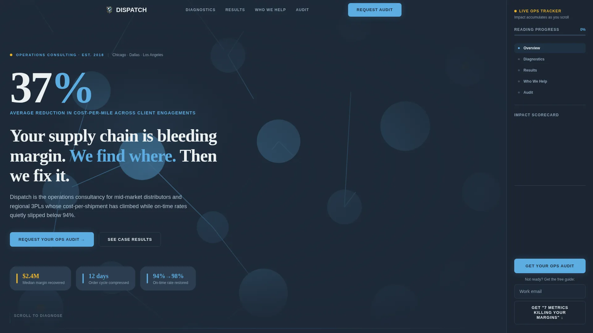
- A dark full-bleed header with a glowing supply-chain node mesh and a large stat fade-in
- A fixed sidebar companion carrying the persistent "Request Your Ops Audit" button and a scroll-progress indicator
- A terminal lead capture form with four fields and a secondary gated PDF download path
Feature list
Dispatch is built around a small number of focused, high-impact components. Each one earns its place by moving the right visitor toward the right next step.
Stats-First Section Architecture
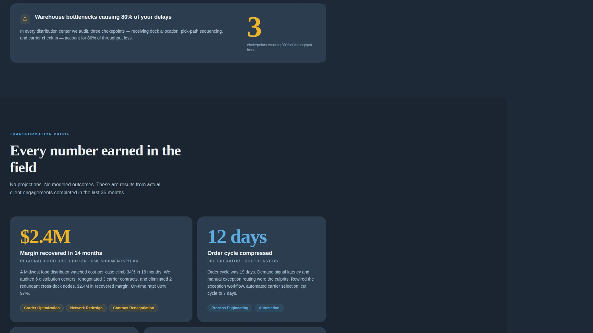
Every content section opens with a large arresting number before any explanation follows. "12 days" precedes the order-cycle compression copy. "$2.4M" opens the recovered-margin case study. This sequence builds credibility fast and keeps ops-minded readers engaged through the scroll.
Fixed Sidebar Companion
The sidebar sits fixed on the right side of the page from the first scroll. It carries the persistent "Get Your Operations Audit" call-to-action button and a progress indicator that shows which section the visitor is currently reading. As visitors scroll, the sidebar quietly accumulates the key stats from each section into a running scorecard.
Dark Full-Bleed Header with Data Atmosphere
The header canvas uses deep dispatch slate with a faint topographic mesh of supply-chain nodes glowing in sky blue. Lines pulse softly between origin and destination dots. A single stat fades in at massive scale, followed by the subhead and a glowing call-to-action button. No photography is used.
Qualifying Lead Capture Form
The terminal section houses a four-field form designed to capture and qualify prospects simultaneously. Fields appear in low-friction order: company name, annual shipment volume via dropdown, biggest operational pain point as a free-text line, and work email last. This sequence reduces drop-off while surfacing the most useful qualifying data.
Gated PDF Download Path
A secondary conversion path offers visitors a downloadable PDF titled "The 7 Metrics Killing Your Margins." It is gated behind email only, requiring no additional qualification fields. This path catches prospects who are not yet ready to book an audit but are willing to enter a nurture sequence.
Scroll-Escalation Content Structure
The page is structured so each section lands with more weight than the last. It moves from diagnostic metrics to transformation proof in a deliberate sequence. By the time a visitor reaches the bottom, the cumulative impact of every stat they have read is reflected back to them in the sidebar scorecard.
Page sections overview
| Section | Purpose |
|---|---|
| Dark Header Canvas | Establishes authority with a large stat fade-in and glowing call-to-action |
| Fixed Sidebar Companion | Persists the audit call to action and accumulates a stat scorecard as visitors scroll |
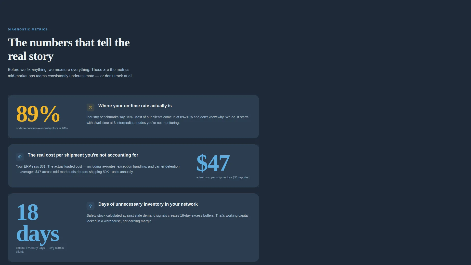
| Diagnostic Metrics Block | Opens with arresting numbers to frame the operational problem |
| Order-Cycle Compression | Leads with "12 days" to show time-reduction proof |
| Recovered Margin Case Study | Opens with "$2.4M" to demonstrate financial transformation |
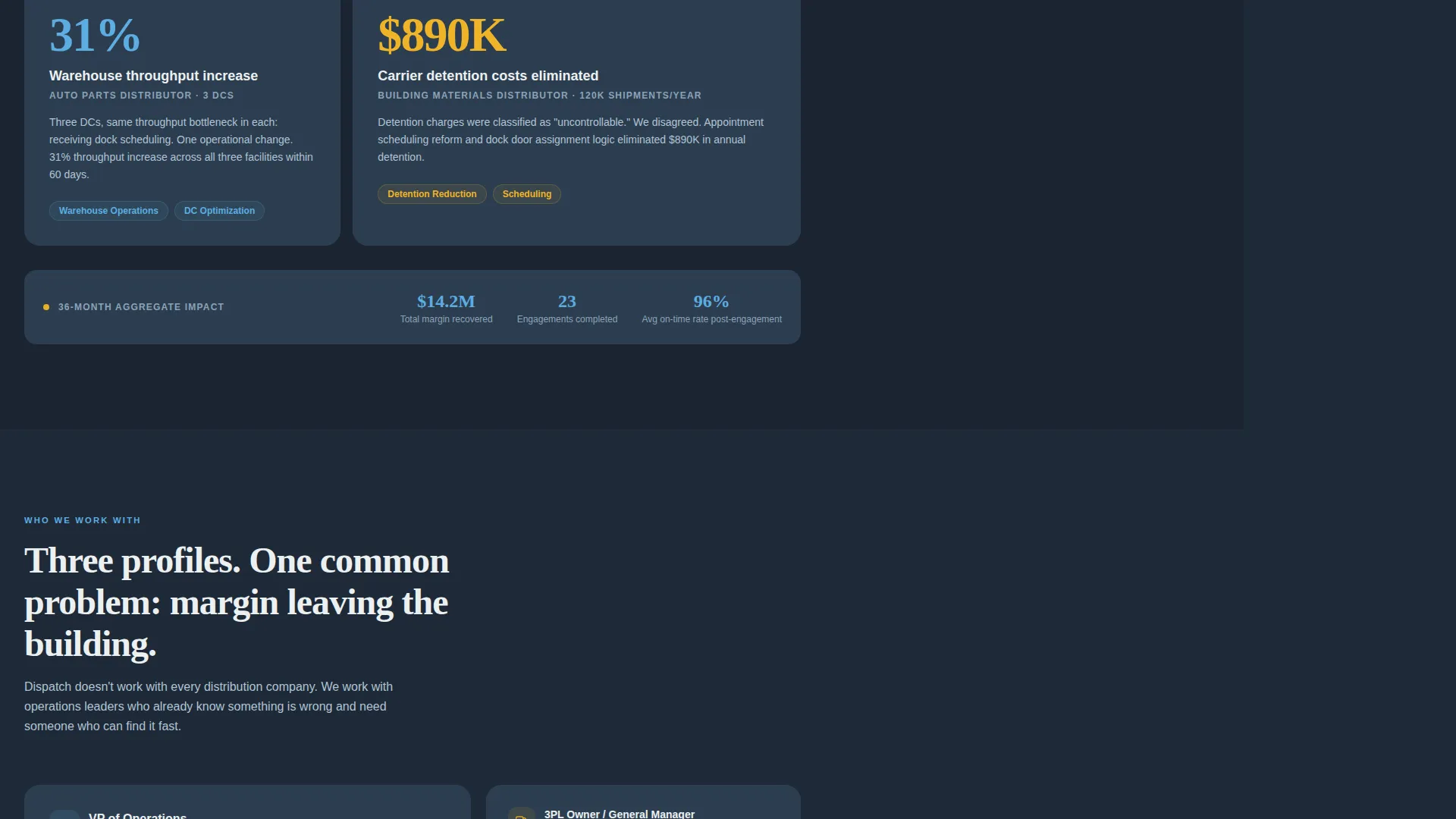
| Transformation Proof Section | Escalates credibility with heavier impact evidence |
| Audit Request Form | Terminal lead capture with four qualifying fields |
| PDF Download Gate | Secondary nurture path gated behind email only |
Design & branding system
The visual identity follows a Service Utility theme built on the Slate and Sky color system. Every color is functional, earning its place by carrying information rather than decoration.
- Core palette: deep dispatch slate (#1E2A38) for backgrounds, tarmac charcoal (#2C3E50) for structural surfaces, airfield sky (#5DADE2) for glowing accents and node lines, and signal white (#ECF0F1) for text and data callouts
- Accent color: runway amber (#F0B429) activates on hover states and live indicators, adding urgency without visual noise
- The overall aesthetic feels like a freight yard at dusk, industrial gray infrastructure lit by the cool blue glow of tracking monitors, functional and unadorned
Mobile & speed optimization
The layout is designed to translate its data-atmosphere visual weight into a clean, readable experience at smaller screen sizes. The sidebar companion adapts so its persistent call to action remains accessible throughout the scroll.
- The fixed sidebar and progress indicator are structured to remain usable on tablet and mobile viewports
- The Stats-First section architecture keeps content scannable at any screen width, with large numbers acting as natural visual anchors
- The form fields are ordered for minimal friction, reducing the likelihood of drop-off on mobile where form fatigue is highest
How this template helps you convert
Dispatch is structured to convert high-intent visitors without relying on hard sales pressure. The page does the qualification work so the consultant does not have to.
- The sidebar scorecard builds a personalized sense of aggregate impact as the visitor scrolls, making the audit feel like the logical next step rather than a cold ask.
- The four-field form leads with low-friction identity questions before the qualifying pain-point field, lowering perceived effort and improving completion rates.
- The gated PDF creates a second conversion lane for visitors not yet ready to book, keeping them inside a nurture path rather than losing them entirely.
Other information about this template
Dispatch is a single-page template, not a multi-page website. It is purpose-built for one goal: converting qualified logistics operations prospects into audit conversations or nurtured leads.
- The template is categorized under Professional Services, with a specific focus on the Logistics Consulting subcategory
- It is particularly well-suited as a logistics operations consultant landing page where the buyer is data-literate and skeptical of generic claims
- The sidebar companion template style is distinct from standard single-column layouts; the fixed right-rail component is a structural feature, not a decorative choice
- The header concept uses a Dark Full-Bleed and Glow approach, which sets this template apart from photography-led service page designs
- The creative direction is Stats-First Impact, meaning the visual hierarchy is built around numbers before narrative throughout the entire page
Theme
Service Utility
Creative direction
Stats-First Impact
Color system
Slate & Sky
Style
Sidebar Companion
Direction
Lead Generation
Page Sections
Stats-first Section Architecture
Fixed Sidebar with Scorecard
Dark Full-bleed Data Header
Qualifying Four-field Lead Form
Gated PDF Secondary Path
Related questions
Who is this landing page template designed for?
What is the fixed sidebar companion and how does it work?
What does the lead capture form ask for?
What is the gated PDF download for?
Can I adapt this template for different logistics service areas?



