Outsourcing & BPO Booking Website Template
Dispatch is a single-page comparison table landing page built for call center and customer service BPO businesses. It pairs hard performance metrics with real team profiles to convert VP-level buyers and operations leaders. The Arctic White Corporate Precision design keeps every element purposeful, and a signal-green booking call to action stays pinned so qualified visitors can schedule instantly.
by Rocket studio
Quick summary
Dispatch is a precision-built BPO landing page template for call center and customer service outsourcing businesses. It leads with a bold headline, anchors trust through a head-to-head comparison table, and weaves team profiles between data sections. A sticky booking button and an inline scheduler make it easy for operations leaders to convert in one visit.
Who this template is for
This template is built for BPO providers and managed call center services targeting mid-market and enterprise buyers. It speaks directly to the decision-makers who control outsourcing budgets and care about proven capacity over polished promises.
- VP-level operations leaders evaluating outsourcing to reduce hold-time abandonment costs
- E-commerce directors who need multilingual, native-language customer support at scale
- Healthcare administrators under compliance pressure to meet strict call-answer time requirements
What problem this template solves
Most BPO providers struggle to move buyers off the fence because they rely on vague service descriptions. Prospects want proof: side-by-side cost comparisons, coverage data, and the real humans accountable for results. This template closes that gap.
- Replaces generic service copy with a structured in-house versus managed comparison table
- Pairs performance metrics with named team leads so visitors trust the system and the people inside it
- Offers two clear conversion paths for buyers at different stages of the research process
What you get with this template
The template delivers a complete single-page layout designed to move a skeptical operations buyer from first scroll to booked meeting. Every section earns its place with a specific job to do.
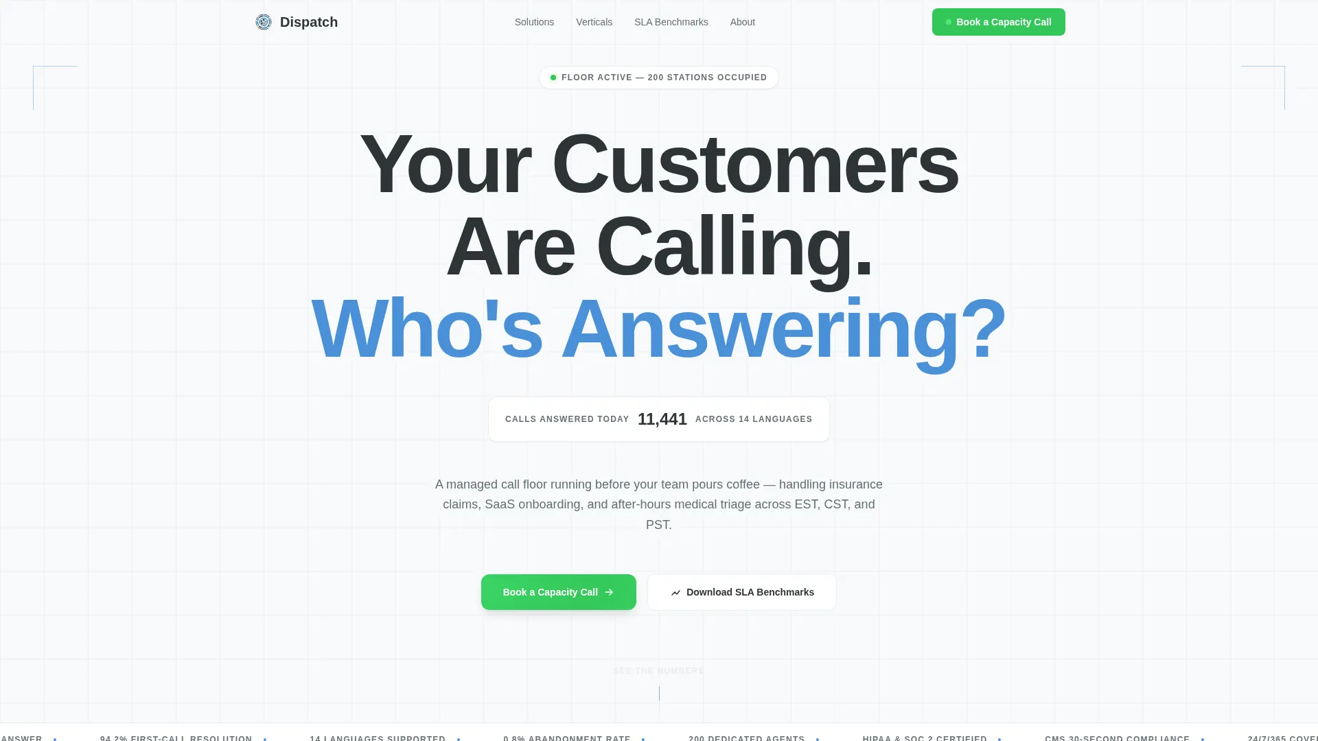
- A full-viewport hero with a bold centered headline and a live-ticker stat animation
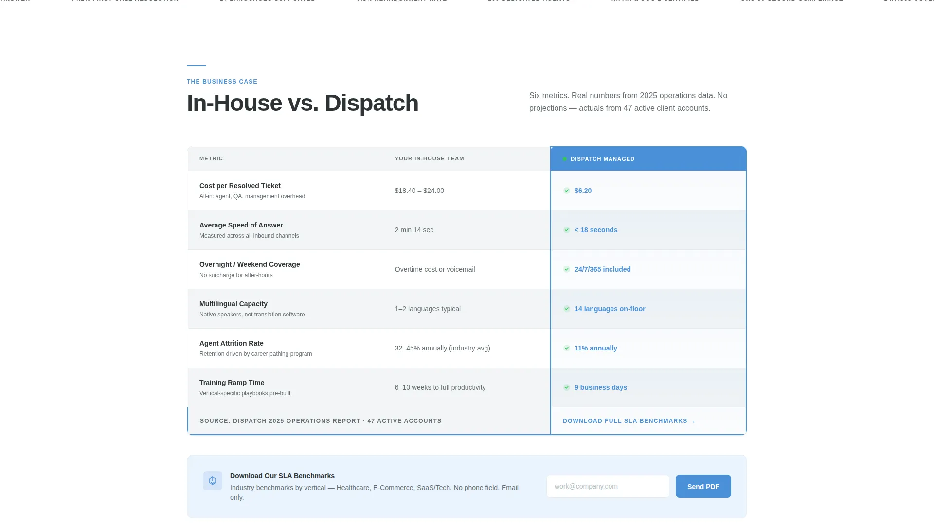
- A column-by-column comparison table covering cost, speed, coverage, language capacity, attrition, and ramp time
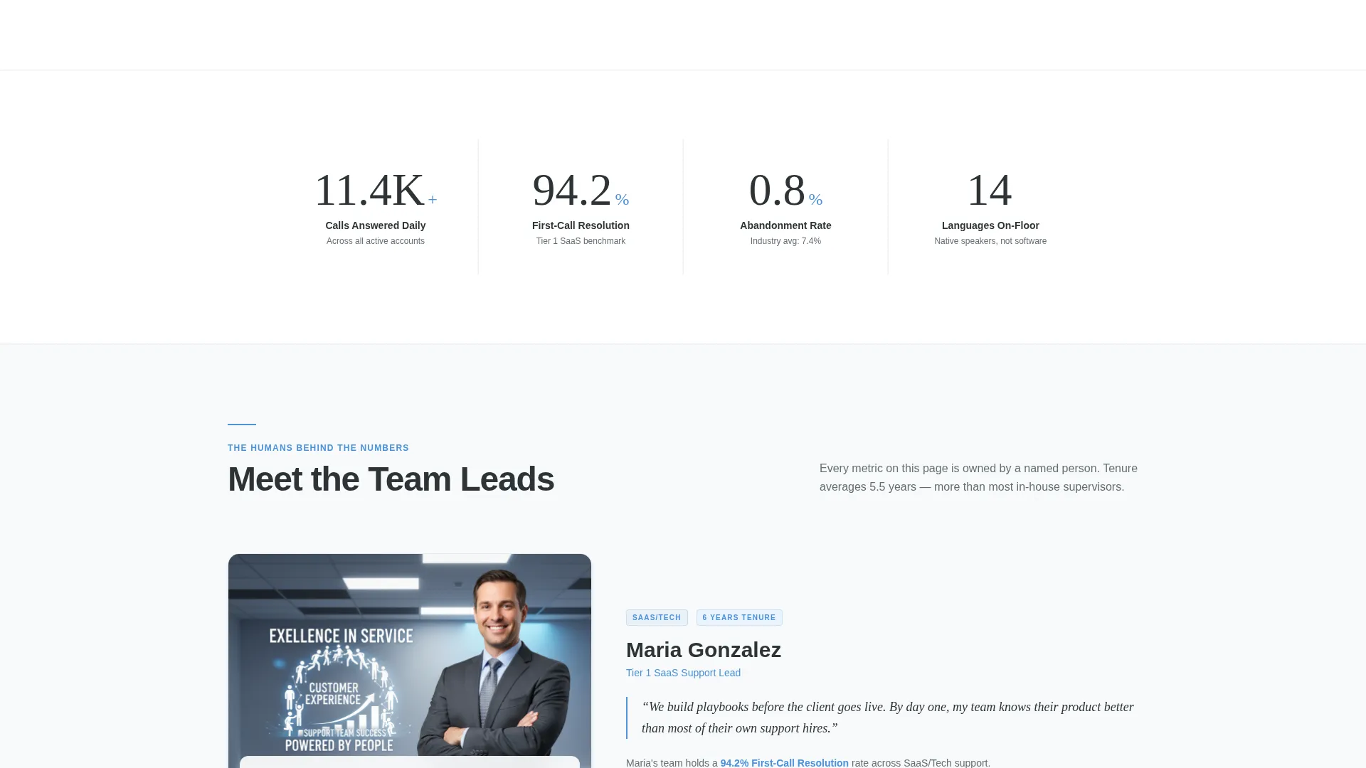
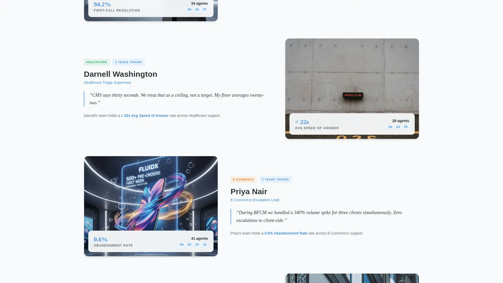
- Named team lead profiles with tenure badges, candid floor photography, and metric-linked quotes
- A sticky "Book a Capacity Call" button in signal green, plus a gated SLA benchmark PDF as a secondary conversion path
- An inline scheduling form with vertical-selector toggle pills (Healthcare, E-Commerce, SaaS/Tech) and fields for call volume and meeting window
Feature list
This template includes purpose-built components drawn directly from the Dispatch brief. Each one serves a specific role in moving a BPO buyer closer to a decision.
Giant Headline Hero Section
The hero opens with a single 120-pixel slate charcoal headline on a stark white background: "Your Customers Are Calling. Who's Answering?" No image, no gradient, no decoration. Below it, a real-time ticker animates the day's call volume across 14 languages. The restraint communicates operational confidence immediately.
Head-to-Head Comparison Table
The core of the page is a structured comparison table pitting an in-house team against the managed BPO solution. Each row covers a measurable variable: cost per resolved ticket, average speed of answer, overnight coverage, multilingual capacity, attrition rate, and training ramp time. Glacier blue highlights draw the eye to key differentiators.
Metric-Linked Team Profiles
Below the comparison table, named team leads appear with tenure badges and performance stats attached directly to their profiles. A shift supervisor quote on quality methodology adds a layer of process credibility. Candid floor photography of agents mid-conversation keeps the section grounded and human.
Sticky Booking call to action
After the first scroll, a signal-green "Book a Capacity Call" button pins to the bottom of the viewport. It stays visible throughout the entire page scroll so a ready buyer never has to hunt for the next step.
Inline Vertical-Filtered Scheduler
Clicking the sticky call to action opens an inline scheduling component. Three toggle pills let the visitor select their vertical: Healthcare, E-Commerce, or SaaS/Tech. The form then captures company name, current monthly call volume range, and preferred meeting window before confirming the booking.
Gated SLA Benchmark Download
A secondary conversion path sits below the comparison table for visitors still in research mode. A "Download Our SLA Benchmarks" prompt collects an email address only, no phone field required. This keeps a lower-intent visitor inside the funnel without friction.
Page sections overview
| Section | Purpose |
|---|---|
| Hero Headline | Establish authority instantly with a single bold statement and live call ticker |
| Comparison Table | Show measurable advantage over in-house teams, row by row |
| Team Lead Profiles | Build trust through named people, tenure data, and first-call resolution metrics |
| Floor Photography Mosaic | Humanize scale with candid images of agents actively working |
| SLA Benchmark Download | Capture research-stage leads with a low-friction email gate |
| Sticky Booking call to action | Keep the primary conversion action visible at all times |
| Inline Scheduler | Convert ready buyers with a vertical-filtered meeting booking form |
Design & branding system
The template uses a Corporate Precision visual theme built on the Arctic White color system. Every color carries a functional meaning rather than a decorative one, making the page feel like a live enterprise operations dashboard.
- Clinical white (#F8FAFB) backgrounds give the layout an open, uncluttered feel that communicates operational discipline
- Slate charcoal (#2D3436) handles all headline and body text for sharp, high-contrast readability
- Glacier blue (#4A90D9) marks interactive elements and highlights key cells in the comparison table
- Signal green (#34C759) appears exclusively on availability indicators and call-to-action buttons, making conversion points unmistakable
Mobile & speed optimization
The Dispatch layout is structured for clean rendering across screen sizes. The comparison table and inline scheduler components are built to reflow predictably on smaller viewports.
- The sticky booking button remains accessible and tappable throughout the mobile scroll experience
- The vertical toggle pills in the scheduling form are designed for thumb-friendly interaction on touch screens
- The spare, low-decoration design keeps the layout lean without relying on heavy image assets in the hero
How this template helps you convert
The page is engineered around two buyer states: the ready decision-maker and the still-researching evaluator. Both have a clear path forward without leaving the page.
- The sticky signal-green call to action captures ready buyers at any scroll depth, routing them into a vertical-filtered inline scheduler that collects only the details needed to prepare for a productive capacity call.
- The gated SLA benchmark PDF gives research-stage visitors a reason to share their email, keeping them inside the funnel until they are ready to book.
Other information about this template
The Dispatch template sits inside the Professional Services category under the Outsourcing and BPO subcategory, with a niche focus on call center and customer service BPO. It is a strong fit for businesses that need to demonstrate measurable operational capacity to skeptical mid-market buyers.
- The template style is Comparison Table, making it especially effective for pitching managed services against an in-house alternative
- The header concept is Giant Headline Centered, a format suited to high-conviction B2B service positioning
- Creative direction follows a Team and People approach, alternating between data sections and human profiles to build layered trust
- The primary landing page direction is Booking and Scheduling, with the sticky call to action and inline form working together to drive calendar conversions
- The template supports three distinct buyer verticals out of the box: Healthcare, E-Commerce, and SaaS/Tech
Theme
Corporate Precision
Creative direction
Team & People
Color system
Arctic White
Style
Comparison Table
Direction
Booking/Scheduling
Page Sections
Giant Headline Hero with Live Ticker
Head-to-head Comparison Table
Metric-linked Team Lead Profiles
Sticky Booking Call-to-action Button
Vertical-filtered Inline Scheduler
Gated SLA Benchmark Download
Related questions
Who is the Dispatch template designed for?
Can I customize the comparison table rows?
How does the vertical-filtered inline scheduler work?
What is the secondary conversion path for visitors not ready to book?
Is Dispatch a single-page layout or a multi-page website?



