Dispatch — Rapid Clutter Hauling Landing Page Template
Haul is a single-page B2B landing page template built for Hong Kong junk removal and clearance services targeting property managers, construction site managers, and facility directors. It combines an editorial magazine aesthetic, a monochrome steel palette, and contextual service-tier comparison tables to move commercial buyers from first scroll to account setup with confidence.
by Rocket studio
Quick summary
Haul is a comparison table landing page designed for a Hong Kong-based commercial junk removal and clearance service. The template leads with a testimonial card, builds trust through team and people storytelling, and closes with a B2B account setup form. The editorial magazine look and monochrome steel palette give the page the authority commercial clients expect.
Who this template is for
This template is built for junk removal operators who sell directly to commercial clients in Hong Kong. It works best when the business serves repeat, high-volume accounts rather than one-off residential jobs.
- Property management companies clearing units between tenants
- Construction site managers who need reliable daily rubble runs
- Facility directors at serviced offices managing tight loading dock schedules
What problem this template solves
Commercial buyers in property and facilities management do not respond to generic service pages. They need to compare service tiers, verify coverage details, and find a direct path to setting up an account. A standard brochure layout leaves those questions unanswered and loses the lead.
- No clear service tier breakdown for ad-hoc, contract, and dedicated crew options
- No B2B-specific conversion path that filters out residential one-off enquiries
- No people-led credibility that separates a professional operator from a van-and-phone competitor
What you get with this template
The template delivers a structured, single-page layout built entirely around the commercial buyer's decision process. Every section earns its place by answering a question a facility director or property manager would ask before committing to a building account.
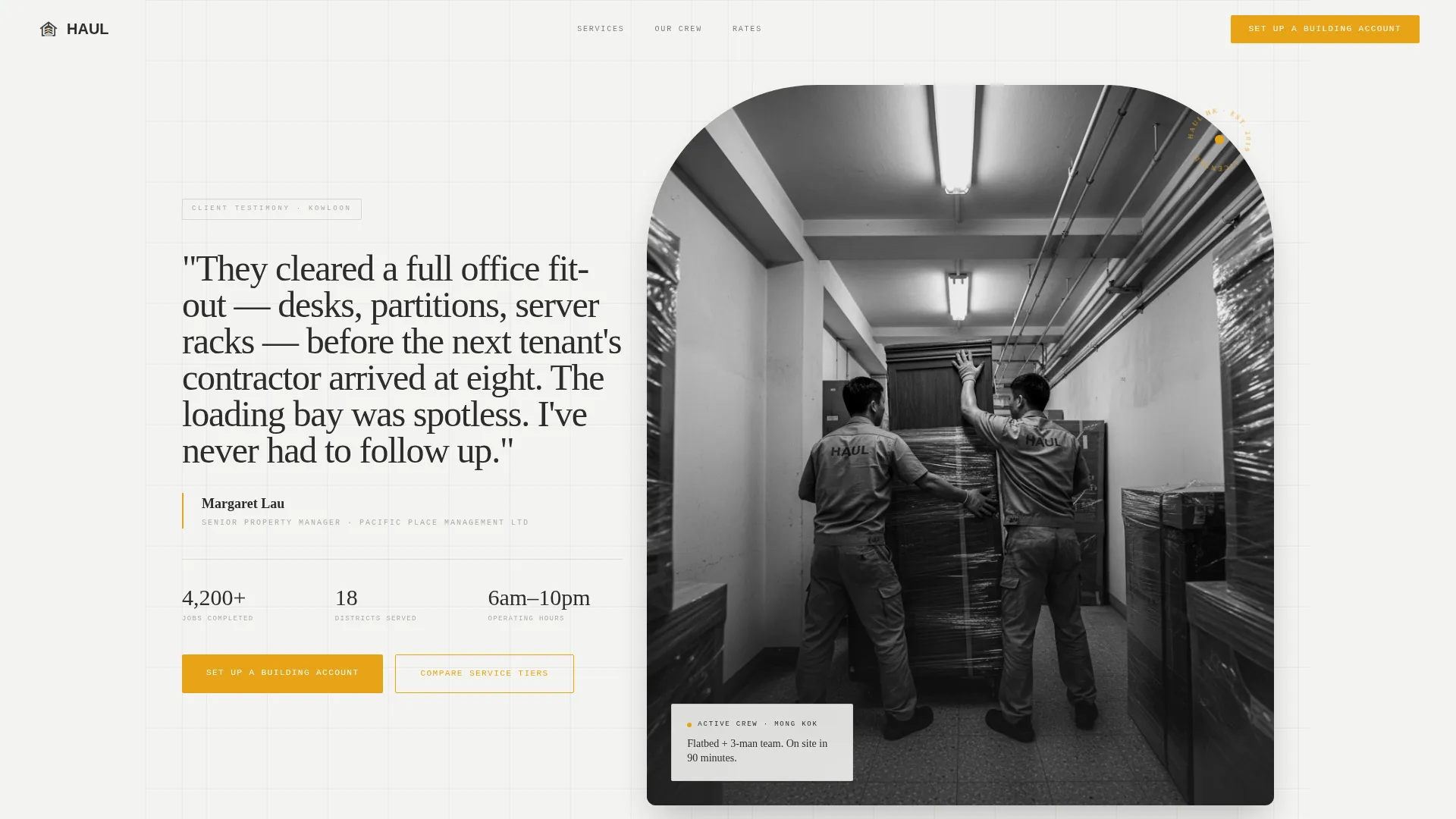
- A testimonial card header with an oversized pull-quote and candid crew photography
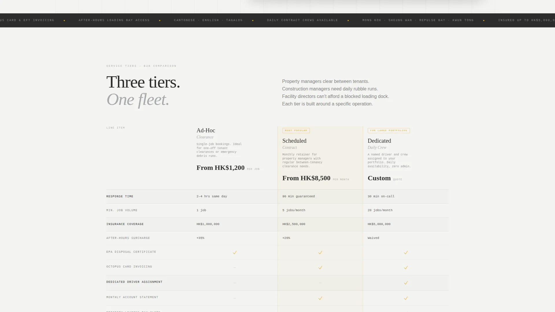
- Three contextual service-tier comparison tables with line items commercial clients actually compare
- A dual conversion path: a building account setup form and a gated rate card download
Feature list
A brief overview of the core building blocks that make this template work for commercial junk removal sales.
Testimonial Card Header
The page opens with a single oversized pull-quote from a named property manager at a recognizable Hong Kong building. Their job title and company appear in small monospaced type beneath the quote. Below the quote, a candid black-and-white photograph of the actual crew mid-job grounds the editorial tone immediately.
Service Tier Comparison Tables
Three side-by-side comparison columns cover ad-hoc clearance, scheduled contract, and dedicated daily crew options. Line items include response time, insurance coverage ceiling, after-hours surcharge, Octopus card invoicing, and EPA-compliant disposal certificates. The tables are placed contextually throughout the scroll, not stacked at the end.
Team and People Storytelling Sections
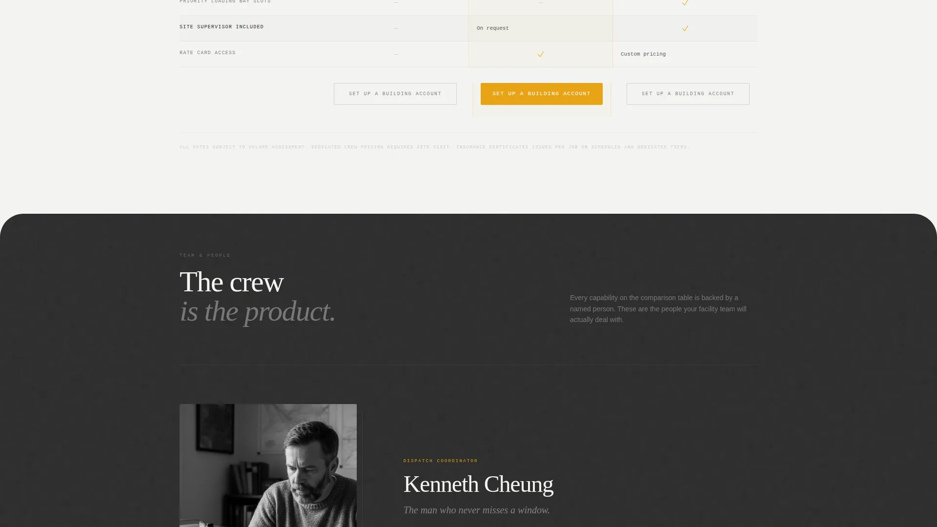
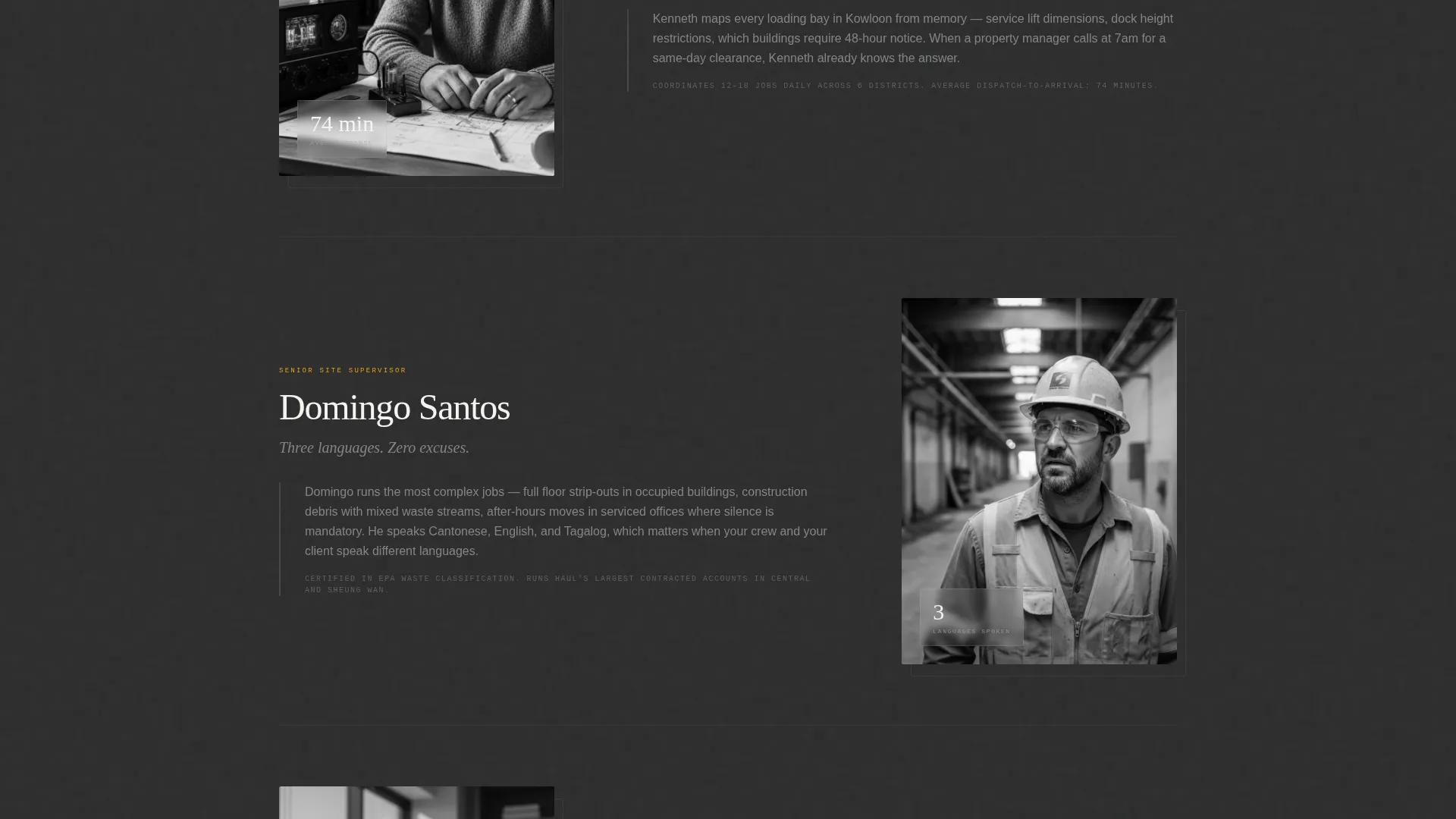
Each scroll section introduces a real crew member or operations lead by name, paired with the specific problem they solve. Full-bleed black-and-white portraits sit between comparison tables. The people-led structure makes crew capability tangible and differentiates the service from anonymous competitors.
B2B Account Setup Form
The primary call to action reads "Set Up a Building Account" and is locked to the bottom of each comparison column. The form collects company name, number of managed properties, average monthly clearance volume via dropdown, and a contact method toggle between WhatsApp and email.
Gated Rate Card Download
A secondary conversion path invites visitors to download the rate card. Access requires a business email address only, which filters out residential enquiries before they reach the sales team. This keeps the lead pipeline commercial and qualified.
Editorial Monochrome Steel Design System
The visual identity uses structural charcoal for primary text and section dividers, galvanized silver for secondary surfaces and table borders, and loading-dock white across open backgrounds. A single safety-tape amber accent is reserved exclusively for calls to action and hover states.
Page sections overview
| Section | Purpose |
|---|---|
| Testimonial Card Header | Opens with credibility via a named property manager quote and candid crew photo |
| Pull-Quote Block | Sets editorial tone and anchors the first scroll with a human voice |
| Ad-Hoc Tier Table | Compares ad-hoc clearance line items for occasional commercial buyers |
| Crew Portrait Block | Introduces the dispatch coordinator with a full-bleed black-and-white portrait |
| Scheduled Contract Table | Side-by-side breakdown of contract service terms for property managers |
| Driver Profile Section | Profiles the driver who knows every loading bay in Sheung Wan |
| Dedicated Daily Crew Table | Presents the daily crew tier with full line-item detail for site managers |
| Site Supervisor Profile | Introduces the multilingual site supervisor and anchors on-site capability |
| Building Account Form | Primary B2B conversion with company and volume fields plus contact toggle |
| Rate Card Download | Secondary gated conversion path requiring a business email address |
Design & branding system
The visual identity follows an Editorial Magazine theme executed through a Monochrome Steel color system. The result feels less like a service website and more like a beautifully typeset infrastructure report, where the grid itself becomes the aesthetic statement.
- Structural charcoal (#2C2C2C) for primary text and section dividers; galvanized silver (#A8A9AD) for secondary surfaces and table borders; loading-dock white (#F4F4F2) for open backgrounds
- Safety-tape amber (#E8A317) used exclusively for calls to action and hover states, creating a single sharp focal point on an otherwise neutral page
- Candid black-and-white crew photography in a photo-essay style, with no stock imagery, reinforces the editorial tone throughout
Mobile & speed optimization
The layout is built to work clearly on the devices commercial buyers actually use in the field. A facilities director checking service tiers from a loading dock needs the comparison tables to be readable without horizontal scrolling.
- Comparison tables are structured to remain legible and scannable on smaller viewport widths
- The contact method toggle between WhatsApp and email supports mobile-first outreach preferences common in Hong Kong commercial workflows
- Full-bleed portrait images are composed to retain editorial impact when cropped to mobile aspect ratios
How this template helps you convert
The page is structured so that a commercial buyer self-qualifies and self-selects their service tier before they ever reach a form. By the time they hit the call to action, the decision is largely made.
- The testimonial card and crew photography establish immediate credibility, reducing friction for first-time commercial enquiries.
- The contextual comparison tables walk buyers through response time, insurance coverage, after-hours surcharges, and disposal certificates, so they arrive at the form already knowing which tier fits their operation.
- The dual conversion path captures both ready-to-commit accounts via the building account form and price-sensitive researchers via the gated rate card download, maximizing qualified lead capture across two buyer stages.
Other information about this template
This template is part of a broader set of professionally designed landing page templates for service businesses operating in competitive local markets. A few additional notes for buyers considering this layout.
- The template is suited for operators who can supply real crew photography; the editorial impact depends on authentic imagery rather than stock substitutes
- The Octopus card invoicing and EPA-compliant disposal certificate line items in the comparison tables are placeholder content that should be updated to reflect the actual service terms of the business using the template
- The gated rate card download section assumes the operator has a prepared PDF rate card ready to connect to the download trigger
- The WhatsApp and email contact toggle is a structural user interface element in the form; connecting it to a live messaging or inbox system requires implementation by the operator or their developer
Theme
Editorial Magazine
Creative direction
Team & People
Color system
Monochrome Steel
Style
Comparison Table
Direction
Partnership/B2B
Page Sections
Testimonial Card Header with Crew Photography
Contextual Service Tier Comparison Tables
Team and People Profile Sections
B2B Building Account Setup Form
Gated Rate Card PDF Download
Editorial Monochrome Steel Visual System
Related questions
Is this template designed for residential or commercial junk removal clients?
Can I update the service tier line items in the comparison tables?
Do I need to provide my own crew photography?
What are the two conversion paths included in this template?
Is this template suitable for junk removal businesses outside Hong Kong?



