Logistics Social Media Agency Landing Page Template
Dispatch is a masonry-style landing page template built for logistics social media agencies. It opens with a Before/After Slider that reveals transformed Instagram grids, then unfolds into an Interactive Explorer of campaign work with live-feeling engagement metrics. The page closes shippers and recruits partners with a free feed audit form and a gated content download.
by Rocket studio
Quick summary
Dispatch is a single-page template designed for social media agencies that serve the freight and trucking industry. It combines a dramatic Before/After Slider header with a scrollable masonry grid of campaign proof, turning a page visit into a visual argument for what great logistics content can do.
Who this template is for
This template is built for agencies and creative studios that produce content exclusively for the freight, trucking, and logistics sector. It speaks directly to the people selling those services and the clients they are trying to win.
- Social media agencies pitching freight brokers, third-party logistics providers (3PLs), and trucking companies
- Freelance content strategists and creative directors targeting mid-size carriers and freight tech startups
- 3PL founders or in-house marketing directors looking to show off a content rebrand
What problem this template solves
Most logistics companies live with embarrassing social feeds: blurry dashcam photos, overloaded Canva graphics, and stock images of container ships that have not changed since 2019. The agency trying to fix that has no standard template that matches the cinematic quality of the work it actually produces.
- There is no ready-made portfolio page that communicates transformation at a glance for a logistics niche agency
- Prospects cannot picture the upgrade until they see a direct side-by-side comparison of before and after
- Generic agency templates feel nothing like the gritty, high-contrast world of freight and dispatch operations
What you get with this template
You get a fully structured, single-page layout that doubles as a portfolio and a lead generation engine. Every section has a clear job, and the design system does the selling before a word is read.
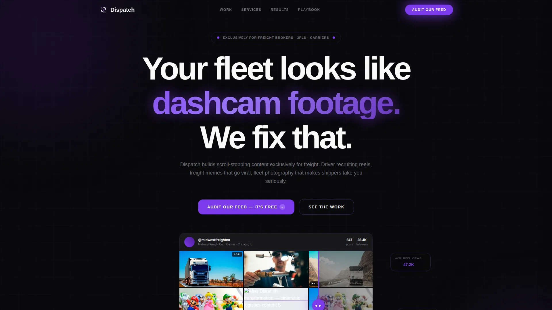
- A Before/After Slider header showing a real logistics Instagram grid transformation with visible engagement metrics
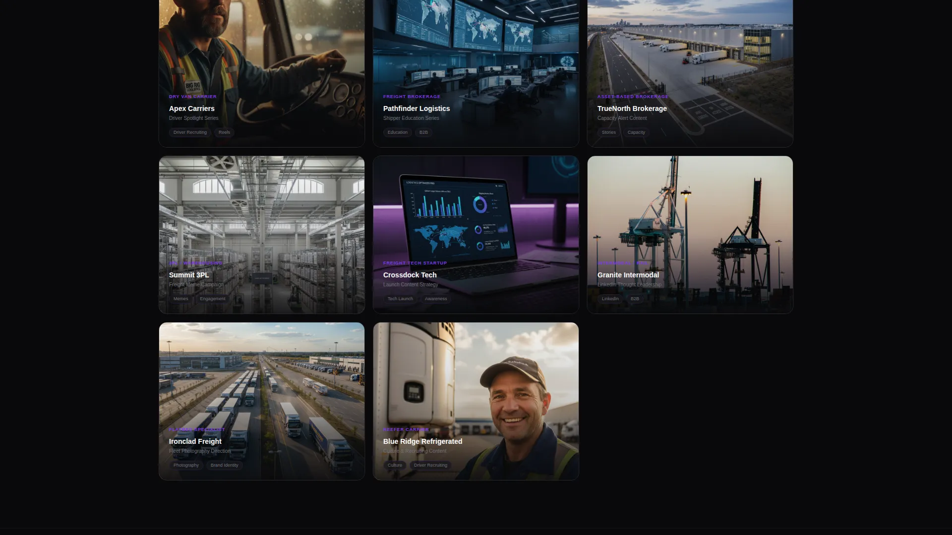
- An Interactive Explorer masonry grid where each card opens a mini case study inline, without leaving the page
- A dual conversion section with a free feed audit form and a gated PDF download called "The Logistics Content Playbook"
Feature list
This template ships with purpose-built interactive components and a visual identity system calibrated for the logistics content niche.
Before/After Slider Header
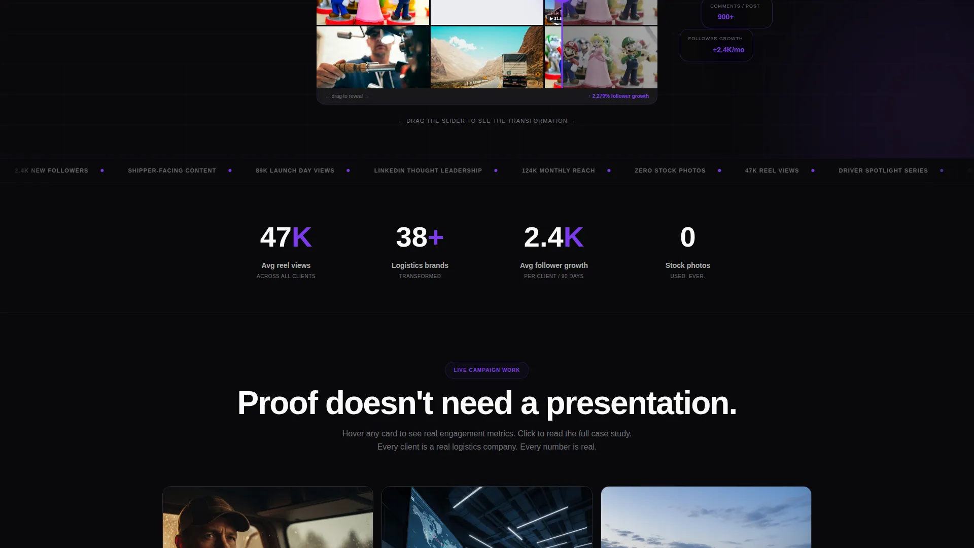
The header splits one logistics brand's Instagram grid into two states. The left side shows the typical reality: blurry fleet photos, cluttered Canva templates, and empty engagement numbers. Dragging the slider right reveals the transformed version: cinematic fleet shots, driver spotlight reels with visible view counts, and freight memes pulling hundreds of comments.
Interactive Masonry Explorer
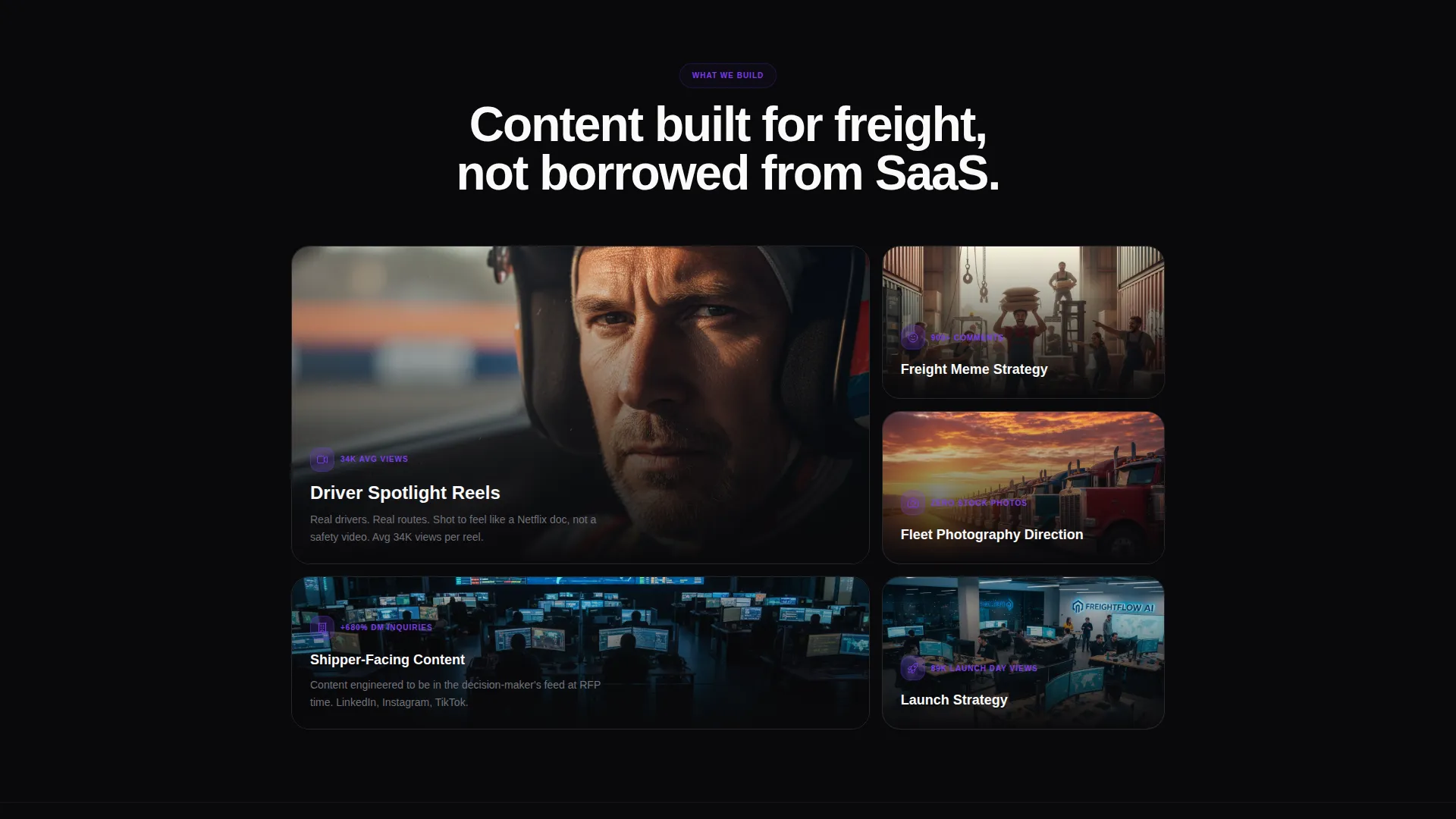
Below the header, a living masonry grid displays campaign work across multiple logistics clients and content types. Hovering over any card animates engagement metrics upward, mimicking a counting dispatch board. Clicking a card opens a mini case study that slides over the grid inline, keeping the visitor on the page throughout.
Free Feed Audit Form
The primary conversion path invites prospects to submit their company Instagram handle for a free content teardown. The form includes a single handle input, a fleet size dropdown (under 50, 50 to 500, and 500 and above), and a toggle asking whether they currently work with a content agency.
Gated PDF Download
A secondary conversion path offers "The Logistics Content Playbook" as a downloadable PDF. It is gated behind a company email field, giving the agency a second lead-capture mechanism for prospects who are not yet ready to book a call.
Void & Violet Design System
The color palette uses absolute void black, electric violet, deep dispatch purple, and terminal glow white. The result feels like a phone screen glowing in a dark truck cab: vivid content against a near-total darkness that makes every image and metric pop.
Lens & Frame Visual Theme
The Lens & Frame theme frames logistics photography the way editorial and film cinematography would. Shallow depth of field, high-contrast lighting, and tight crop treatments give every card on the grid the feel of intentional visual storytelling rather than quick snapshots.
Page sections overview
| Section | Purpose |
|---|---|
| Before/After Slider | Show grid transformation with visible engagement metrics |
| Interactive Masonry Grid | Display campaign proof across multiple logistics clients |
| Card Case Studies | Open inline mini case studies without leaving the page |
| Feed Audit Form | Capture Instagram handle, fleet size, and agency status |
| PDF Lead Capture | Gate the content playbook behind a company email field |
Design & branding system
The Void & Violet color system is the backbone of the entire visual identity. It creates a consistent atmosphere across every section of the page, from the hero header down to the conversion forms.
- Core palette: absolute void black (#09090B), electric violet (#7C3AED), deep dispatch purple (#4C1D95), and terminal glow white (#FAFAFA) for typography and card borders
- The Lens & Frame theme applies cinematic framing principles to logistics photography, using shallow depth of field and high-contrast treatment to make fleet imagery feel editorial
- Typography and card borders in terminal glow white keep the layout crisp and legible against the deep dark backgrounds
Mobile & speed optimization
The masonry grid layout and inline case study panels are built to work within a single-page flow. The template structure prioritizes fast visual scanning so prospects can move through proof quickly on any screen size.
- The masonry grid reflows naturally for narrower viewports, keeping card content readable on mobile devices
- The Before/After Slider is touch-friendly, allowing prospects on phones or tablets to drag the reveal with a finger
- The dual conversion forms are stacked cleanly on small screens, reducing friction for prospects who discover the page on mobile
How this template helps you convert
Every structural decision in this template is made to shorten the distance between a skeptical visitor and a completed lead form. The page earns the click by piling up visual proof before it ever asks for anything.
- The Before/After Slider creates an immediate emotional reaction. Seeing a real grid transformation in the first scroll sets the credibility of the agency before any copy is read.
- The masonry grid lets prospects wander through proof at their own pace. The sheer volume of transformed brands becomes the argument, and animated engagement metrics make results feel live and verifiable.
- The dual conversion paths lower commitment barriers. The free feed audit feels low-risk, and the downloadable playbook gives hesitant visitors a reason to share their email without booking a call.
Other information about this template
This template is part of a broader set of niche-specific agency portfolio layouts built for industries where the visual gap between average and great content is especially wide. A few additional details worth knowing before you use it:
- The template style is Masonry/Pinterest, which means content tiles do not follow a rigid grid; they stack organically by height, creating a feed-like browsing experience
- The creative direction is labeled Interactive Explorer, meaning the page rewards curiosity rather than guiding visitors through a fixed linear scroll
- The landing page direction is Partnership/B2B, so every call to action and form field is calibrated for agency-to-business conversations, not direct-to-consumer transactions
- The header concept (Before/After Slider) is a standalone interactive component and the first thing a visitor sees, making first impressions inseparable from social proof
Theme
Lens & Frame
Creative direction
Interactive Explorer
Color system
Void & Violet
Style
Masonry/Pinterest
Direction
Partnership/B2B
Page Sections
Before/after Slider Header
Interactive Masonry Explorer
Free Feed Audit Capture Form
Gated PDF Lead Magnet
Void & Violet Color System
Lens & Frame Visual Theme
Related questions
Who is this landing page template built for?
What does the free feed audit form collect from prospects?
Can I use this template with only a small portfolio of logistics clients?
What is the purpose of the gated PDF download section?
Does the Before/After Slider work on mobile devices?



