Trusted CDL | Free Website Template | Rocket
Dispatch is a single-column landing page template built for CDL training providers who serve career-changers, military families, and second-generation truckers. It leads with animated stats counters, walks visitors through family-focused story sections, and closes with a free prep course form. The design pairs institutional navy authority with centerline gold to earn trust and drive enrollments.
by Rocket studio
Quick summary
Dispatch is a stats-first landing page template for CDL training schools. It opens with three animated counters that establish credibility instantly, then guides visitors through family archetypes, hiring partner proof, a week-by-week training timeline, and a free prep course sign-up form. Every section builds on the last, moving visitors from "this works" to "this could start Monday."
Who this template is for
This template was designed for vocational training providers in the transportation and logistics space. It fits operators who need to convert skeptical, cost-conscious visitors into enrolled students using proof and empathy rather than hard-sell pressure.
- CDL training schools targeting career-changers, military spouses, and second-generation truckers
- Vocational programs offering a free trial or prep module as the entry point to enrollment
- Transportation and logistics training providers who want a mobile-first, credibility-led page
What problem this template solves
Families researching CDL training are making a serious financial decision. They need to see proof before they commit. Most training school pages bury their results and lead with generic copy. Dispatch flips that sequence.
- Visitors see hard numbers first, before they read a single line of marketing copy
- The page addresses real audience segments by name, so career-changers, veterans, and family operators all feel seen
- The free prep course call to action lowers the barrier to entry without discounting the program
What you get with this template
Dispatch includes a fully structured single-column page flow with five content sections and a footer. Every section is pre-built and purpose-matched to the enrollment journey.
- An animated stats hero, a family archetype bento grid, a hiring partner logo carousel with salary lift metric, and a week-by-week training timeline
- A dual-path conversion form with a primary enrollment call to action and a secondary PDF download option for lighter-intent visitors
- A Navy Authority color system with gold accent buttons, serif display type, and a linear single-row footer
Feature list
A quick paragraph on features: each component in Dispatch was built to carry a specific job in the enrollment journey. Nothing is decorative without purpose.
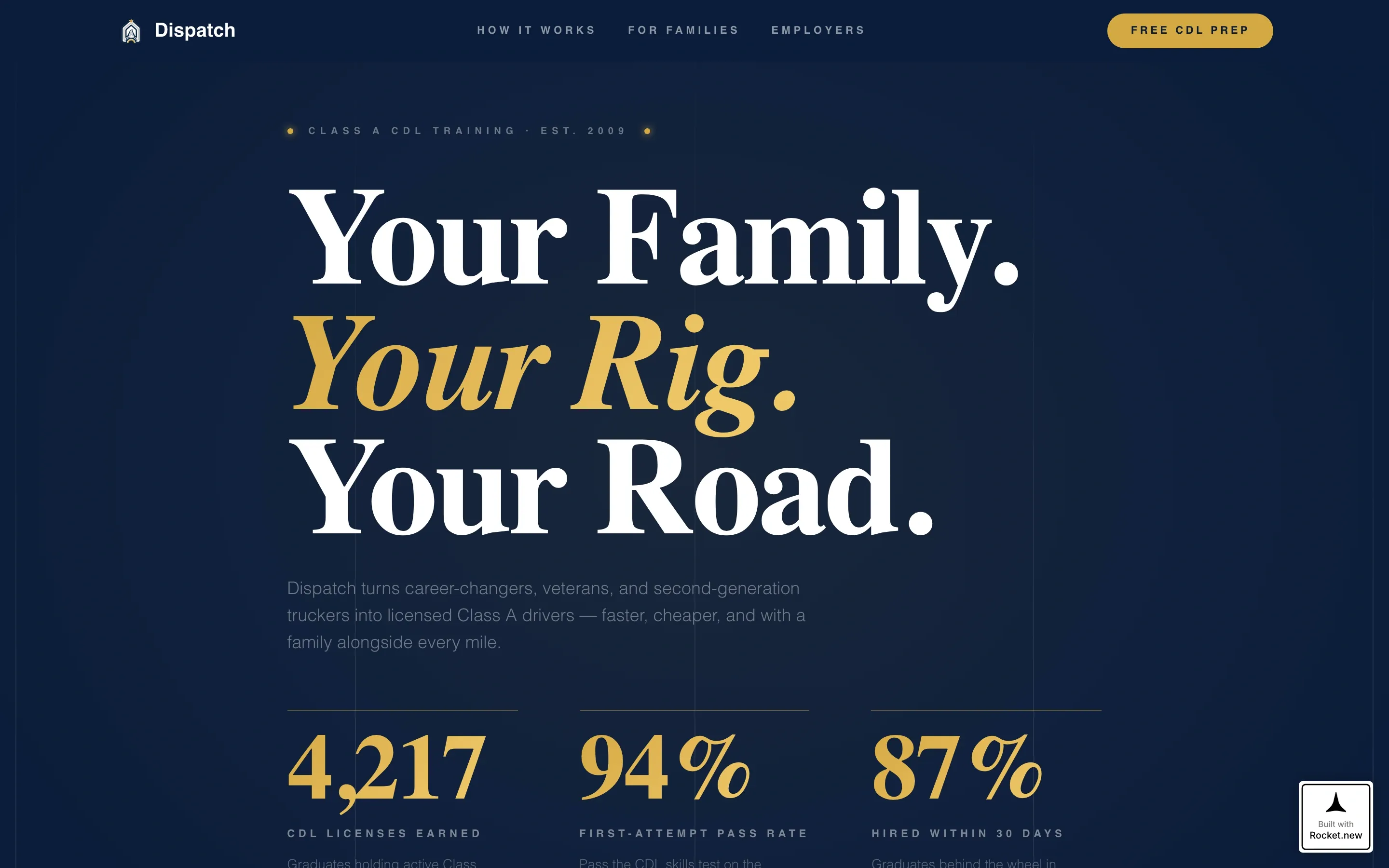
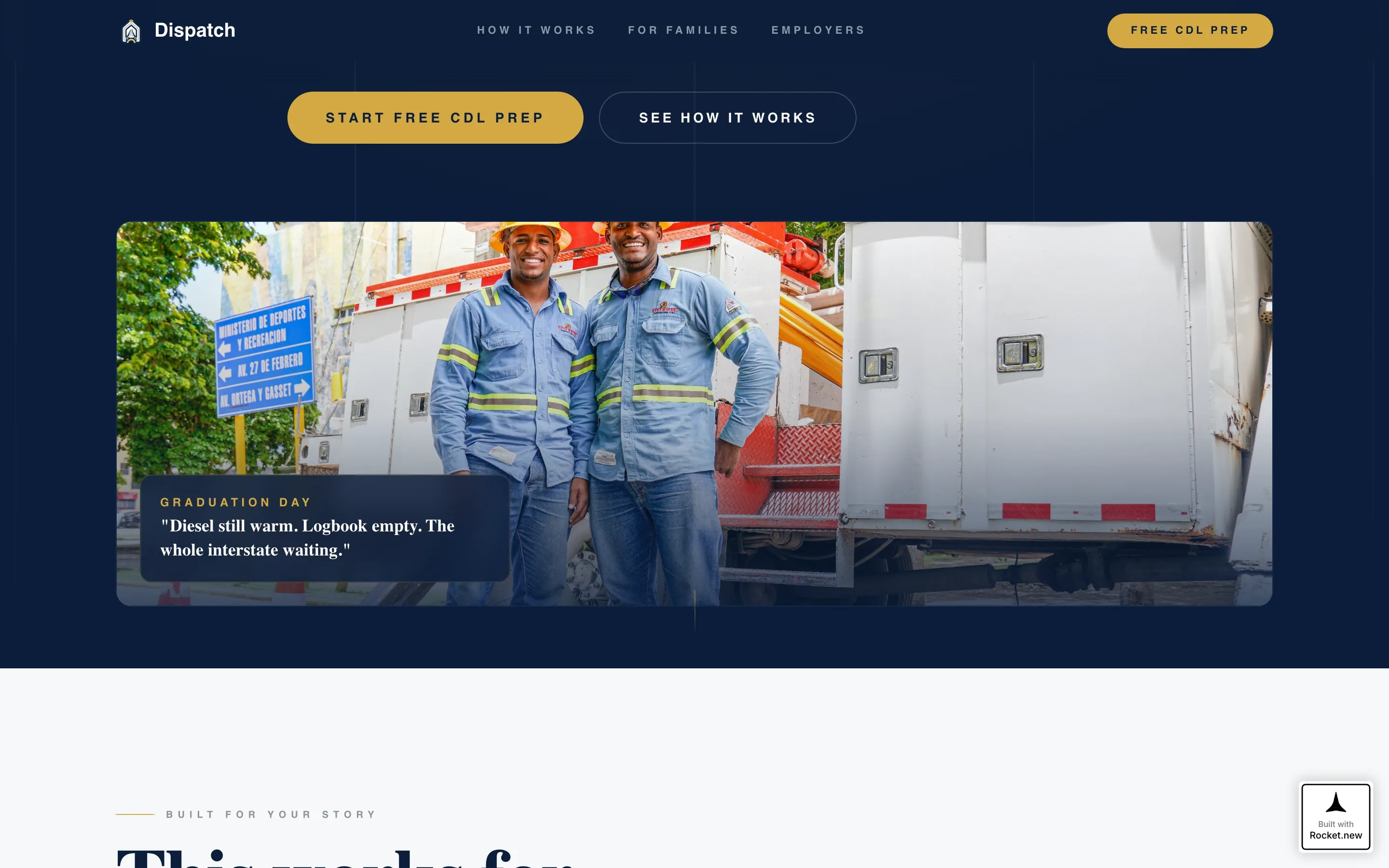
Animated Stats Counter Hero
Three oversized counters open the page against a deep navy background. Each counter ticks upward on scroll entry, displaying results like pass rates and hiring outcomes in gold tabular figures. A candid graduation photo fades in below the counters to add a human face to the numbers.
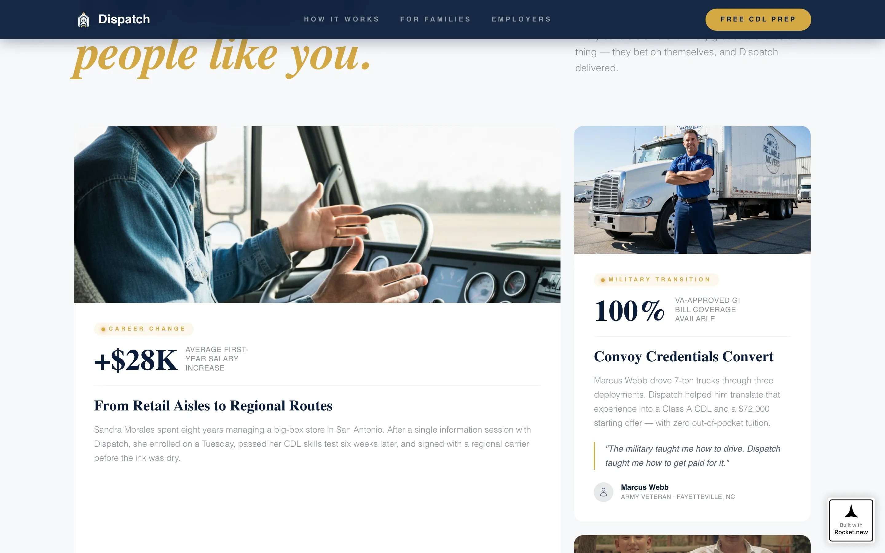
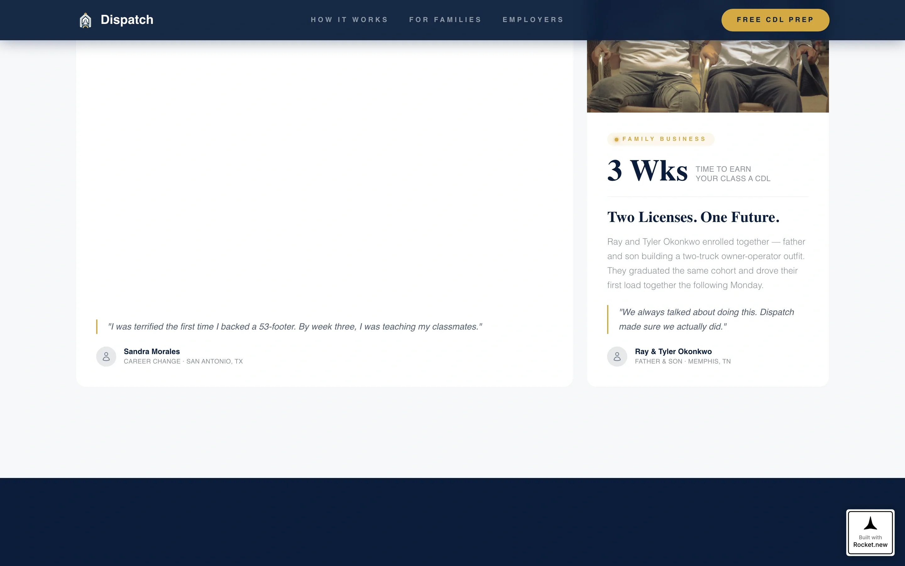
Family Archetype Bento Grid
A three-card bento grid presents distinct visitor profiles side by side. Career-changers, military families, and second-generation truckers each get their own story block. This section makes the page feel personally relevant to a wide range of visitors without losing focus.
Hiring Partner Logo Carousel
A scrolling carousel displays employer partner logos alongside a salary lift metric. The combination of recognizable brand names and a concrete income number gives visitors a clear picture of where training leads. The carousel keeps the section visually active without requiring copy to do all the work.
Week-by-Week Training Timeline
A horizontal timeline lays out the training program week by week. Showing the commitment as a finite, structured sequence reduces anxiety about how long the process takes. Visitors can see the full path from day one to license in hand.
Dual-Path Conversion Form
The primary form collects first name, phone number, and a situation dropdown with options like "Career change," "Military transition," and "Family business." A secondary email capture below the form offers a class schedule PDF for visitors who are not yet ready to enroll. Both paths keep leads in the pipeline.
Single-Row Linear Footer
The footer follows a clean linear single-row pattern. It keeps the page tidy without adding visual noise at the close of what is already a high-density proof journey.
Page sections overview
| Section | Purpose |
|---|---|
| Stats Counter Hero | Opens with animated proof metrics and a graduation photo |
| Built For Your Story | Bento grid matching three family visitor archetypes |
| Hiring Partners and Salary Lift | Logo carousel paired with a concrete salary increase metric |
| Training Timeline | Week-by-week horizontal view of the full program path |
| Free Prep Form | Primary enrollment form and secondary PDF download capture |
| Linear Single-Row Footer | Closes the page with a clean, low-distraction footer |
Design & branding system
The visual identity is built around a "weigh station at dusk" feeling. It is institutional enough to carry career-level trust, and warm enough to welcome a family making a big decision together.
- Navy (#0B1D3A) dominates headers and the footer; gold (#D4A843) fires on every button, counter, and progress indicator
- Silver (#C8CDD3) carries body text for readability; white (#F7F8FA) opens breathing room between sections
- Fraunces serif handles display headings for authority and warmth; DM Sans handles body copy for clean legibility
Mobile & speed optimization
Dispatch is built mobile-first because the target audience researches training options on phones. The layout is a single-column flow, which means it translates directly to smaller screens without restructuring.
- Counter animations, scroll reveals with blur and translateY transitions, and staggered card entries are handled as client components to keep static sections fast
- The logo carousel and form dropdown are interactive components designed to work cleanly on touch screens
- Server components handle all static content, keeping the initial load lean while animations layer in on interaction
How this template helps you convert
The page is designed as a credibility escalation sequence. Each section earns a little more trust before asking for anything in return.
- The stats counter hero establishes proof in the first three seconds, before a visitor reads a headline or scrolls past a hero image
- The family archetype section and hiring partner carousel build personal relevance and outcome confidence, moving visitors from "this works" to "this works for people like me"
- The dual-path form closes the journey with a low-friction free prep course offer, capturing both ready-to-enroll visitors and early-stage researchers with the PDF secondary path
Other information about this template
Dispatch sits at the intersection of transportation and logistics HR and vocational career training. It was built for providers operating in a high-trust, high-stakes decision environment.
- The template uses a Stats-First Impact creative direction, meaning proof leads every section before the narrative context follows
- The Freemium/Trial landing page direction means the primary call to action offers real value before asking for payment or commitment
- The Family First theme runs through every copy placeholder and layout choice, from the bento grid labels to the form dropdown options
- This template is categorized under HR and Hiring with a Transportation and Logistics HR subcategory, making it a strong fit for workforce development programs and employer-partnered CDL schools
Theme
Family First
Creative direction
Stats-First Impact
Color system
Navy Authority
Style
Single Column Flow
Direction
Freemium/Trial
Page Sections
Animated Stats Counter Hero
Family Archetype Bento Grid
Hiring Partner Logo Carousel
Week-by-week Training Timeline
Dual-path Conversion Form
Navy Authority Color System
Related questions
What type of training business is this template designed for?
Can I update the stats counters to reflect my school's real results?
How does the dual-path conversion form work?
Is this template suitable for visitors browsing on mobile phones?
Does the page include social proof beyond the opening stats counters?


