Retail & Commercial Space Design Booking Website Template
Dispense is a bold brutalist landing page template built for pharmacy interior design firms. It combines a scroll-driven masonry grid, an animated abstract geometric header, and a dual-path waitlist section. Independent pharmacy owners and compounding pharmacists can reserve a buildout slot or download the design manifesto, all within a single, architecturally confident page.
by Rocket studio
Quick summary
Dispense is a single-page brutalist landing page template for pharmacy and drugstore design firms. It opens with an SVG-animated geometric header, flows through a Pinterest-style masonry origin story grid, and closes with a split conversion section: a three-field waitlist form and a blurred manifesto PDF gate. The design is desktop-first, raw, and deliberately monumental.
Who this template is for
This template is built for design professionals and studios that specialize in pharmacy interior design and retail space buildouts. If your work transforms clinical, fluorescent-lit spaces into something worth photographing, this page gives that work a stage that matches its ambition.
- Independent pharmacy owners looking to commission a complete spatial redesign
- Compounding pharmacists who want their physical environment to reflect the craft and science behind their work
- Small drugstore chains preparing to enter new markets and establish a distinctive spatial identity
What problem this template solves
Most pharmacy design firms have no visual language strong enough to separate them from generic contractors. Their online presence looks as institutional as the spaces they are supposed to be replacing. Prospective clients cannot tell who takes the work seriously.
- Generic portfolio sites fail to communicate a firm's design philosophy before the first meeting
- Soft or scattered visual identity makes high-investment clients hesitant to commit
- No built-in urgency mechanism means interested visitors leave without taking action
What you get with this template
You get a complete, single-section landing page structured around three distinct experiences: an animated brand statement, a story-driven masonry portfolio grid, and a high-converting waitlist module. Every component is pre-built and purposefully connected.
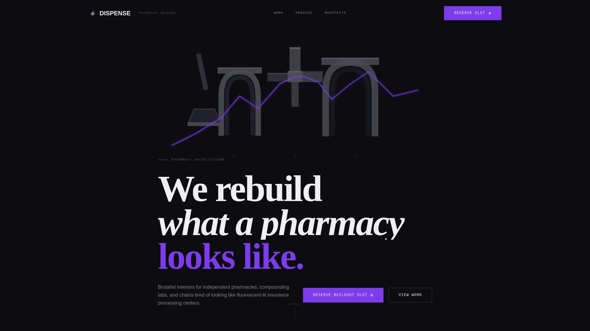
- An abstract geometric SVG hero with a scroll-triggered violet vein animation and dual call-to-action buttons
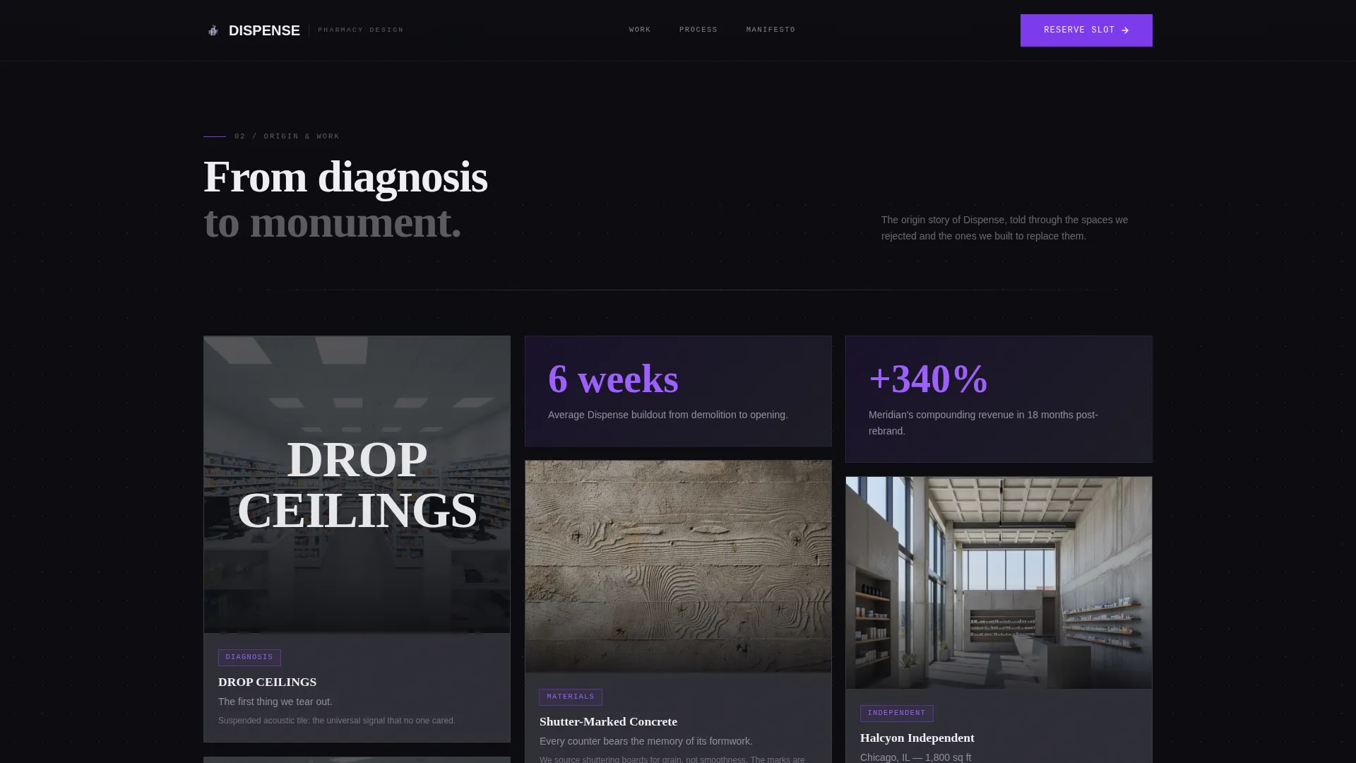
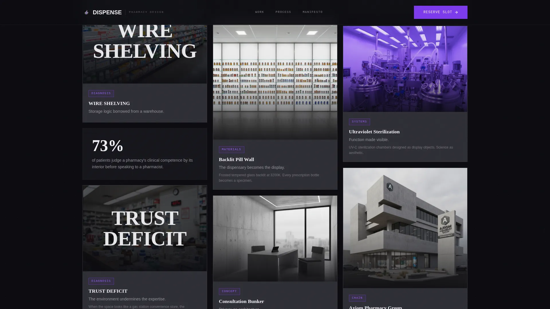
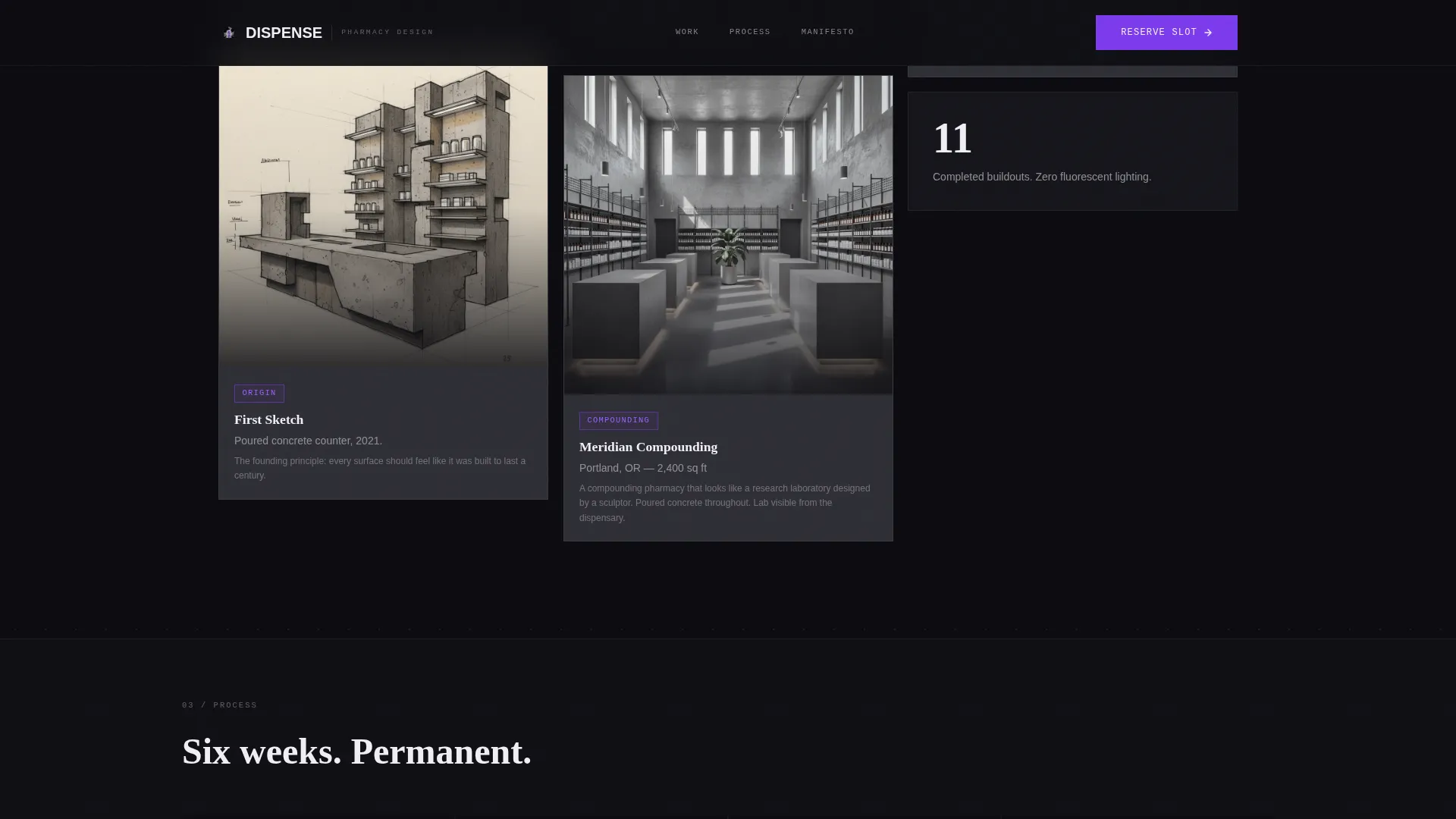
- A variable-height masonry grid that tells the firm's origin story from problem to completed project, card by card
- A split conversion block featuring a three-field reserve form, a blurred manifesto PDF gate, and a live waitlist position counter
Feature list
This template is built around a small number of high-impact components. Each one is designed to do a specific job.
SVG Geometric Hero Animation
The header opens with interlocking pharmaceutical shapes rendered as brutalist sculpture. Capsule halves become concrete arches, a mortar-and-pestle silhouette fractures into angular planes, and a cross symbol shatters and slowly reassembles on page load. A single violet line traces through the geometry on load, giving the animation a precise, clinical finish.
Scroll-Driven Masonry Grid
The masonry grid is the narrative engine of the page. Cards are variable in height, Pinterest-style, and reveal progressively as the visitor scrolls. The grid moves from problem-state photography with brutalist typographic overlays through early sketches, material samples, and full project documentation. Violet accents increase with each row, making the story visibly brighten as it progresses.
Dual-Path Conversion Block
The lower section splits into two conversion paths. The primary path is a three-field waitlist form collecting pharmacy name, square footage range, and email. The secondary path is a PDF manifesto gate requiring only an email address. Three brutalist renderings are visible but blurred behind the gate, creating desire without giving the asset away.
Live Waitlist Position Counter
A live counter displays the visitor's current position in the waitlist (for example, "You'll be #47"). This creates concrete, real-time urgency without relying on a countdown clock. It makes the scarcity feel earned and factual rather than manufactured.
Spotlight Card Hover Effect
Each masonry card responds to cursor position with a spotlight hover effect. The interaction gives the grid a tactile, high-end feel that reinforces the firm's attention to material and surface. It works as both a design statement and a signal of craft.
Bold Brutalist Typography System
The template uses Fraunces for serif display headings, DM Sans for body copy, and IBM Plex Mono for labels and category tags. The combination reads as architectural: precise, weighted, and deliberately serious. Violet accents on interactive elements and project category tags ensure every visual signal is intentional.
Page sections overview
| Section | Purpose |
|---|---|
| Geometric Hero | Brand statement with SVG load animation and dual call-to-action buttons |
| Masonry Origin Grid | Scroll-driven story from problem photography to completed project documentation |
| Waitlist Reserve Form | Three-field form to capture pharmacy name, square footage, and email |
| Manifesto PDF Gate | Blurred rendering preview with email gate and live waitlist position counter |
| Footer | Linear single-row footer with minimal navigation links |
Design & branding system
The visual identity runs on a Void and Violet color system built to feel like a pharmacy after hours. Every color has a functional role, and nothing is decorative for its own sake.
- Four-color palette: void black (#0B0B0F) for backgrounds, raw concrete gray (#4A4A52) for card surfaces, electric violet (#7C3AED) for interactive elements and category tags, and antiseptic white (#F0EFF4) for typography and negative space
- Typography trio: Fraunces display serif for headlines, DM Sans for body paragraphs, and IBM Plex Mono for label text and project tags
- Violet appears only on interactive elements and project category tags, making each accent feel intentional and rare, like a pill under blacklight
Mobile & speed optimization
The template is built desktop-first, which reflects how architecture and design firm clients typically evaluate proposals and portfolios. Mobile layout is included as a functional fallback.
- Server components handle static sections, keeping initial load clean and fast for the content-heavy masonry grid
- Client-side components manage animations, spotlight interactions, form validation, and the live waitlist counter separately, so heavy interactivity does not block page rendering
- Masonry grid adapts to narrower viewports with a simplified column structure that preserves the scroll-reveal narrative on mobile screens
How this template helps you convert
The page is structured so that every scroll decision either deepens trust or moves the visitor closer to one of two conversion actions. Neither path feels like a hard sell.
- The masonry origin story builds authority card by card before the visitor reaches any form. By the time they see the waitlist module, they have already watched the firm's design philosophy unfold. The ask feels earned.
- The dual-path conversion block removes the binary choice between "buy now" and "leave." Visitors who are not ready to reserve a buildout slot can still enter the funnel by downloading the manifesto, giving the firm a qualified lead at a lower commitment threshold.
- The live waitlist counter adds friction in the right direction. Seeing a real position number prompts faster decisions without manufactured countdown pressure.
Other information about this template
This template sits at the intersection of pharmacy and drugstore design, brutalist architecture, and high-stakes retail space conversion. It is purpose-built for a niche where most competitors have no coherent digital presence.
- The template is localized for English (United States) with no currency fields or regional formatting dependencies
- Animation intensity is high by design: SVG path animation on load, scroll-driven masonry card reveals, parallax layers, and spotlight hover effects are all built in
- The footer follows a linear single-row pattern, keeping the page focused on conversion rather than navigation
- The page type is a single-page landing page, not a multi-page website, so all content and conversion paths exist within one scrollable experience
- This template is well-suited for firms operating in retail and commercial space design who want to launch a new service division, announce a waitlist, or gate a lead-generation asset behind a form
Theme
Bold Brutalist
Creative direction
Origin Story
Color system
Void & Violet
Style
Masonry/Pinterest
Direction
Waitlist/Coming Soon
Page Sections
SVG Geometric Hero with Load Animation
Scroll-driven Masonry Origin Grid
Dual-path Waitlist Conversion Block
Live Waitlist Position Counter
Spotlight Card Hover Interaction
Bold Brutalist Typography System
Related questions
Who is the Dispense template designed for?
Can I use this template to collect waitlist signups?
How does the live waitlist position counter work?
Is this a single page or a multi-page template?
What makes the masonry grid different from a standard portfolio layout?



