Local Brick & Mortar Business Professional Website Template
Dispense is a Neo-Retro masonry landing page built for a home medical equipment marketplace. It guides caregivers, occupational therapists, and veterans through a urgency-tiered product grid, a two-field coverage-check modal, and an equipment list builder, all wrapped in an Ink and Paper visual identity that feels organized, trustworthy, and ready to ship.
by Rocket studio
Quick summary
Dispense is a single-page masonry marketplace landing page for a home medical equipment supplier. It moves hospital-grade mobility aids, oxygen concentrators, and adjustable beds from warehouse to doorstep. The design uses a Neo-Retro Ink and Paper palette, urgency-tiered product cards, and a friction-reducing coverage-check modal to turn late-night caregivers into confident buyers.
Who this template is for
This template is built for anyone selling or sourcing durable home medical equipment online. It serves the real people who show up at odd hours with urgent needs and no patience for confusing storefronts.
- Adult caregivers researching equipment during a parent's hospital discharge
- Occupational therapists building shareable equipment lists for outpatient clients
- Veterans and their families navigating insurance reimbursement and tight shipping deadlines
What problem this template solves
Most medical equipment pages dump visitors into a flat category grid with no context about cost, coverage, or urgency. That friction causes delays, and delayed equipment means delayed recovery. This template removes the guesswork at every scroll beat.
- Visitors never have to wonder what their insurance covers before they browse
- Urgency cues like countdown timers and stock counters make the stakes of waiting visible
- The equipment list builder lets non-purchasing users, like therapists and coordinators, engage without needing a credit card
What you get with this template
You get a fully structured, single-page masonry landing page designed specifically for home medical equipment retail. Every section has a defined purpose and a matching visual weight.
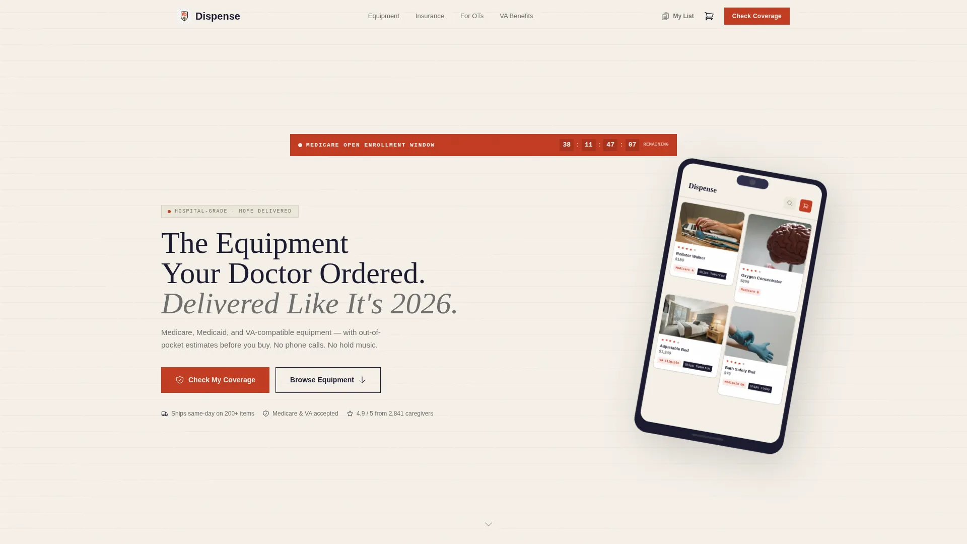
- A tilted device-frame header with a live-looking marketplace preview and a pulsing enrollment countdown banner
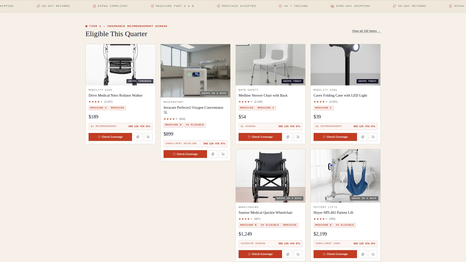
- A three-tier urgency masonry grid: insurance-eligible items, seasonal demand callouts, and clearance stock with counters
- A two-field coverage-check modal, a shareable equipment list builder, and a sticky mobile bottom bar
Feature list
This template packages every major conversion surface a medical equipment marketplace needs into one cohesive, scroll-driven landing page.
Urgency-Tiered Masonry Grid
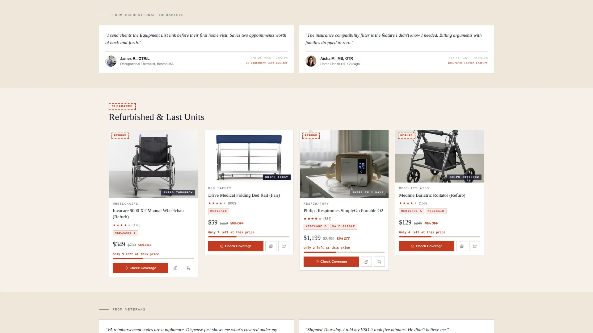
Product cards are organized by urgency level, not just category. The first row flags items eligible for current-quarter insurance reimbursement. The second cluster highlights seasonal demand. The third wave shows clearance and refurbished units with live stock counters. Each tier keeps the visitor moving with purpose.
Coverage-Check Modal
Every product card carries a "Check My Coverage" button that opens a two-field modal. The visitor selects their insurance provider from a dropdown and enters their ZIP code. Matching items instantly re-sort with out-of-pocket estimates, answering the single biggest question before any dollar is requested.
Equipment List Builder
A secondary conversion path lets occupational therapists and caregivers add items to a shareable, printable equipment checklist without committing to a purchase. This serves the professional buyer segment and keeps high-intent non-purchasers engaged with the page.
App Store Preview Header
The header features a stylized device frame tilted five degrees against the cream background. Its screen shows the marketplace mid-scroll, complete with product thumbnails, star ratings, insurance-compatibility badges, and "Ships Tomorrow" tags. A chunky slab-serif headline sits above the frame, and a pulsing red countdown banner anchors the urgency theme from the first second.
Testimonial Strips with Timestamps
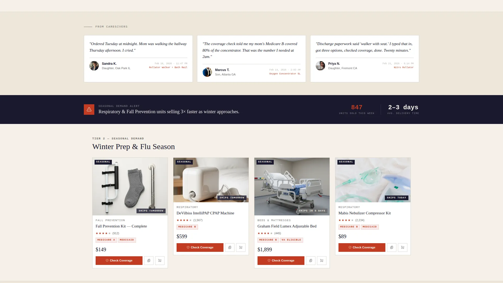
Between product clusters, testimonial strips appear with real-feeling timestamps. Lines like "Ordered Tuesday, Mom was walking Thursday" give the page social proof that is specific, credible, and tied directly to the product promise of fast delivery.
Sticky Mobile Bottom Bar
On mobile screens, a persistent bottom bar holds the coverage-check button alongside a cart icon with an item count. This keeps the two primary actions reachable at any scroll depth without cluttering the card grid above.
Page sections overview
| Section | Purpose |
|---|---|
| Device Frame Header | Introduces the marketplace with a tilted app preview, slab-serif headline, and pulsing enrollment countdown |
| Insurance Eligible Row | First urgency tier showing products with current-quarter reimbursement deadlines stamped on each card |
| Seasonal Demand Cluster | Second urgency tier highlighting fall prevention kits and respiratory units ahead of seasonal peaks |
| Clearance Stock Wave | Third urgency tier displaying refurbished units with live stock counters and price-drop indicators |
| Testimonial Strips | Social proof blocks with specific timestamps placed between product clusters |
| Coverage Check Modal | Two-field overlay triggered by any product card call to action, re-sorting results by out-of-pocket estimate |
| Equipment List Builder | Secondary conversion path for therapists and caregivers to build a shareable checklist |
| Sticky Mobile Bar | Persistent bottom bar on mobile holding the coverage-check button and cart icon |
Design & branding system
The visual identity follows a Neo-Retro Ink and Paper system. It reads like a 1962 apothecary catalog printed on heavy cotton stock, credible, organized, and quietly confident.
- Prescription-pad cream (#F5F0E8) dominates the background; deep fountain-pen black (#1A1A2E) anchors serif headlines; pharmacy-label red (#C23B22) marks countdown timers and urgency badges; typewriter-ribbon gray (#6E6E6E) softens dividers and secondary text
- Typography leans on chunky slab-serif weights for headlines and clean body fonts to keep product details legible at a glance
- The five-degree device tilt, subtle drop shadow on the header frame, and gray grid lines between cards give the layout physical depth without visual noise
Mobile & speed optimization
The landing page layout is built with mobile caregivers in mind. Someone filling out discharge paperwork at 11 p.m. on a phone needs everything reachable and nothing in the way.
- The sticky bottom bar keeps the coverage-check button and cart icon accessible at every scroll depth on mobile screens
- The masonry grid adapts cleanly to narrow viewports, preserving card hierarchy and urgency badges without crowding
- Countdown timers and stock counters remain visible and readable at small sizes, so urgency cues never get lost on phone screens
How this template helps you convert
This template converts by removing the two biggest friction points in home medical purchasing: not knowing what insurance covers, and not feeling enough urgency to act today.
- The coverage-check modal answers the cost question before the visitor reaches the cart, replacing hesitation with a personalized out-of-pocket estimate that makes the "add to cart" step feel safe.
- The urgency tier structure, from reimbursement deadlines to stock counters to timestamps on testimonials, creates a steady, rational drumbeat that frames delay as a real cost to recovery.
Other information about this template
This template sits inside the Retail and E-Commerce category with a Local Brick and Mortar Business subcategory focus, bridging the gap between a physical medical supplier and a digital-first storefront. It uses the Masonry and Pinterest layout style to organize a large, varied product catalog without losing the visitor to visual fatigue.
- The Neo-Retro theme and Ink and Paper color system make this template visually distinct from the clinical white and teal aesthetic common in health retail, helping it stand out in a crowded marketplace
- The Marketplace and Multi conversion model means the page supports both direct purchase paths and indirect paths like list building, making it suitable for B2C caregivers and B2B professionals simultaneously
- The template is designed as a single landing page, meaning all conversion surfaces, from the header call to action to the sticky bar, live within one continuous scroll experience
Theme
Neo-Retro
Creative direction
Unboxing Experience
Color system
Citrus Burst
Style
Masonry/Pinterest
Direction
Marketplace/Multi
Page Sections
Urgency-tiered Masonry Product Grid
Two-field Coverage-check Modal
Shareable Equipment List Builder
App Store Preview Header Frame
Timestamped Testimonial Strips
Sticky Mobile Bottom Bar
Related questions
Who is the primary audience for this template?
Can occupational therapists use this template without making a purchase?
How does the coverage-check modal work in this template?
What makes the urgency design different from typical countdown timers?
Is this template suitable for a large product catalog?



