Pharmacy & Drugstore Professional Website Template
Dispense is a hub-and-spoke landing page template built for neighborhood pharmacies that compete on trust, speed, and personal care. It leads with a credential-heavy header, stat-first section openings, and a frictionless three-field prescription transfer form. The design uses a Medical Clarity color palette and anchored navigation to guide every visitor toward one clear action.
by Rocket studio
Quick summary
Dispense is a single-page pharmacy landing page template designed to convert chain-pharmacy patients into loyal neighborhood pharmacy customers. It opens with an award-badge constellation and a bold accuracy stat, then walks visitors through six credibility-building sections via anchor navigation. Every section leads with a number, earns trust, and ends with a call to transfer their prescription.
Who this template is for
This template is built for independent and neighborhood retail pharmacies that want to compete directly with chain drugstores. It works especially well when your strongest selling points are accuracy, wait time, personal service, and compounding capabilities.
- Retail pharmacies and independent drugstores running lead generation campaigns
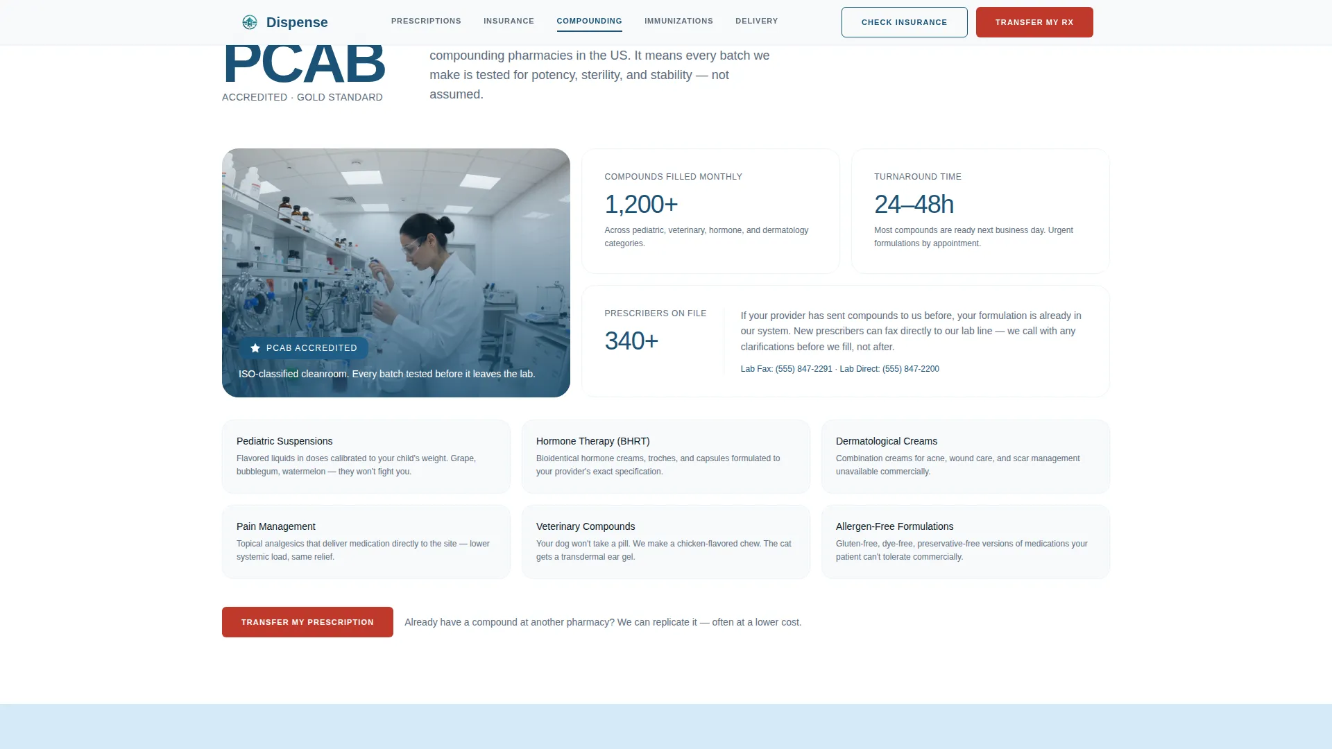
- Compounding pharmacies that need to communicate PCAB (Pharmacy Compounding Accreditation Board) credentials clearly
- Pharmacy owners targeting families, elderly Medicare patients, and parents with urgent medication needs
What problem this template solves
Chain pharmacies frustrate patients with long waits, impersonal service, and confusing insurance processes. Independent pharmacies often lose those patients simply because their online presence does not communicate what makes them different. This template solves that gap directly.
- It front-loads proof of competence so visitors feel confident before they ever reach a form
- It simplifies the prescription transfer decision with a lightweight, three-field form and a pharmacist callback promise
- It addresses the most common patient hesitations, including insurance coverage, wait times, and medication accuracy
What you get with this template
You get a fully structured, single-page layout with six spoke sections anchored to a sticky navigation bar. Every section is pre-built around a stats-first content approach, so your numbers do the persuading before your words have to.
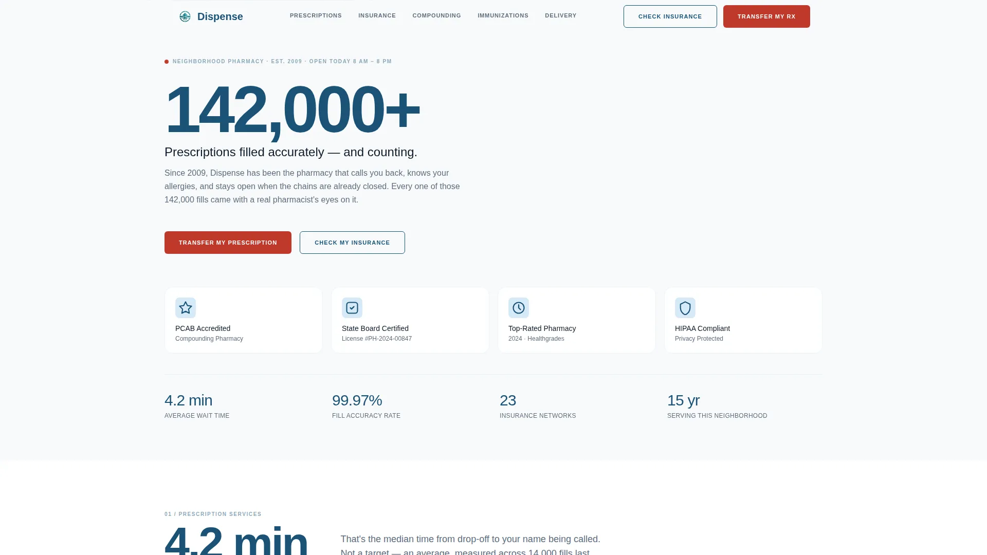
- A credential-forward hero with badge constellation layout, accreditation seals, and a large numerical accuracy callout
- Five content spoke sections covering Prescription Services, Insurance and Pricing, Compounding Lab, Immunizations and Wellness, and Delivery and Transfer
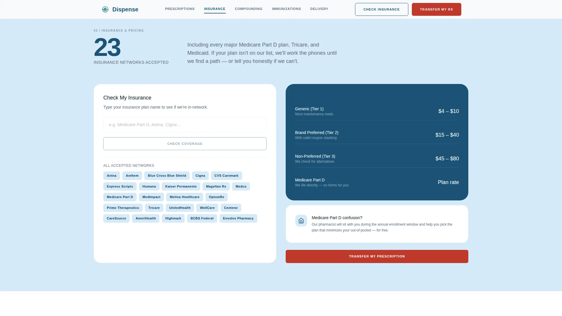
- Two conversion paths: a three-field Transfer My Prescription form and a Check My Insurance lookup widget
Feature list
This template includes practical, audience-tested components built specifically for pharmacy lead generation.
Stats-First Section Openings
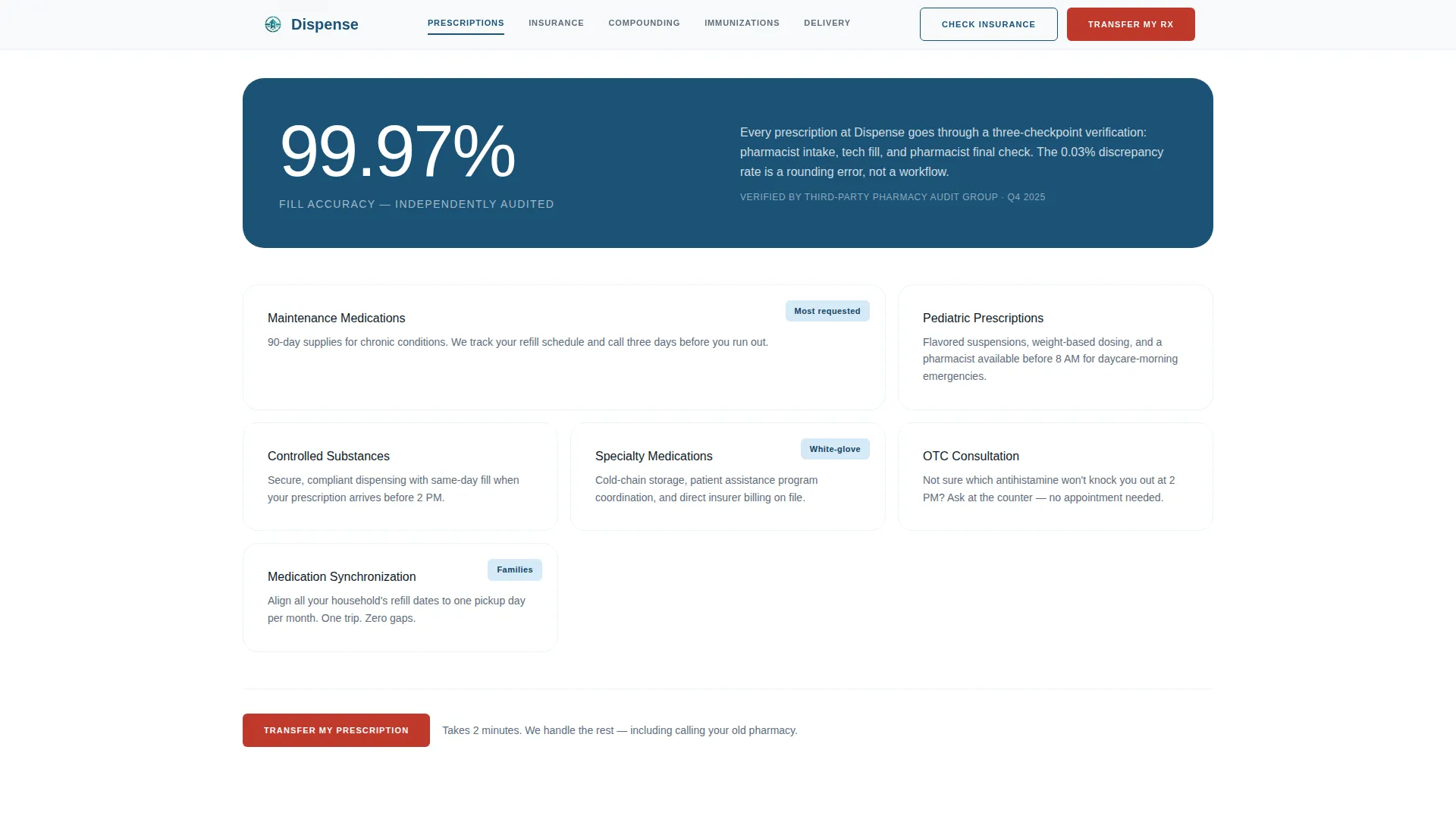
Each spoke section opens with a prominent numerical stat before any narrative copy. Stats like "4.2 minutes" average wait time and "99.97%" fill accuracy are styled to land like vital sign readings, followed by a brief human explanation of the real workflow behind each number.
Sticky Anchor Navigation Bar
A persistent navigation bar sits at the top of the page throughout the scroll. It links directly to each spoke section and carries the primary "Transfer My Prescription" call-to-action button at all times, keeping the conversion path visible without interrupting the reading experience.
Three-Field Prescription Transfer Form
The transfer form collects only three inputs in sequence: current pharmacy name, prescription count, and phone number for a pharmacist callback. Keeping the form minimal reduces friction and makes the transfer feel like a straightforward, low-effort decision.
Check My Insurance Widget
A secondary conversion path opens a lightweight insurance lookup widget. It lets visitors quickly check whether their plan is accepted among the 23 insurance networks listed, removing a common barrier before the transfer commitment is made.
Award Badge Hero Layout
The header section displays PCAB accreditation seals, state board certification marks, a consumer-platform top-rated badge, and the "142,000+ Prescriptions Filled Accurately" stat. There is no hero image. The credentials and the number are the visual centerpiece, arranged with deliberate precision.
FAQ Accordion Component
An interactive accordion component handles frequently asked patient questions about insurance, compounding, transfers, and Medicare Part D. It keeps the page clean while making detailed answers accessible on demand.
Page sections overview
| Section | Purpose |
|---|---|
| Award Badge Hero | Establish trust immediately with credentials and a headline accuracy stat |
| Prescription Services | Lead with wait-time and accuracy stats, then describe service types |
| Insurance & Pricing | Show 23 accepted networks and surface the Check My Insurance widget |
| Compounding Lab | Highlight PCAB accreditation and custom formulation capabilities |
| Immunizations & Wellness | Present walk-in availability stats and the vaccine service list |
| Delivery & Transfer | Host the three-field Transfer My Prescription form and callback promise |
| Footer Row | Provide minimal single-row links following a developer-minimal layout pattern |
Design & branding system
The visual identity follows a Medical Clarity theme. The palette feels sterile without being cold, like a freshly organized prescription counter under clean halogen lighting. Every color has a specific job in the layout.
- Arctic White (#F8FAFB) covers primary backgrounds; pharmaceutical ice blue (#D6EAF8) is used for section dividers and card surfaces; deep scrub teal (#1A5276) handles all headlines and navigation anchors
- Alert red (#C0392B) is reserved exclusively for calls to action and urgent badges, keeping it high-contrast and immediately noticeable
- Typography uses DM Sans throughout for clean, highly legible text appropriate for medical and healthcare contexts
Mobile & speed optimization
The template is built with a mobile-first layout priority. Elderly patients and busy parents are most likely browsing on a phone, and the design accounts for that with large touch targets, readable type sizes, and a sticky nav that works cleanly on smaller screens.
- Static content sections use server-side rendering patterns to reduce initial load weight, while interactive components like the transfer form and insurance widget are handled client-side
- Scroll-reveal animations and stat counter effects use a low-to-medium motion approach, keeping the experience engaging without causing distraction on mobile devices
- The single-column anchor navigation collapses predictably on smaller viewports, keeping all spoke destinations reachable with minimal scrolling
How this template helps you convert
The entire page is structured as a credibility funnel. Visitors arrive skeptical and leave either convinced or actively in the transfer process. Every design decision is in service of that arc.
- The header hits visitors with credentials and a six-figure accuracy stat before they read a single sentence of marketing copy, establishing competence as the very first impression
- Each spoke section deepens trust with a specific stat and a human explanation, so by the time a visitor reaches the Transfer My Prescription form, the decision feels obvious and low-risk
- Two distinct conversion paths, the transfer form and the insurance lookup widget, catch visitors at different stages of readiness without competing with each other
Other information about this template
This template is categorized under Health and Medical, specifically within the Pharmacy and Drugstore subcategory for retail pharmacy use cases. It is localized for the United States market, using USD pricing references, 12-hour time format, and English language throughout.
- The layout follows a hub-and-spoke structure with anchor navigation, meaning all sections radiate from the central trust established in the header
- Animation behavior includes scroll reveals with stagger timing, stat counter animations on section entry, and an FAQ accordion for compact question handling
- The footer follows a single-row minimal layout pattern, keeping the page exit clean and uncluttered
- This template is well suited for pharmacies preparing patient-facing materials related to Medicare Part D plan navigation, compounding services, and multi-generational family prescription management
Theme
Medical Clarity
Creative direction
Stats-First Impact
Color system
Arctic White
Style
Hub & Spoke (Anchor Nav)
Direction
Lead Generation
Page Sections
Stats-first Section Openings
Sticky Anchor Navigation Bar
Three-field Prescription Transfer Form
Check My Insurance Widget
Award Badge Hero Layout
FAQ Accordion Component
Related questions
Can I customize the stats and badge content for my pharmacy?
Does the prescription transfer form connect to any specific pharmacy software?
Is this template suitable for a compounding pharmacy?
What does the Check My Insurance widget do?
What type of pharmacy benefits most from this template?



